Madeleine Bays
Glasgow-based communication designer with an established concept-led approach to graphic design and art direction.
This year, my practice has been collaborative, context-responsive and rooted in human touch. Expressed through print, publication, editorial design, brand identity and world-building projects.
Working within the context of North East England, my home region, I use graphic design as a tool for good: uplifting regional culture, whilst responding to the contemporary political and cultural landscape of the UK.
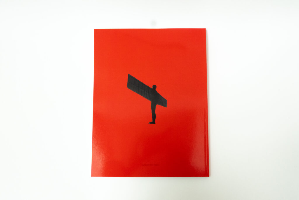
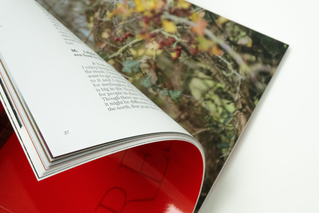
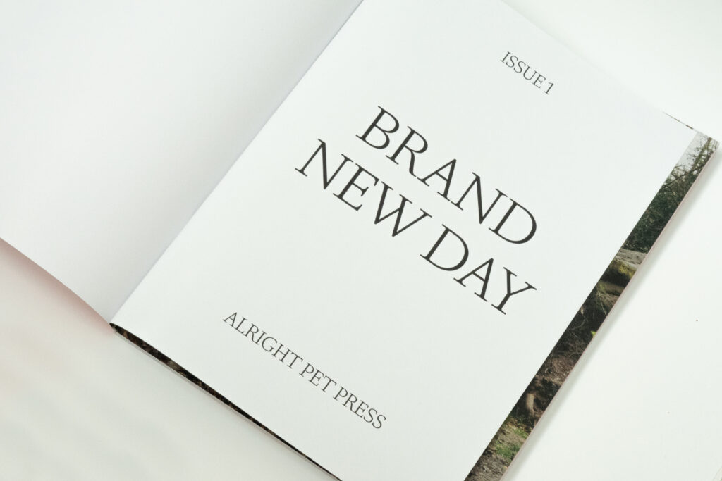
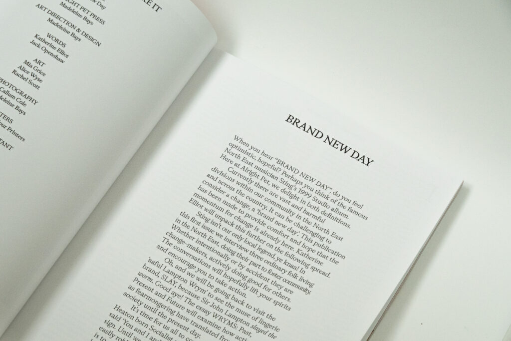
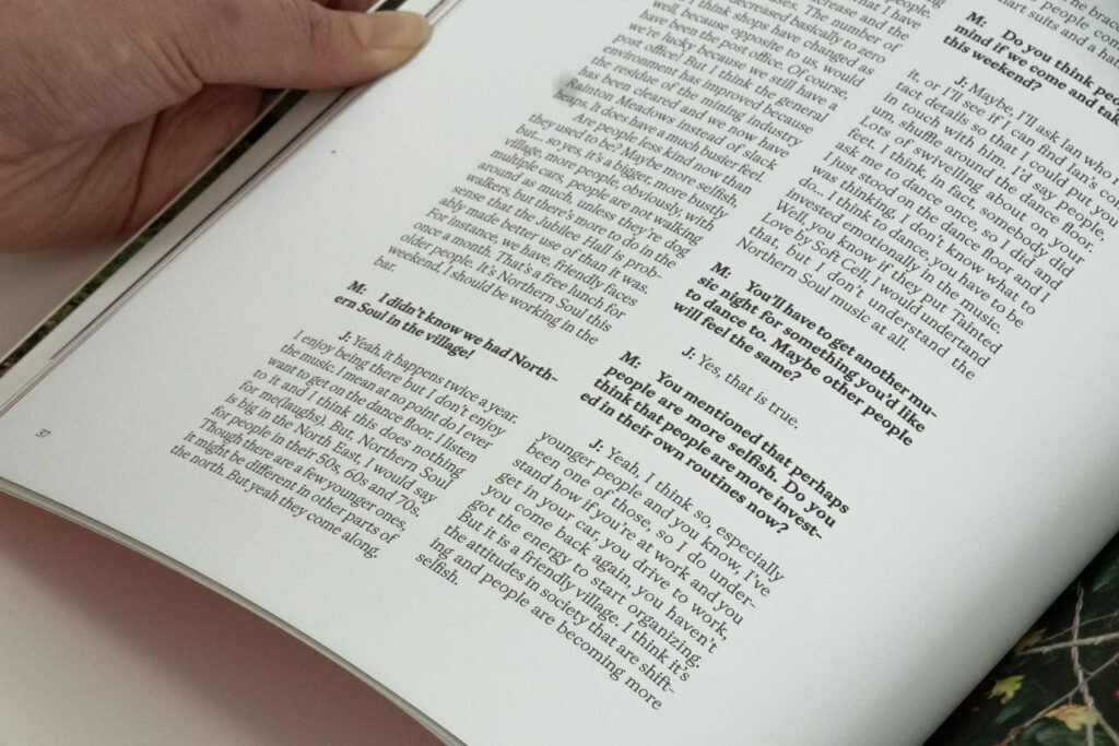
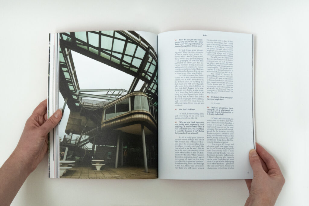
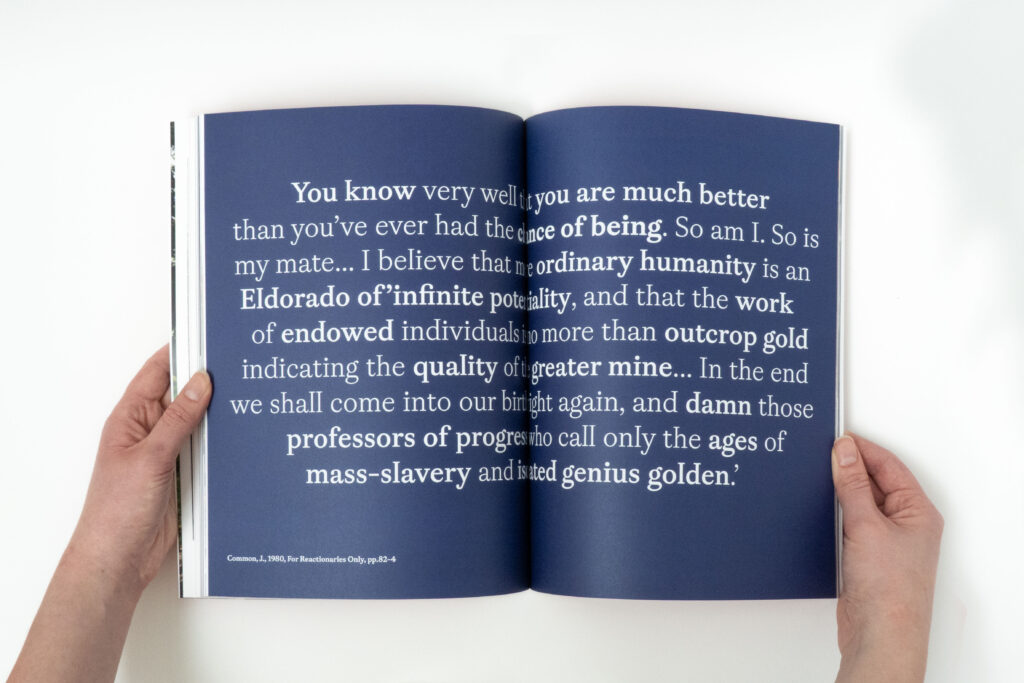
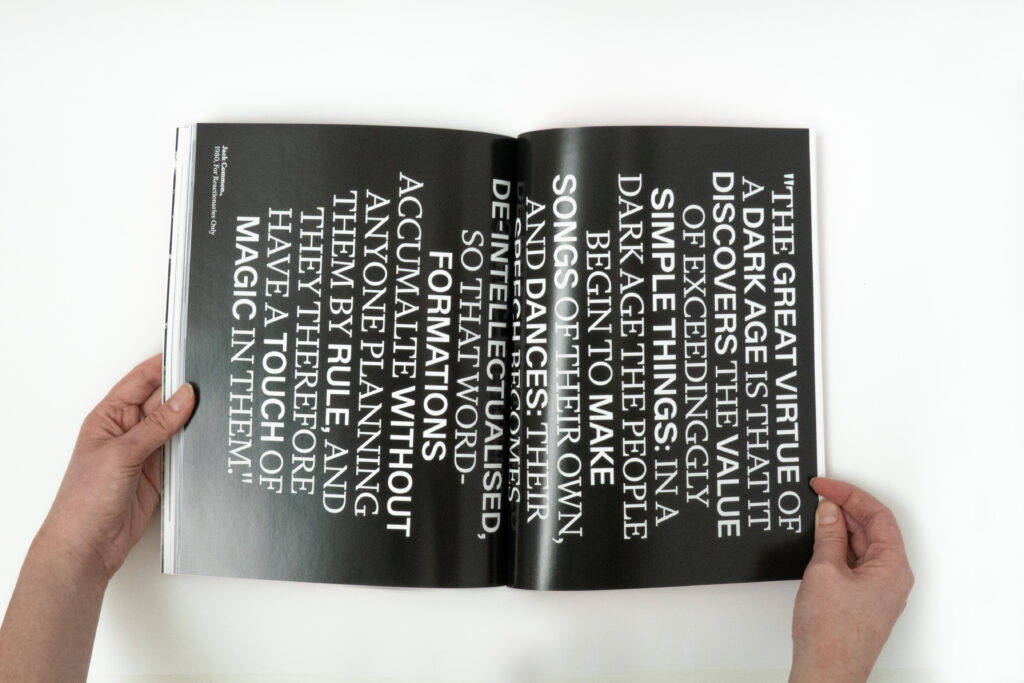
Brand New Day – Publication
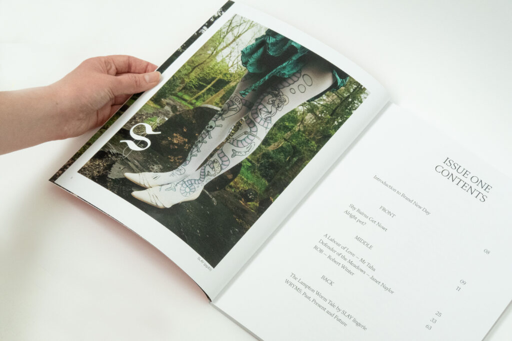
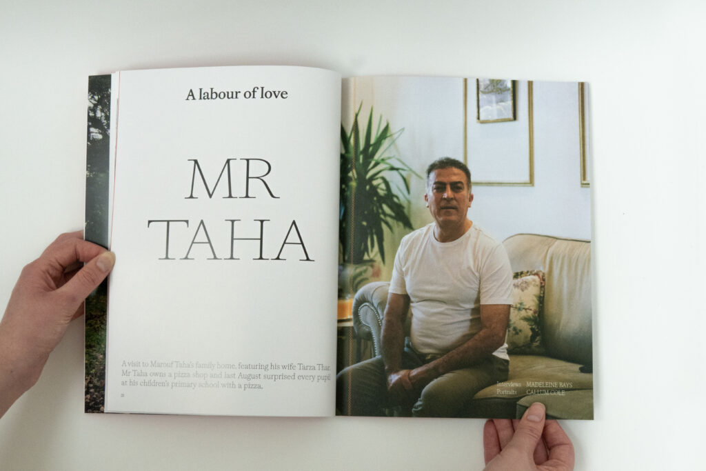
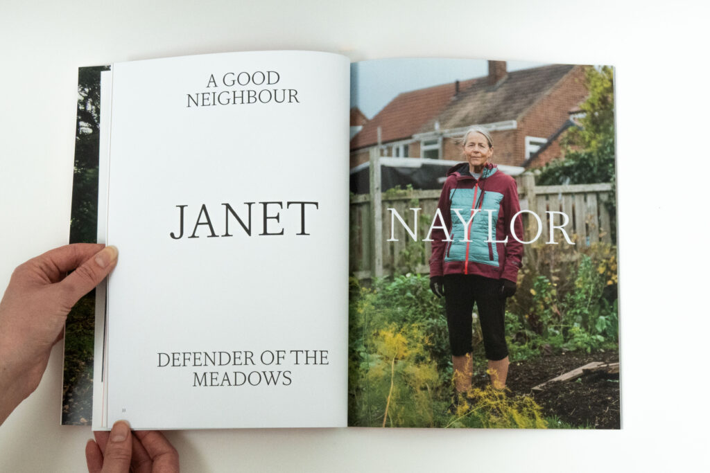
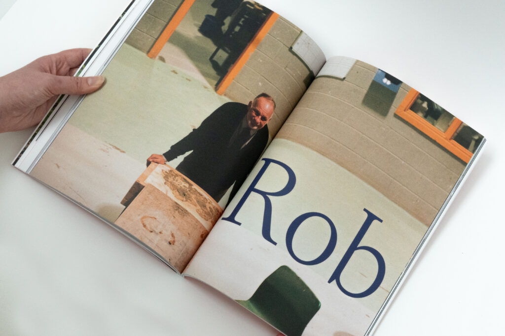
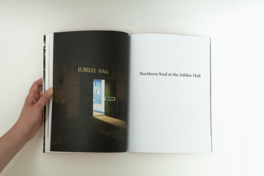
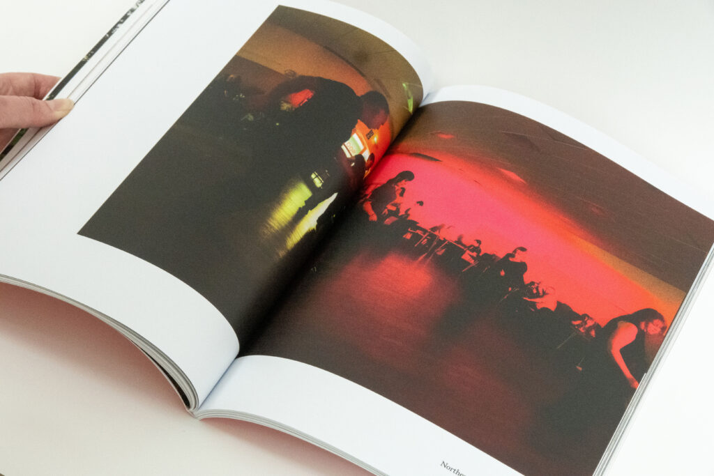
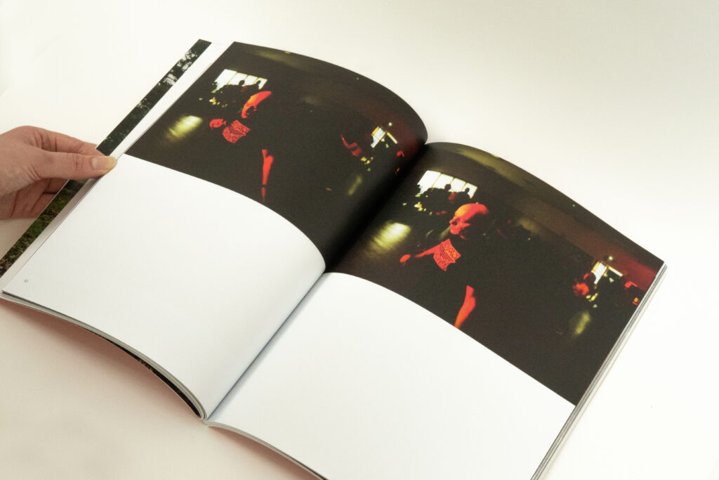
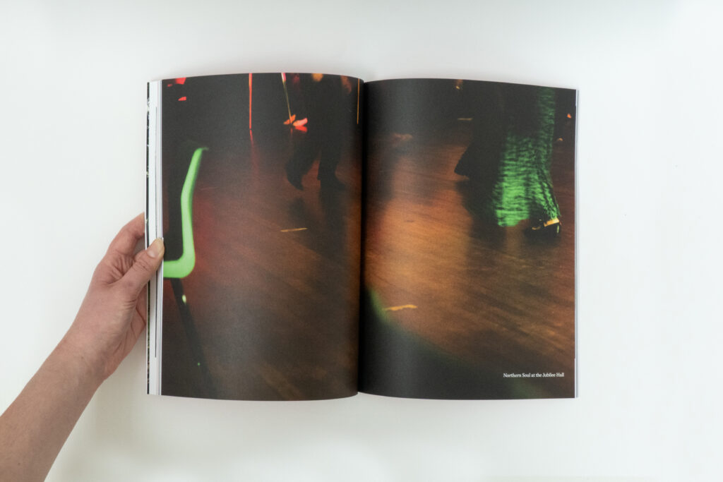
This publication was created to celebrate culture within the North East of England. Contributions came from two local writers, Katherine Elliot, Jack Openshaw, photographer Callum Cole, illustrator Alice Wyse and textile designer Mia Grice.
It has been incredibly rewarding to work with people who are also passionate about storytelling, community and a meaningful design practice.
This project features change makers within my community and encourages a hopeful, inclusive outlook for the future, reflected in the title ‘Brand New Day’. The publication is split into three sections: front, middle and back, allowing the magazine to have variety and visual contrast, insightful over multiple topics.
Over the last year, I conducted research, built relationships, and managed communications. I also designed the book, came up with the content ideas, created photography content and made briefs.
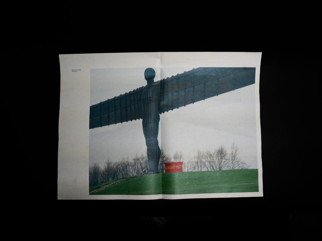
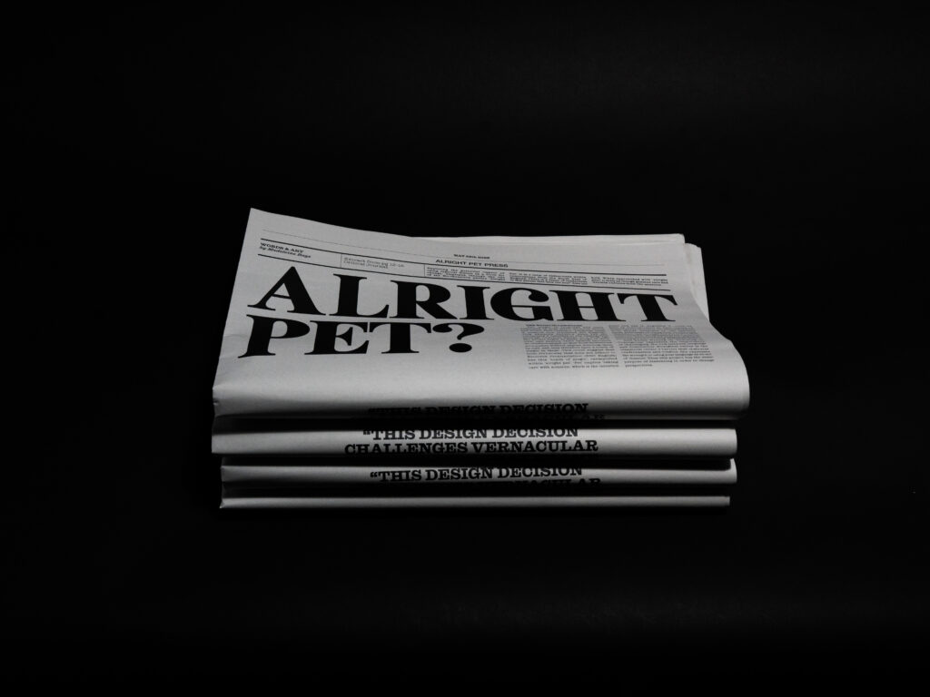
Alright Pet? – Large Format Print
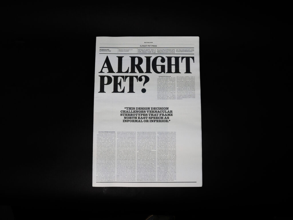
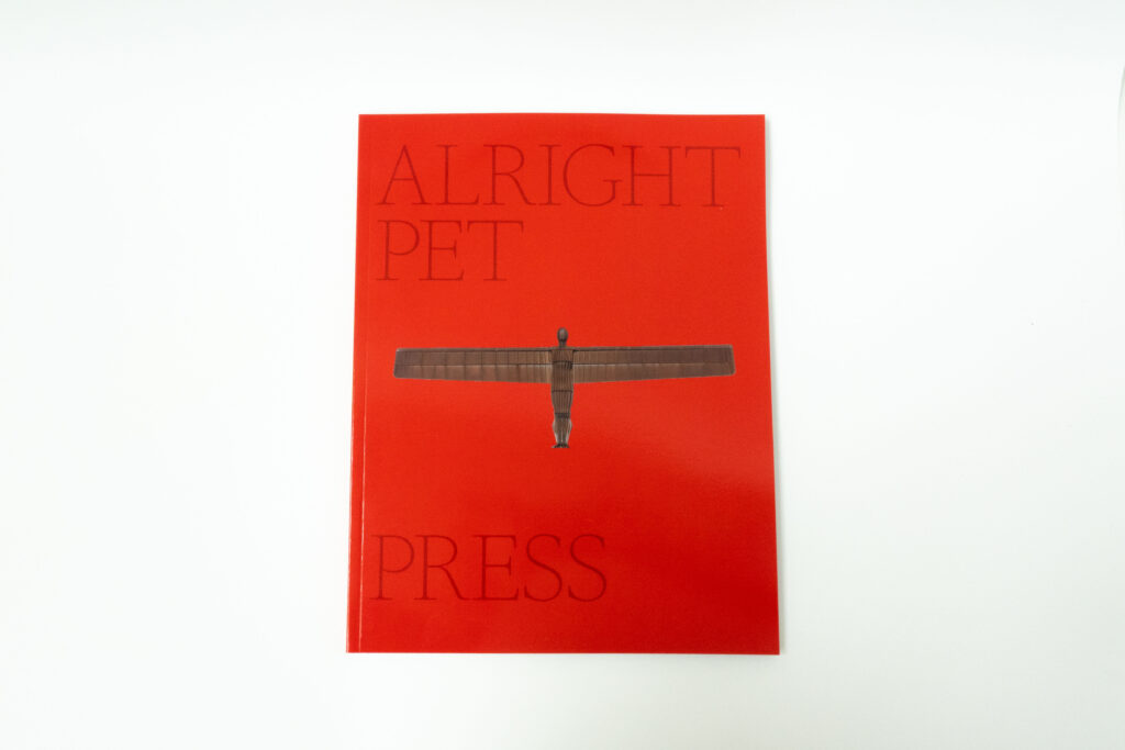
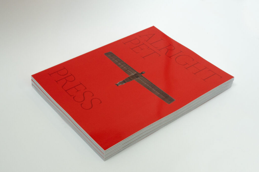
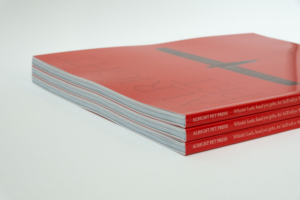
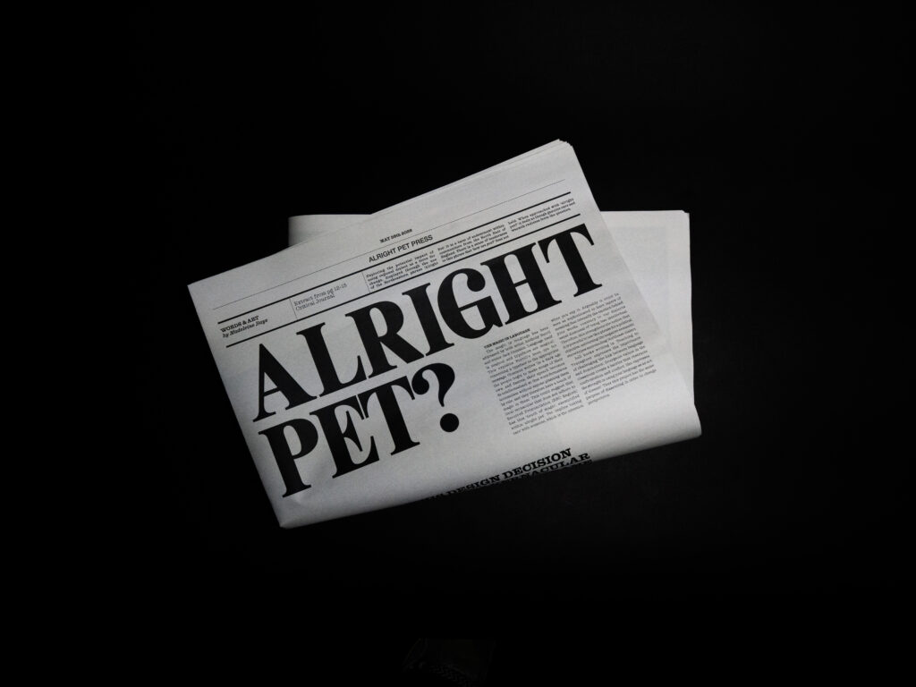
This project investigates the tenderness embedded within North East dialect and the cultural power of regional language. Regional accents are often reduced to stereotypes of humour or lack of intelligence; this work challenges those assumptions through graphic intervention.
Referencing the solidarity banners of the miners’ strikes, the project places the phrase “alright pet?” at the centre of the work, framing it as an expression of care and resistance. By photographing the banner within unexpected public contexts,
the project generates social and political discussion around the phrase and its meaning.
The final outcome adopts the format of a newspaper publication to reflect themes of politics, community and public voice. Designed as a series of large loose sheets, the publication can be unfolded and reordered, functioning as an open and evolving archive.
Freedom of the streets – Product Design and World Building
This project draws on my research into the writer Jack Common and the principles of a relational art practice. The stencils I created are designed to recreate the street games Common references in his writing about childhood play in working-class backstreets.
Each stencil carries a segment from this quote from Common to frame the project: “Why there’s such a good communal stir and warmth out on the pavements that it would be a queer kiddy who would sooner sit indoors than mix in it — even if indoors was a palace.” This quote highlights the importance of shared public space as something accessible to everyone, regardless of class, whilst also emphasising the freedom children experience through creating their own worlds and communities through play. The archived imagery placed between sections helps to visually narrate this story.
The final designed object functions both as an aesthetic piece and as a practical tool for children’s world-building, encouraging community interaction and reclaiming the backstreet as a social space. A striking contrast between the 1930s and today is the decline of children playing outdoors, an issue that feels increasingly important to address due to the social and developmental value of outdoor play.
Throughout the project, I designed and produced the stencils, created instructional guides for each game, carried out extensive research into Common’s writing and traditional street games, sourced and curated archival imagery, and reinstalled the games within a contemporary backstreet setting.
SLAY Brand Identity
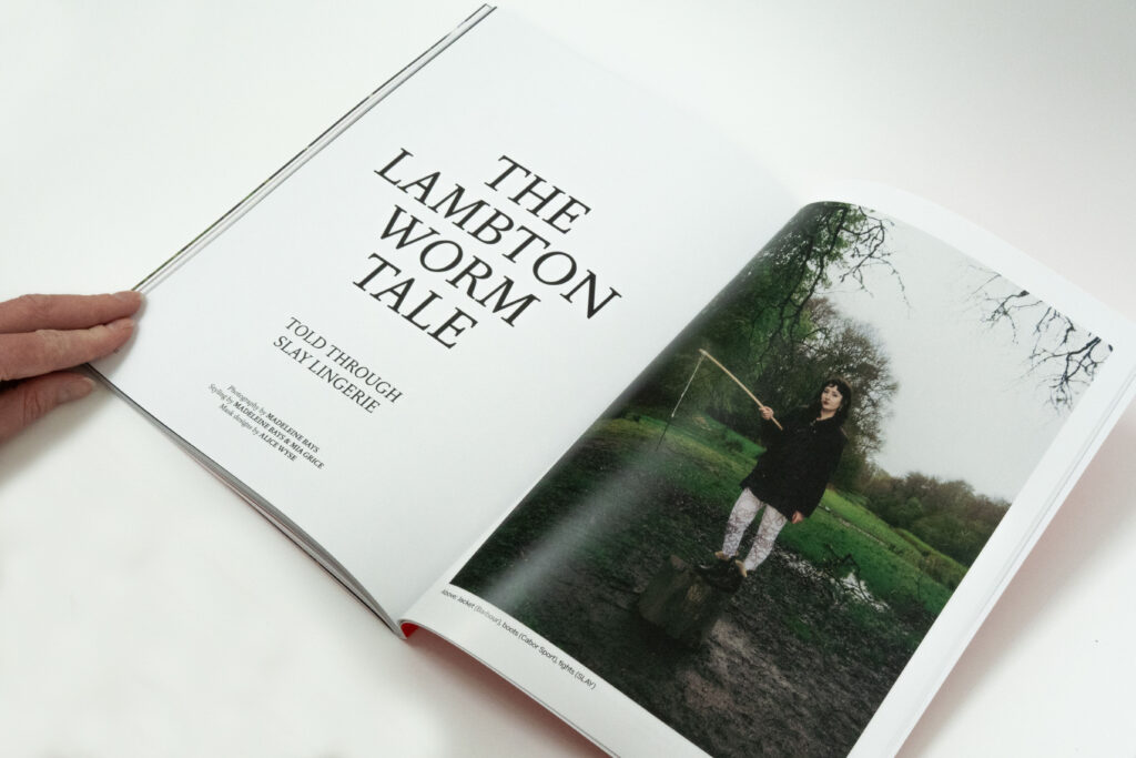
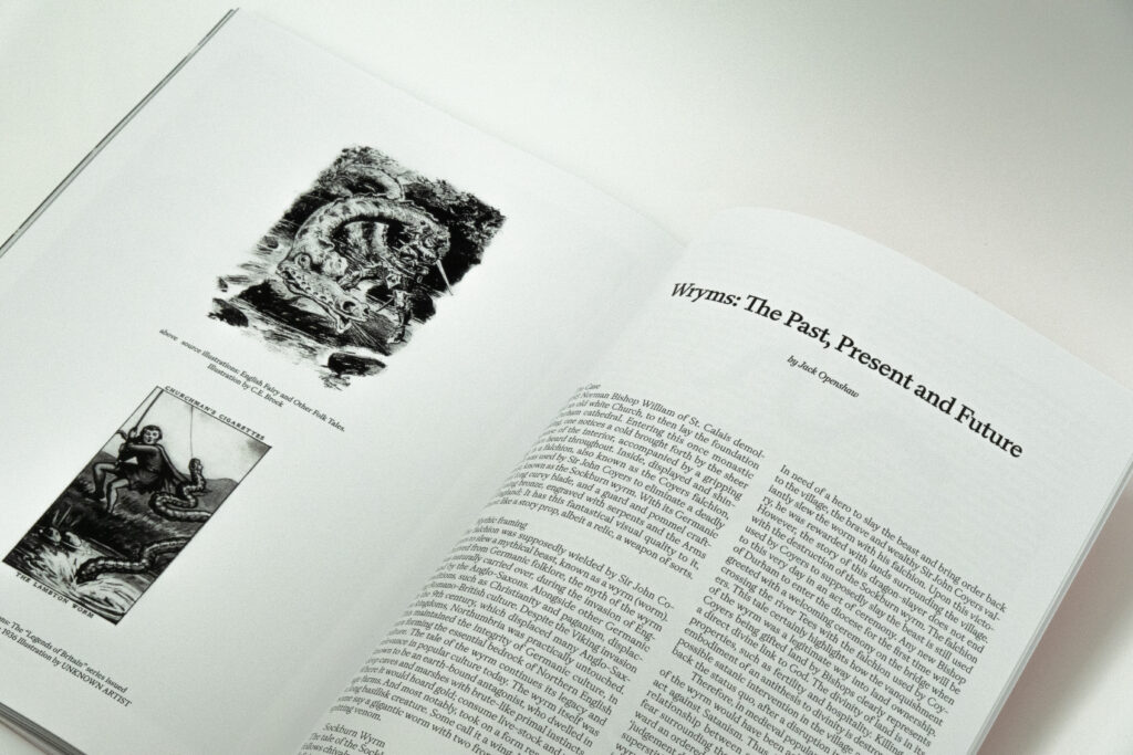
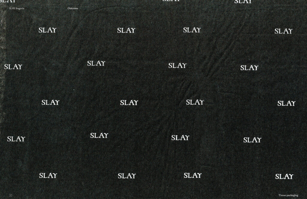
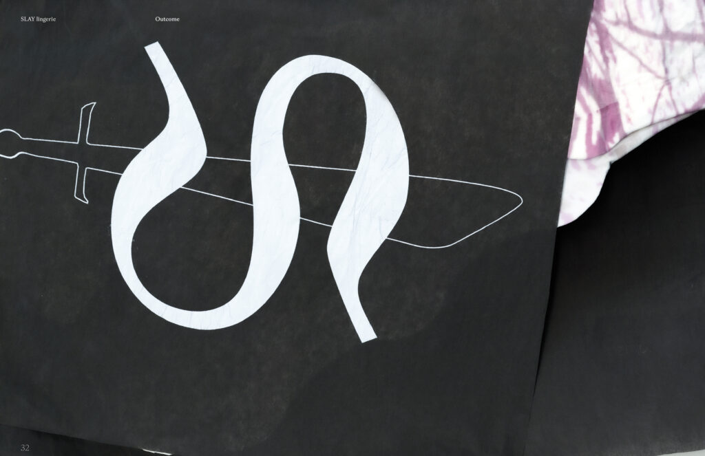
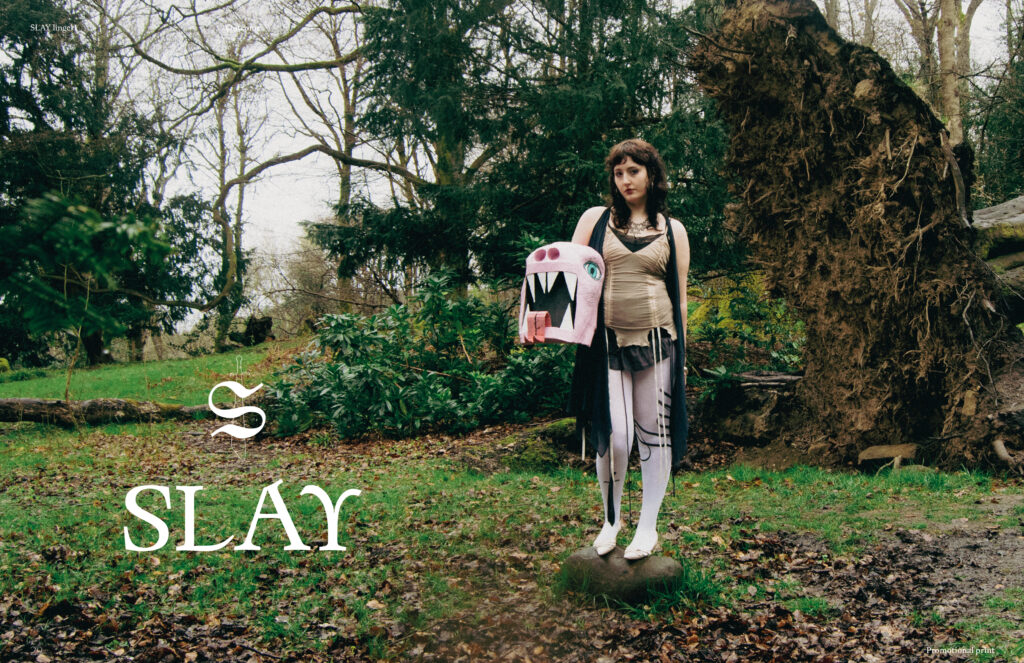
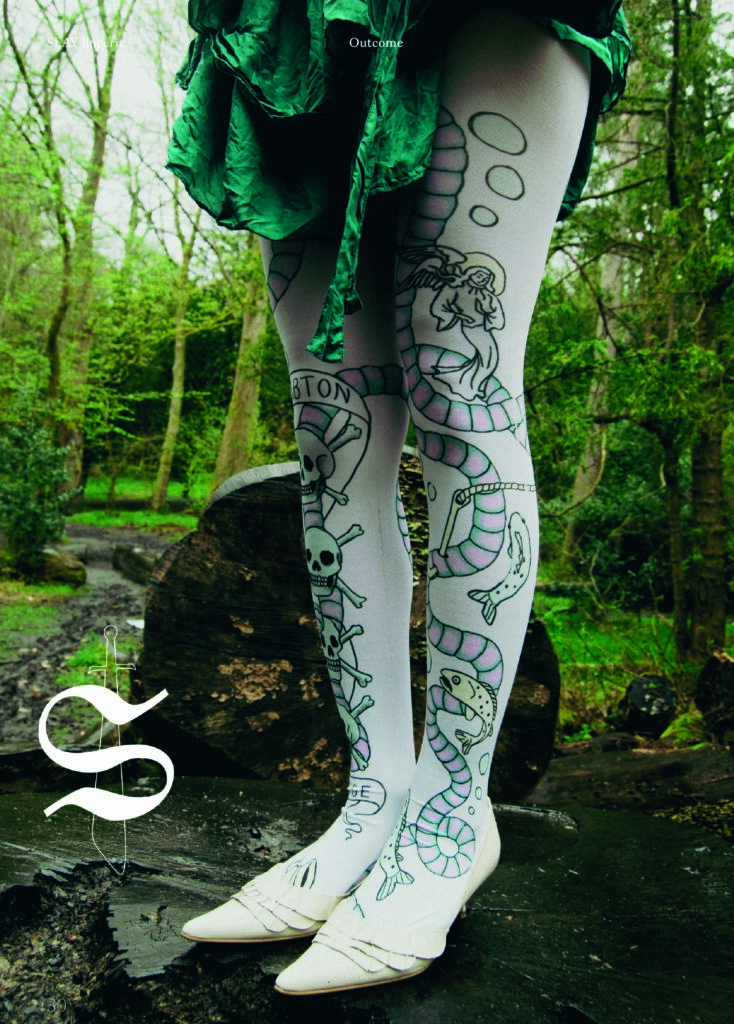
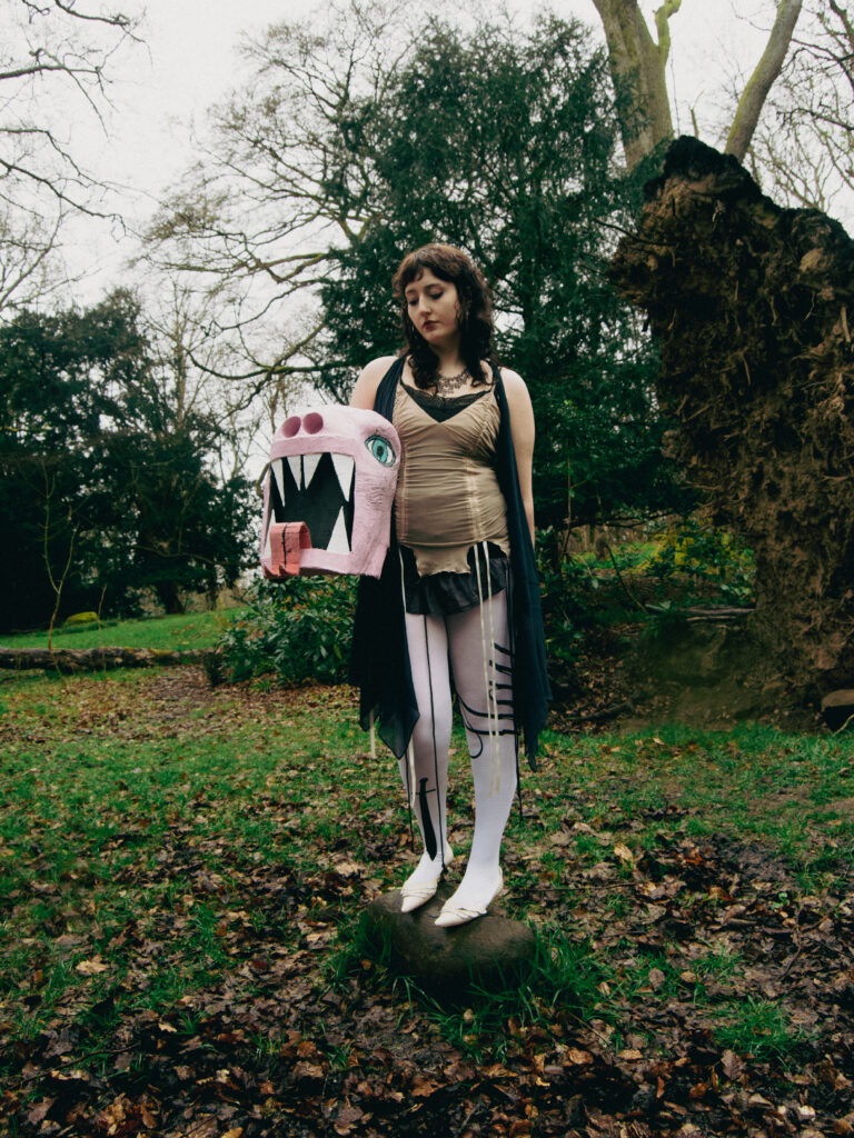
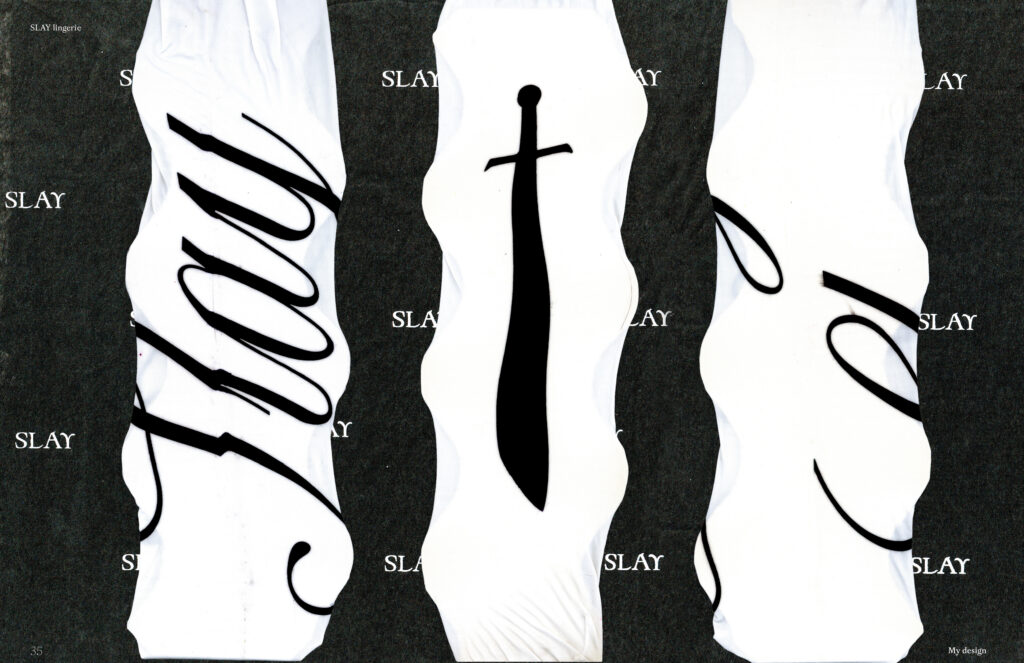
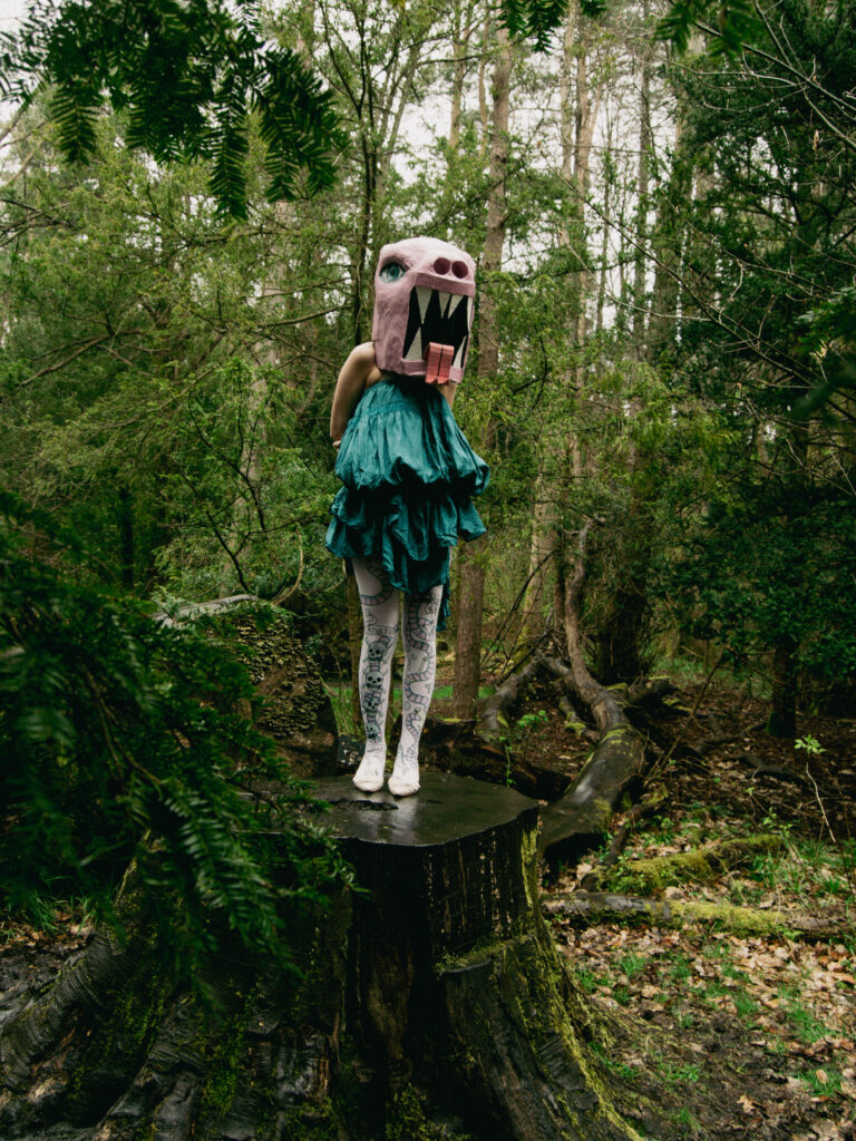
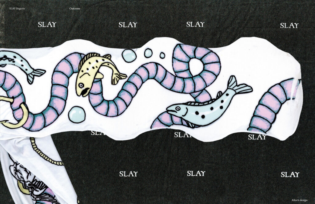
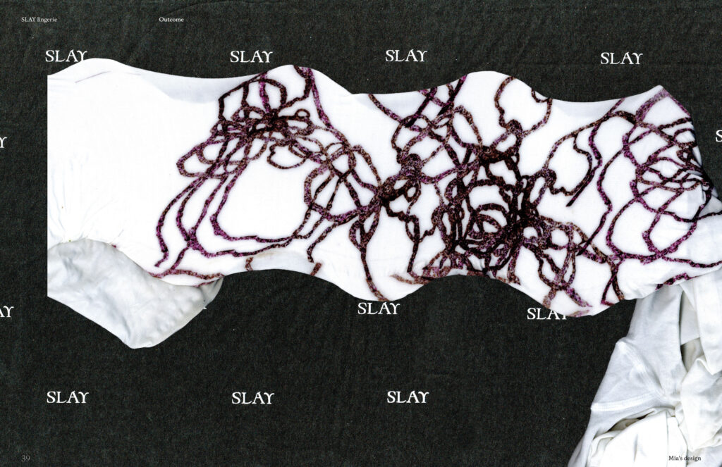
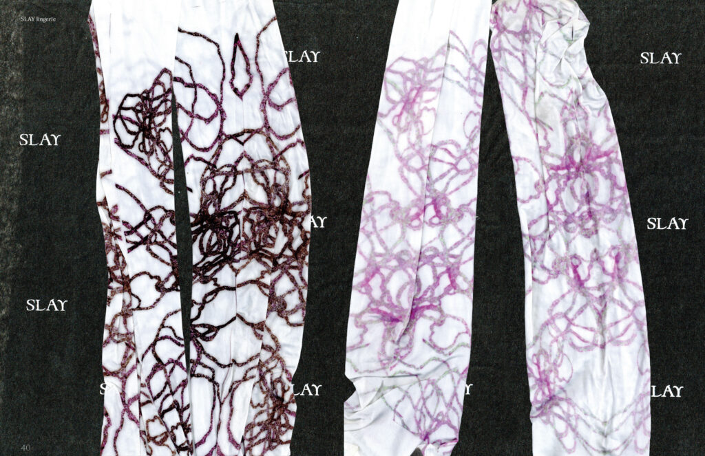
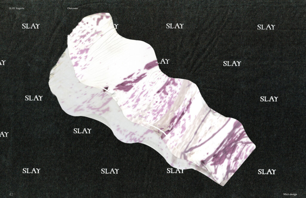
SLAY Lingerie reframes the legend of The Lambton Worm through contemporary pop-cultural language and tights merchandise.
Influenced by Eike König’s idea that pop culture transcends social and cultural boundaries, the project aims to reconnect regional storytelling with a modern North East audience. The project centres around the layered meaning of the word “slay”, a term associated with both destruction and style. This combination of violence, glamour and folklore shapes the visual outcome, creating a bold reinterpretation of local myth through graphic design.
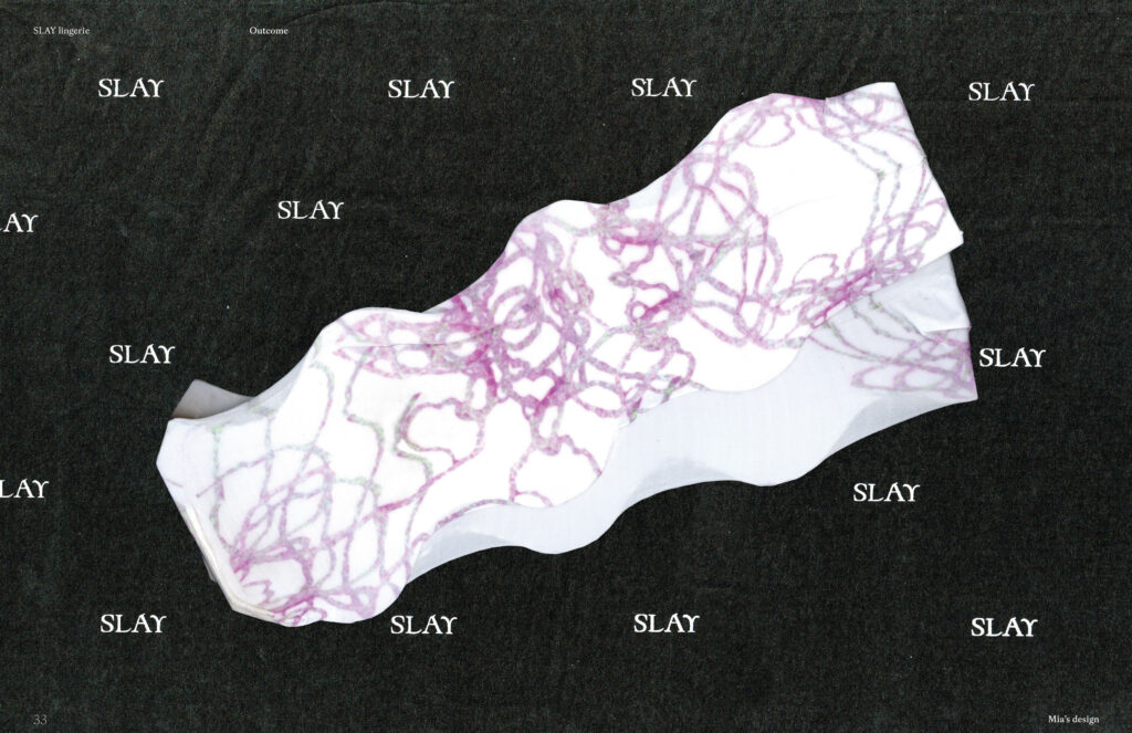
Developed as a collaborative brief, this project explored cross-disciplinary creative practice through partnerships with illustrators Alice Wyse, Li Liu, textile designer Mia Grice.
Acting as creative lead, I coordinated the project’s visual direction, did brand development, packaging design, and the design of a bespoke pair of tights. I also produced the promotional campaign through photography, editing, and direction of the final video outcome.