Rebecca Chaplain
(She/Her)
Driven by experimentation and play, my practice is informed through material exploration that pushes beyond the traditional boundaries of illustration.
I explore biographical themes throughout my work, using them as a platform to navigate personal emotions, vulnerability, and shared human experiences.
My final year work explored themes of memory, grief and loss, centred around my Gran and her experience with dementia. As an avid crafter, she was the biggest creative inspiration in my life. Through a combination of textile processes, I explore the visualisation of the fragmentation of memory loss while honouring her creative legacy. Ultimately, these projects invite viewers into a shared space of vulnerability, turning private grief into a relatable exploration of what it is to love and remember.
Blanket Tapestry
Blankets are objects I associate strongly with my Gran. They are warm and soft, conveying how I felt about her while directly connecting to her own creative practice. This blanket features collagraph illustrations of the objects I explored throughout this project, arranged in a pattern reminiscent of the ones my Gran used to make. Breaking away from the object’s traditional functional use, this blanket tapestry merges illustration and fabric to imbue the material with narrative weight. This outcome functions as a physical bridge across loss and the value these objects now hold.
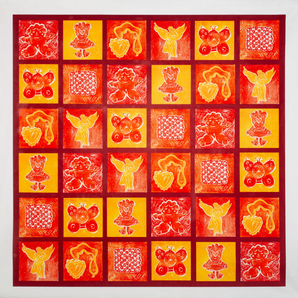
Blanket Tapestry featuring collagraph illustrations of the chosen objects, in a quilt/granny square style.
Memory Zine
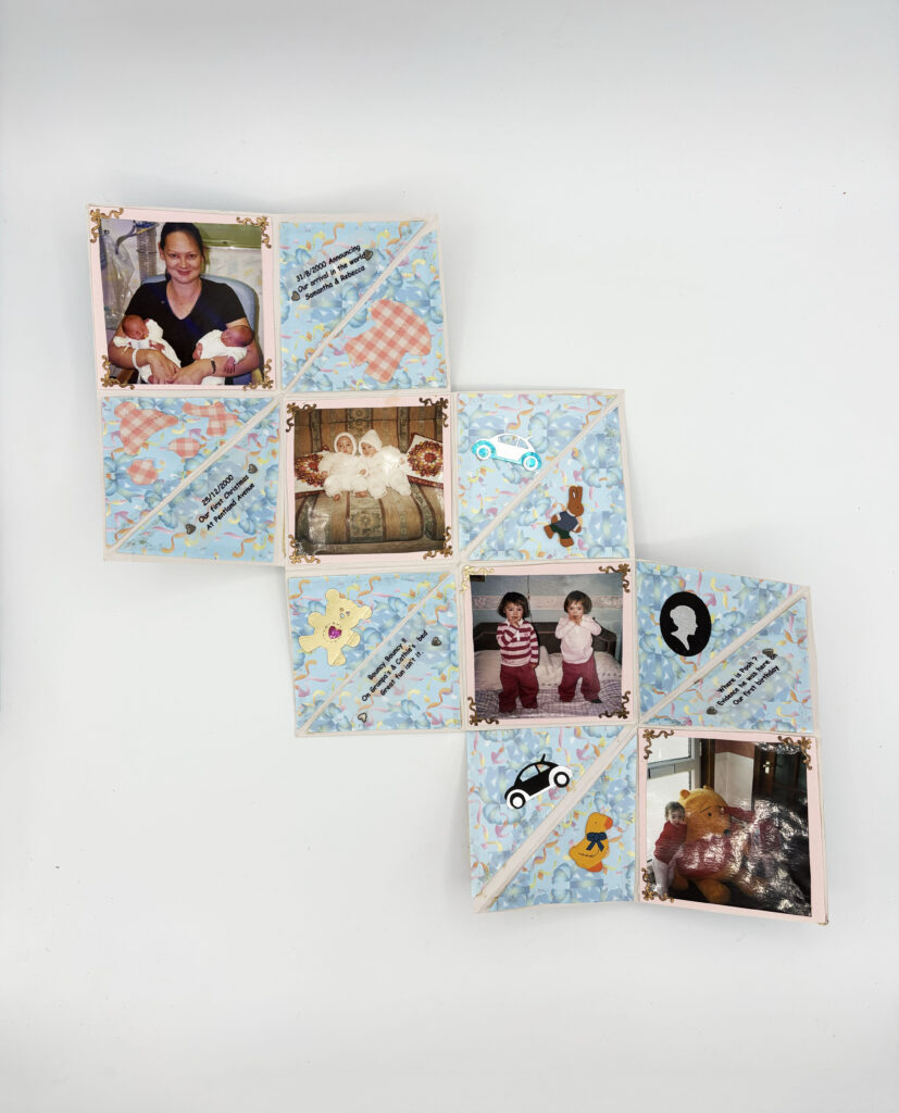
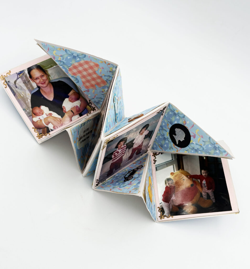
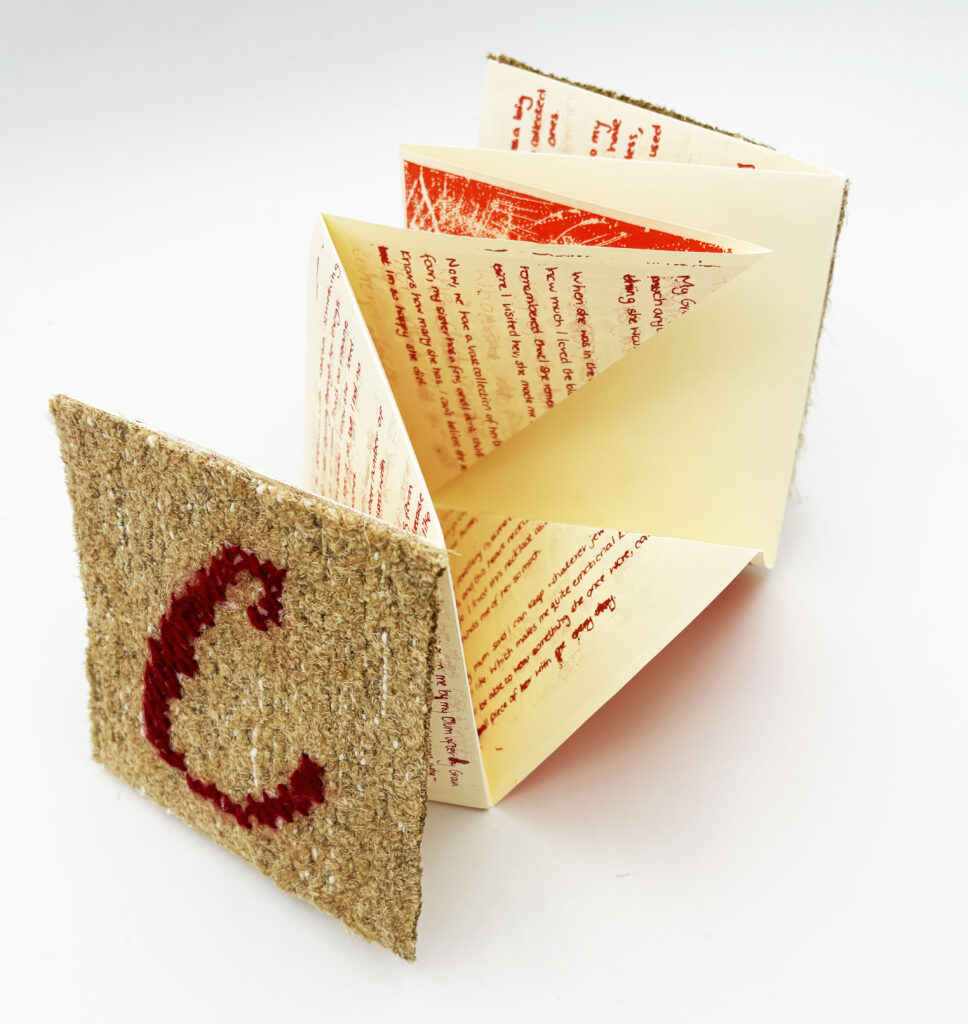
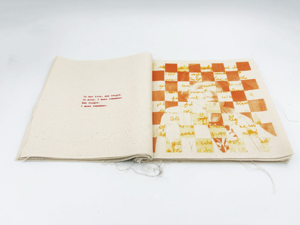
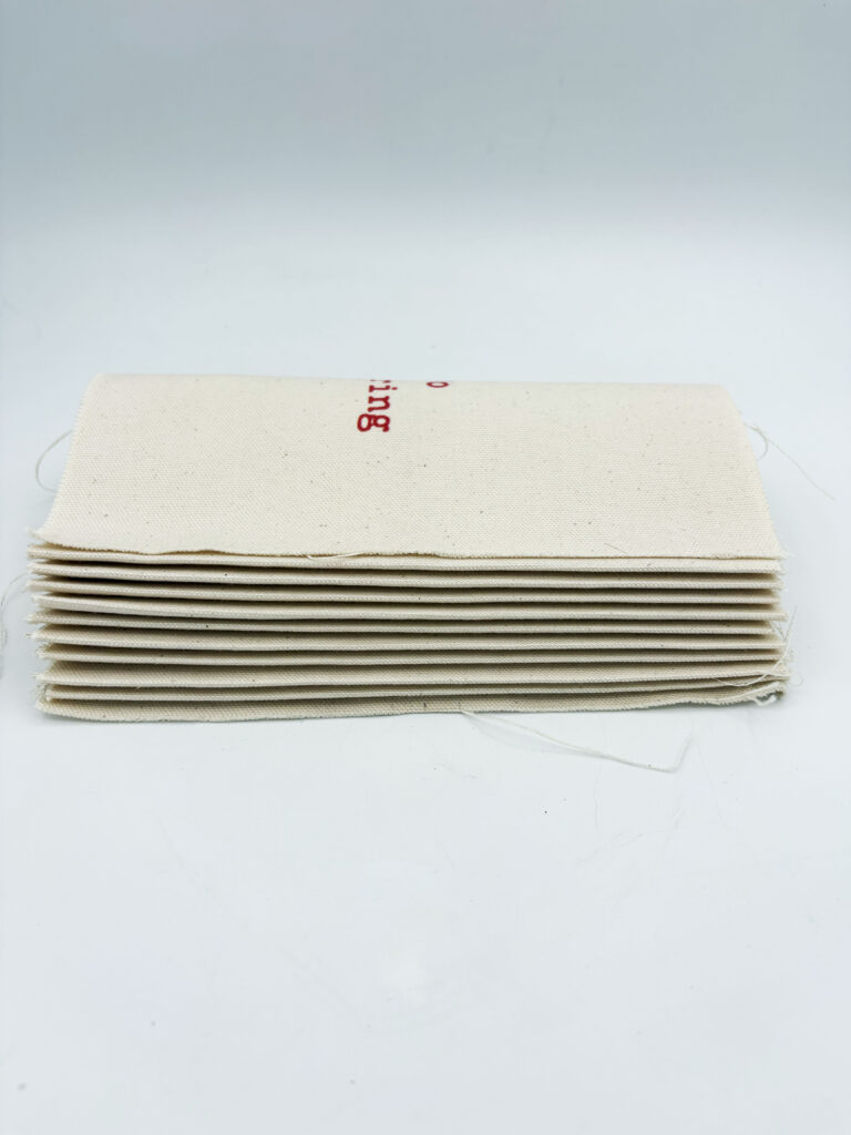
My Gran would make books/cards for others’ special occasions, and never received one herself. As another outcome of this project, I decided to change that. Replicating the same format, this zine serves as a gift to her, investigating the objects I’ve chosen and the specific memory attached to them. This outcome shows the true value of these seemingly ordinary objects, detailing the special memories my Gran and I share and the impact she had on others.
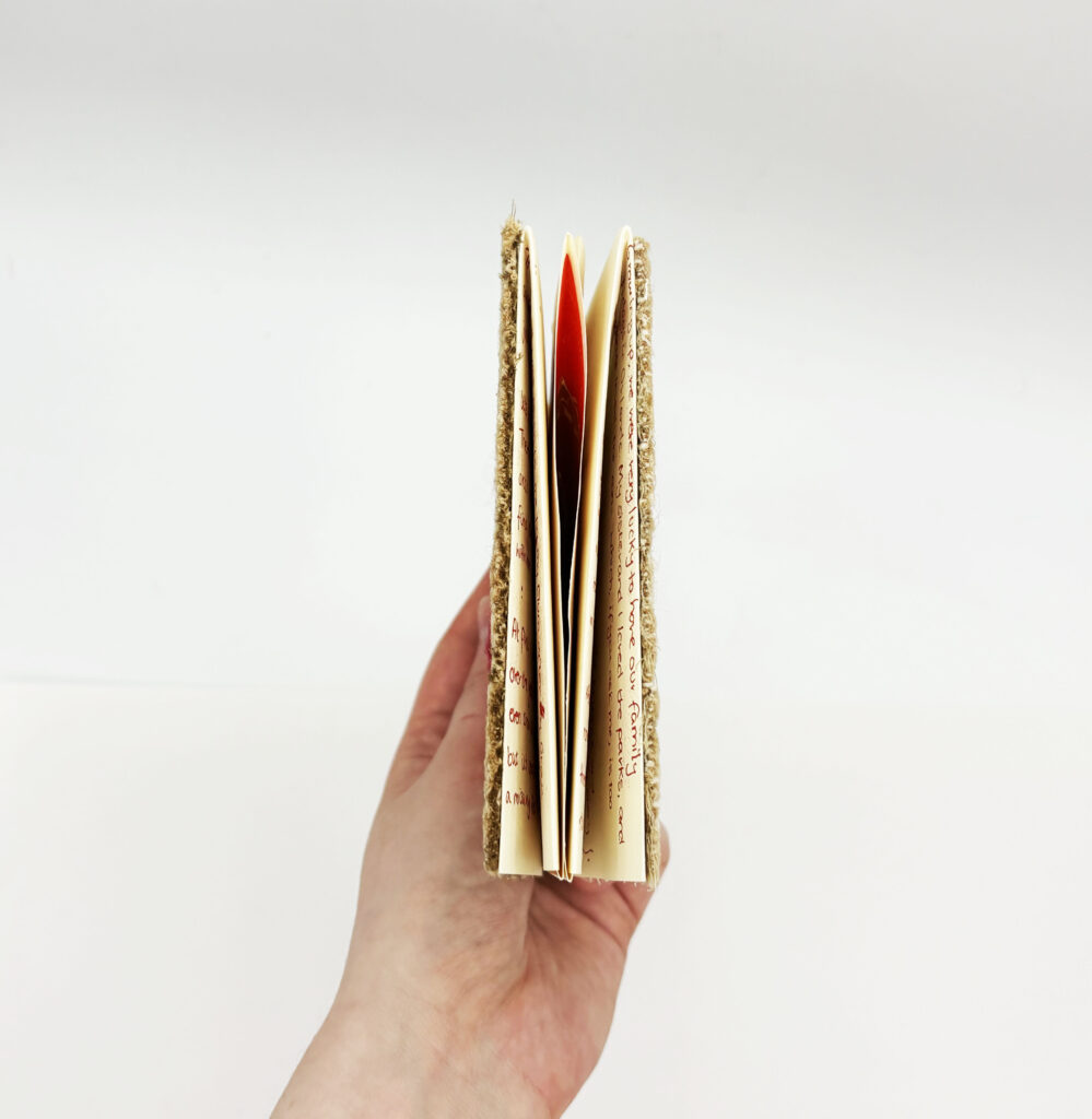
The final zine is fully screenprinted, featuring both text and images, taking advantage of the original book’s unique layout, creating an engaging outcome.
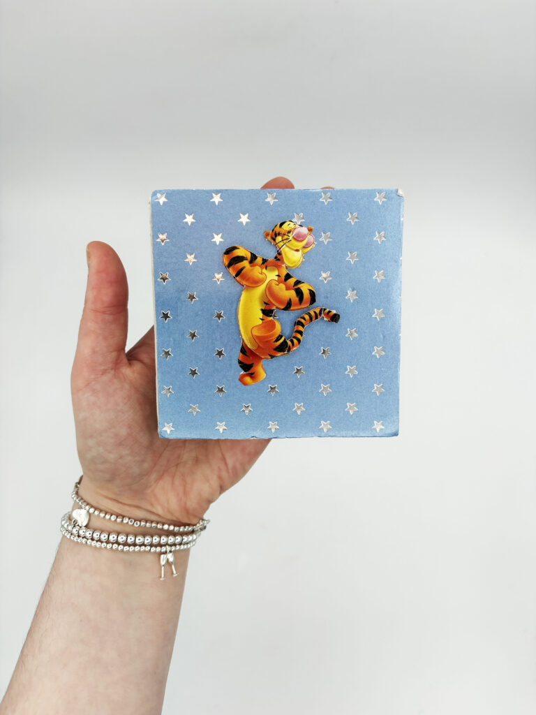
Front cover of one of the books my Gran made, we believe it was made for my sisters and me on our 21st.
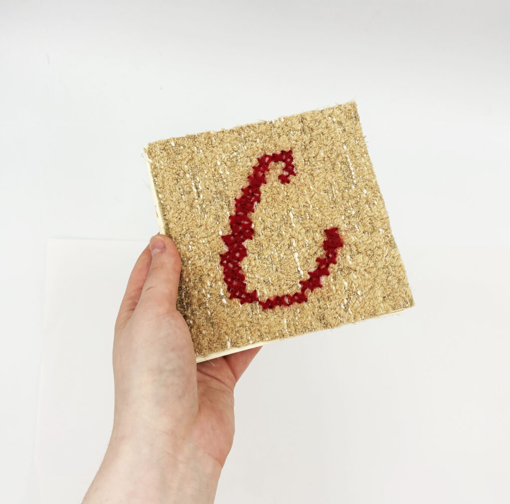
Zine I made for my Gran, titled C,C, her initials.
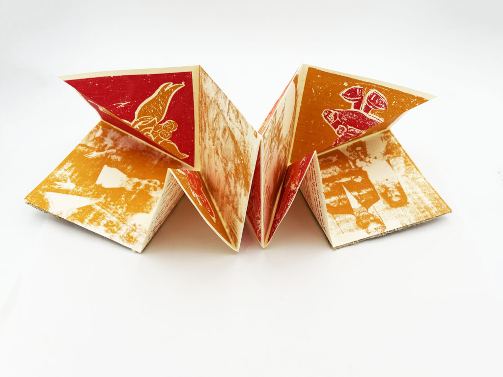
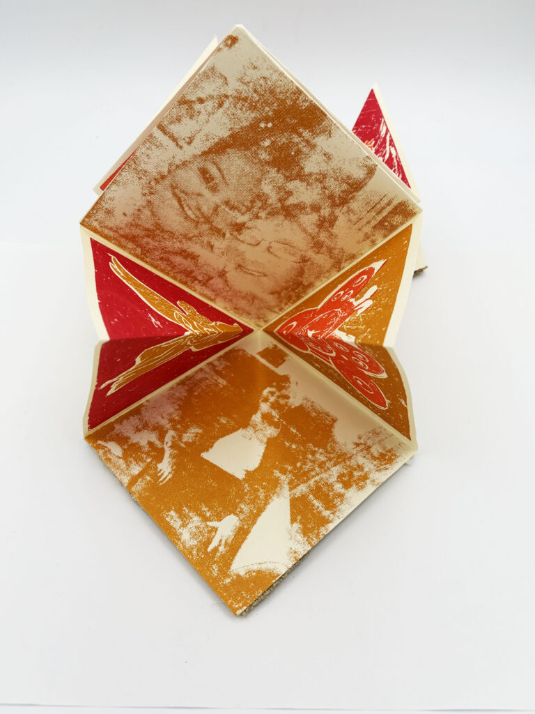
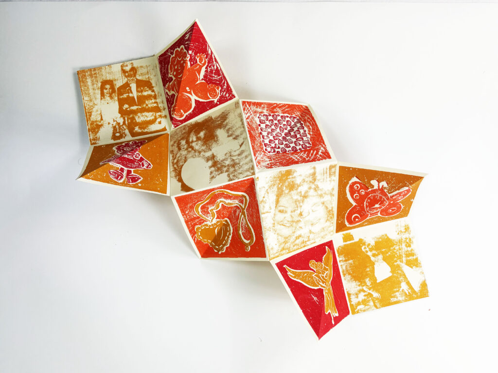
Zine opened, Side 1: Image. Featuring collagraph illustrations of the chosen objects and photo transfers that follow a timeline of key events in my grandma's life.
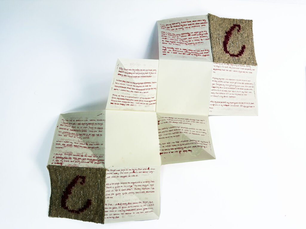
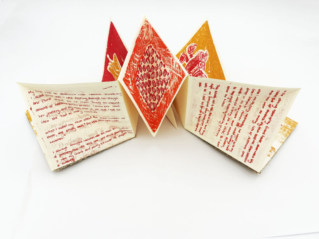
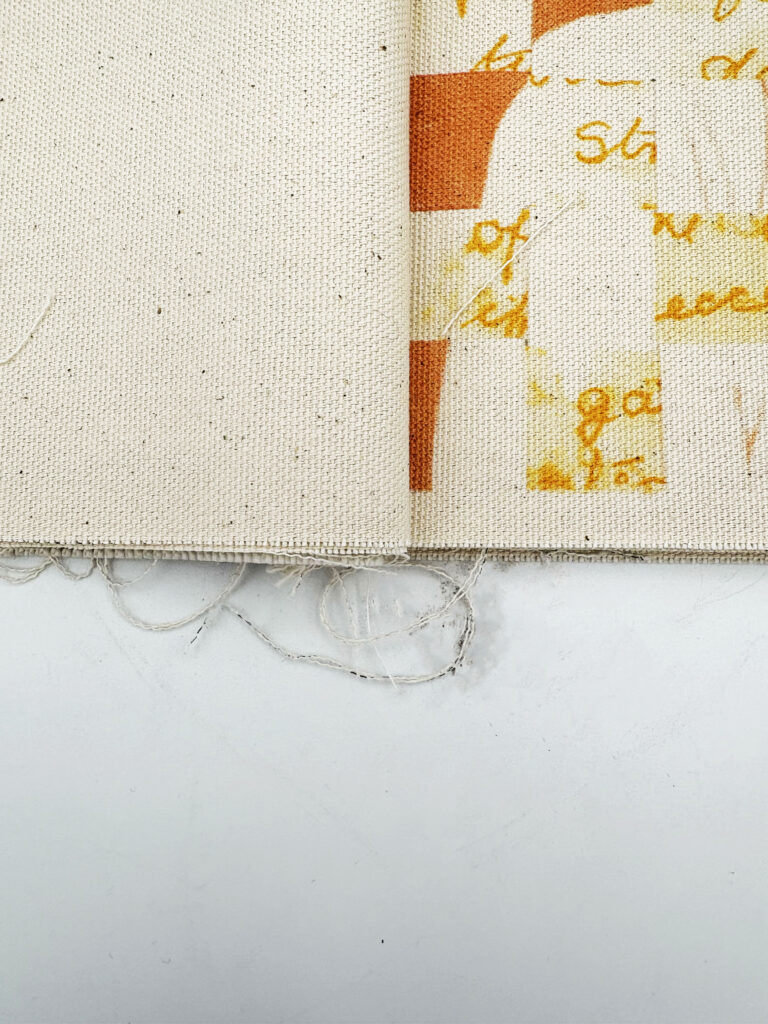
Zine open, Side B- Text. Features handwritten text of the memory linked to the object. The layout corresponds to the collagraph illustration.
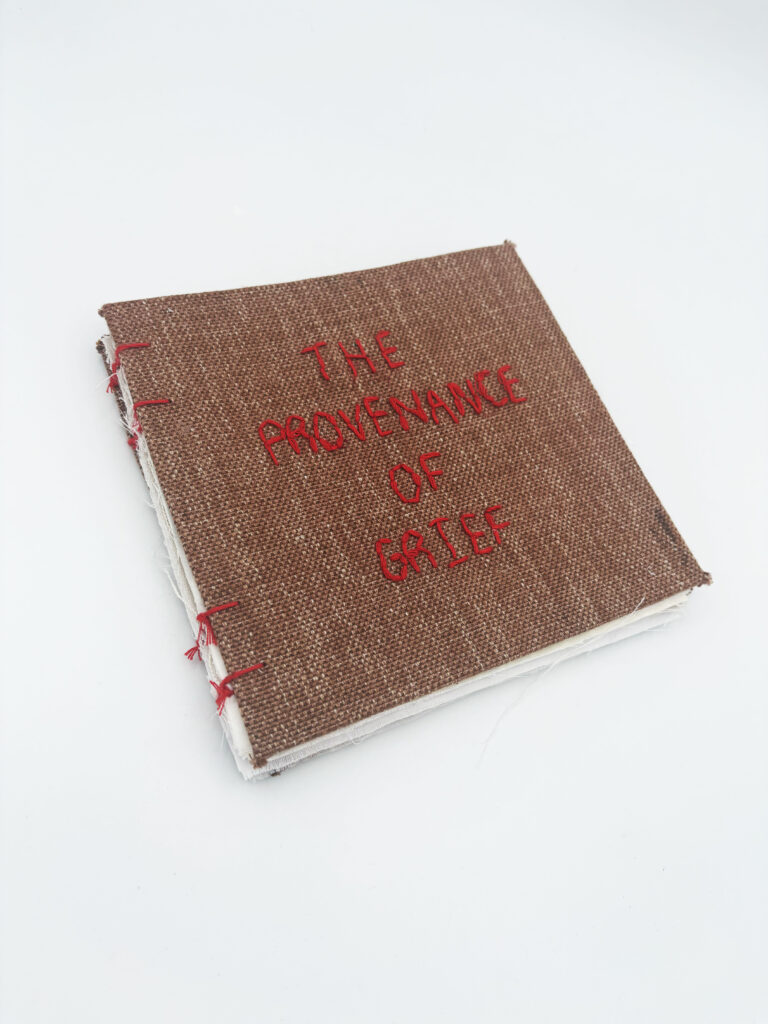
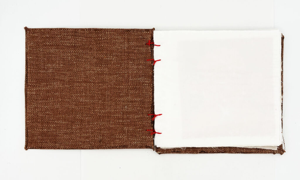
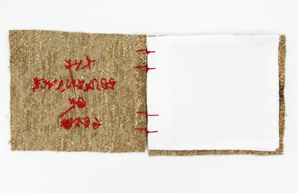
Fabric Book- Form 1
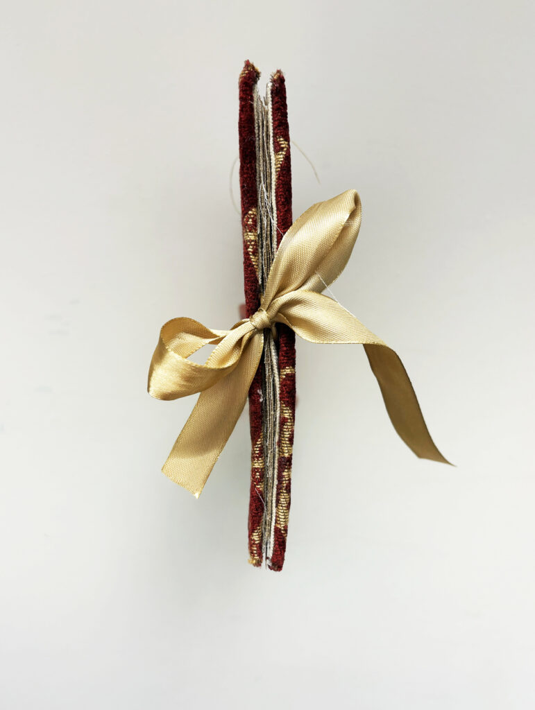
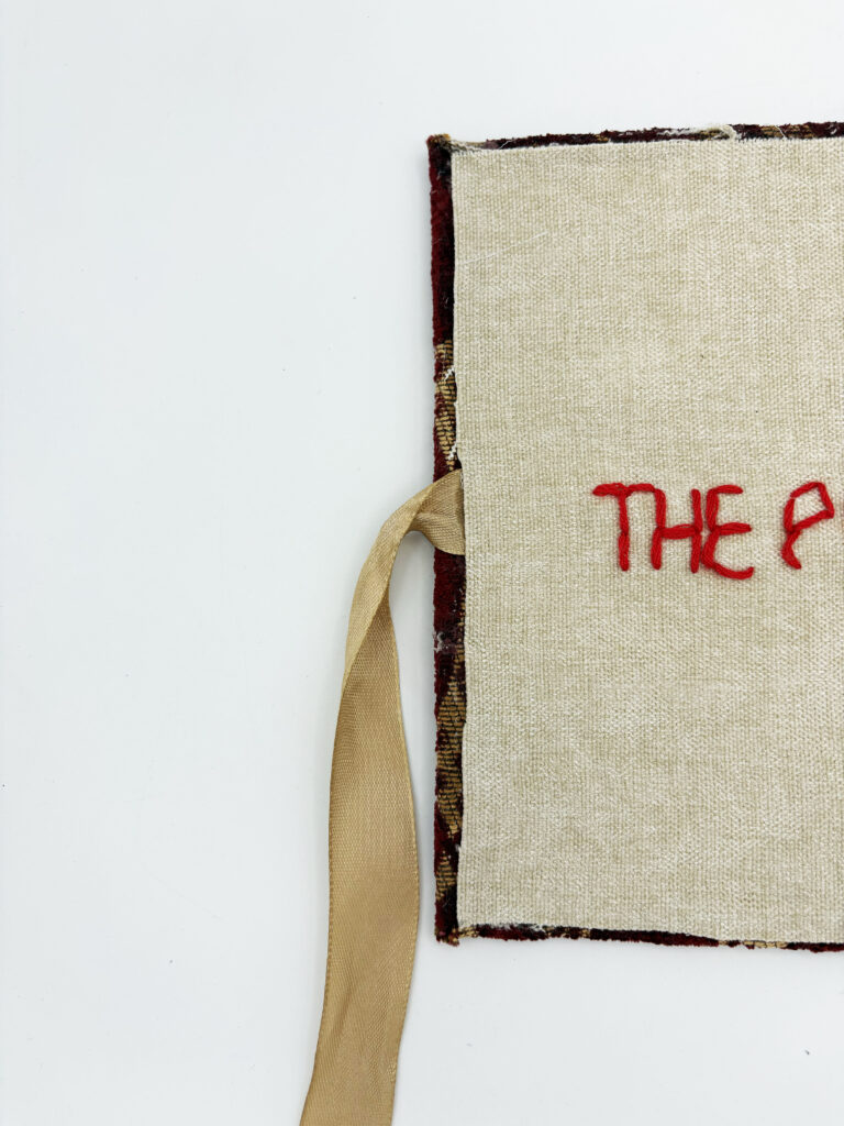
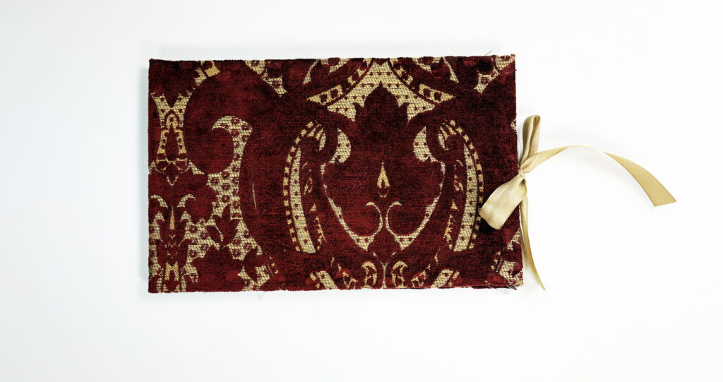
The main outcome of this project is a fabric book. My work is heavily influenced by Louise Bourgeois. I connect deeply with Bourgeois’s experiences and her specific approach to fabric books, finding a close personal resonance in her work. Additionally, because my Gran was a seamstress, working with fabric provides a direct connection to her and allows me to build on the skills we share.
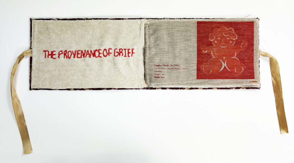
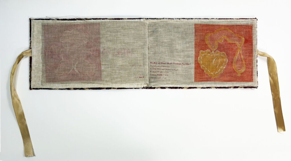
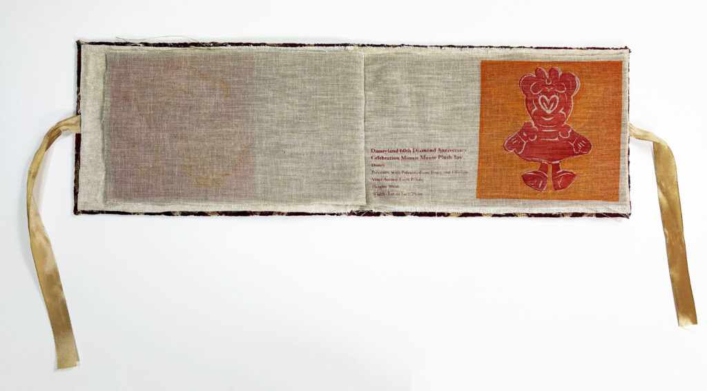
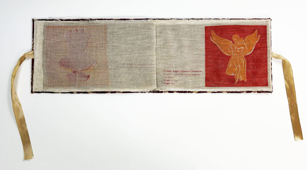
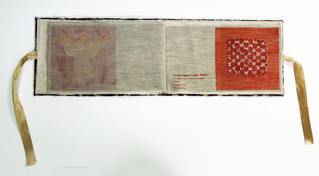
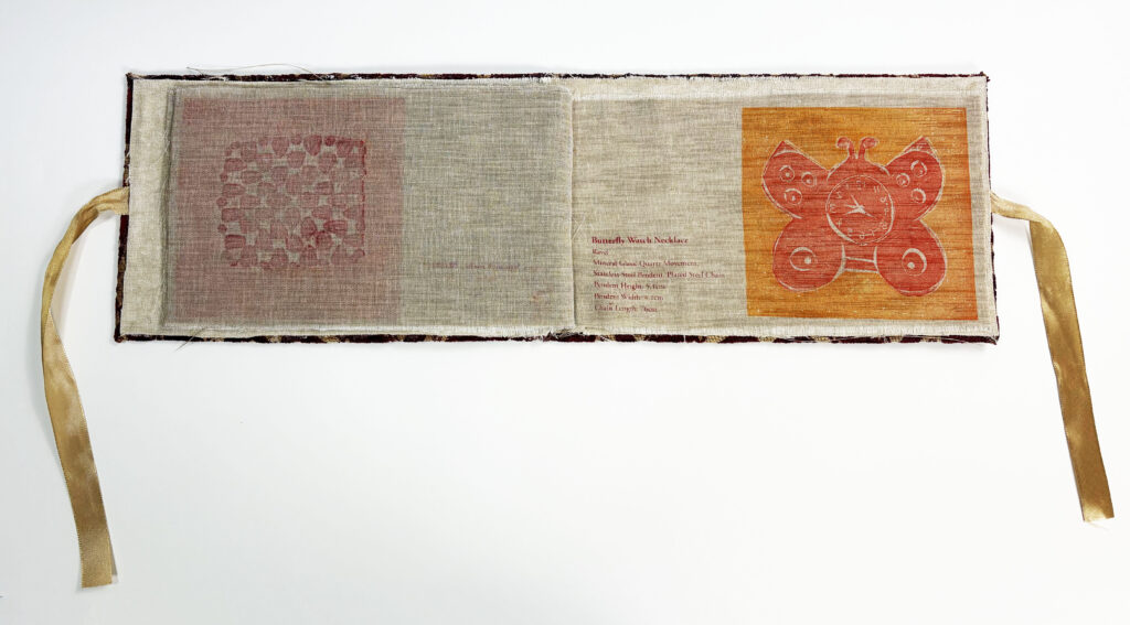
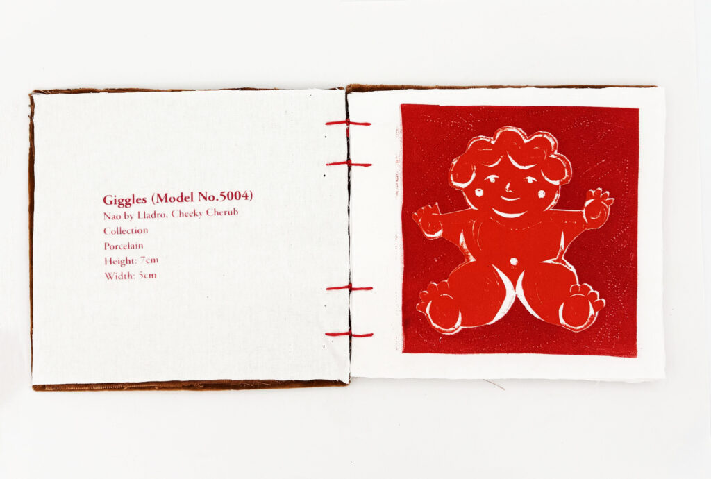
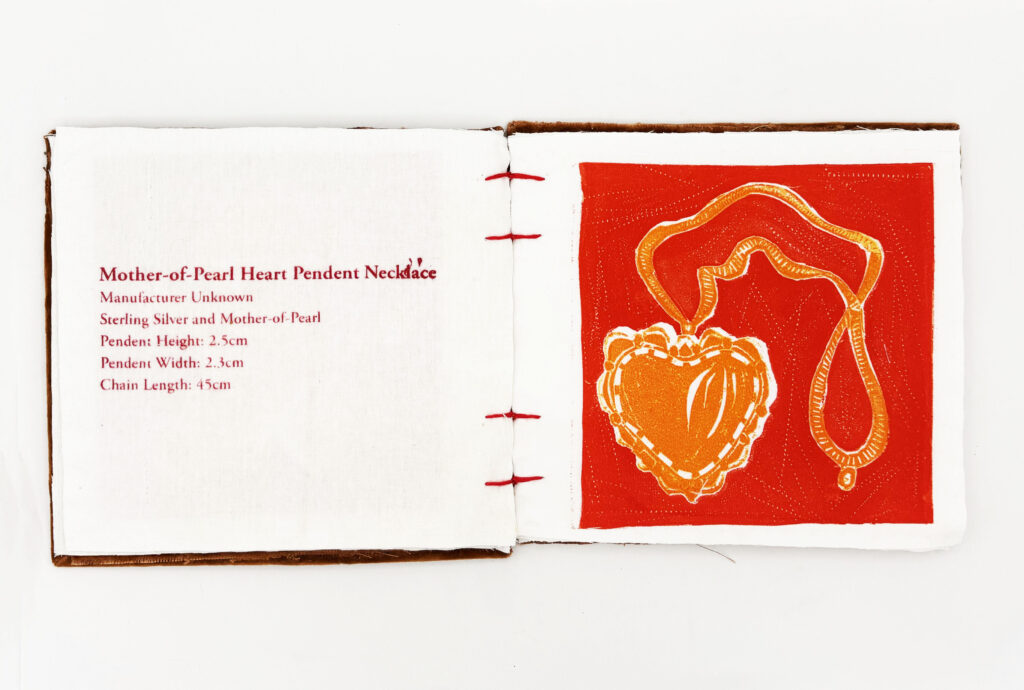
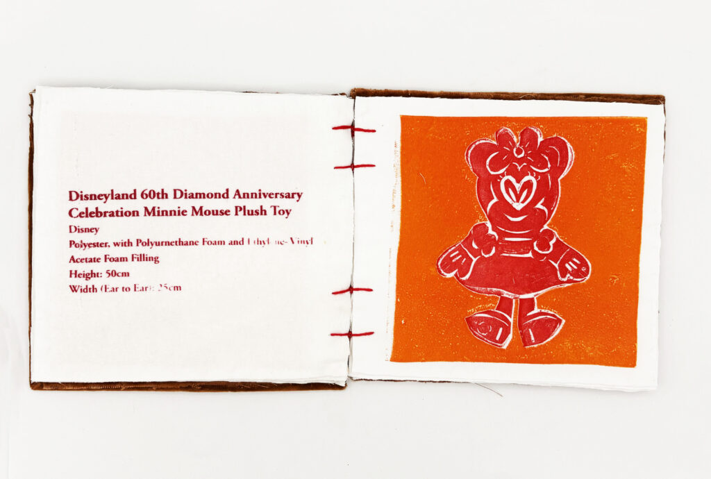
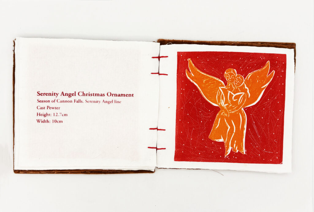
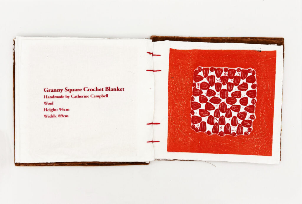
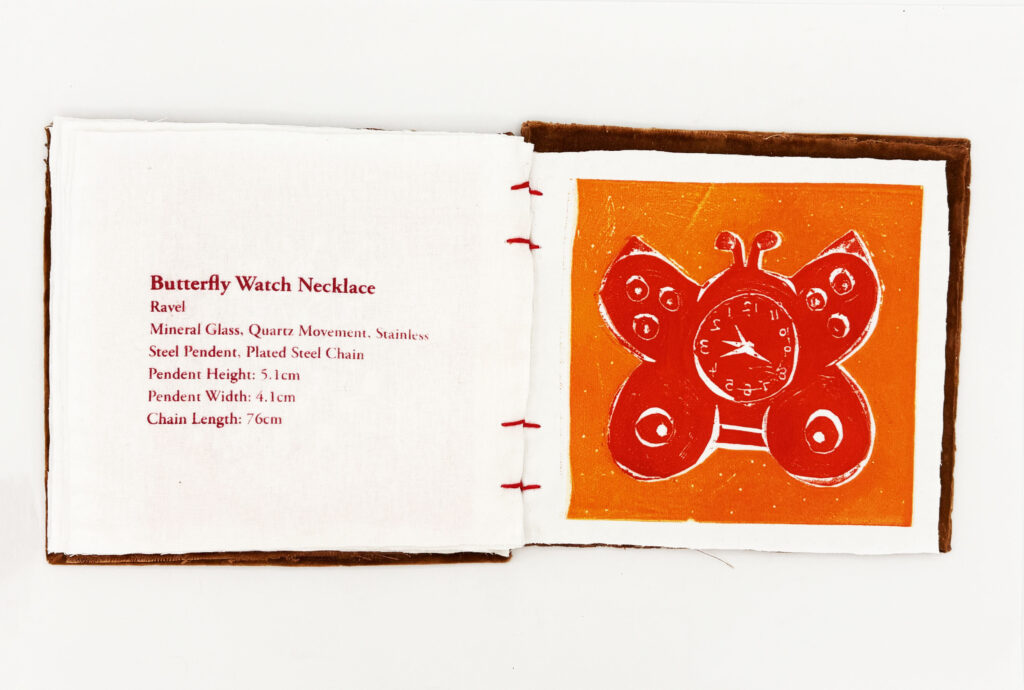
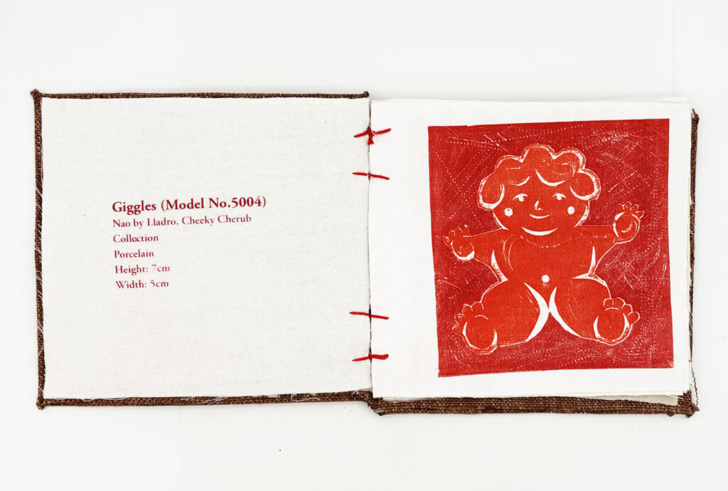
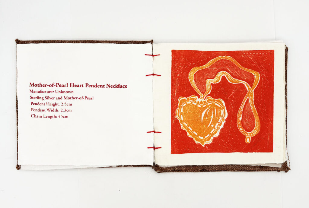
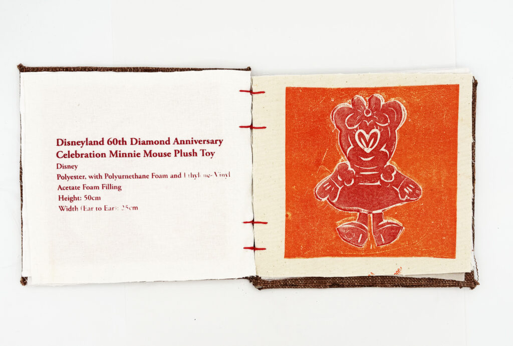
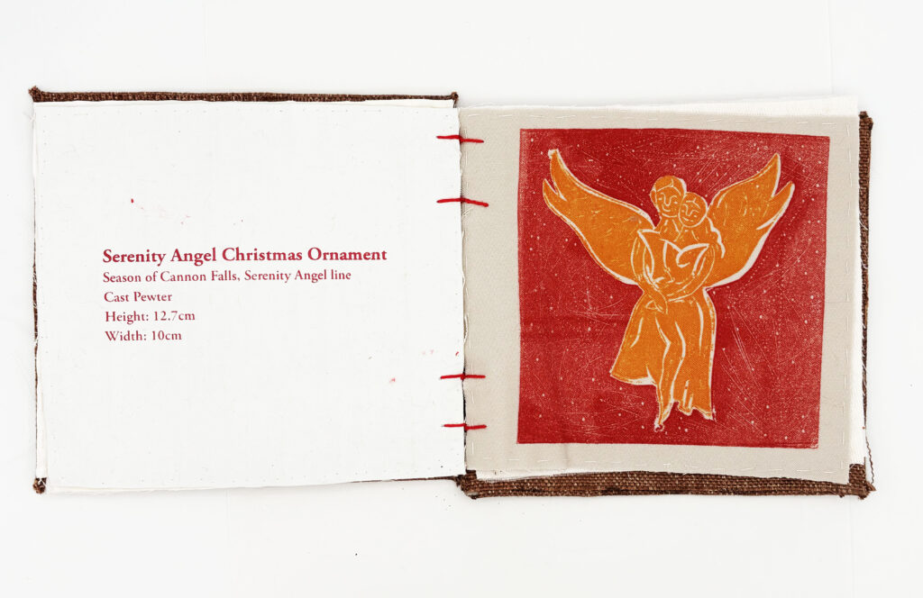
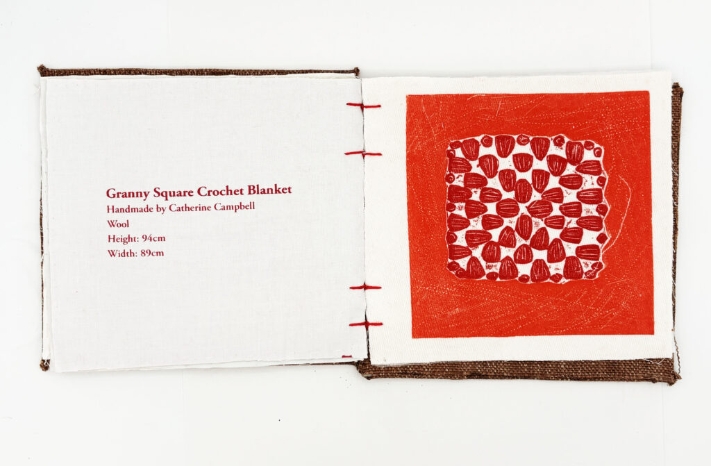
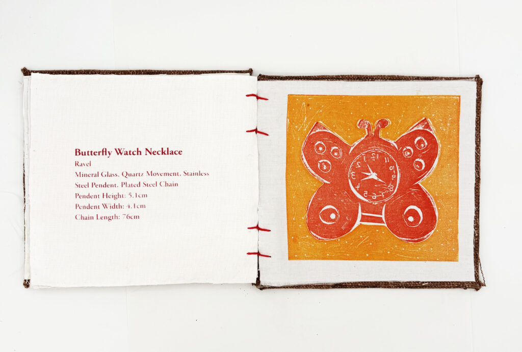
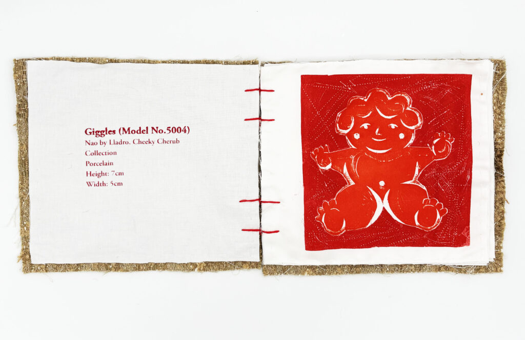
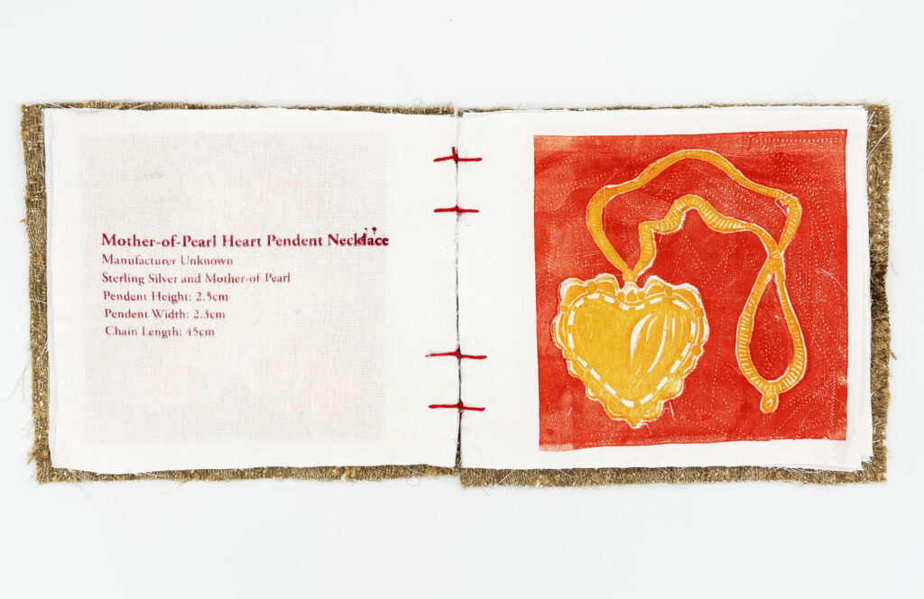
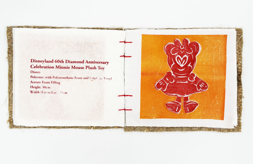
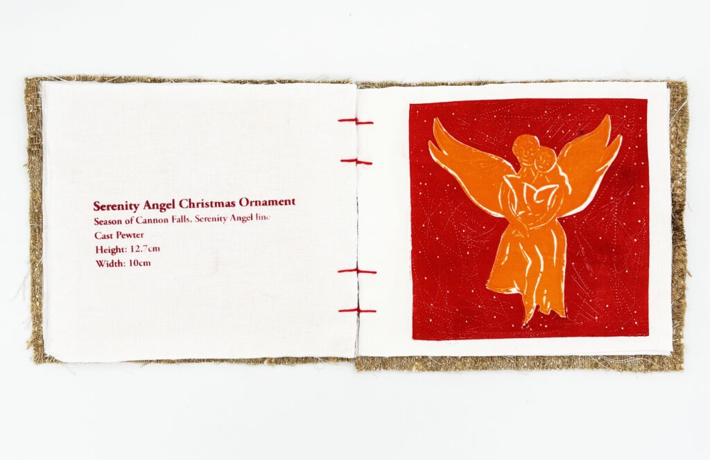
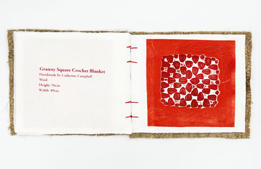
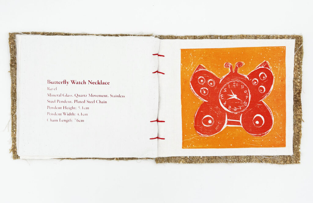
Structurally, the book functions as a museum catalogue, featuring illustrations and captions of the objects I focused on throughout this project. It adopts a clinical, museum-style narrative format to create a contrasting tension between the cold, matter-of-fact text and the bright, bold illustrations.
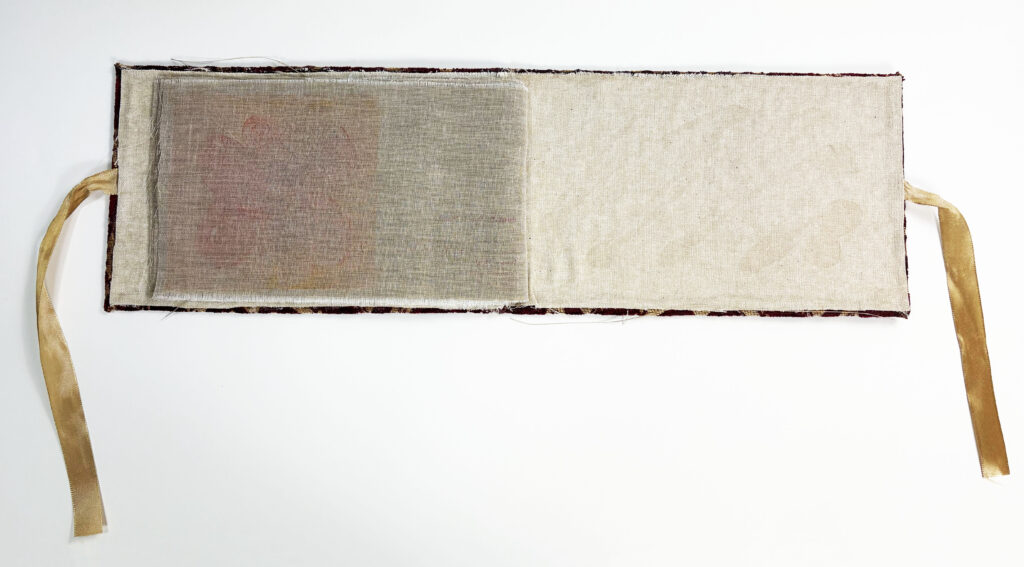
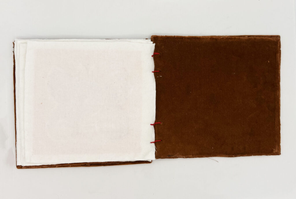
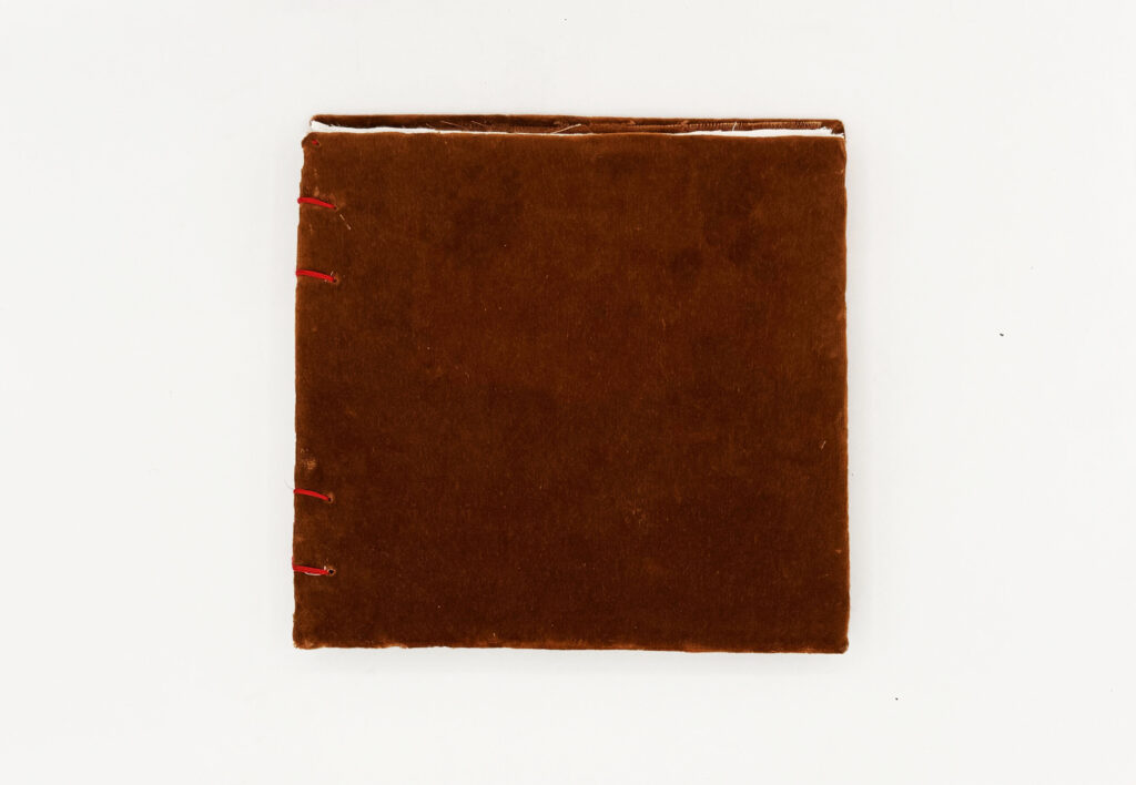
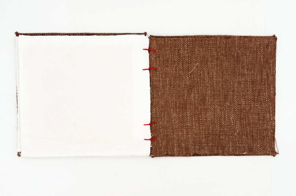
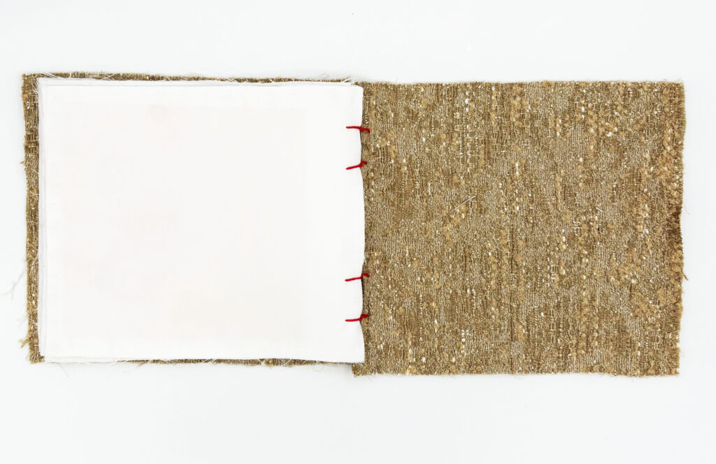
To find the best possible outcome, I experimented with different iterations of the form, playing with layout, the relationship between text and image, and various fabrics. The final iteration is presented in a landscape format, with the text and image sharing the same page, and printed on sheer brown fabric. The pages are one-sided, allowing ghost prints to bleed through, and the edges are left rough and unhemmed to further visualise the unravelling of memory.

Fabric Book- Form 2
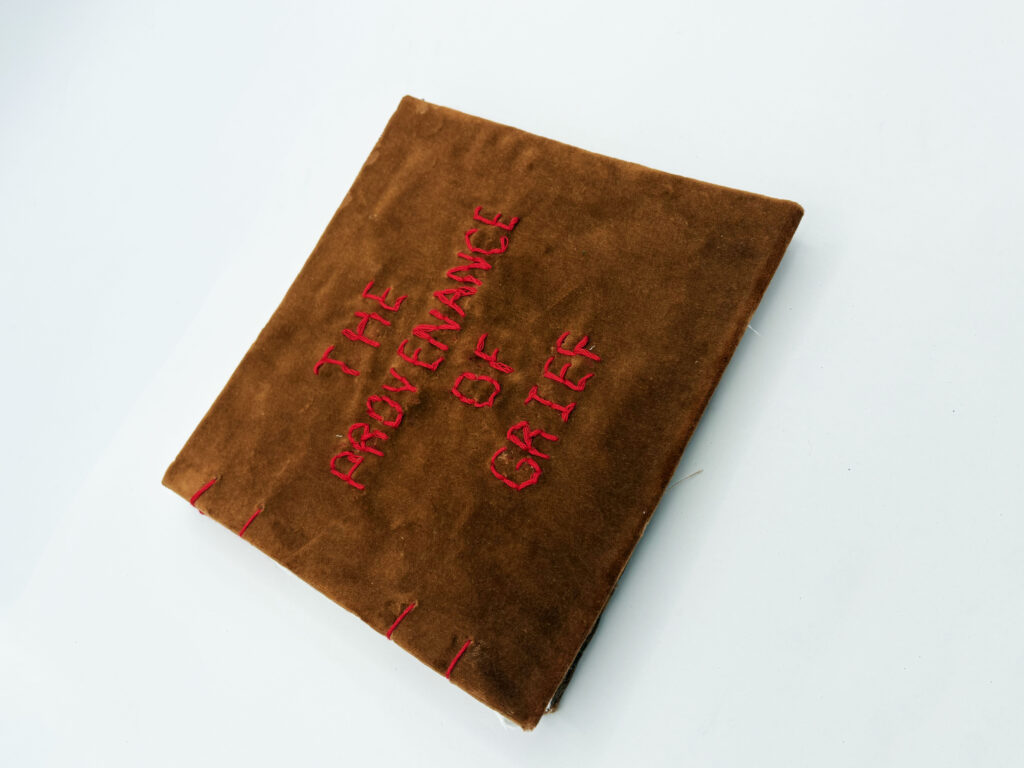
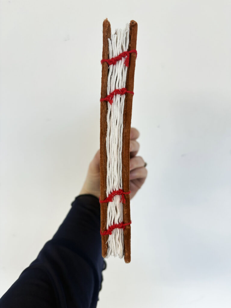
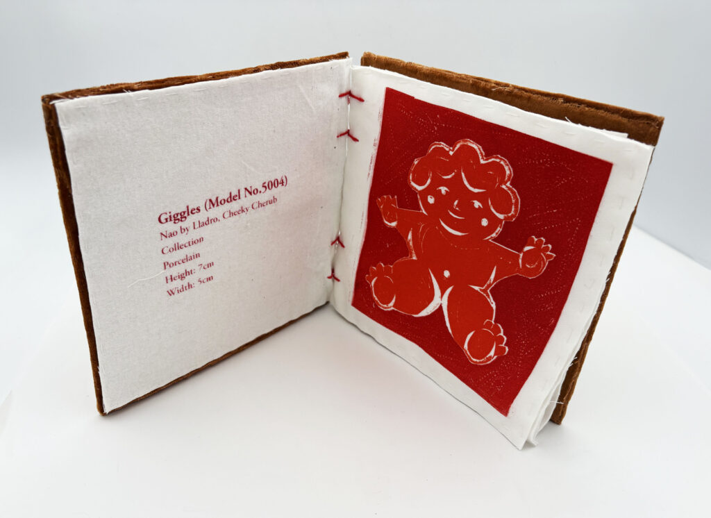
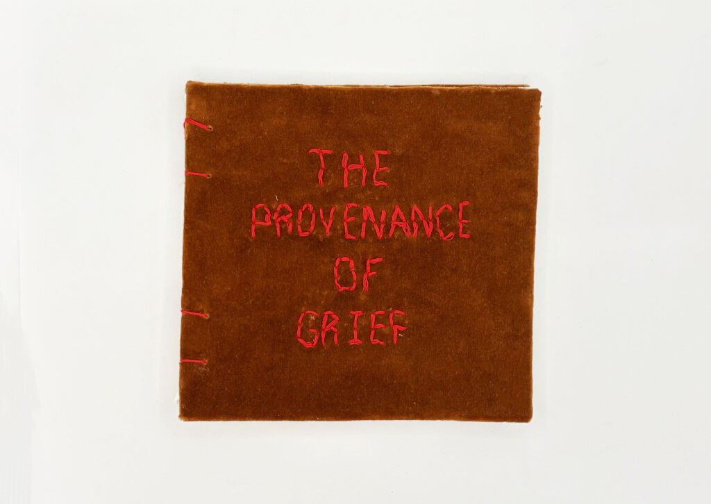
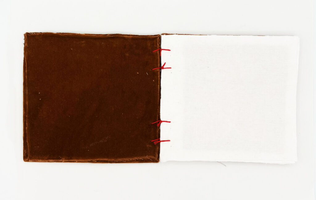
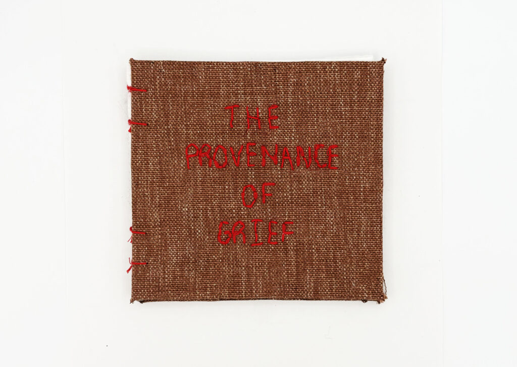
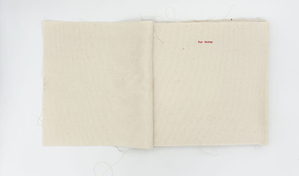
These iterations of the fabric book adopt a square format, featuring text and imagery on separate pages. The square format is directly influenced by the granny squares featured on the blankets my Gran made, deepening the personal connection to her craft.
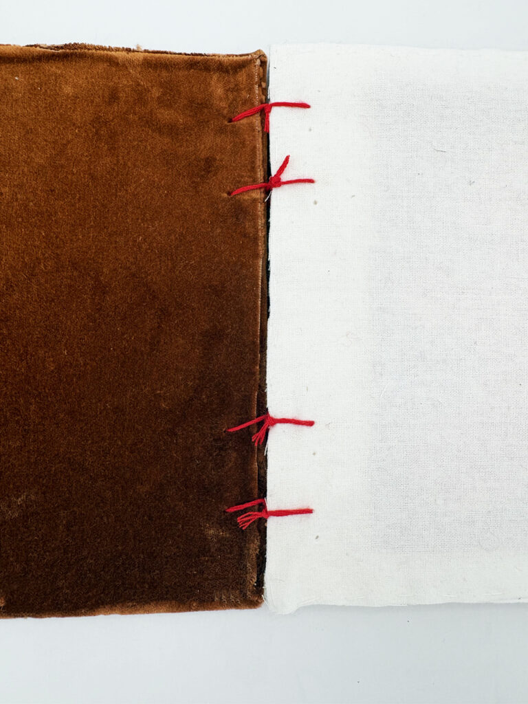
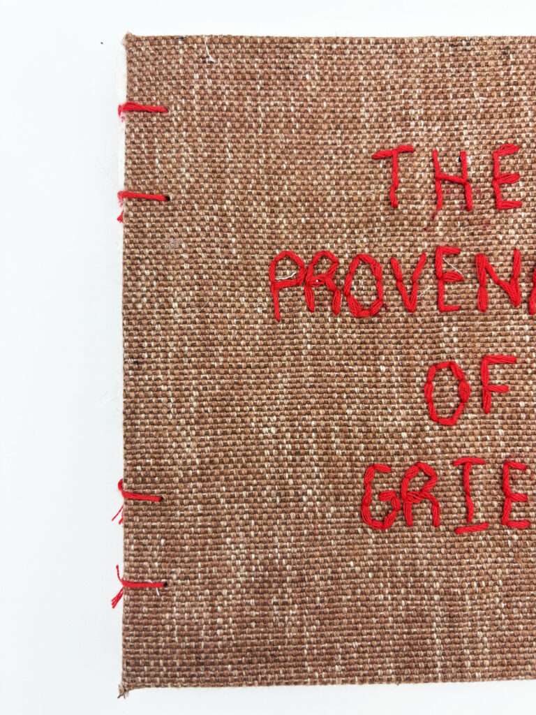
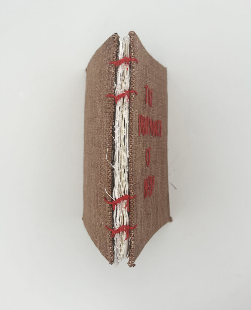
While these forms feature the same text and illustrations as the previous version, they explore a completely different layout. The final fabric book features collagraph illustrations and screenprinted text with hand-sewn pages, utilising visible stitching and binding that display the shared skills my Gran and I have. The pages are left unhemmed, adding to the piece’s tactility and further visualising the unravelling of memory.
Fabric Book- Form 3+4
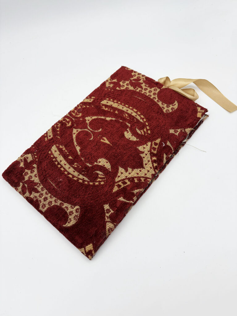
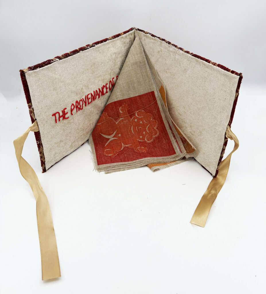
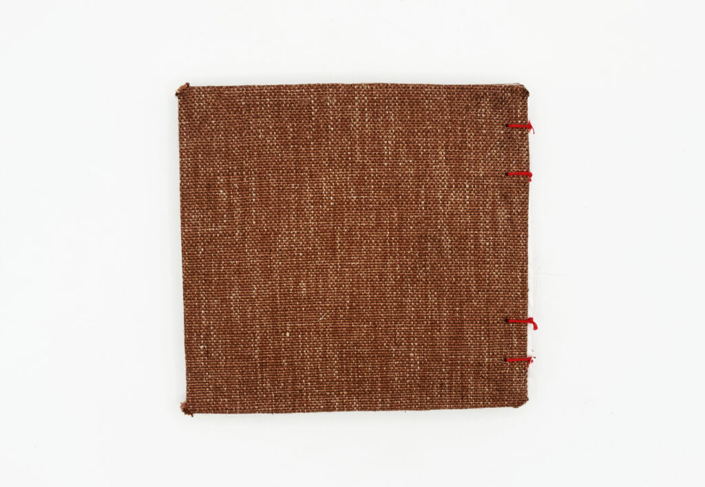
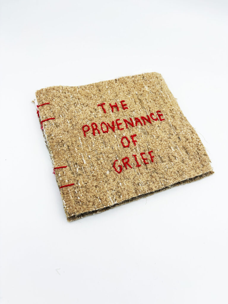
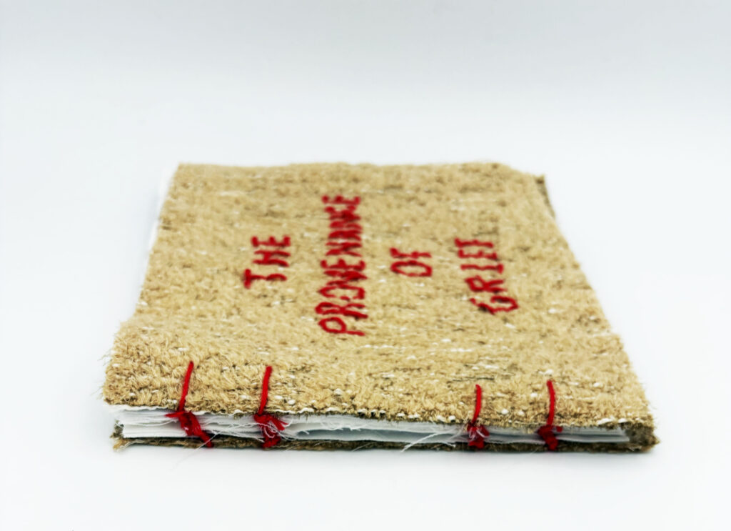
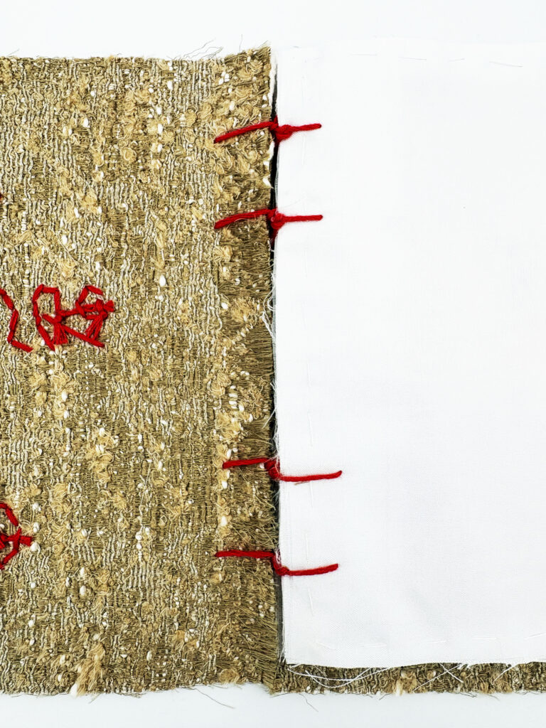
Through these specific forms, I experimented with printing on different fabrics, pushing the book’s tactile and sensory qualities to change how it is experienced.
Form 3 features a hardback cover, providing structure and protection to the fabric pages inside.
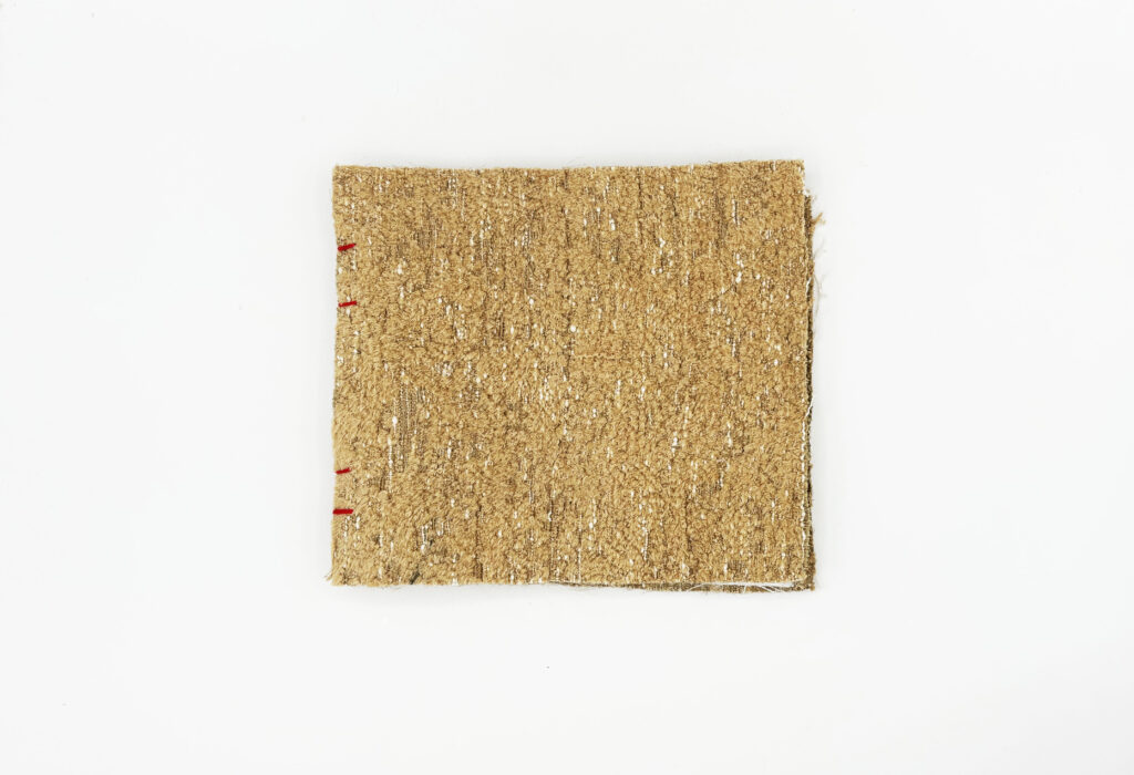
Form 4 has no hardback cover and is fully soft, allowing the stitching to be visible and creating a more intimate relationship between the reader and the book.
Ode to Remembering
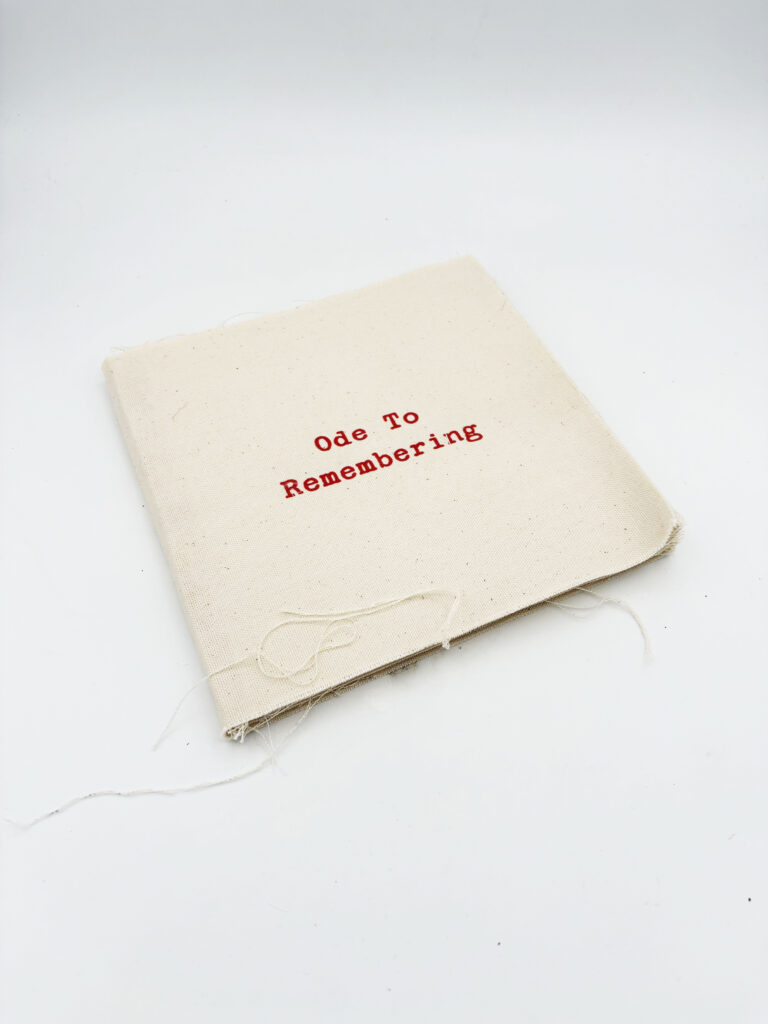
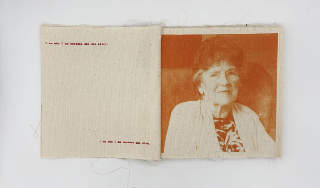
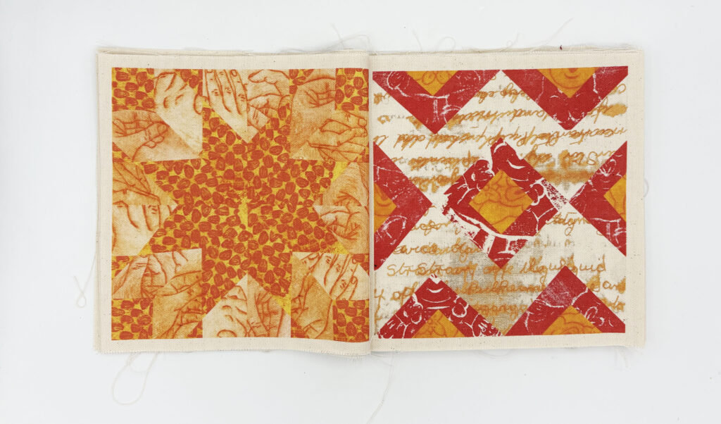
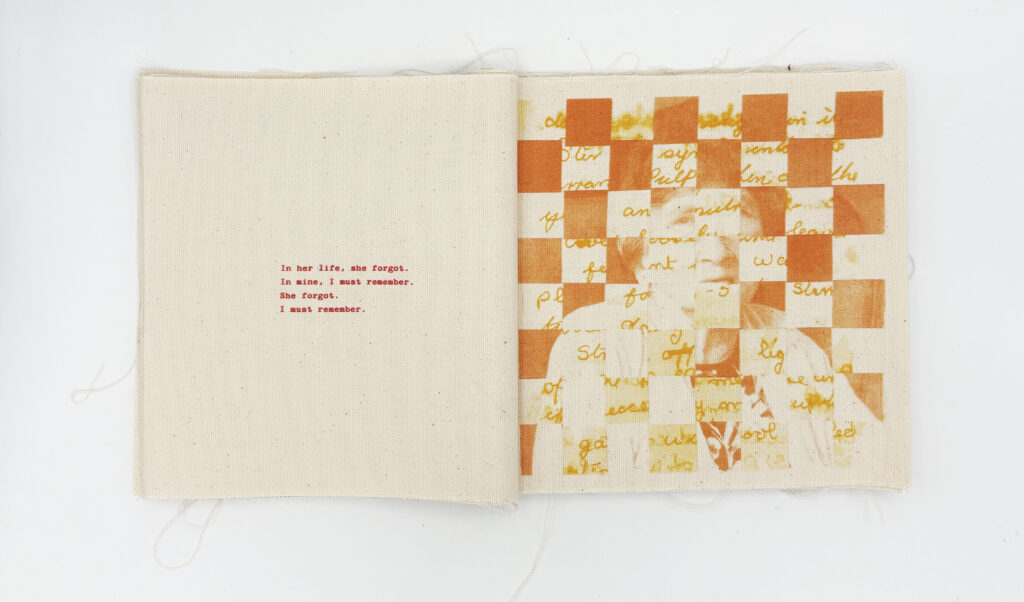
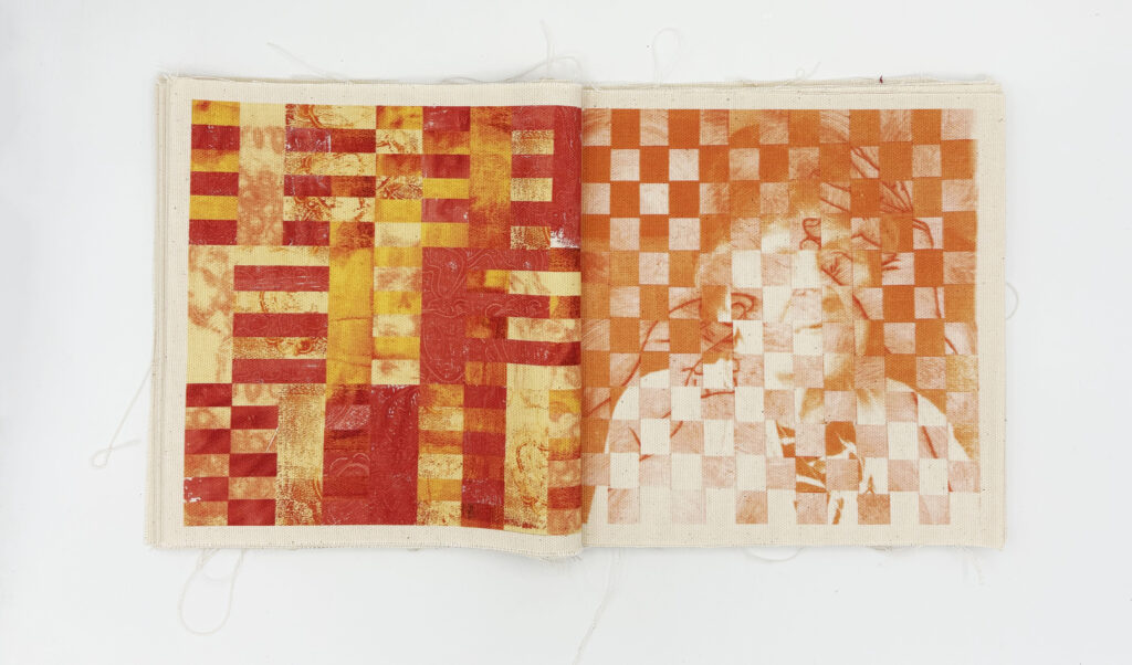
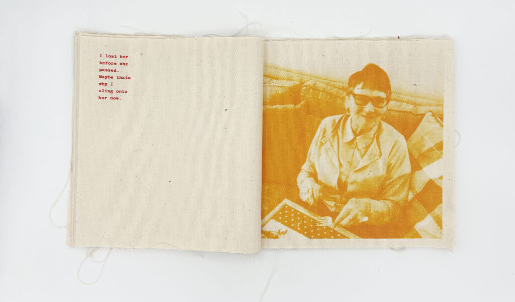
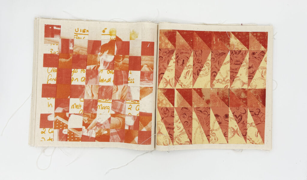
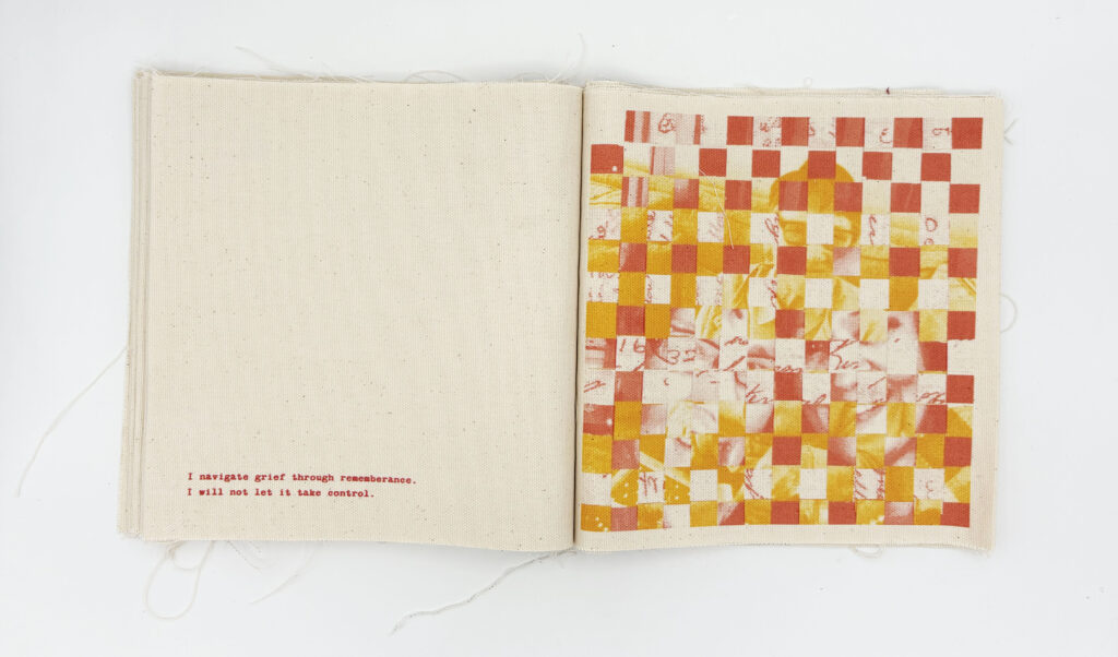
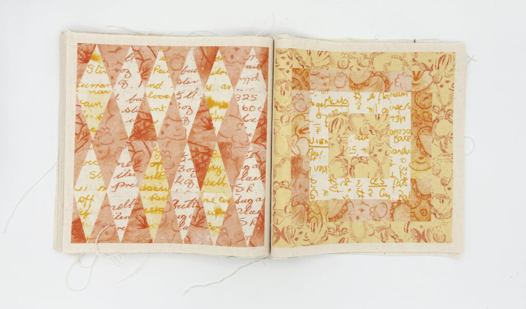
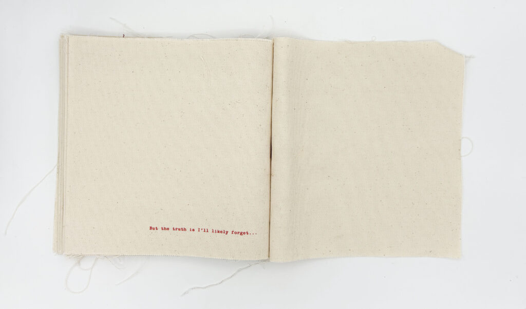
This fabric book visualises my personal process of grief. The book adopts a dual narrative structure: the raw text acts as a space for my own vulnerable confessions related to the mourning of my Gran, while the abstract, fragmented images symbolise my Gran’s dissolving memory due to dementia. Through the tactile intimacy of the book format, the piece maps a painful yet healing reconciliation with loss.
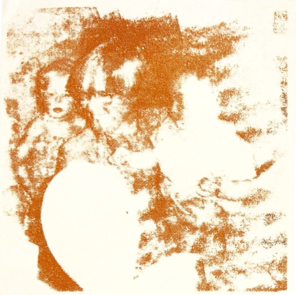
The final fabric book contains collages and weaves featuring illustrations of my Gran’s objects, as well as photos of my Gran, visualising who she was and her battle with dementia.
The colour scheme is bright and warm, conveying the happy memories she created, and it is also the colours that those with dementia recognise most and are often used in therapy.

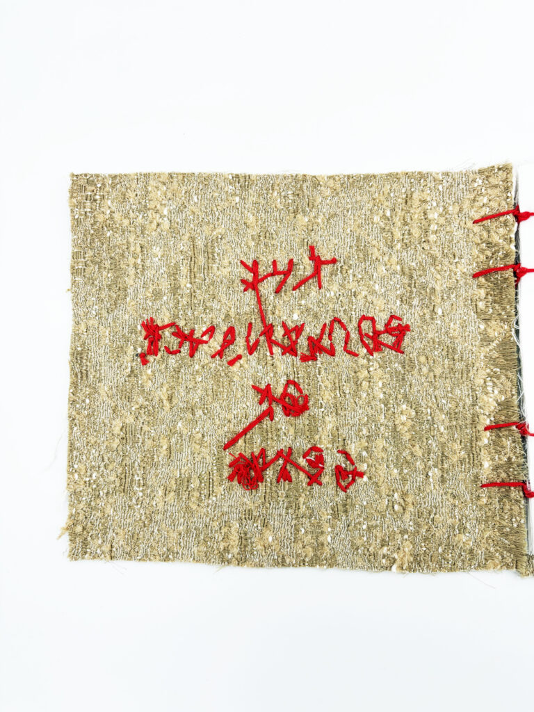
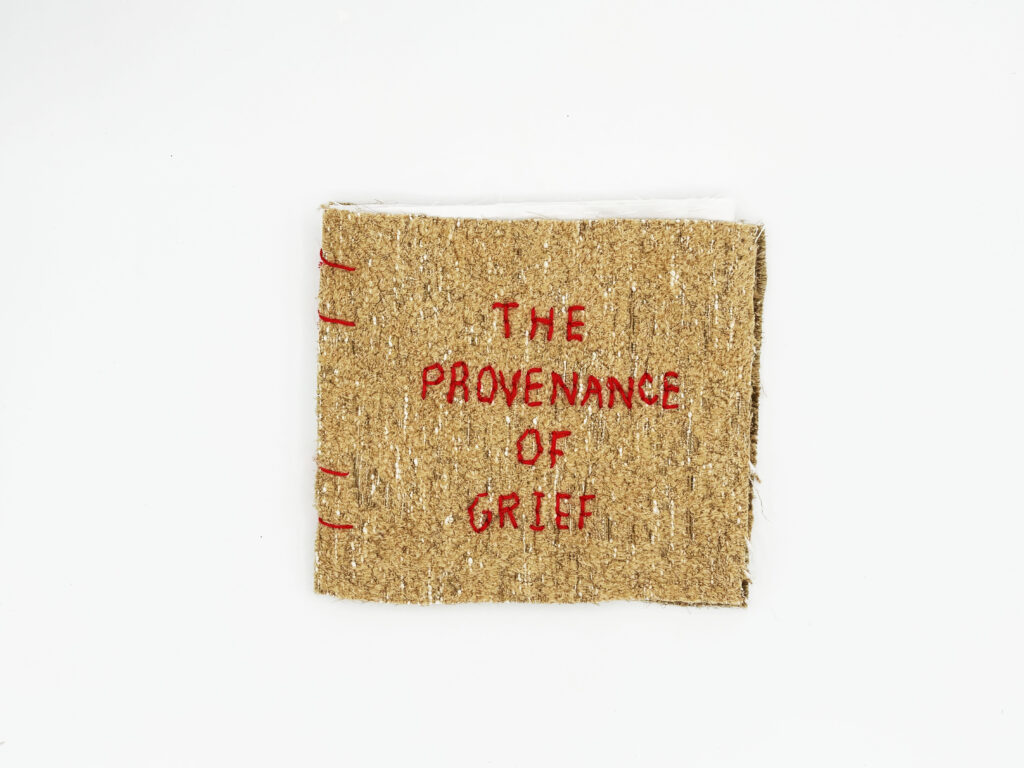
The Provenance of Grief
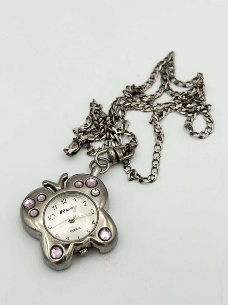
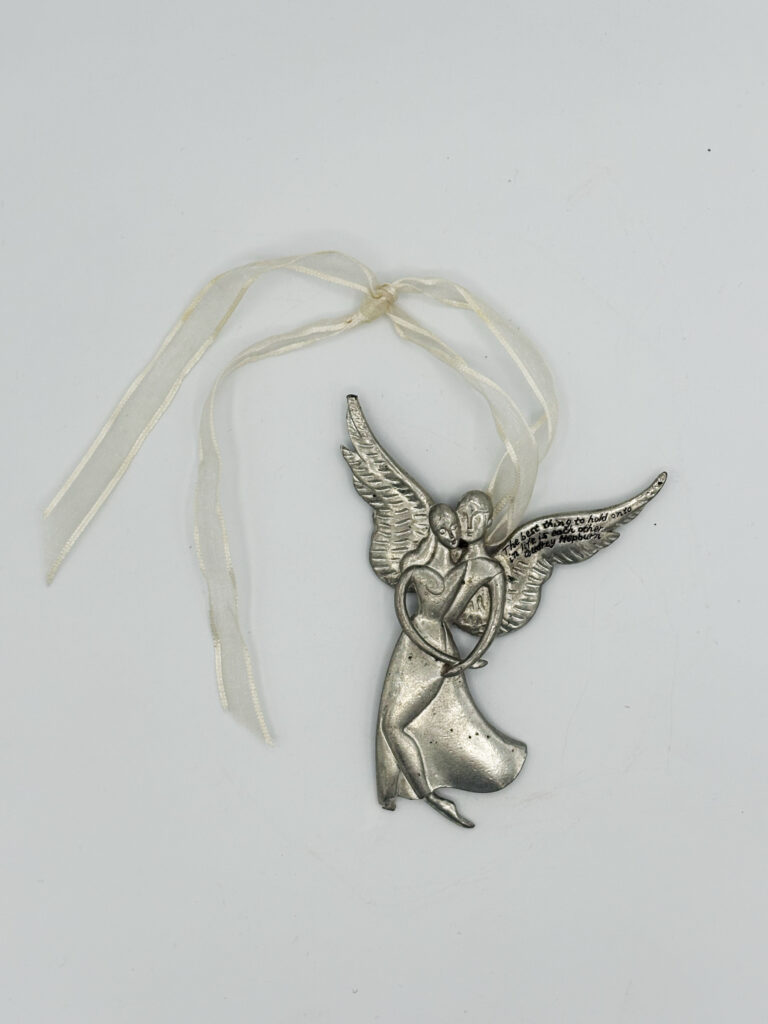
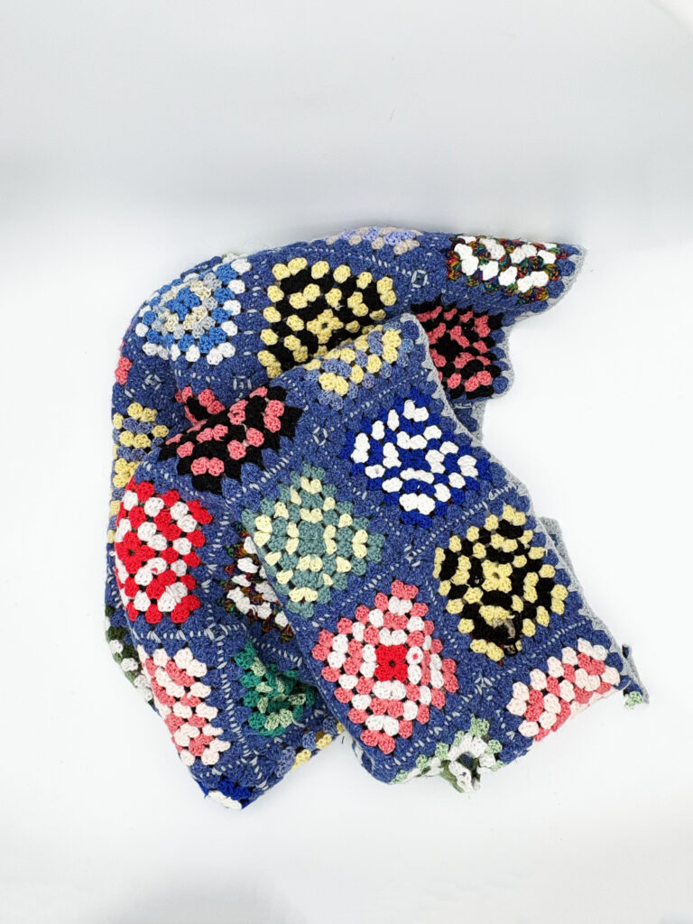
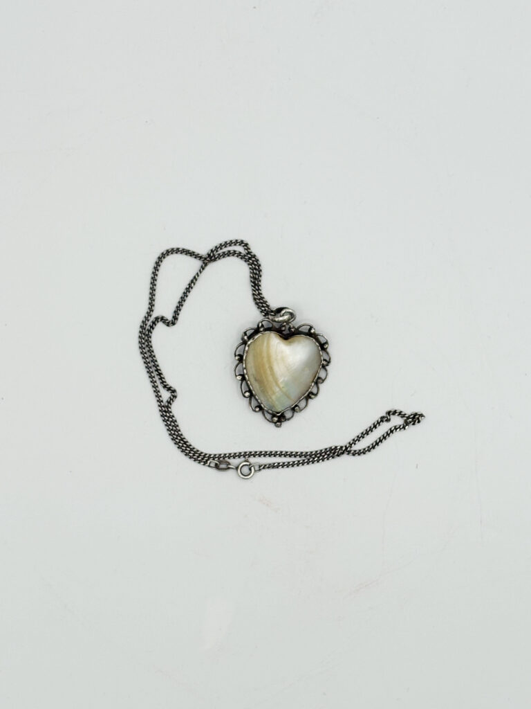
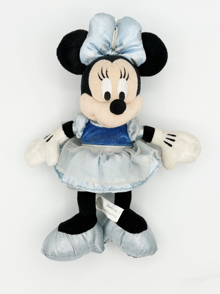
This project explores the significance of objects left behind by loved ones who have passed away. Centred around the objects of my Gran’s that were kept, I was interested in investigating how tangible items serve as anchors for cherished memories and connection after loss. I chose to focus on a small selection of objects owned by my Gran that give an insight into her personality, sense of style, and hobbies, elements of who she was when she was alive.
As my Gran lost her memory due to dementia, I was motivated to create an archive that acts as a permanent remembrance of her and who she was in life—as she forgot, I want to remember.
Throughout this project, I explored multiple methods of making, looking at how materials, forms, and structure represented and visualised memory loss. I developed multiple outcomes for this project, exploring different forms that highlight the main themes and materials I experimented with.
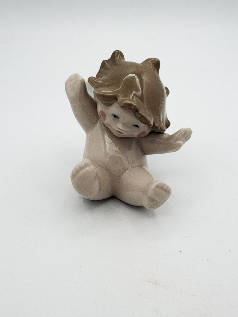
Objects I chose to focus on within this project.
What We Could’ve Made Togther
This project stems as a development from The Provenance of Grief. This series of blanket tapestries serves as a posthumous collaboration between my Gran and me, bridging our creative practices of blanket-making and illustration.
In my final year, I have been interested in exploring printmaking and integrating it into my practice. In the first part of this project, I explored different printmaking methods, illustrating the objects I focused on in the previous project and experimenting with how each technique affected the outcome. I then used collage to experiment with cutting, fragmentation, and abstraction, disrupting full images.
Ultimately, this series visualises the progression of dementia, with the tapestries becoming a physical manifestation of loss, transforming absence into a shared and tangible dialogue between me and my Gran.
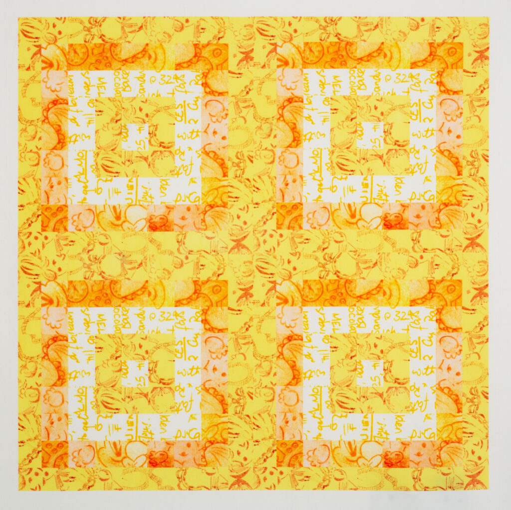
This collage is made from multiple prints from different printmaking techniques, illustrating the objects that were the main focus of my previous project: The Provenance of Grief. The printmaking methods layered within this piece include monoprinting, etching, and screenprinting.
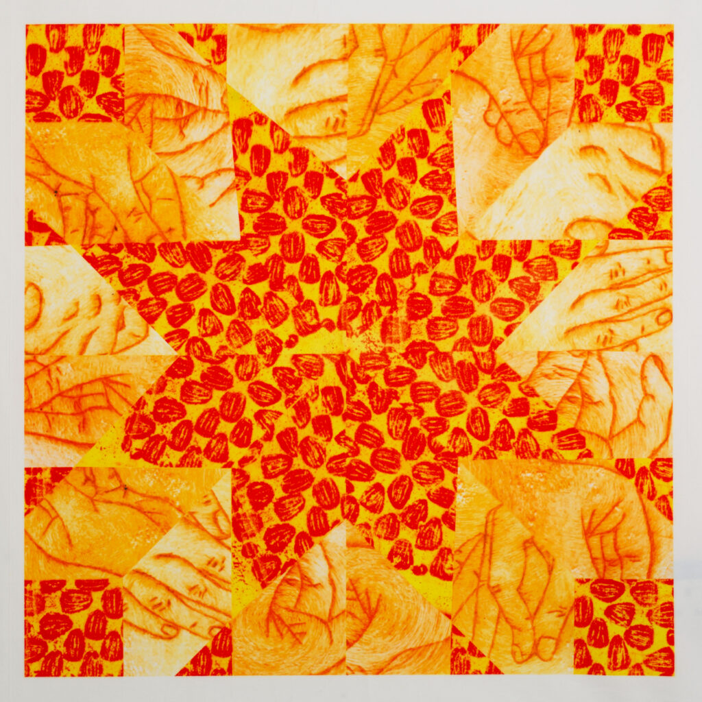
The printmaking methods included within this piece are etching and gelli printing.
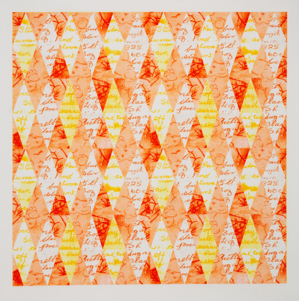
The printmaking methods used in this tapestry include screen printing and etching.
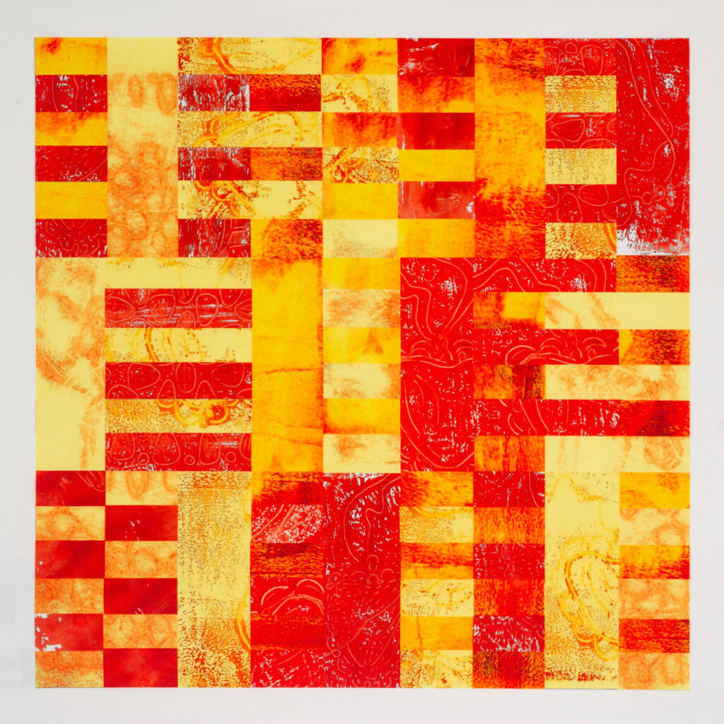
Suspiria
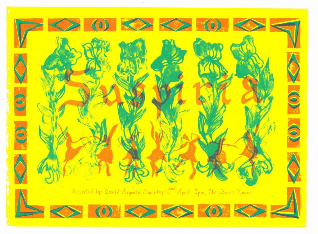
This project is a poster design for the film Suspiria. I was assigned this film and was immediately attracted to its bright colours and fairytale elements. Inspired by the movie’s primary influences, tricolour lighting, the Brothers Grimm, and Art Deco set design, I sought to create a poster that conveyed these distinct elements.
I played with different materials, experimenting with texture and gestural drawing, aiming to capture the film’s mood and atmosphere rather than using literal imagery from it. The different textures featured in the poster create a visual contrast, communicating both the beauty and unease present within Suspiria. Additionally, the colour scheme was developed to replicate the vivid hues of the iconic lighting and tricolour influences within the film, helping to capture its dramatic and surreal atmosphere.