
Sofya Epishkina
I am a graphic designer interested in typography, digital design, and visual systems. I often work with structure, whether it is a grid, a letterform, a colour palette, or a historical reference, and explore how they can be pushed, disrupted, and reinterpreted often in a playful way.
Through projects such as a Constructivism-inspired typeface and an interactive colour mosaic tool, I investigate how design can move between analogue references and digital experiences. Through projects like the Black Dolphin font, I explore different cultural systems and my own heritage by giving a modern look to traditional practices. I am particularly interested in work that invites interaction, whether through movement, colour, type, or the viewer’s participation.
Black Dolphin Typeface
Black Dolphin was inspired by the Russian prison tattoo culture and the aesthetics of the unique lettering found within it. Being Russian myself, I was surrounded by the prison culture in our arts and literature scene. It projected its values and secrets into our day to day environment from prison riddles to popular songs. The typeface is named after a popular song about one of the top security life sentence prisons in Russia, with a jarring pink fountain with a black dolphin in its yard. The text reads ‘A head held high is not for everyone’, which is a direct translation from Russian from the original tattoo on a prisoner’s body that served as a starting point for the development of the font.
The Latin and Cyrillic letterforms create a hand-crafted feel, being almost carved into the space. Inspired by a real tattoo on a prisoner’s body, Black Dolphin combines different type systems in a unified mix. The main features are runic, traditional Slavic lettering, and symbols from the Slavic church ligatures. Together, these create the idea of tradition, ancestry, and moral values, which, given the context, create a juxtaposition effect.
The juxtaposition is further intensified by the involvement of the Russian calligraphic style. This writing is mostly associated with the school system, where little kids just begin learning how to write in cursive before developing their unique handwriting styles later. This detail of something so ingrained in the memory of the tattoo artist, so child-like and innocent, creates an astonishing contrast between the childhood and the tough environment of his adulthood.
The type specs were done in collaboration with Libby Hiatt to showcase the font in the same context it came from, on a human body. I wanted to become the canvas for my font to connect with my cultural heritage. The projection of the letterforms on my body also served as the continuation of the prison theme and the idea of the panopticon, the constant surveillance in prisons and the feeling of constantly being observed.
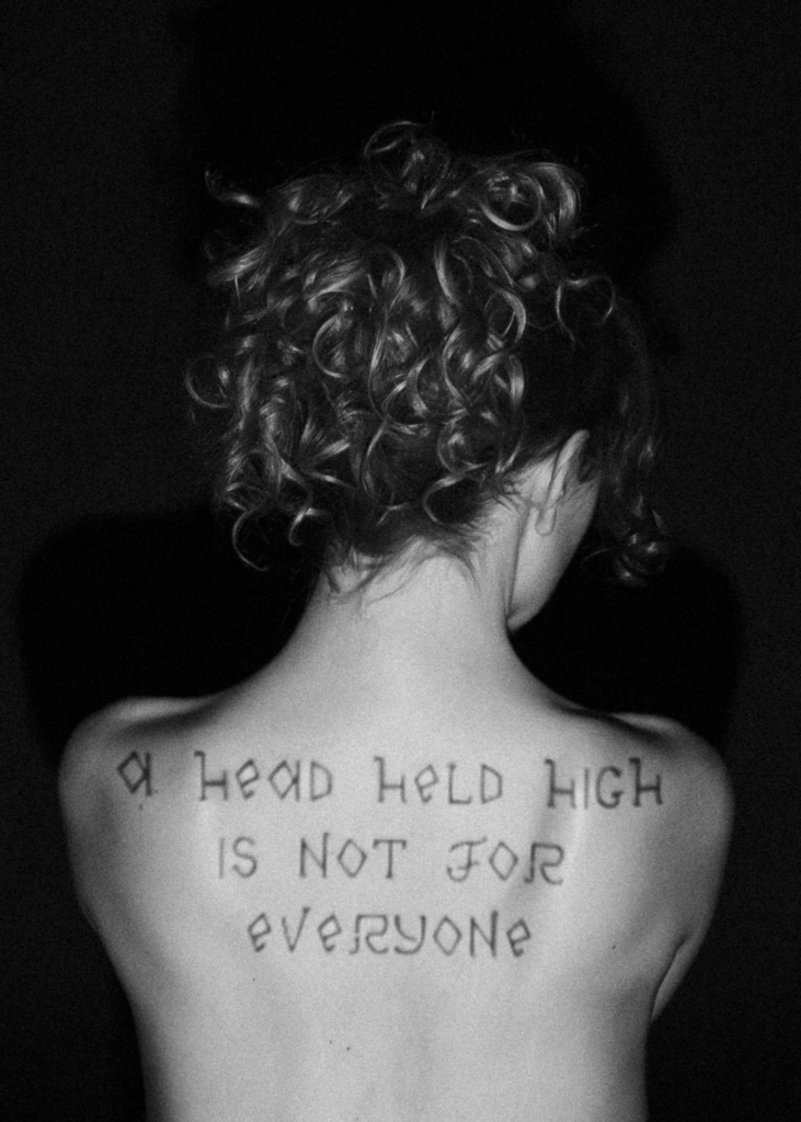
Black Dolphin type specimen exploring the body as a surface for typographic expression and connection to cultural heritage.
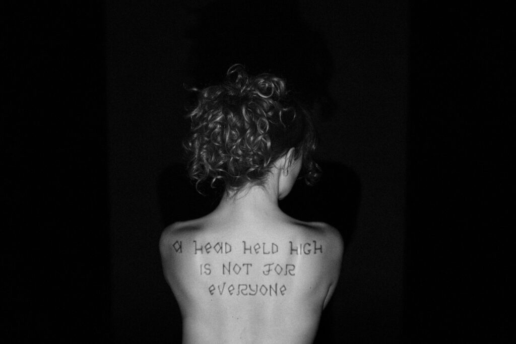
Black Dolphin Latin type specimen exploring the body as a surface for typographic expression.
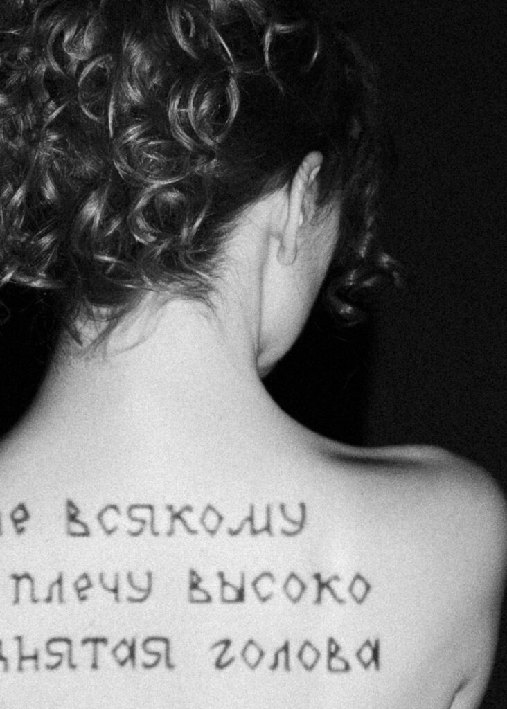
Black Dolphin Cyrillic type specimen exploring the body as a surface for typographic expression. The text translates to 'A head held high is not for everyone'.
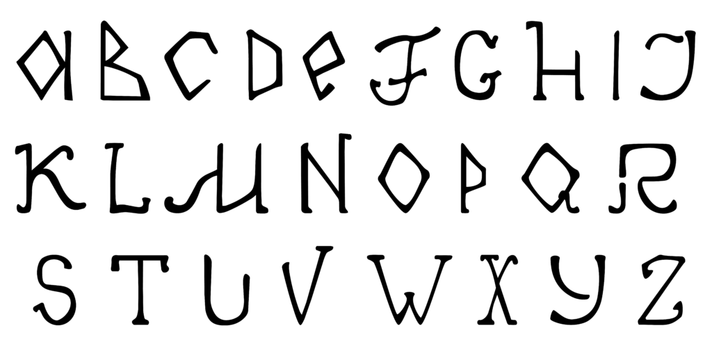
Black Dolphin Latin alphabet specimen showing the full character set and its expressive, hand-drawn letterforms.
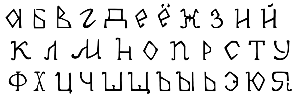
Black Dolphin Cyrillic alphabet specimen showing the full character set and its expressive, hand-drawn letterforms.
Kazimir Typeface
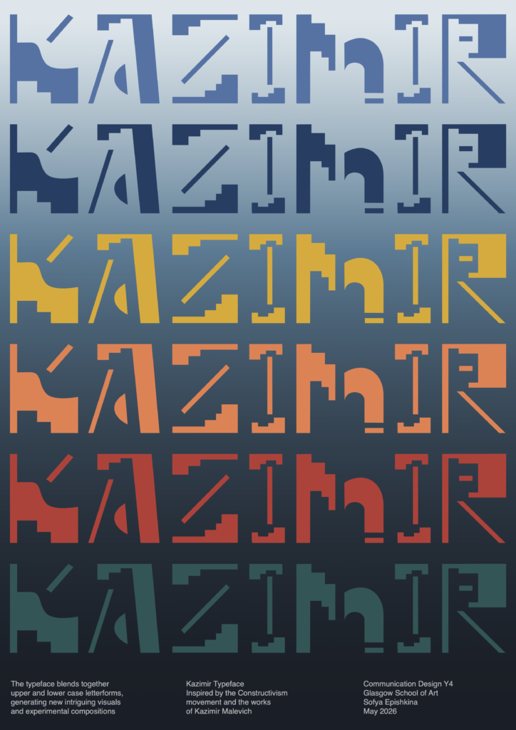
Kazimir is an experimental display typeface developed from the Type Design workshop with Gudmunder Ulfarson. This font explores how letterforms can move beyond functional reading and become a system for generating visual compositions.
Inspired by Suprematism Movement and the works of Kazimir Malevich, Kazimir investigates the relationship between geometry, contrast, and negative space. The typeface merges upper and lowercase structures, creating hybrid letterforms. Each character carries a sense of movement through contrasting stroke weights, detached elements and fragmented forms, allowing the eye to complete what is not fully spelled out.
Rather than behaving as a neutral tool for communication, Kazimir is intentionally bold, expressive and image-led. Its letterforms can be arranged as patterns, structures and spatial compositions, turning typography into a visual language of its own.
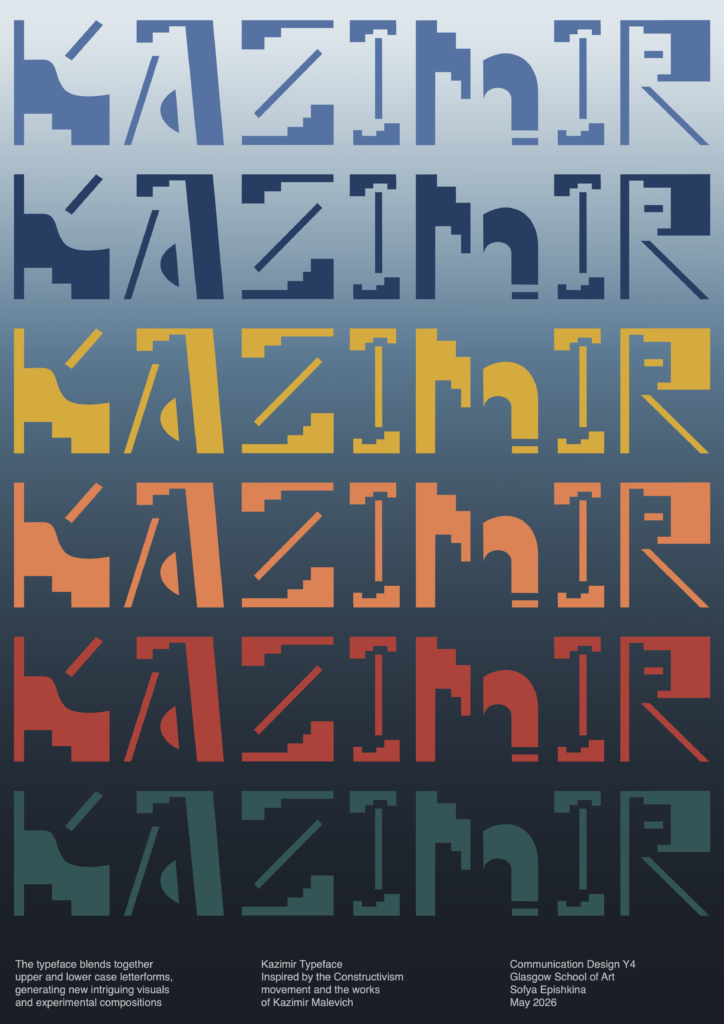
Kazimir type specimen poster exploring the relationship between constructed letterforms, colour, rhythm and negative space.
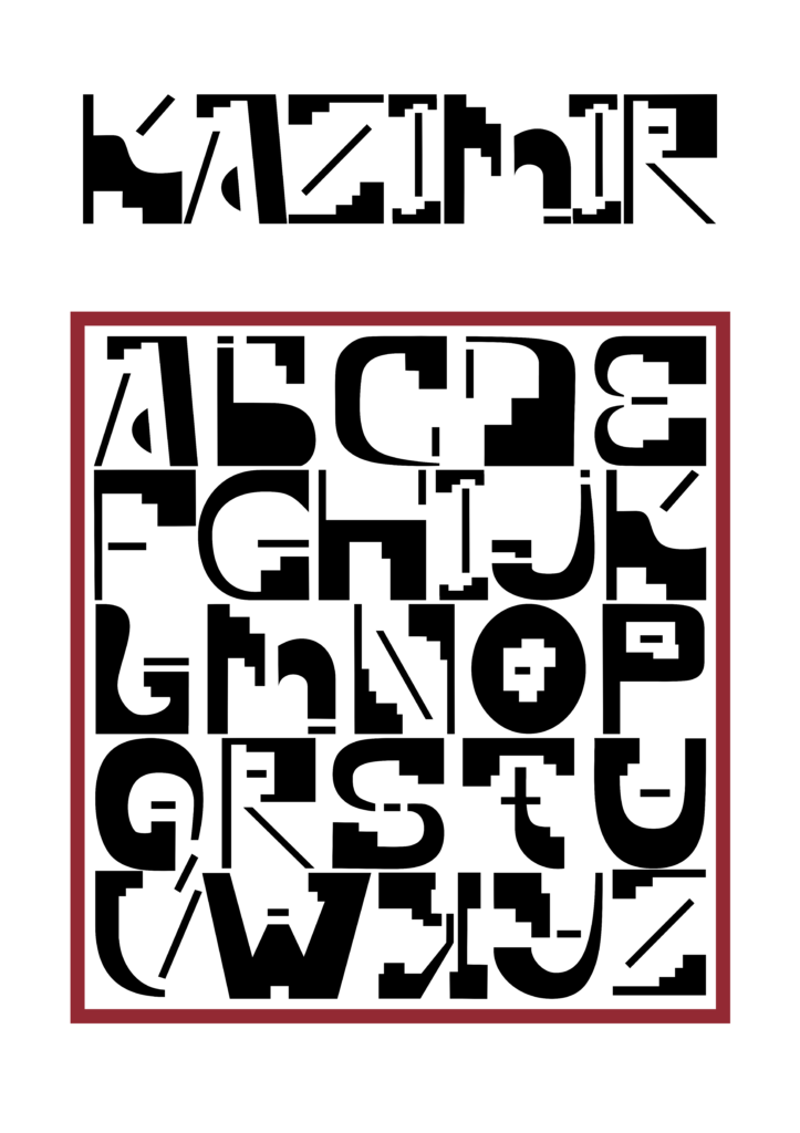
Kazimir alphabet specimen exploring modular letterforms, contrast and negative space.
Double-Page Spread in a Class Publication
This double-page response was created for a class publication, based on a conversation with GSA graduate Abby Bayani. The project began with research into Abby’s practice, from her structured typographic work and modular forms to her editorial projects and careful use of print, texture and composition. Her attention to detail, systematic approach and interest in the relationship between analogue and digital processes became the foundation for the visual direction.
The outcome reflects the exchange between two designers at different stages of their creative lives. Using emails between Abby and myself as the textual content, the spread turns conversation into both readable material and visual texture. The grid structure was inspired by Abby’s print experiments, while the halftone gradient introduces a sense of transition, movement and uncertainty. This represents the shift from being a student to entering professional practice, as well as the flow of advice, reassurance and connection passed between graduates.
Working in grayscale, the design brings together Abby’s analogue print sensibility with my own interest in digital processes. The final publication spread values detail and subtle communication, inviting the reader to look closer rather than immediately consume the text. At its core, the publication is about mentorship, shared experience and the continuity of the GSA design community, receiving guidance from those who have already moved forward, while hoping to offer the same support to future graduates.
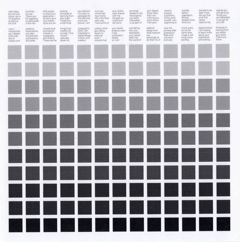
Class publication layout exploring the conversation with a GSA graduate through a double-page visual response.
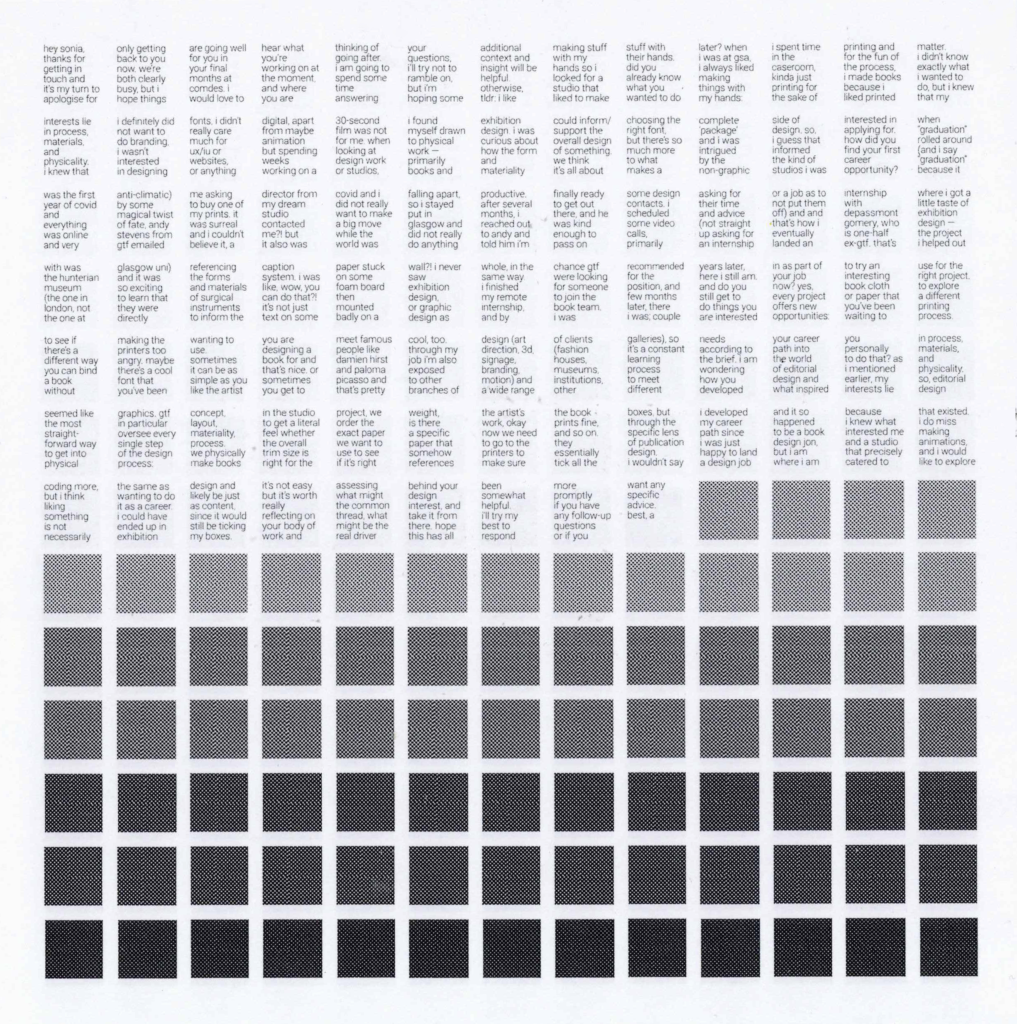
Class publication layout exploring the conversation with a GSA graduate through a double-page visual response.
Mosaic Recipe Tool
This tool was developed through creative coding in p5.js as a digital response to an old recipe, inspired by a Digital Design workshop with the Otherway studio. The project explores how food, colour and interaction can come together to make cooking feel more playful, visual and shareable.
The tool translates live camera footage or uploaded images into a motion-responsive mosaic grid, extracting colours from the image and reassembling them into a dynamic geometric composition. Rather than simply documenting a recipe or food image, it transforms it into a decorative digital surface, where colours shift, move and become part of a new visual language.
The concept treats colour as an ingredient and the screen as a cooking surface. Images of food, ingredients, recipes or everyday moments can be sampled, mixed and rebuilt through a grid of triangular forms. This creates a playful connection between the sensory experience of cooking and the systems-based logic of digital design.
Originally rooted in recipe-sharing and the desire to make people fall in love with cooking, the tool can also be applied to any image as an interactive visual system. It allows users to turn personal photographs, food memories or visual references into colourful mosaic compositions that can be saved and shared. The final outcome sits between graphic design, creative coding and social media, using interaction as a way to make digital image-making feel more tactile, joyful and alive.
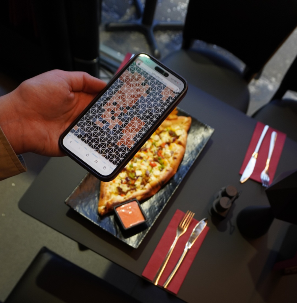
The Mosaic Recipe tool in use, translating a food image into a playful colour-based mosaic composition.
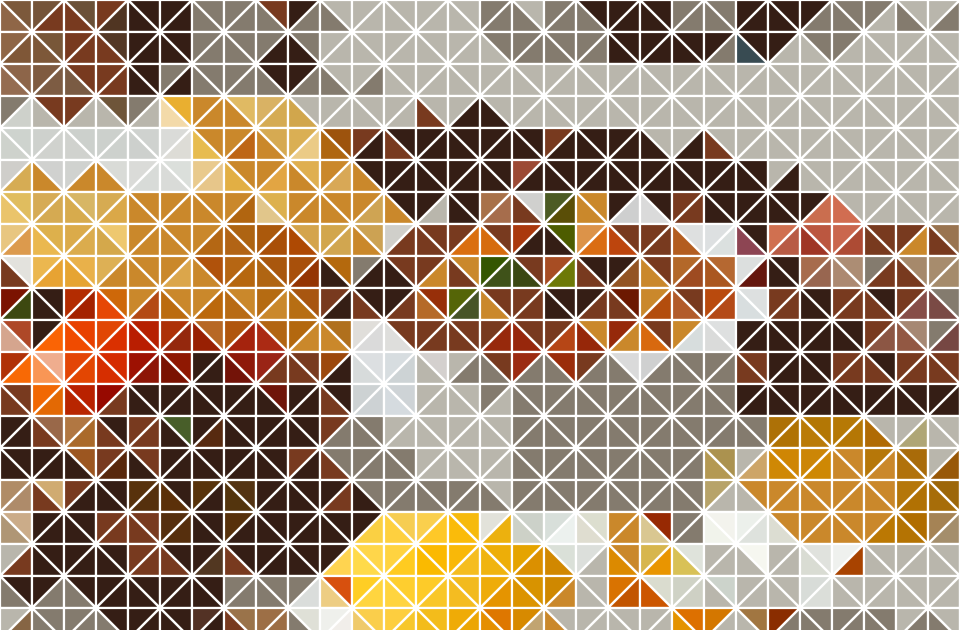
A Scottish breakfast on a plate transformed through the Mosaic Recipe tool into a colour-based triangular mosaic.
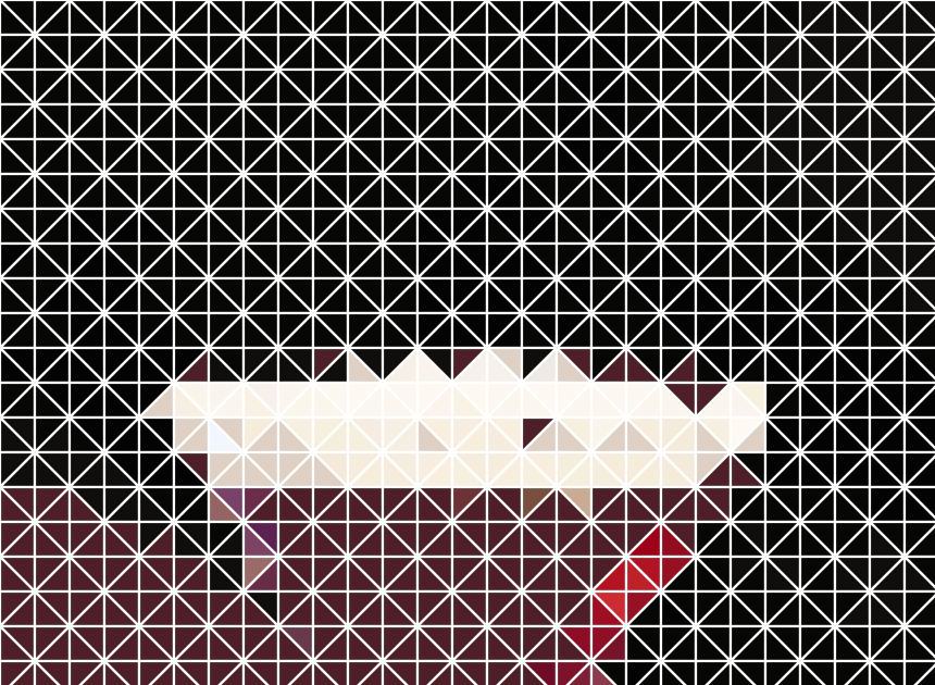
The photo of a cocktail transformed through the Mosaic Recipe tool into a geometric triangular mosaic.
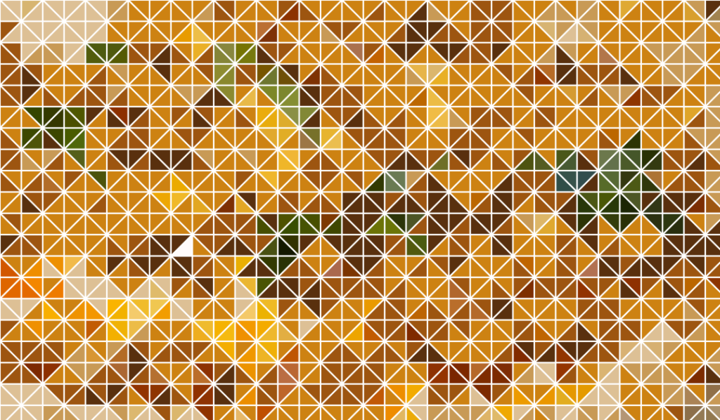
The original photo of a plate of hummus with greens transformed with the Mosaic Recipe tool into a colour-based triangular mosaic.
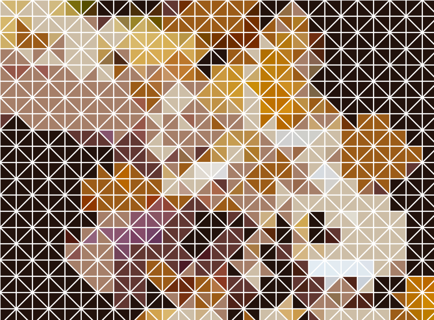
The original photo of a cheese platter is transformed through the Mosaic Recipe tool into a colour-based triangular mosaic.