Willow Glendenning
(she/her)
My practice frequently makes light of human behaviour and creates links between seemingly unrelated ideas. Motivated by concept lead briefs, I enjoy developing my ideas through archival research and bringing my work into contemporary culture. I’m especially passionate about the tangible qualities of design, printmaking has been central to my final year projects. I want my work to make people think, and through honest, human sentiments I always aim to make good, honest work.
Weaponisation
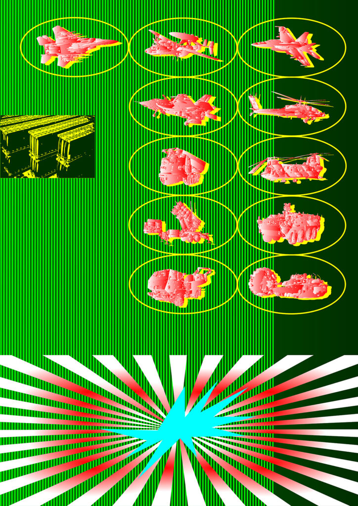
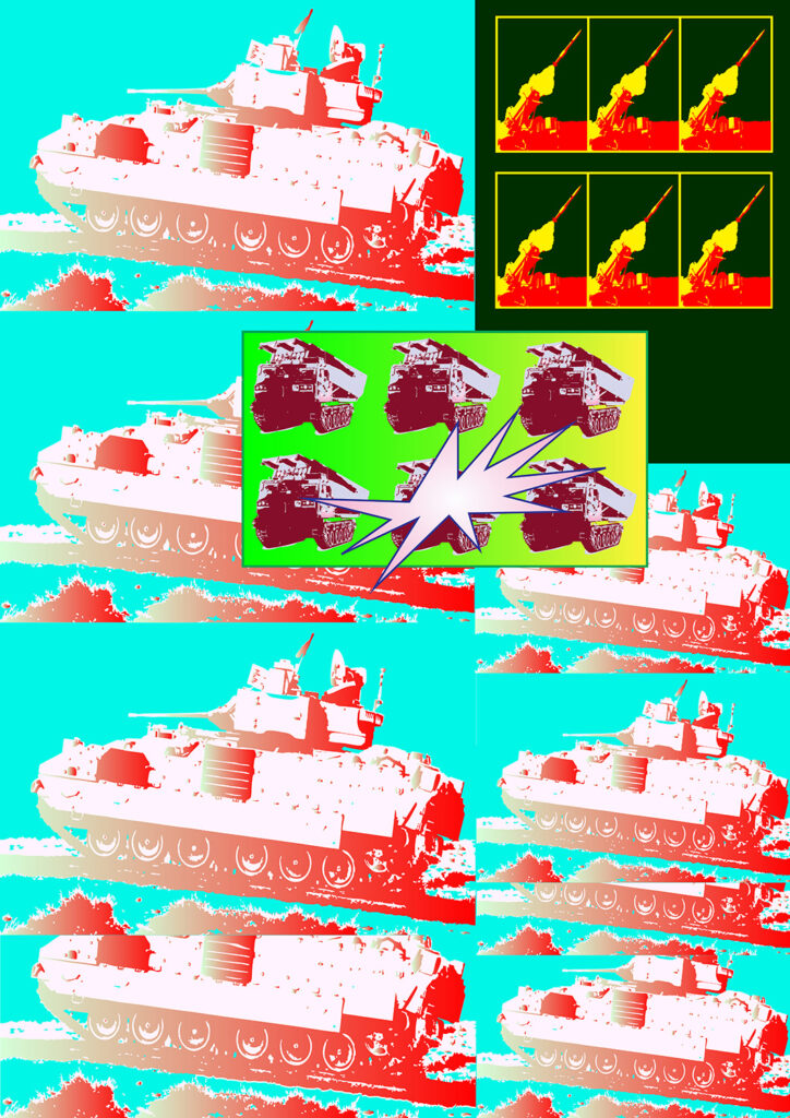
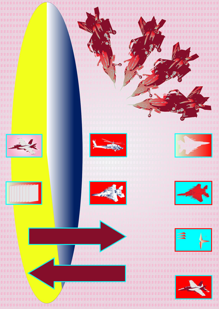
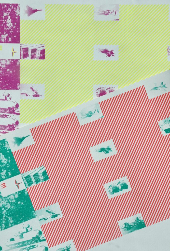
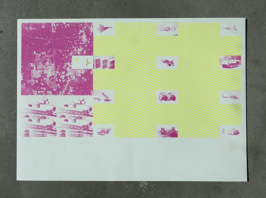
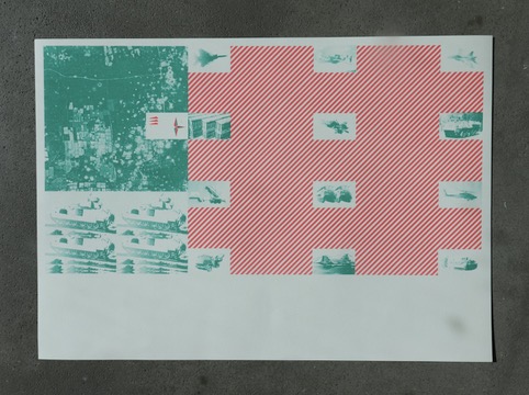
Visual communication has the power to persuade the masses and subvert information. ‘Weaponisation’ is a project based on my Extended Essay about the political nature of Western graphic design in the Cold War period. I wrote about how design was used as a weapon of psychological manipulation and how visual culture is inextricably linked to the issues we face in the world. As a visual response, I brought my work into the current political climate of global arms sales. The US is responsible for 43% of the exports of major conventional weapons worldwide, and my project brings to light this often overlooked body of information from The Campaign Against Arms Trade.
By manipulating images of weapons that are currently sold in the global arms trade, and rendering them to look like toys in catalogues; I was able to disguise harmful, dark imagery into the aesthetics of consumerist sales. With motifs of dollar signs and explosions, I highlight the role that Western powers play in wars worldwide. With visual references to 1950’s Pop Art and Indian firework displays, the outcomes for this project were a series of screen prints and digital posters. Reinforcing the idea of disguising weaponry as something to play with, they have a bright, bold visual language.
Sorry
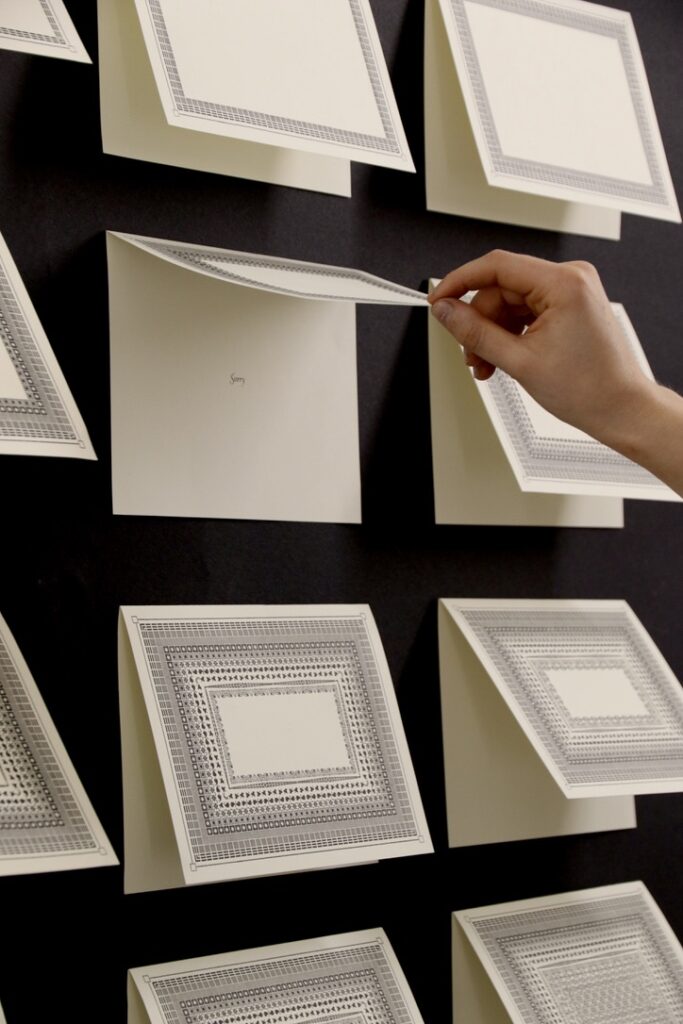
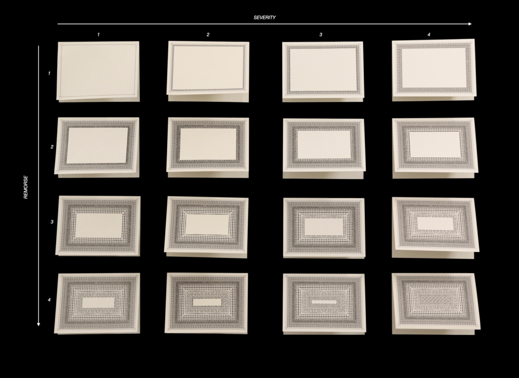
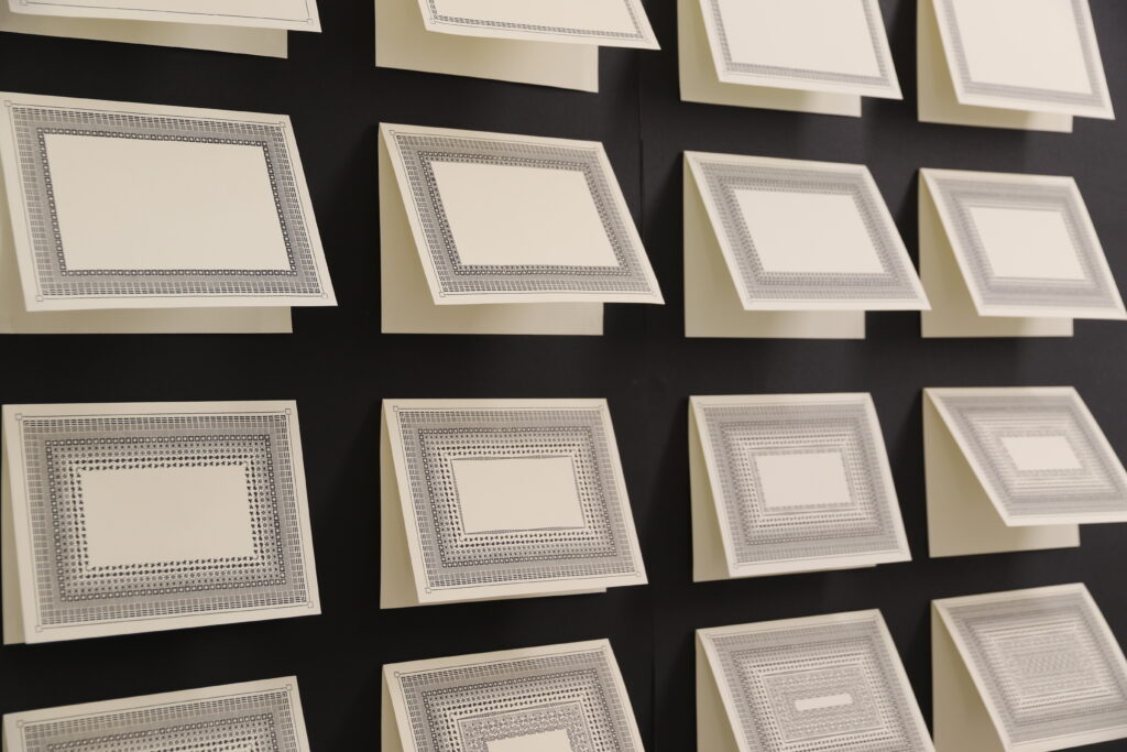
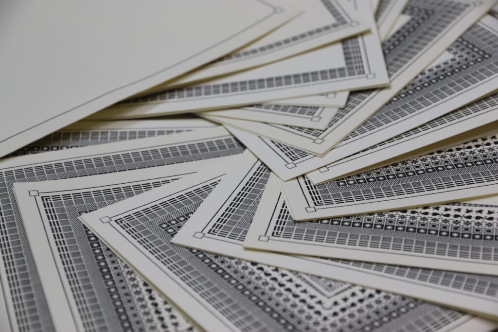
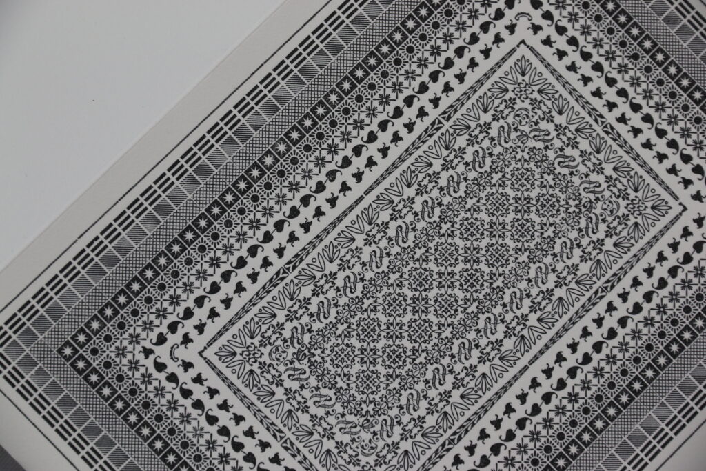
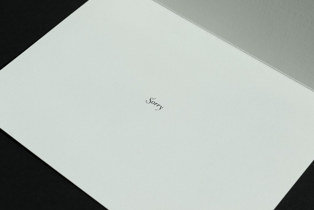
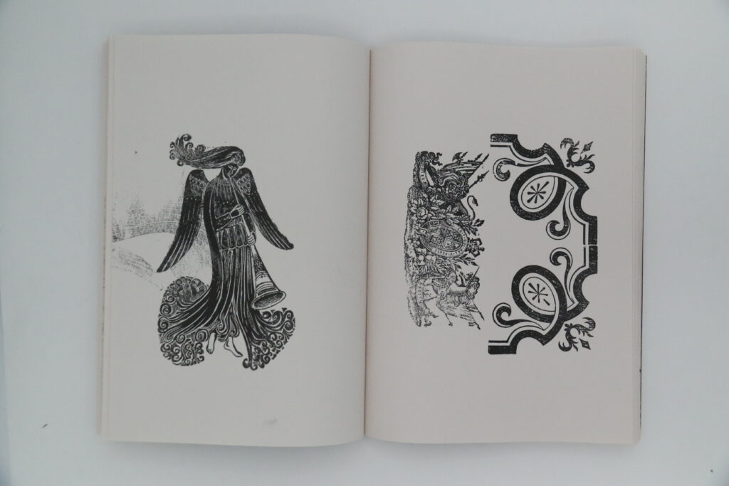
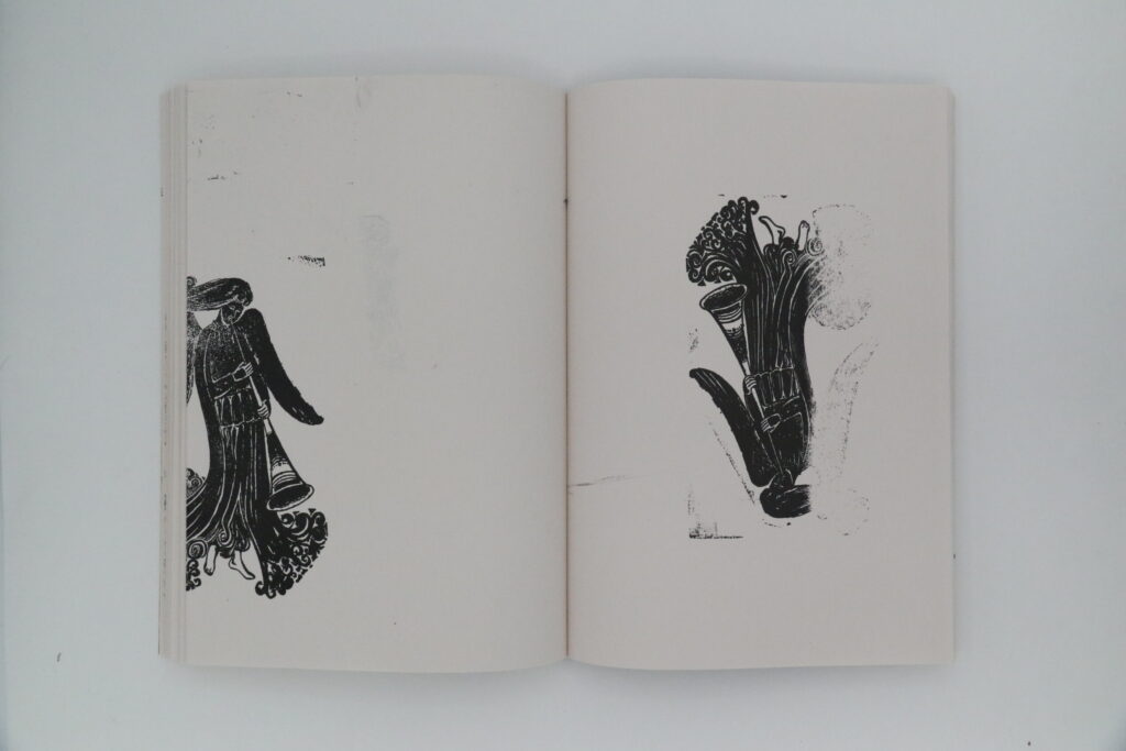
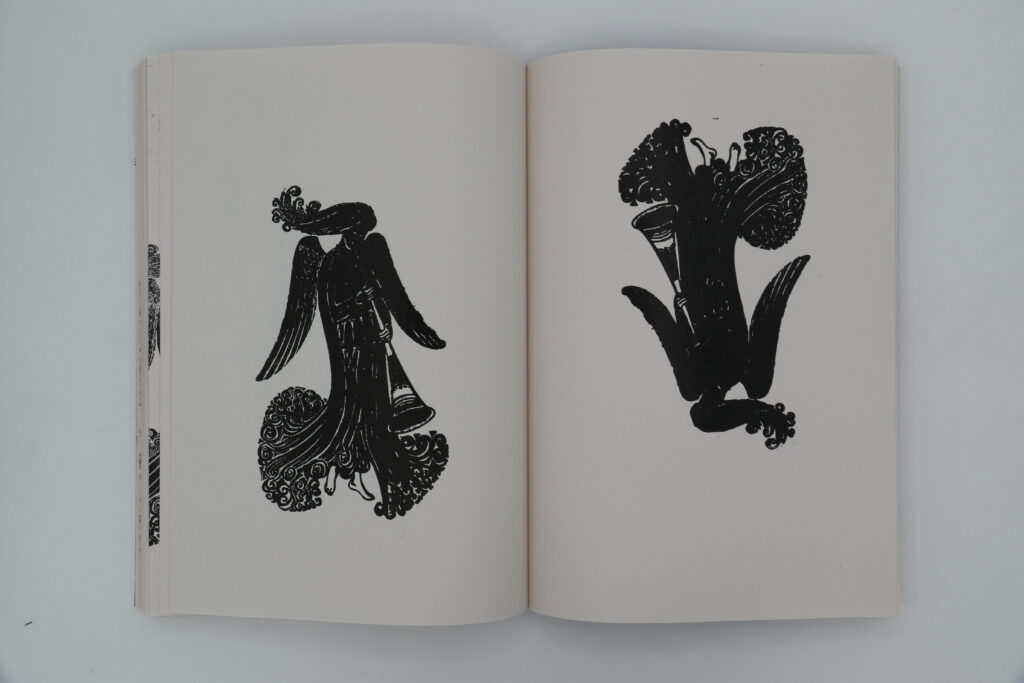
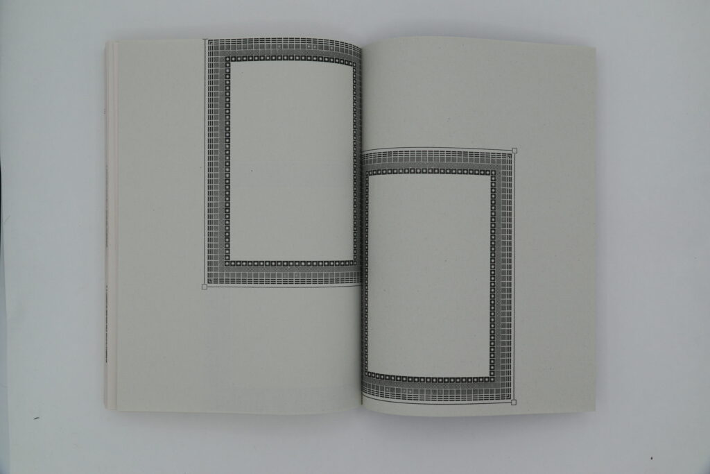
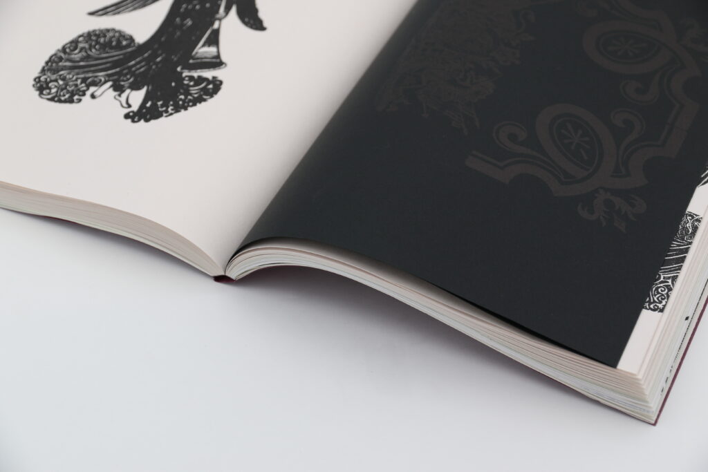
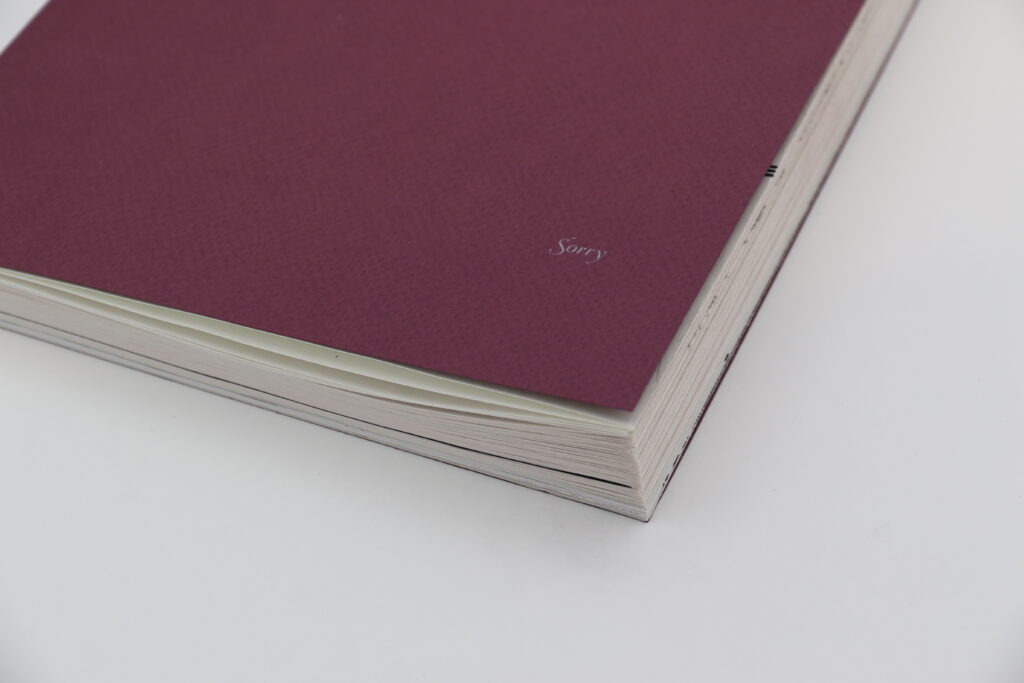
This project explores how the word sorry and its varying definitions can be communicated visually. The word is used in various situations; mishearing someone, a small mistake, the desperate need to repair a relationship or the death of a loved one. The etymology of the word shows its origins from deep sorrow to its current use as a social lubricant. Exploring how values are reflected in design, led to research of Victorian Mourning Stationary . Envelopes and letters featured black borders, where a thicker border represented an intense level of grief, whilst a thin one remained a polite gesture. How can you show you are really sorry? Prescribing a set answer for a human experience allowed this set of cards to have many layers. Letter pressed in the caseroom with individual lead border pieces, they change from simple, to detailed and ornamental, representing the evolution of the word. Each column increases in paper weight to show the severity of the apology and increases in the number of borders to represent the level of remorse. I created a questionnaire, a set of 16 cards with increasing letterpresses borders, along with a perfect bound book of printing mishaps.
View From a Window
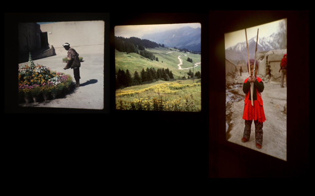
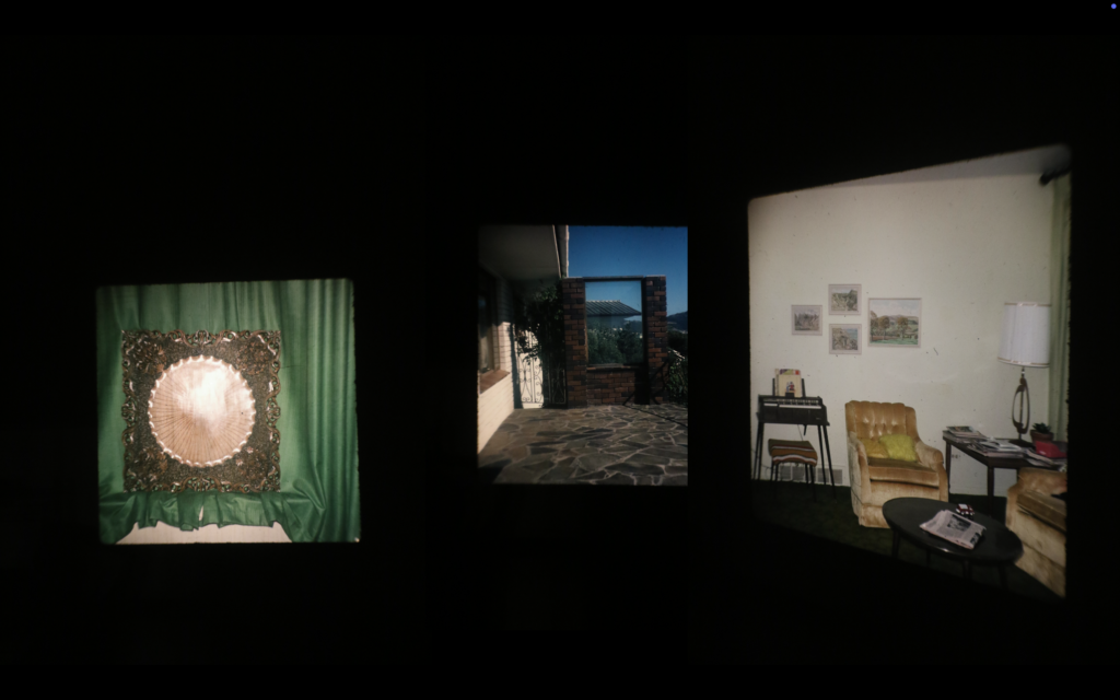
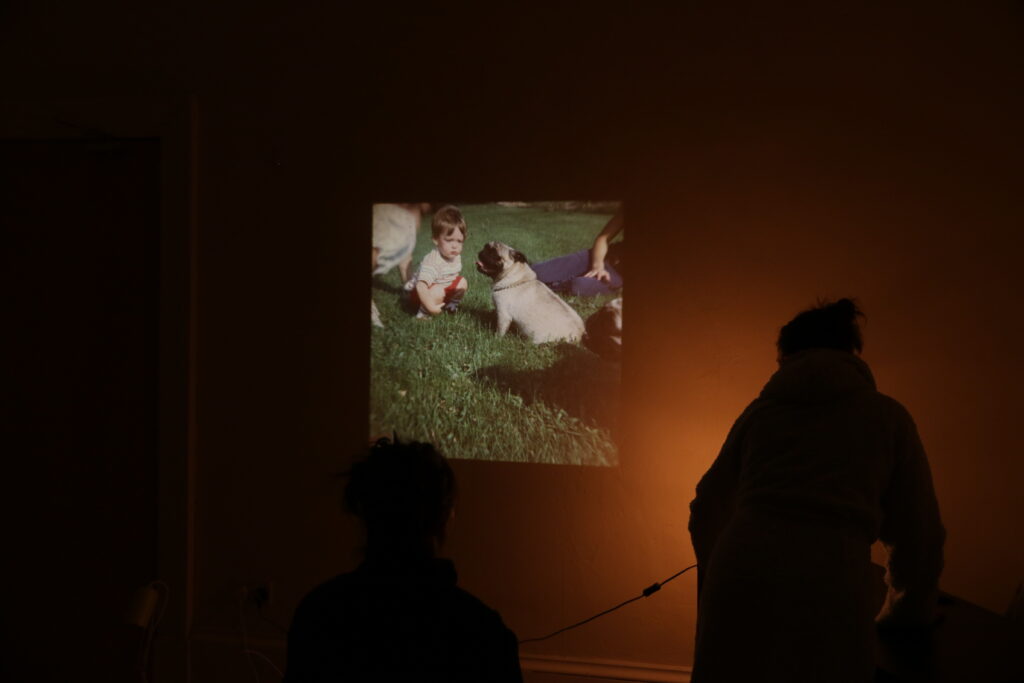
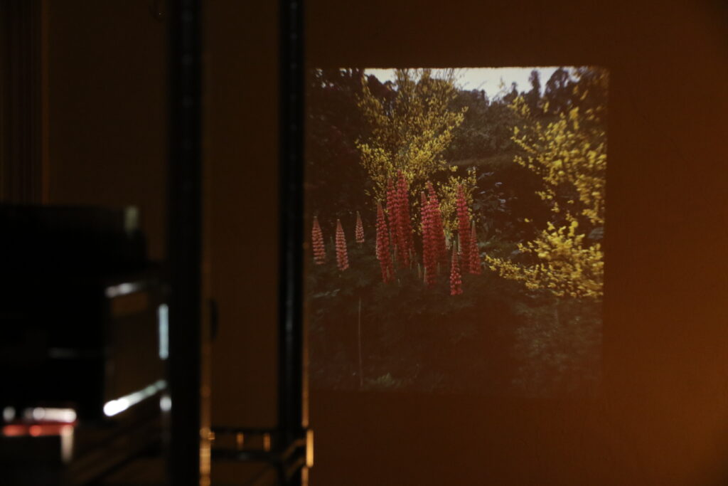
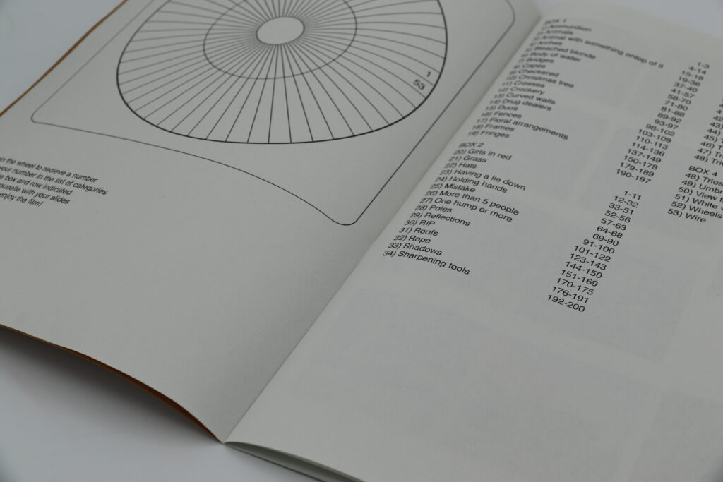
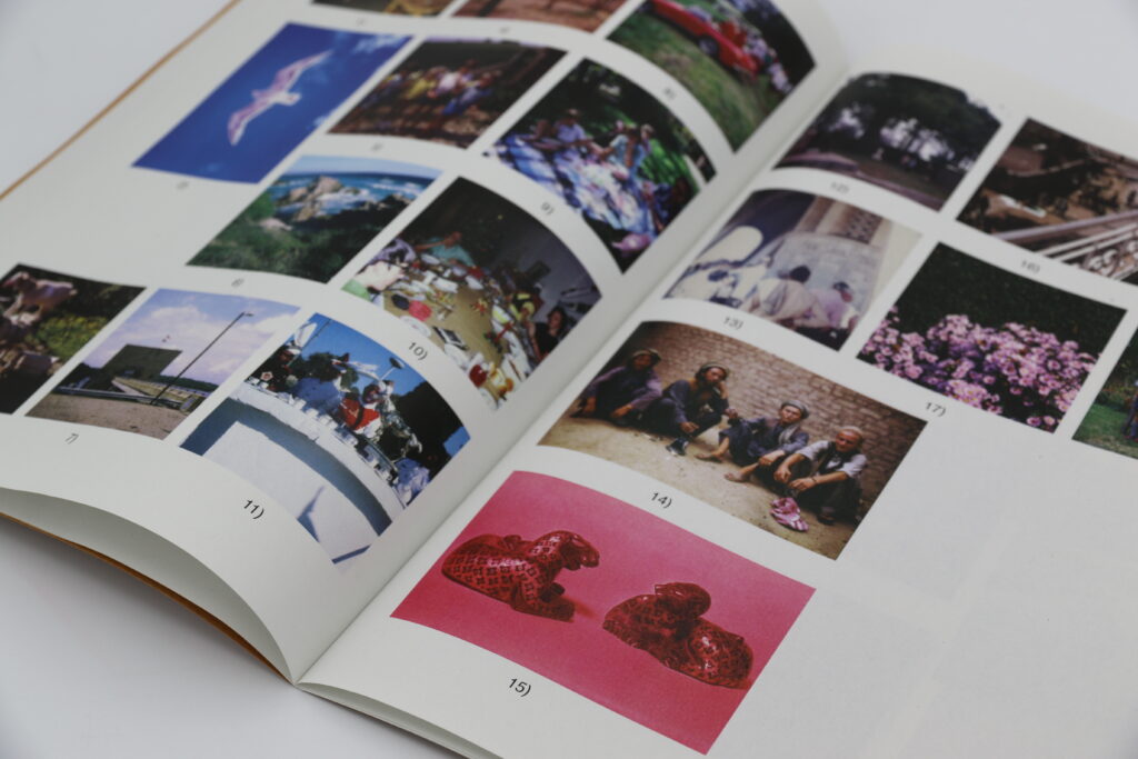
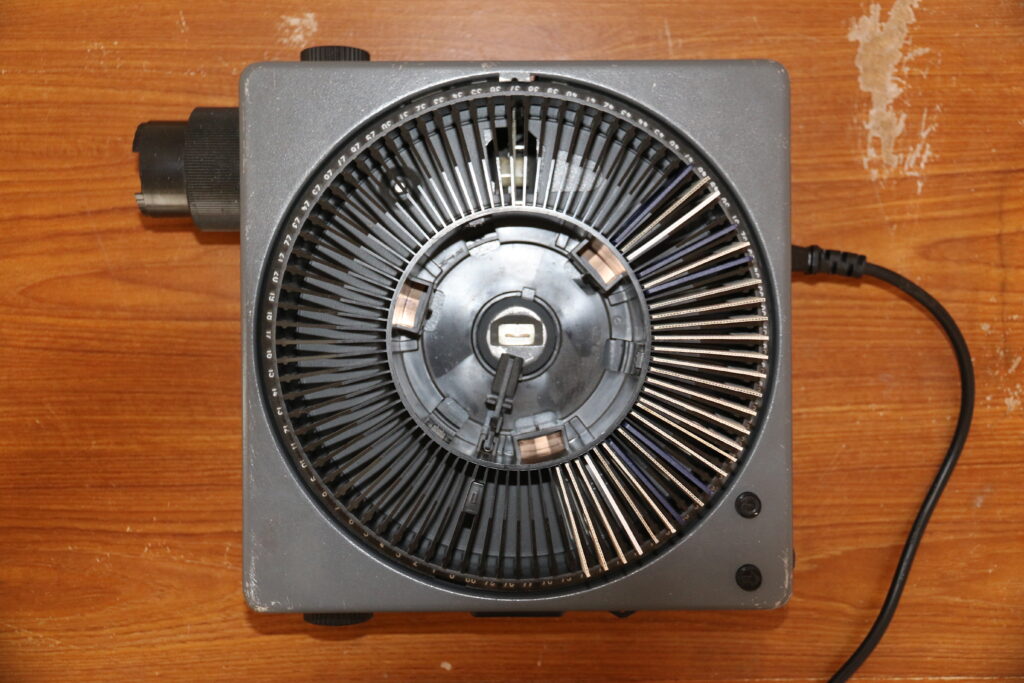
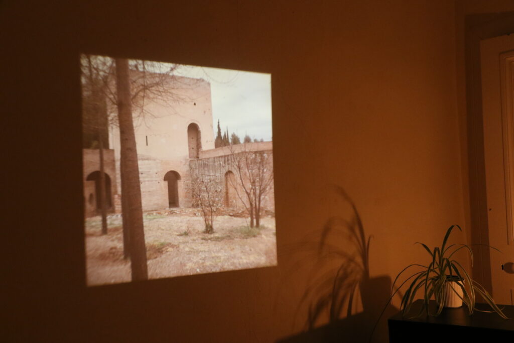
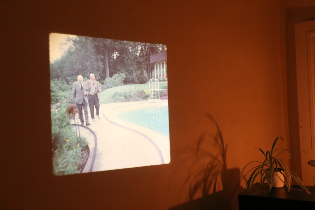
My practice frequently makes light of human behaviour and creates links between seemingly unrelated ideas. View From a Window project nourished my lateral thinking and allowed me to experiment with a dying technology. By organising hundreds of forgotten photographic slides into categories I was able to comment on the shared human experience. I created a book that takes the viewer on a journey, it prompts you to spin a wheel to receive a category, after, you fill the slide projector with your chosen group of slides. A hybrid of moving image and stills, this project is interactive and creates space for the audience to make their own narratives out of sequences of images.
Corner
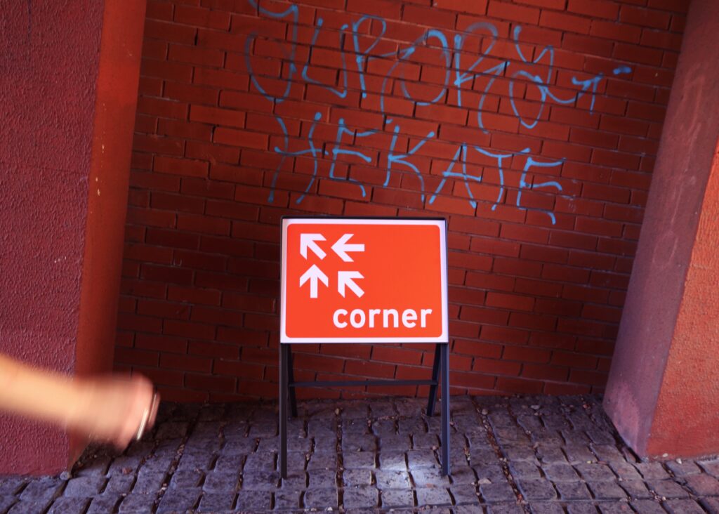
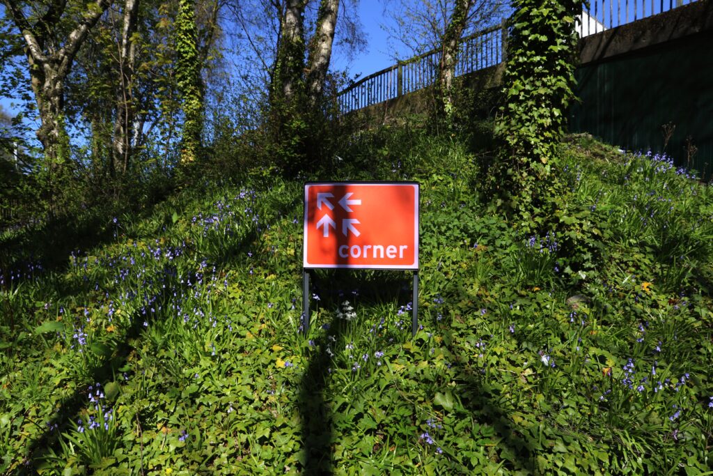
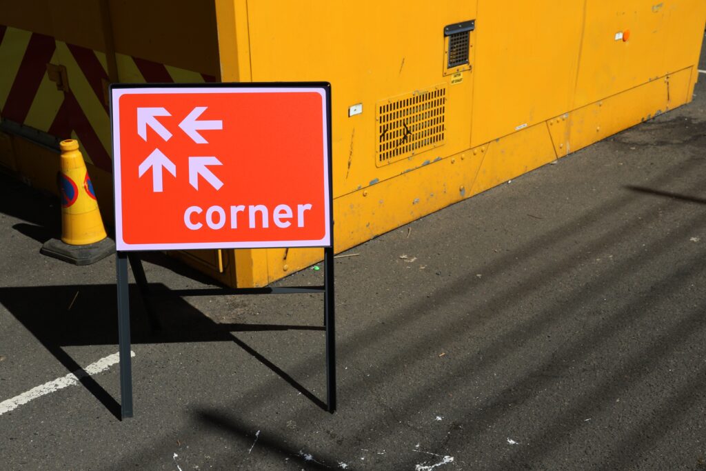
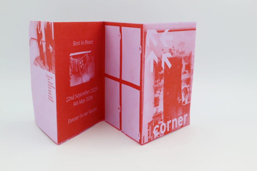
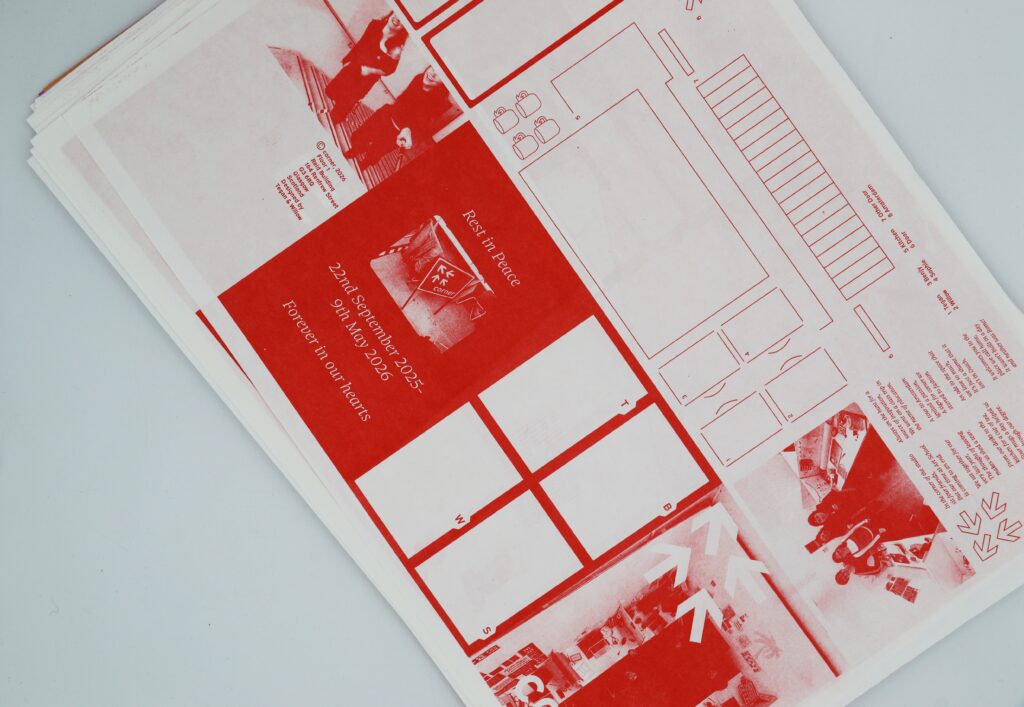
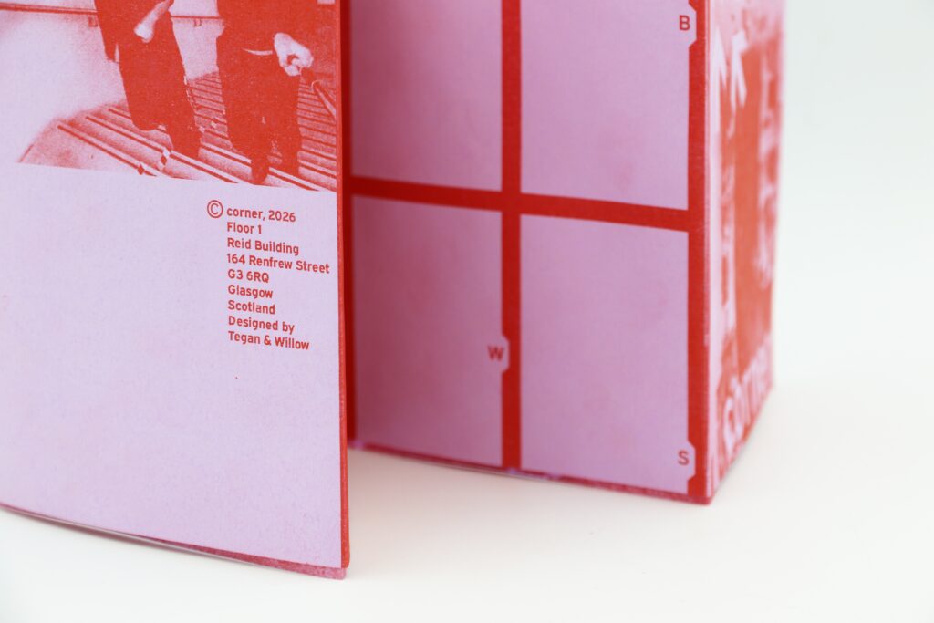
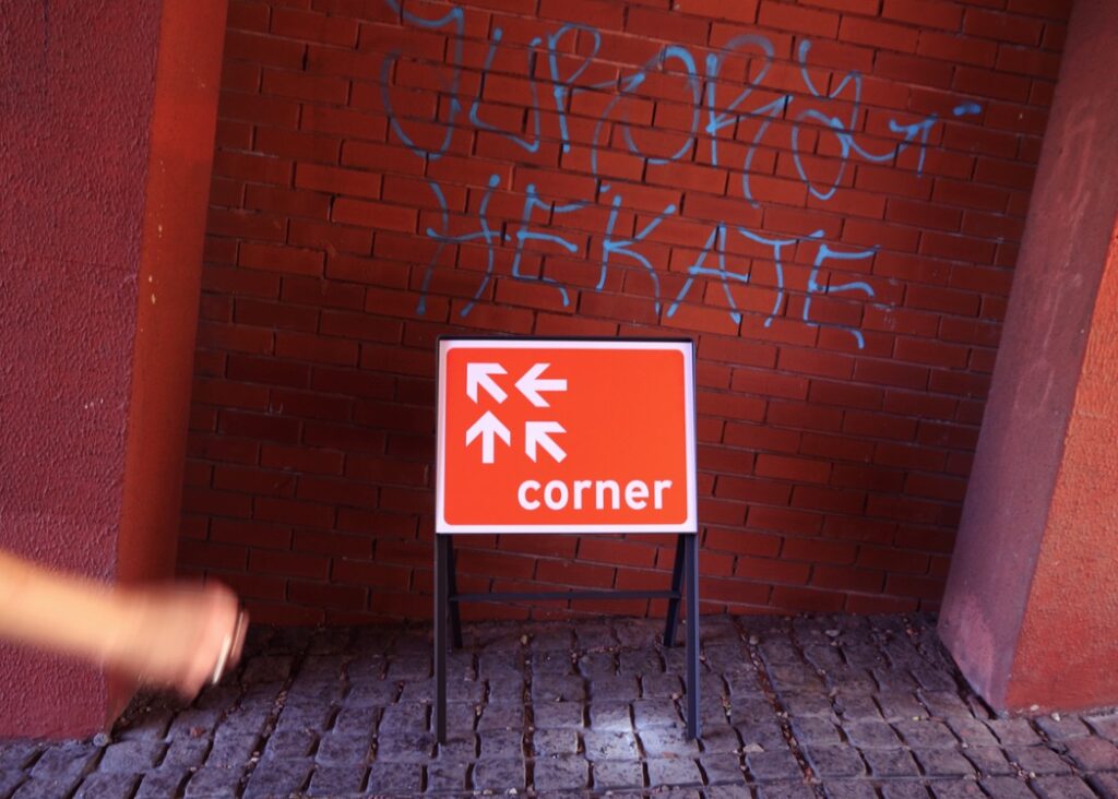
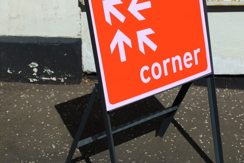
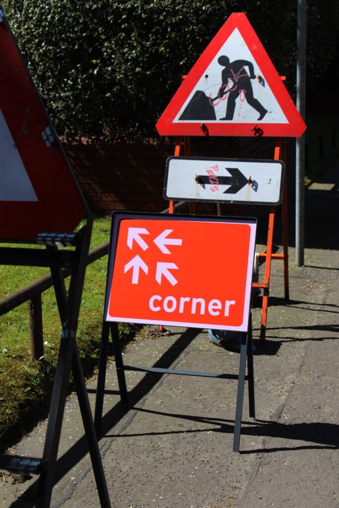
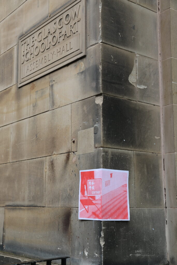
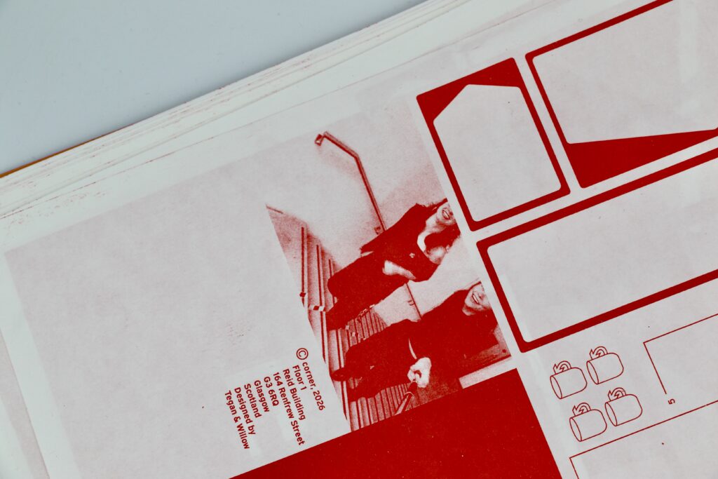
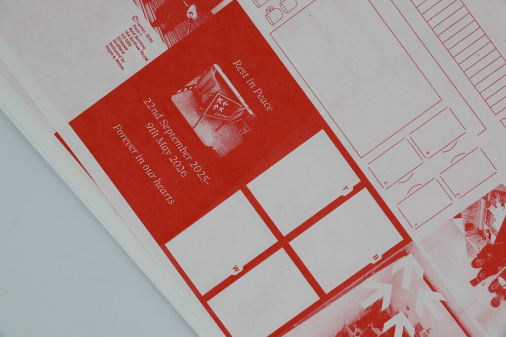
This collaborative project resulted in a road sign for the identity of our corner of the studio, along with an information leaflet that provides context for the sign. A playful brief that combined both of our styles and lateral thinking, an ode to the studio culture that will be greatly missed.
Play
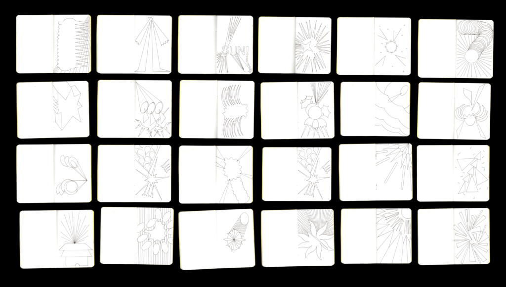
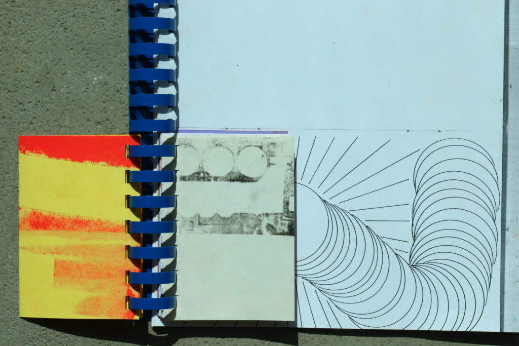
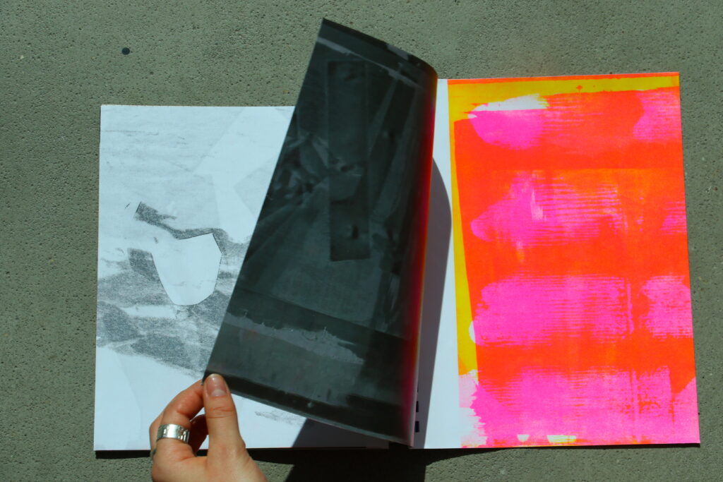
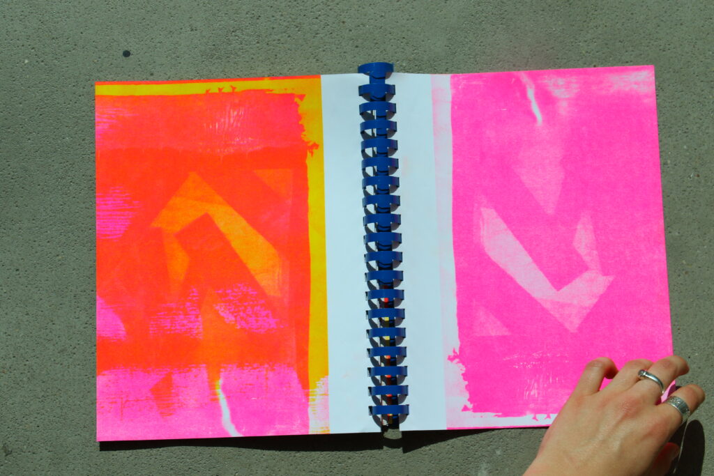
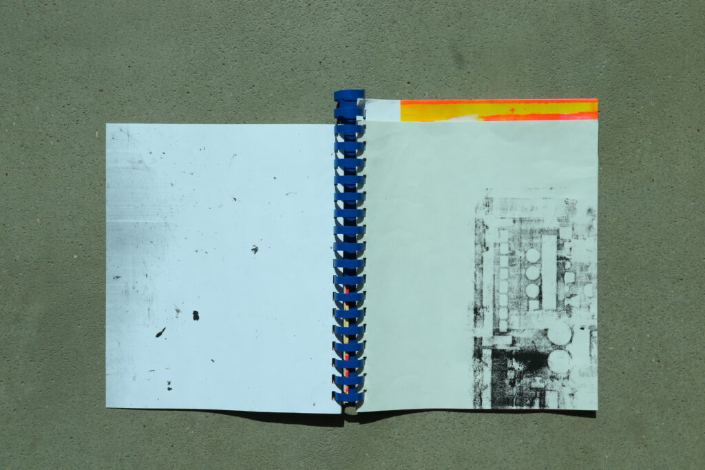
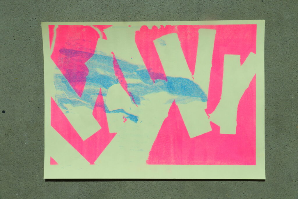
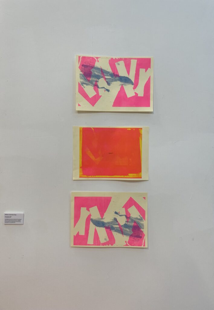
Play is a short process led project that had multiple outcomes that developed from the experimental process. I started to question what play means to me; it resulted in a return to making with no particular objectives. This iterative process was fun and allowed my creativity to run wild whilst being able to treasure the experience rather than a singular final piece. The outcomes featured a series of risograph prints that evolved from a screen print that had gone wrong. I created a comb bind book of the project, focusing on complimentary colours and textures.
Corner
This collaborative project was developed as an ode to studio culture. A playful brief that combined both of our styles and lateral thinking, we developed an identity for our corner of the studio– a road sign and zine that provides context for not only the sign, but our experience in the studio in final year.