Lydia Harris
(She/Her)
The work explored this year mainly focuses on looking at visual languages of information systems found within and beyond design. Abstracted concepts and ideas realised in various expressions of visual media, primarily through publication design.
1 Path With 2 Degrees of Separation
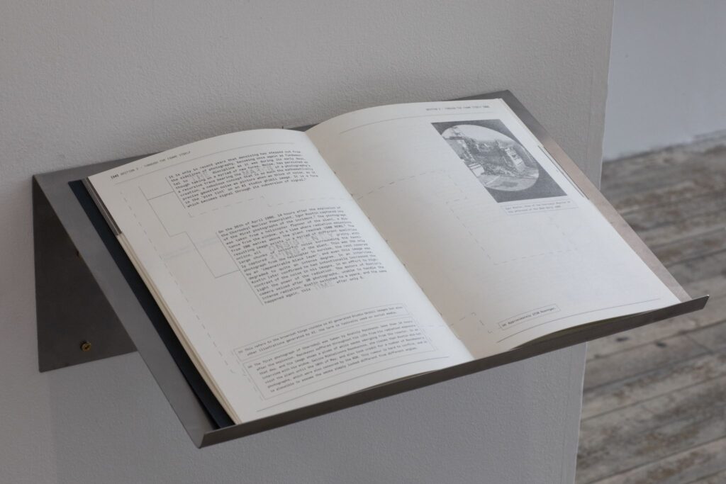
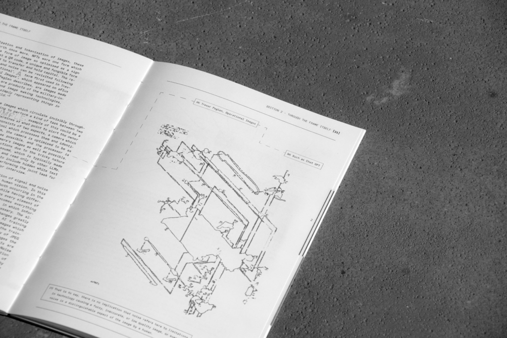
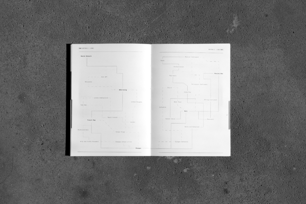
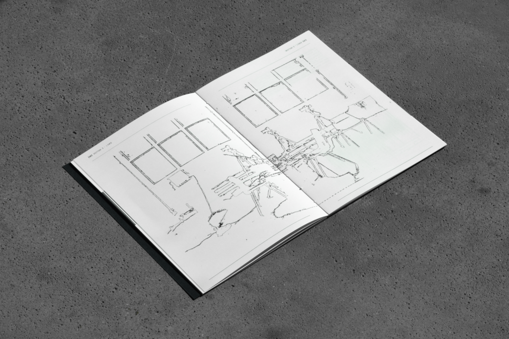
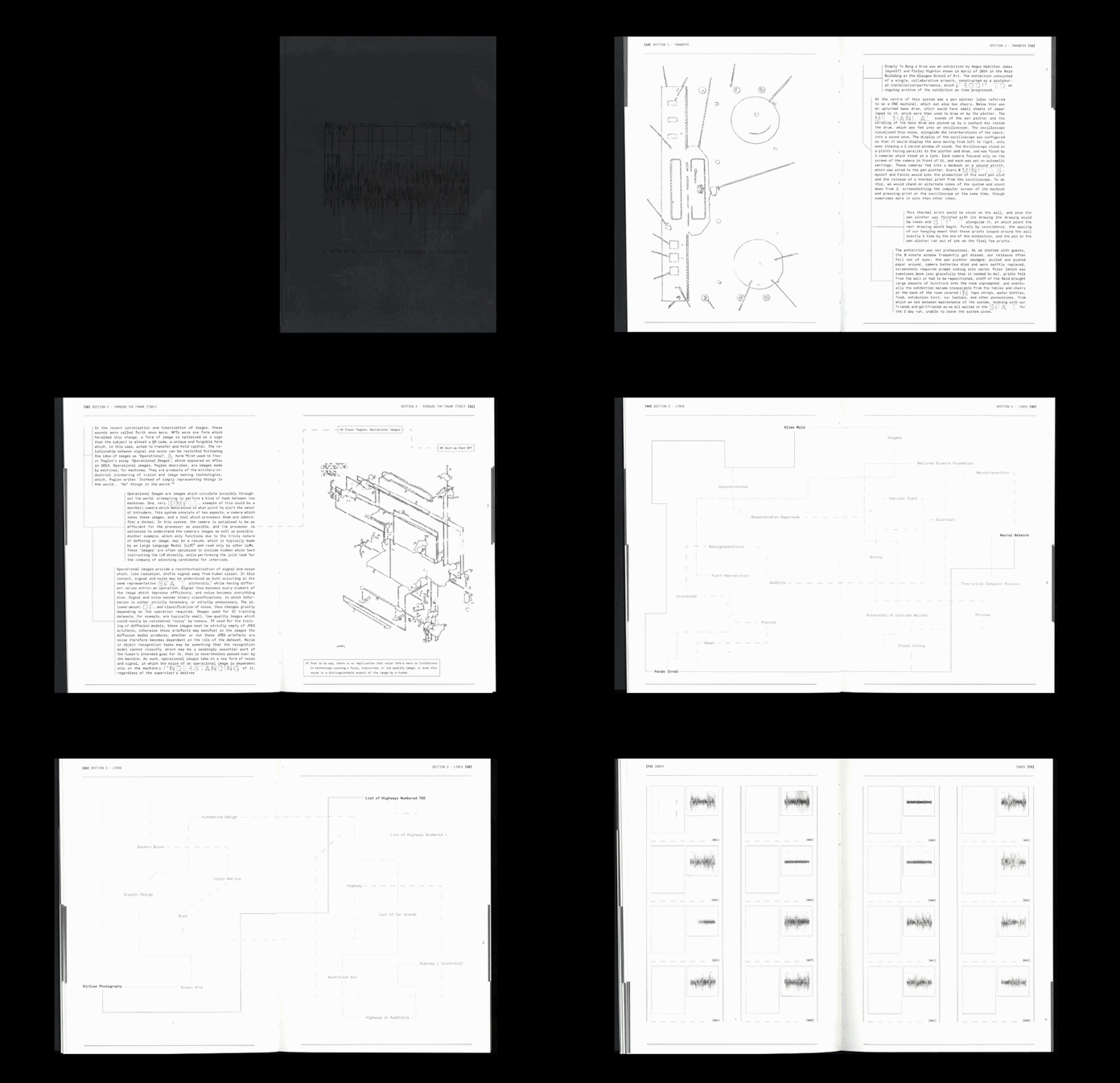
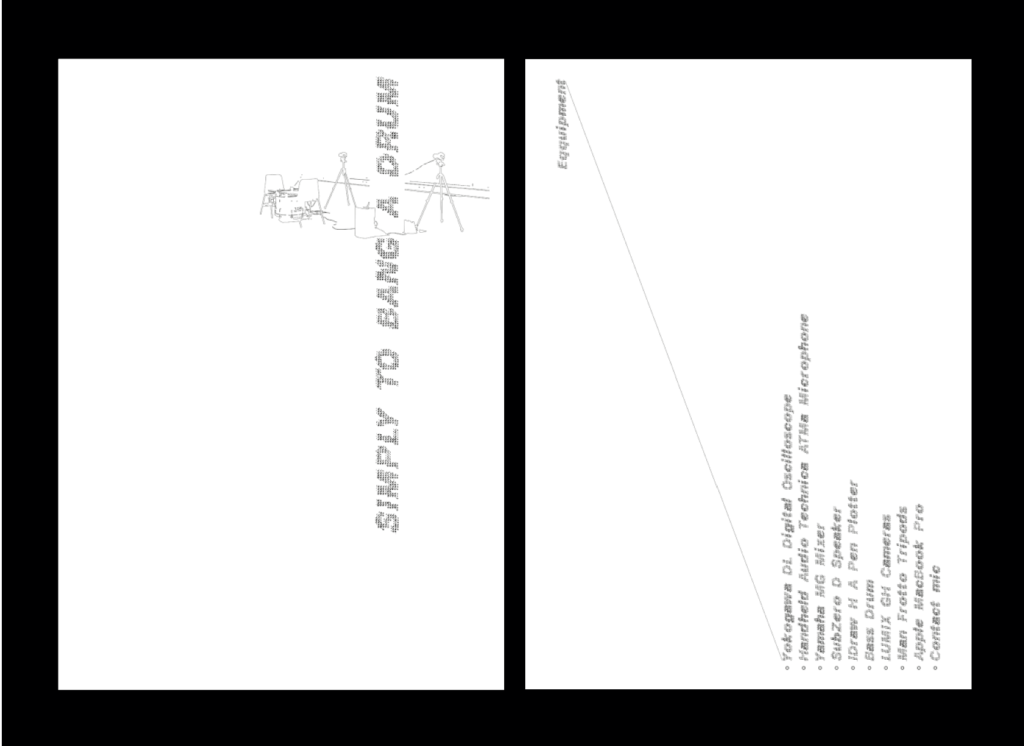
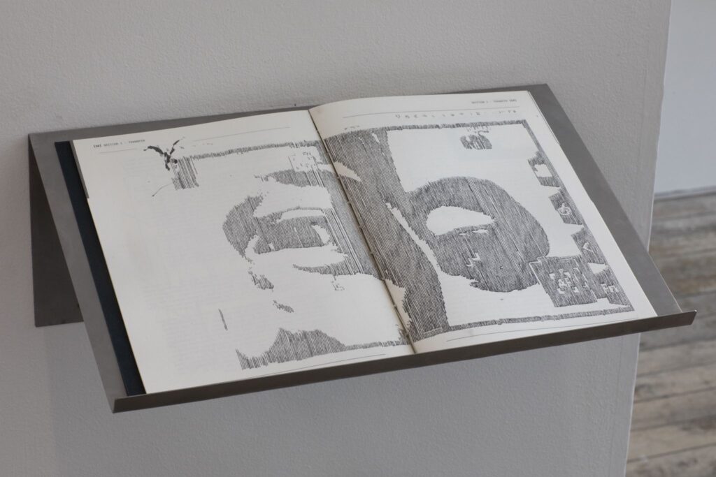
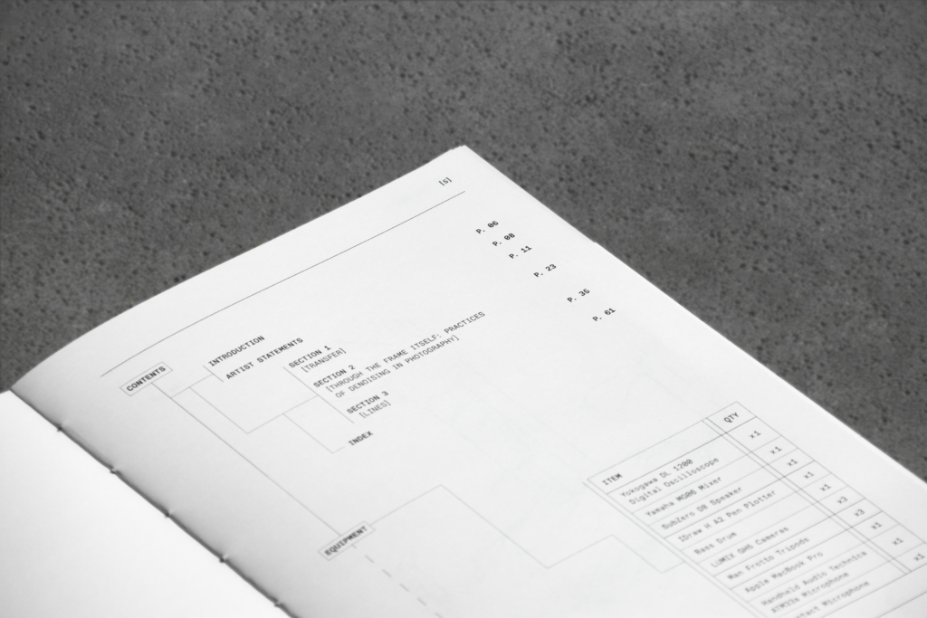
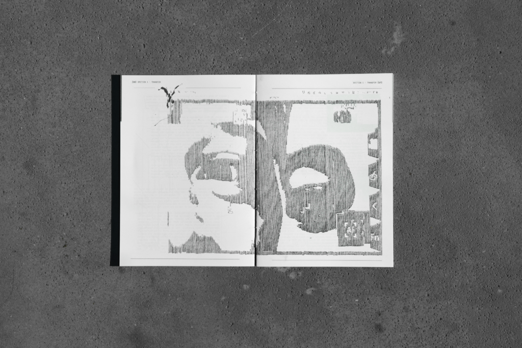
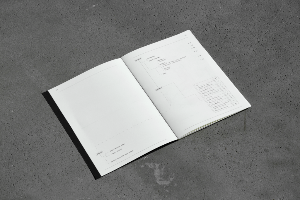
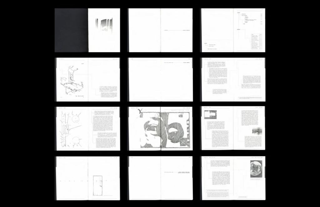
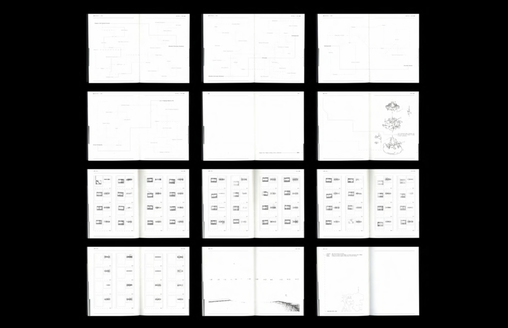
‘1 Path With 2 Degrees of Separation’, is an 80 page riso printed publication showing the works of Angus Hamilton James and Finley Highton, exploring contemporary image making through archival material from the exhibition ‘Simply to Bang a Drum’ (2025) alongside a collection of essays.
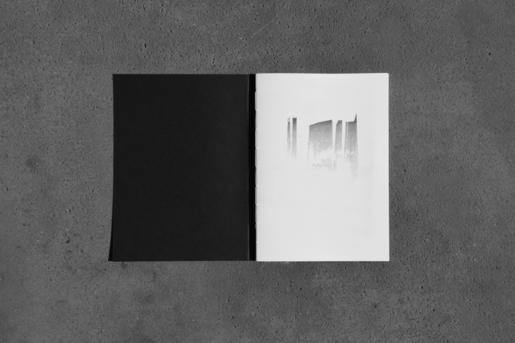
Each publication comes hand bound, with 1 of 7 relief printed dust covers that depict oscilloscope images from different moments during the exhibition. Inside are 3 essays which explore image transfer, artwork, noise, radiation, and logical structures. All images have been drawn by the same pen plotter from the exhibition itself, together with a custom font re-introducing the machine in fragments of the writing.


Measuring Abstraction
“What is not defined cannot be measured. What is not measured, cannot be improved. What is not improved, is always degraded” – Thomas Kelvin (1890s)
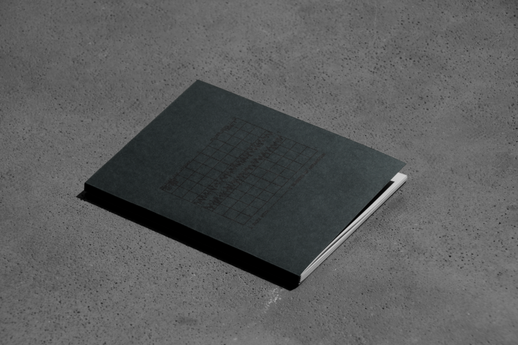
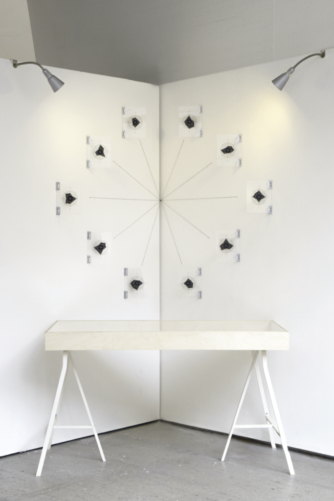
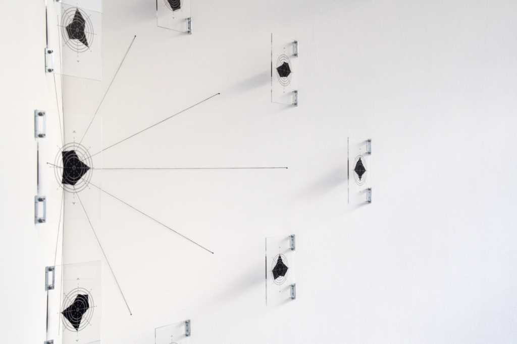
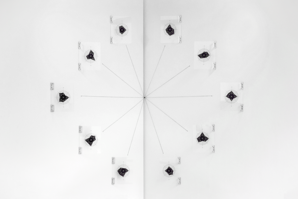
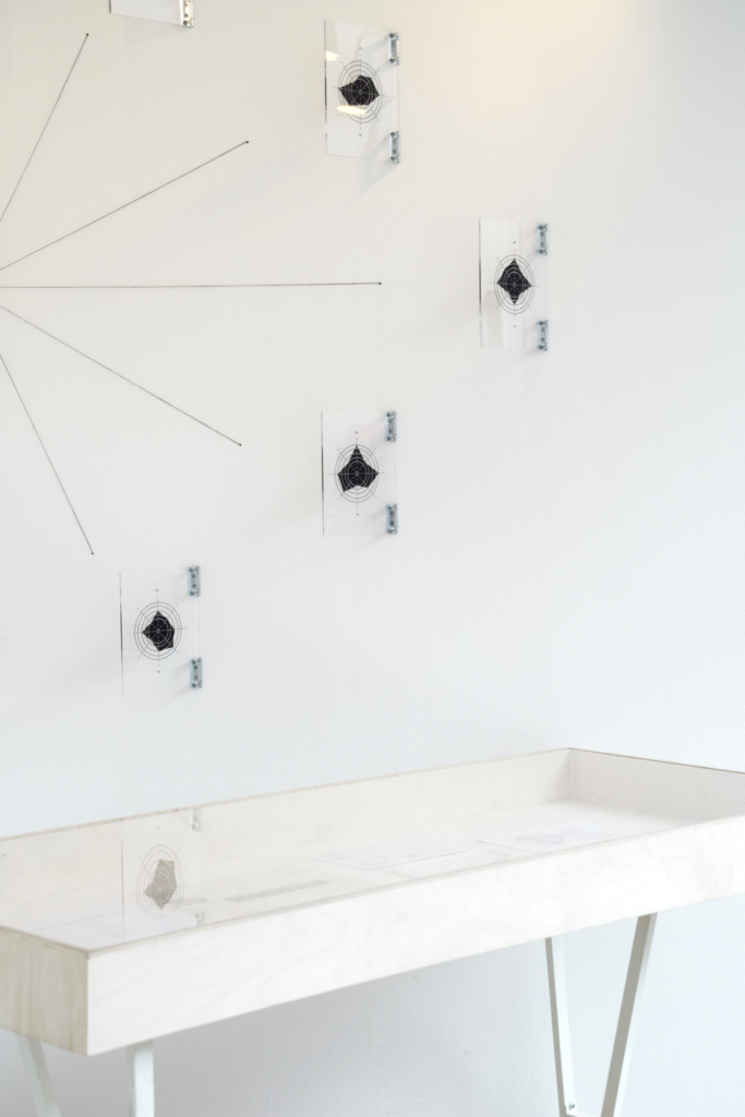
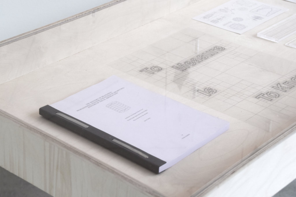
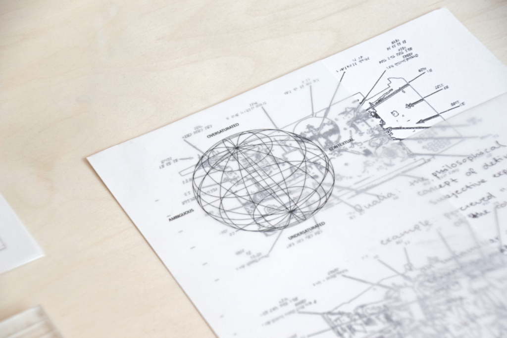
If this statement is true – abstraction is degrading, but what would it look like to measure it? This project seeks to comment on the human urge to have an answer for everything, mapping and defining visual abstraction through looking at existing measure systems. Conceptually systemising and rationalising something that in its definition cannot be measured, creating an illusion of trust at first glance by using academic visual language. A fabricated research paper is being presented along with all its supporting explorations, highlighting our assumption of authority when seeing diagrams and graphs. This theme was explored in two parts, one for abstraction in typography (see below) and an extension into visual abstraction.
Measuring Abstraction (Typography)
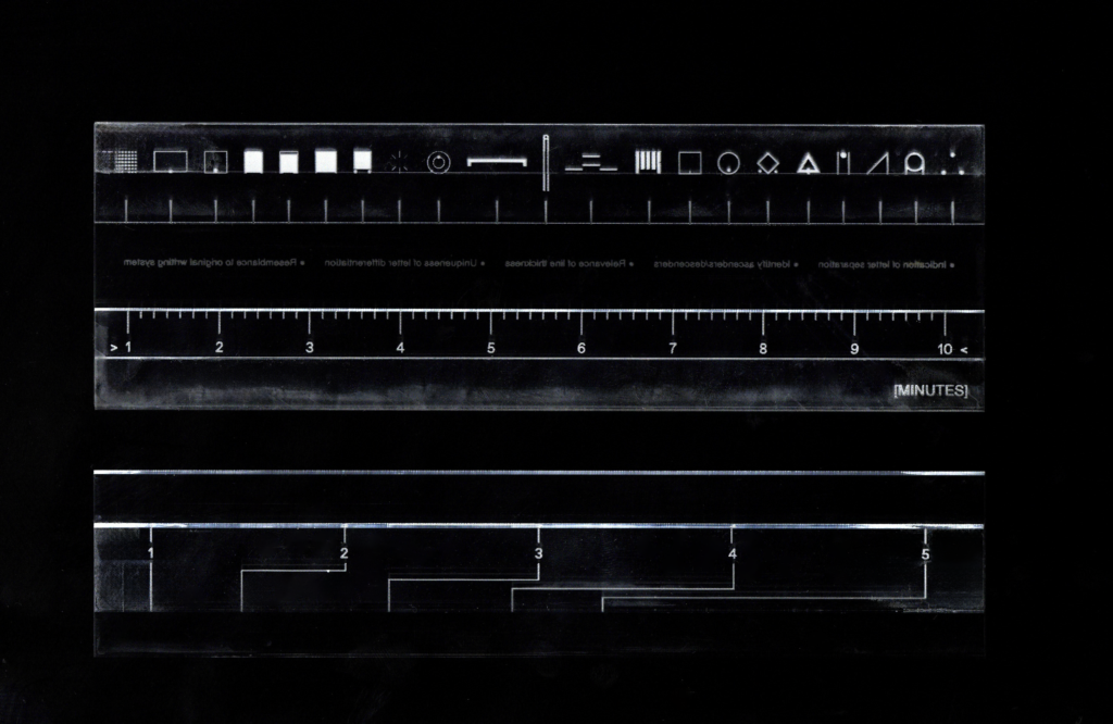
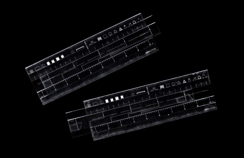
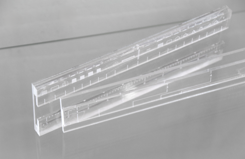
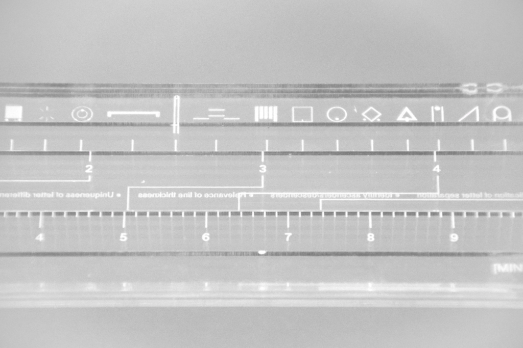
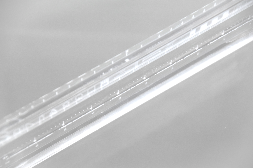
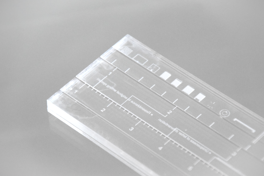
This outcome is part of the same exploration to measure abstraction. A tool was created to guide beginners in atypographic reading. Atypography is a contemporary typographic movement born in a rejection of the oversaturation of typography found in public spaces and in advertising – hiding messages and writing behind abstracted letterforms that are less obtrusive. The tool mimics the mechanics of slide rules and guides beginners in the estimated time it would take to decode each font, based on a set of five information points.
Data Mining
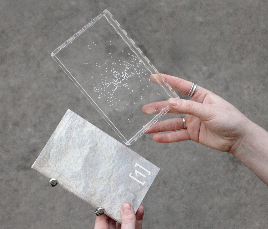
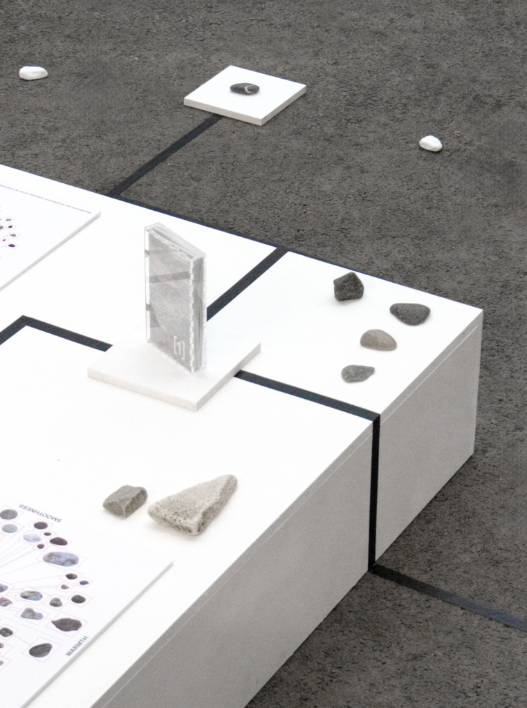
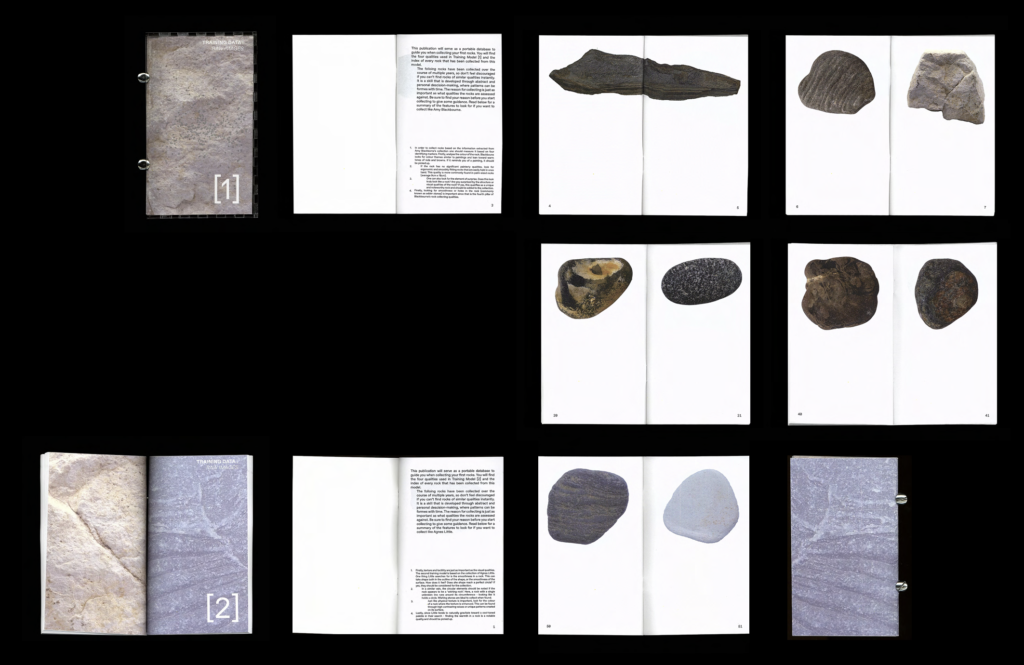
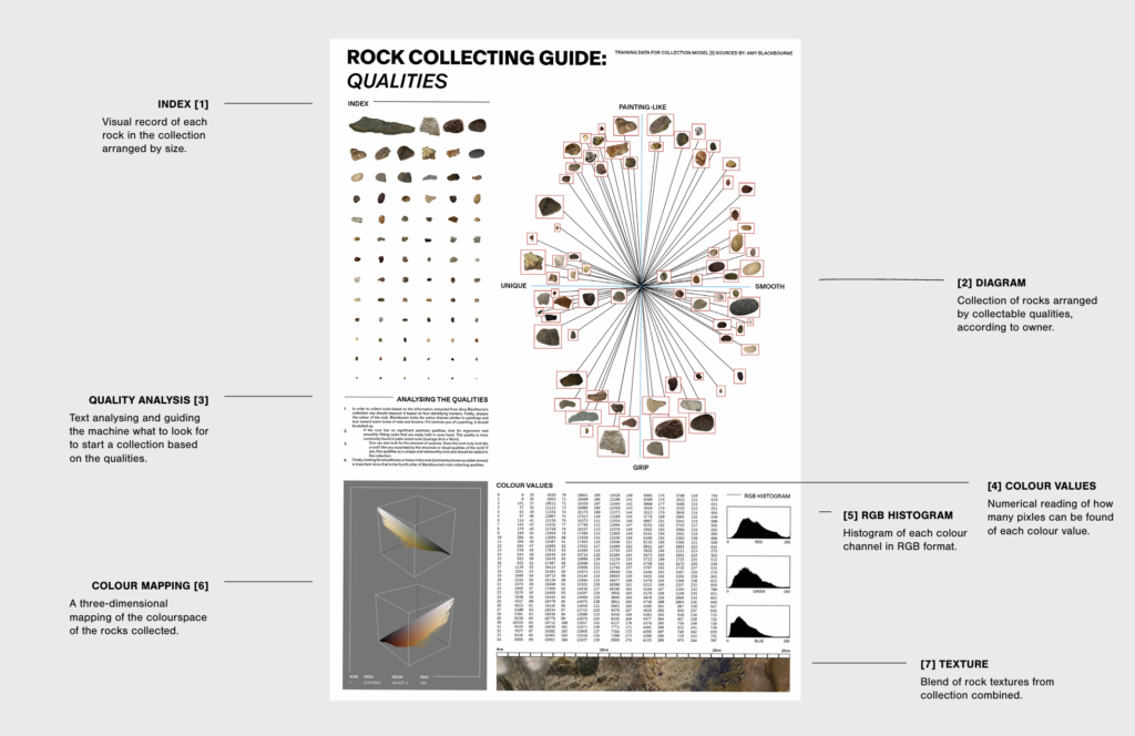
This project is an observation on our desire to make machines more human in order to understand them – but what would it look like to teach them sentimental human habits in their own language?
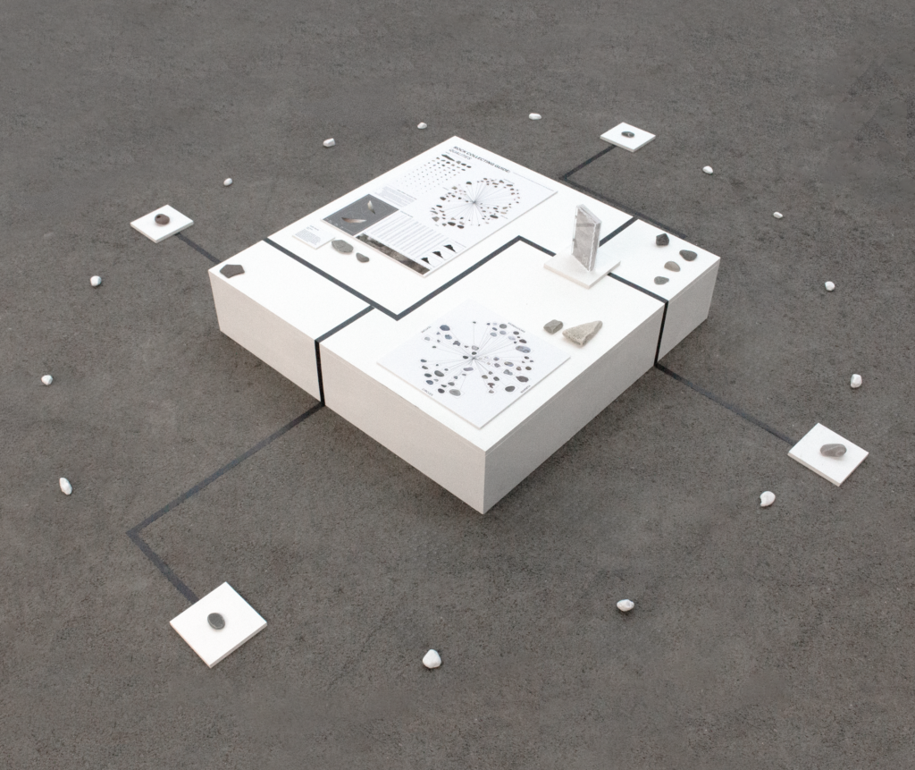
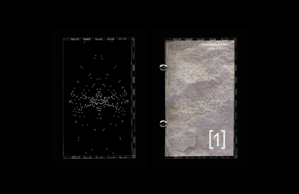
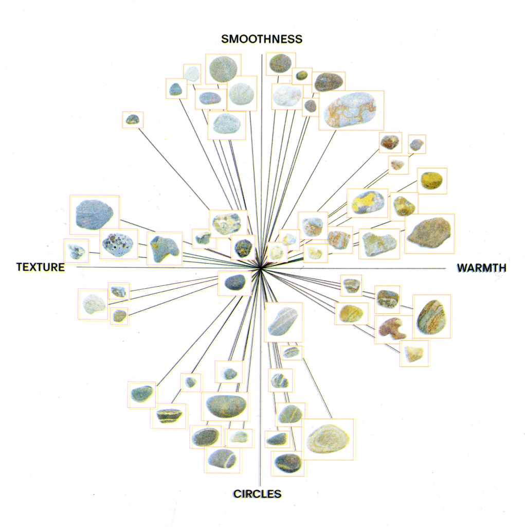
This work is a visual guide for a (hypothetical) machine attempting to learn the human habit of rock collecting. The presentation is a breakdown and analysis of real rock collections to identify markers for what humans are drawn to, and how this can differ for each collector. By following this guide, one should have all tools necessary to start their own rock collection and ultimately become more human.
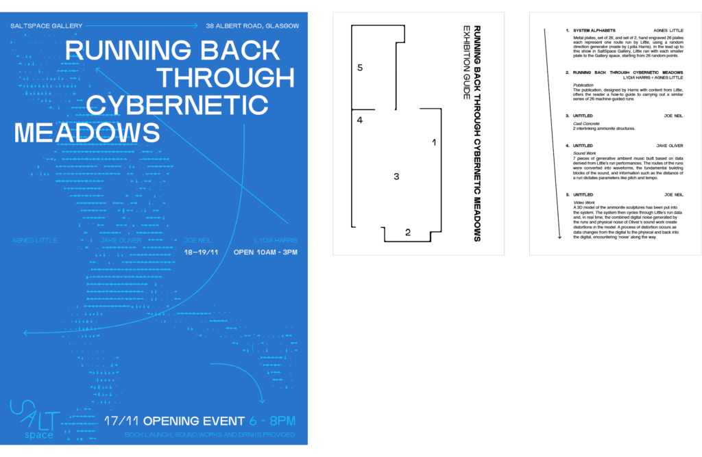
Running Back Through Cybernetic Meadows
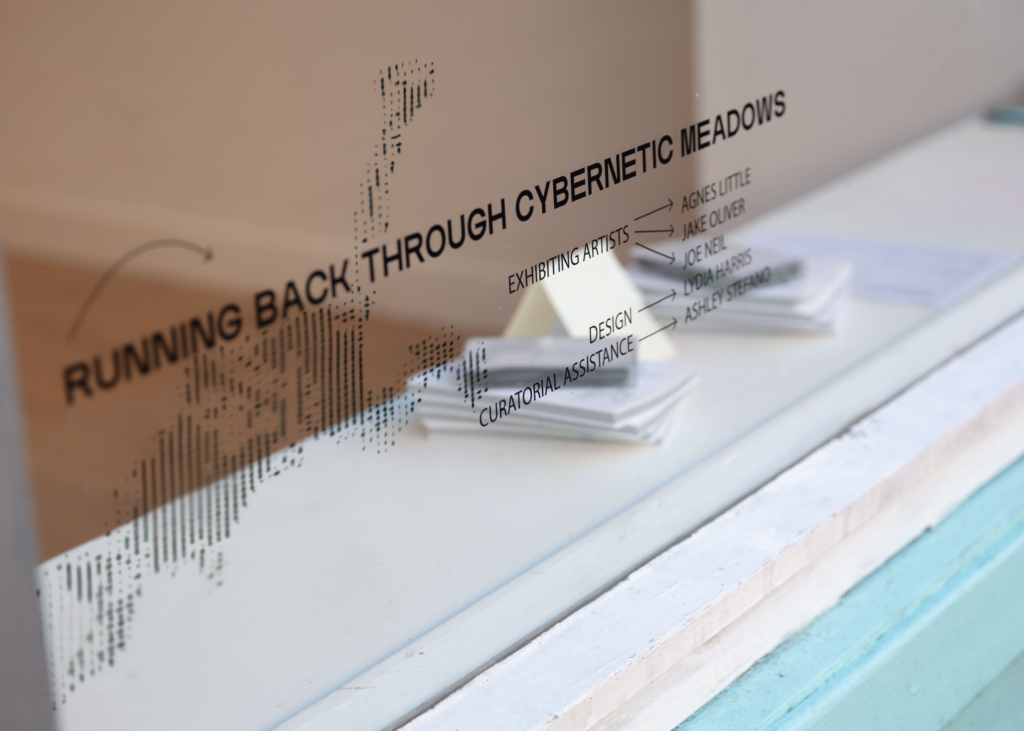
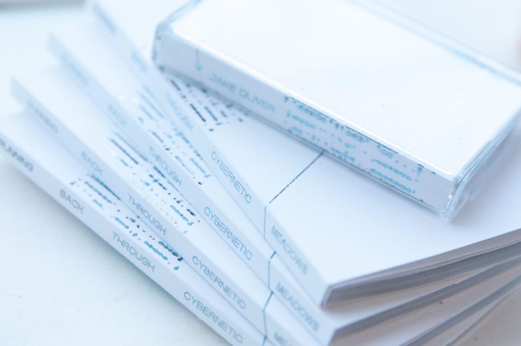
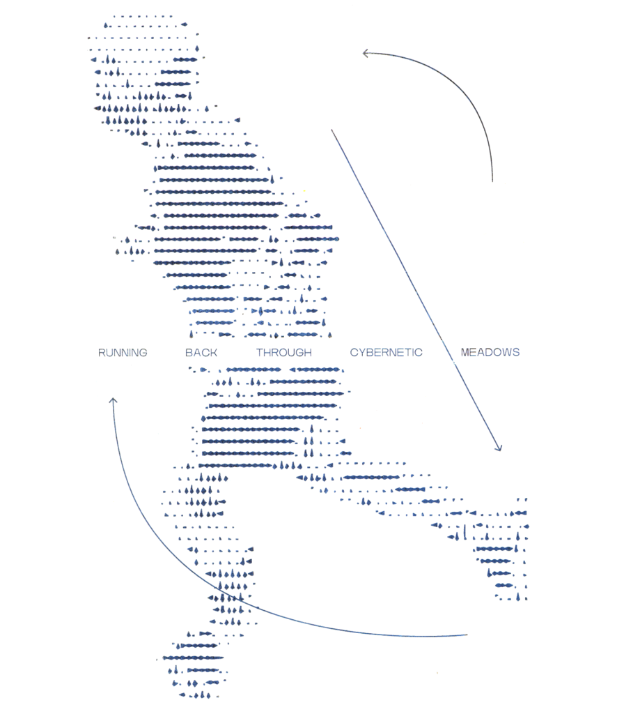
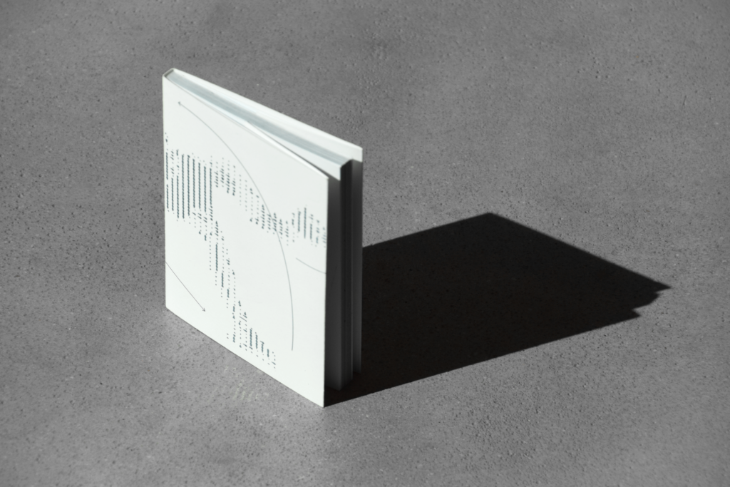
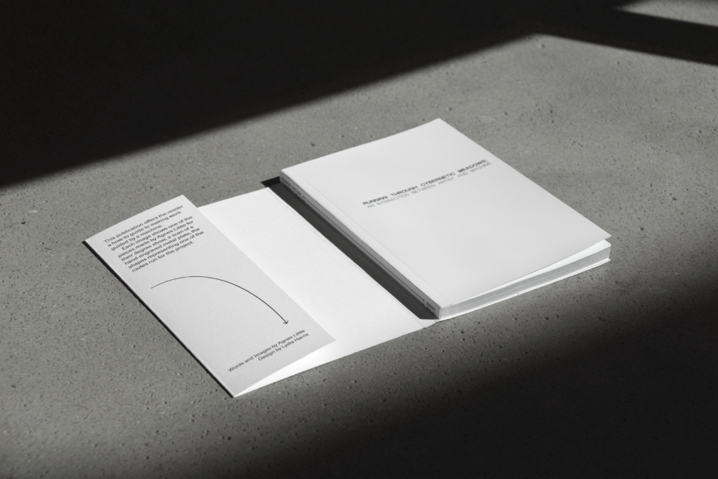
Artist book and exhibition identity for group show Running Back Through Cybernetic Meadows at Saltspace (November 2025) featuring work from Agnes Little, Joe Neil and Jake Oliver, examining feedback loops and iterative work through each artists’ voice.
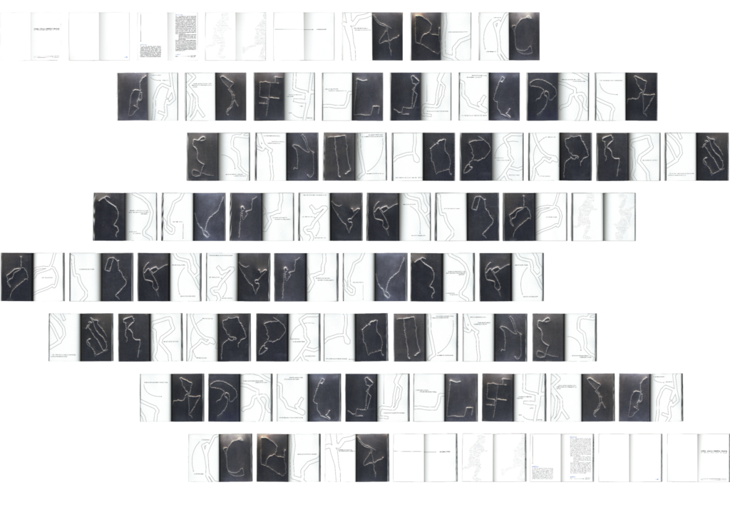
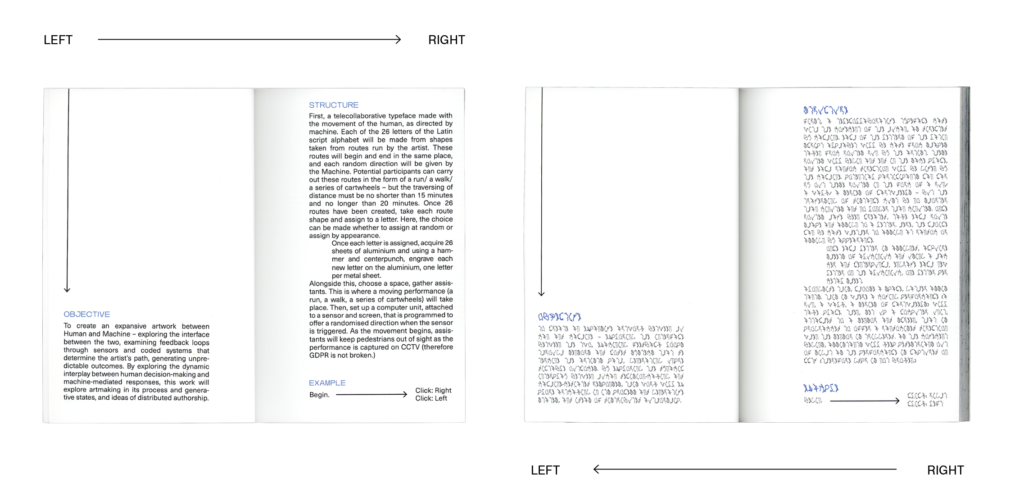
The publication is a record of 26 machine-guided runs and fragmented writing paced throughout the pages written by Agnes Little. It can be read from both ends – mirroring itself, with one direction legible and the other written with letterforms from the runs.

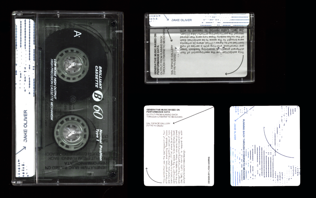
For Sale: Limited copies of publications and cassette tapes available on request