Tegan Ward-Tefft
(she/her)
With particular focus on the tactility of print, my work is rooted in experimental process. Moving between analogue and digital experimentation, I find joy in the act of making as much as the final application. I am fascinated by materiality, engaging in design that can be touched, held, and physically experienced.
“4’33″” (Four Minutes and Thirty-Three Seconds) and As Light As Sound
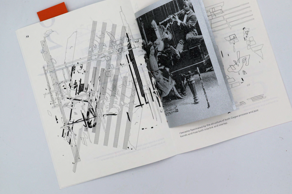
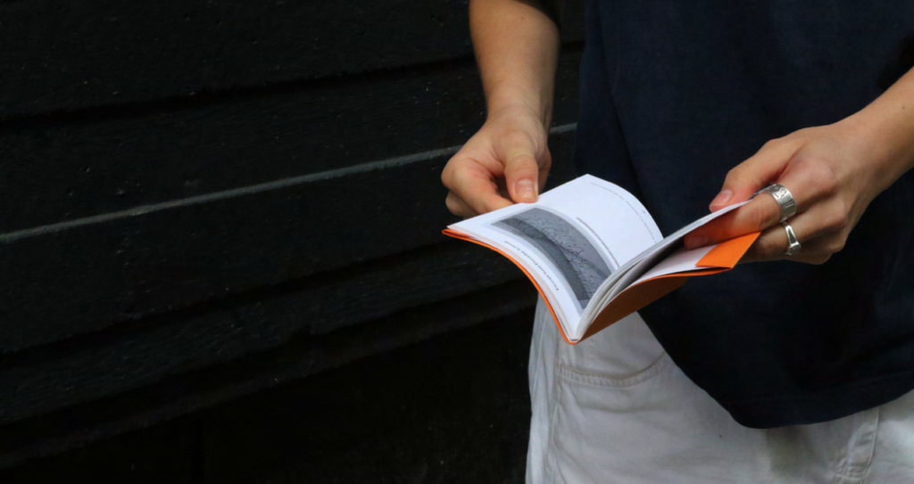
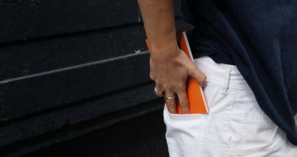
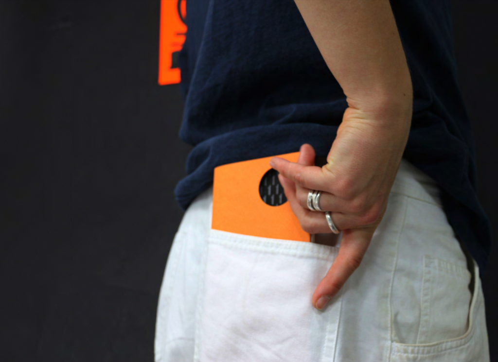
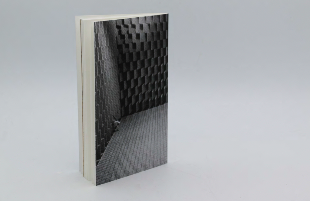
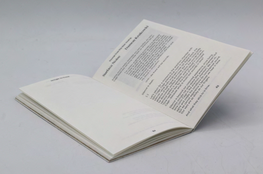
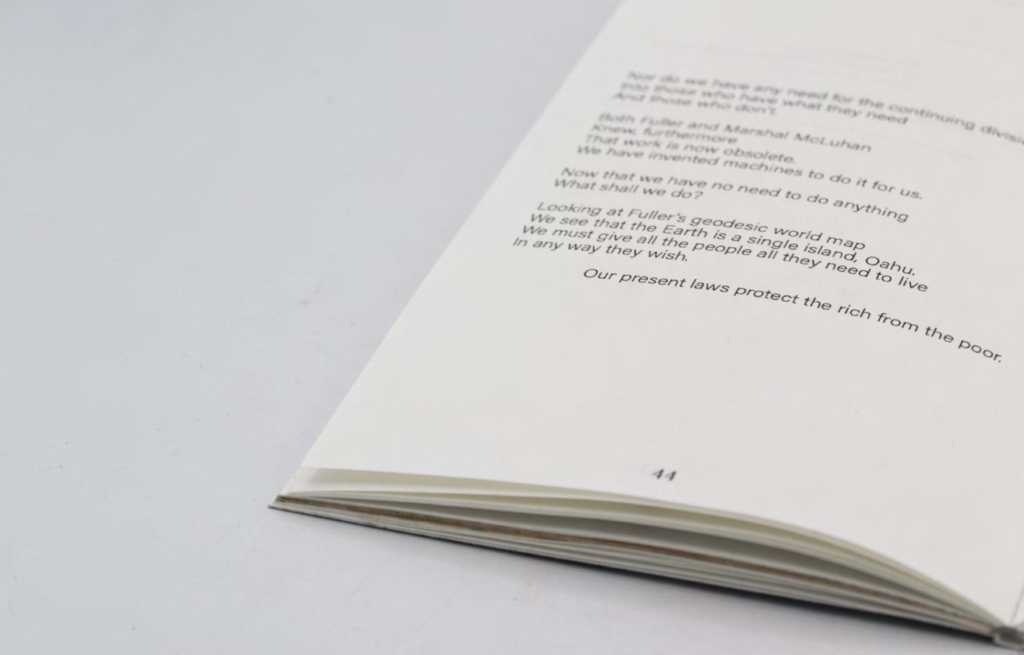
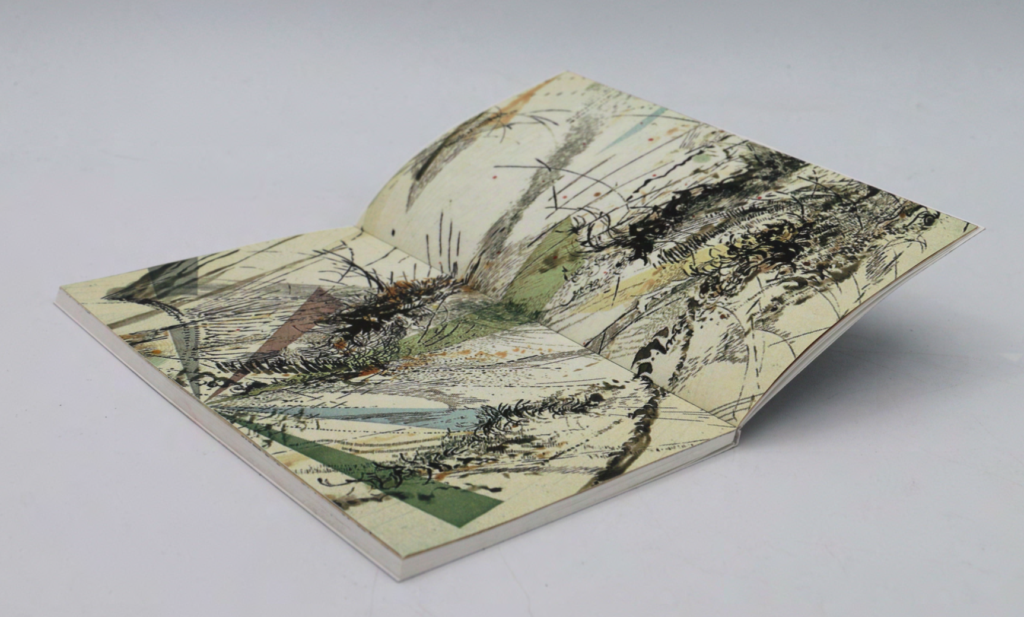
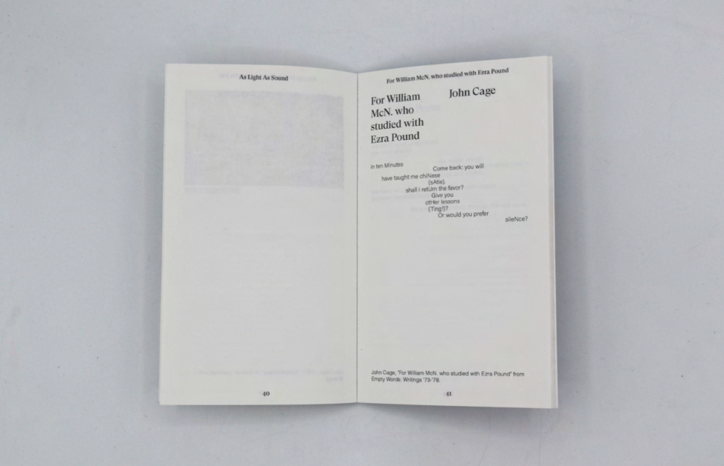
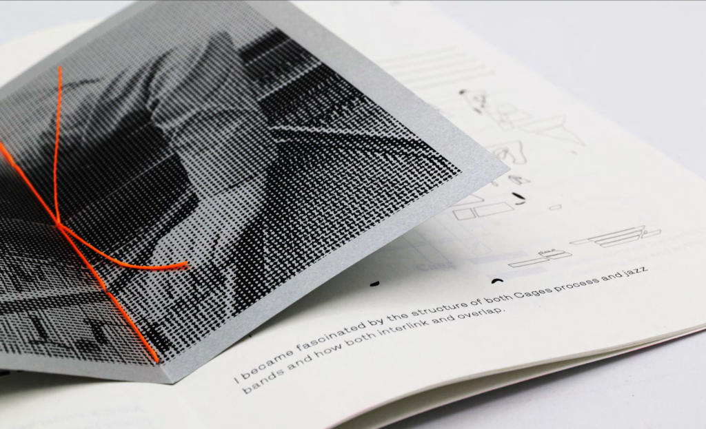
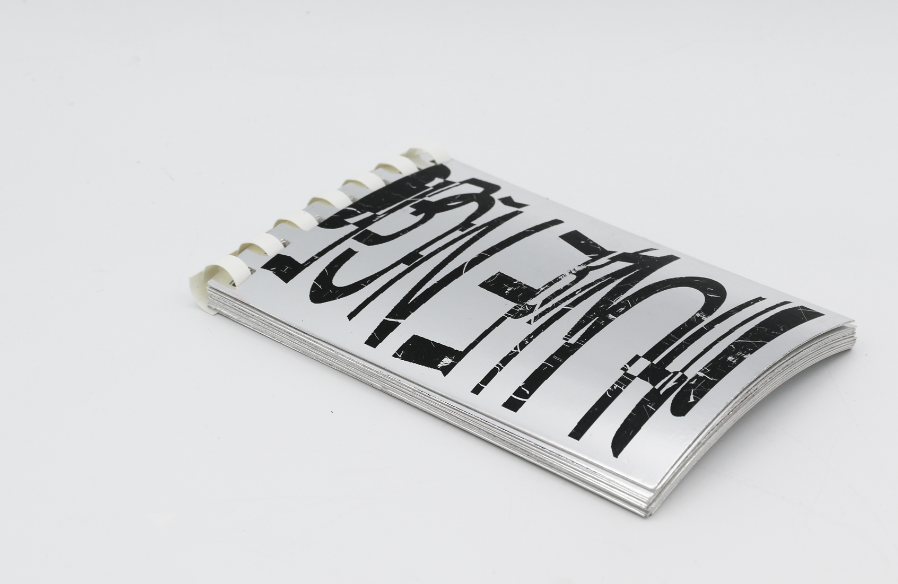
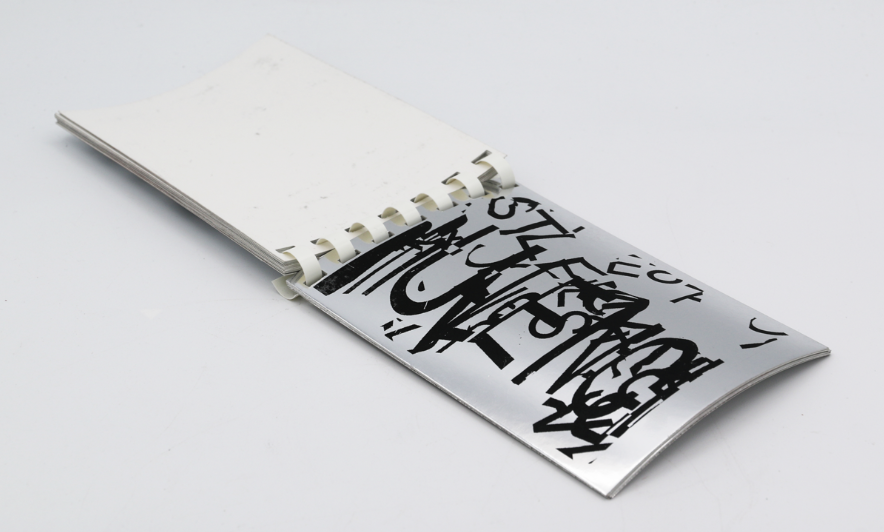
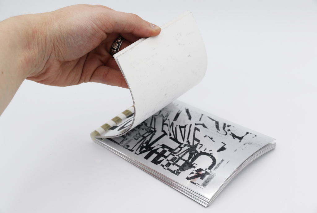
Stemming from my Typographic Jazz project, As Light As Sound is a compilation of selected works written about John Cage with accompanying artworks and graphic notations. Pocket-sized, printed and bound in-house, the book enables the philosophy of Cage to be carried everywhere, as light as sound. This format echoes the frameworks for design composition used in Typography Jazz, inspired by Cage’s experimental approach, which I carried with me throughout the entire creative process. Borrowing its title from John Cage’s seminal silent composition—where ambient environmental sounds become the music—”4’33″” (Four Minutes and Thirty-Three Seconds) accounts and contextualises the process behind Typographic Jazz. The digital illustrations are visualisations of improvisational jazz on a music score and the “white space” in the layouts acts as the ambient room noise in these compositions. Both publications exist to contextualise both my process and research surrounding Typographic Jazz and John Cage.
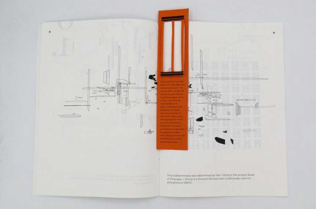
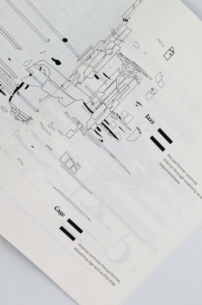
Typographic Jazz
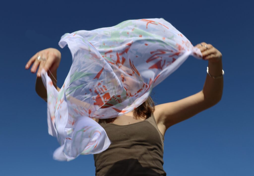
This project began as a response to jazz music, graphic notations and the hierarchy of jazz band structure. From riso animation to fabric design, this project enabled endless forms of experimentation, leading to multiple applications of design.
Inspired by composer John Cage’s systems of indeterminacy, chance operations and removing the ego, I created frameworks where the process of generating the design existed through randomness and improvisation– the outcomes prioritising interaction between the viewer and the piece, much like a composer and orchestra or the music and listener.
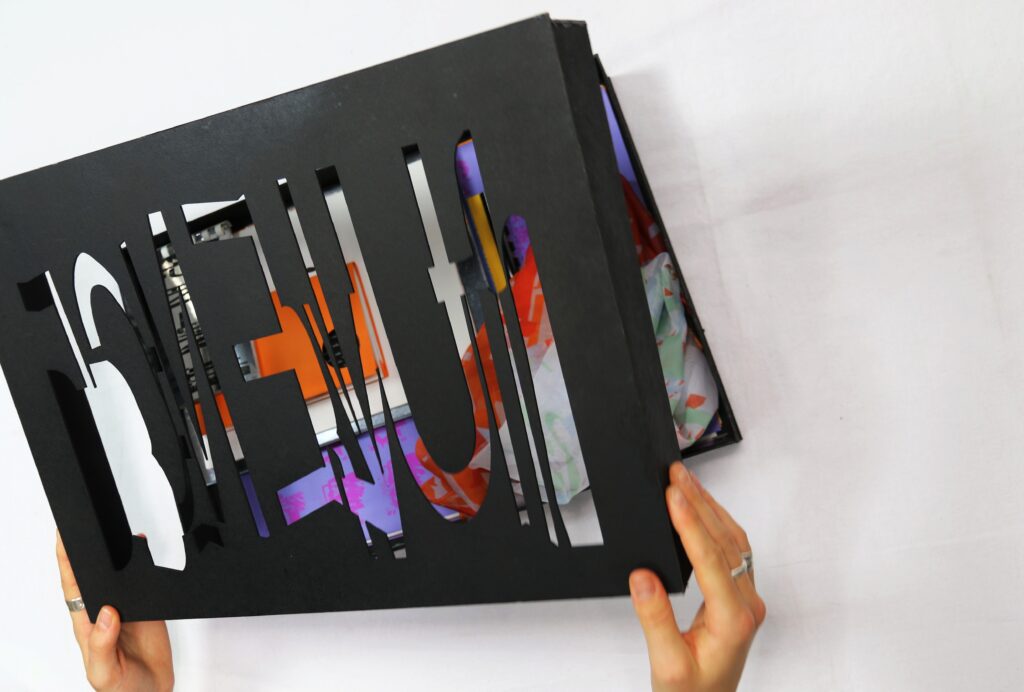
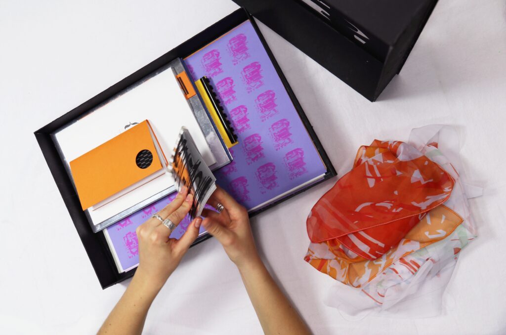



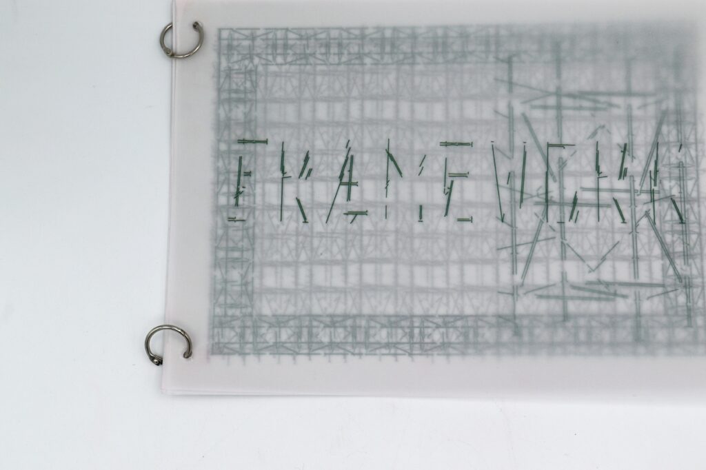
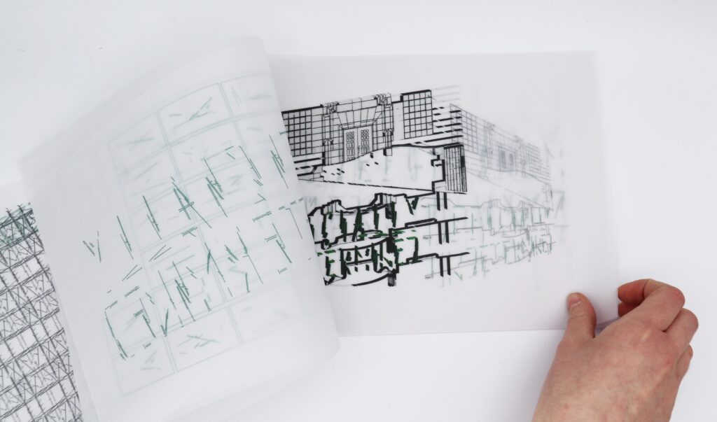
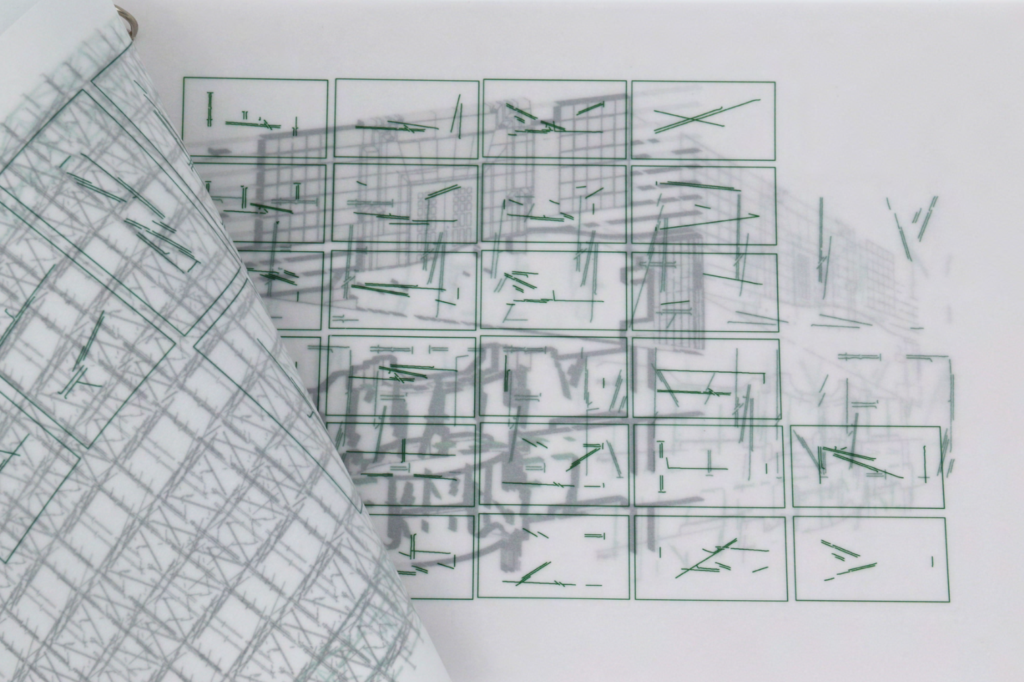
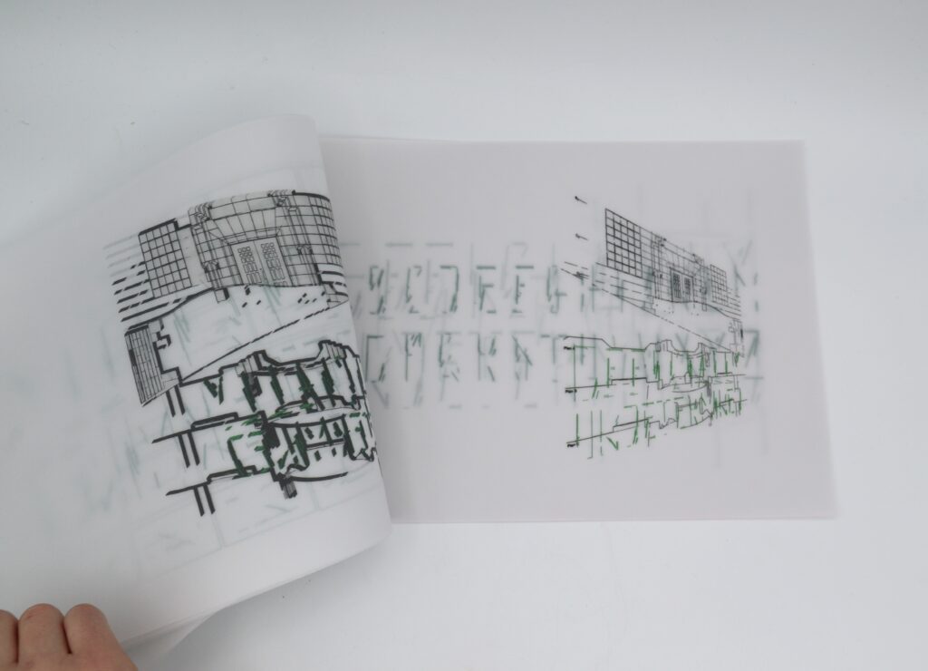
Framework
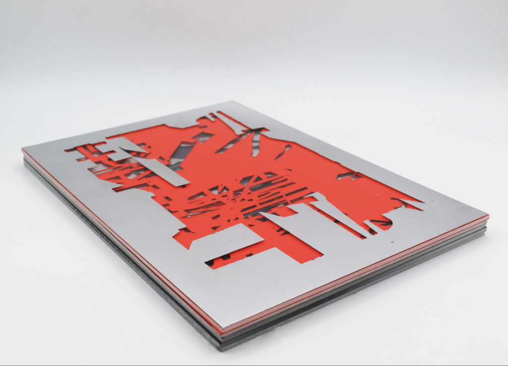
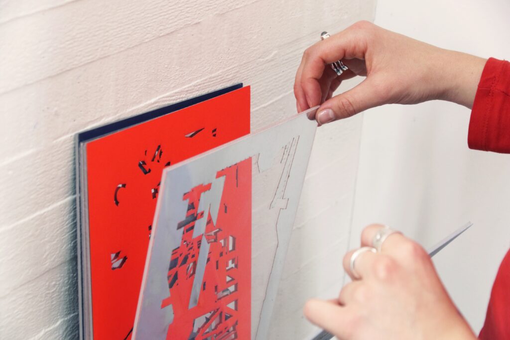
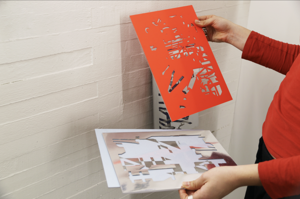
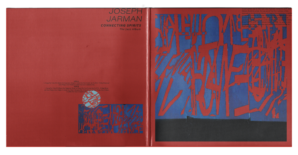
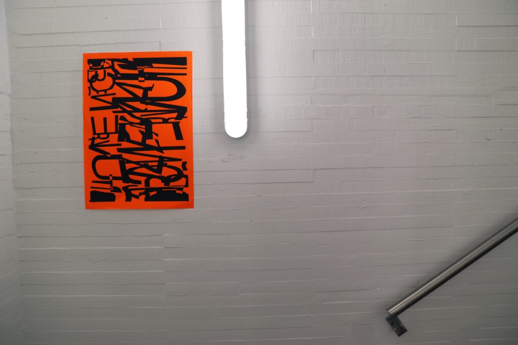
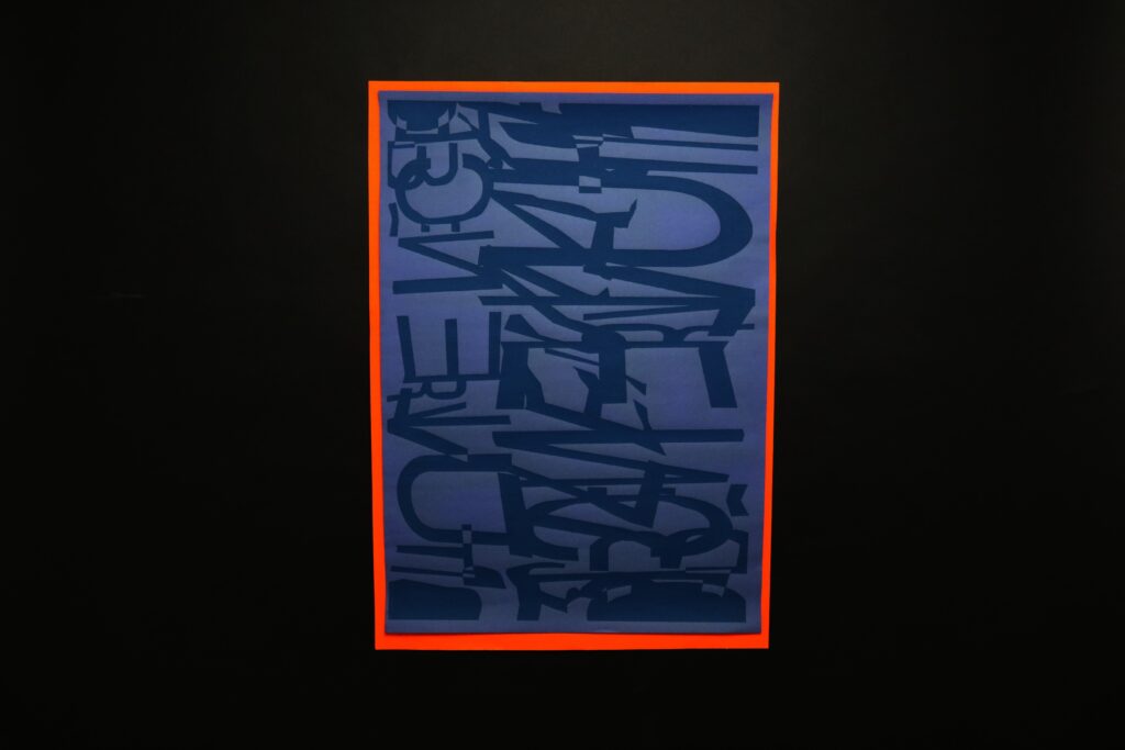
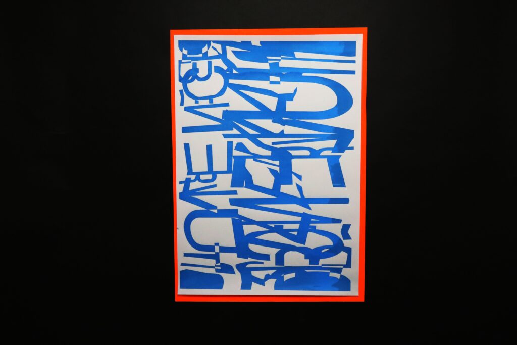
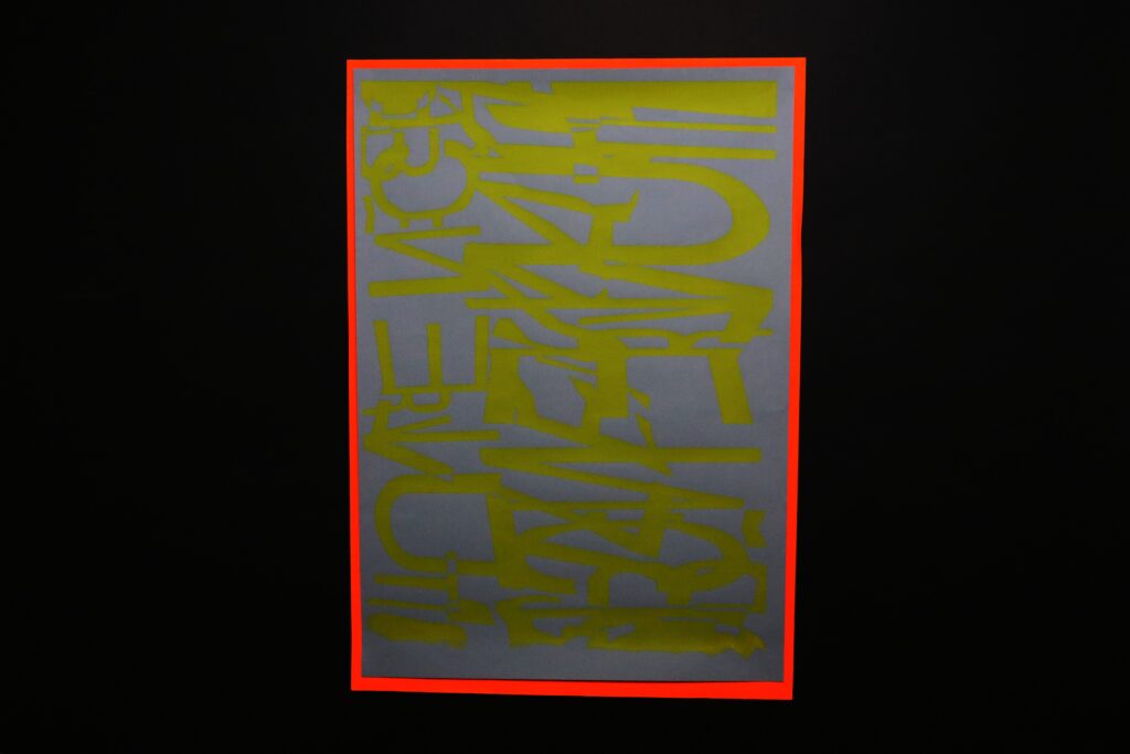
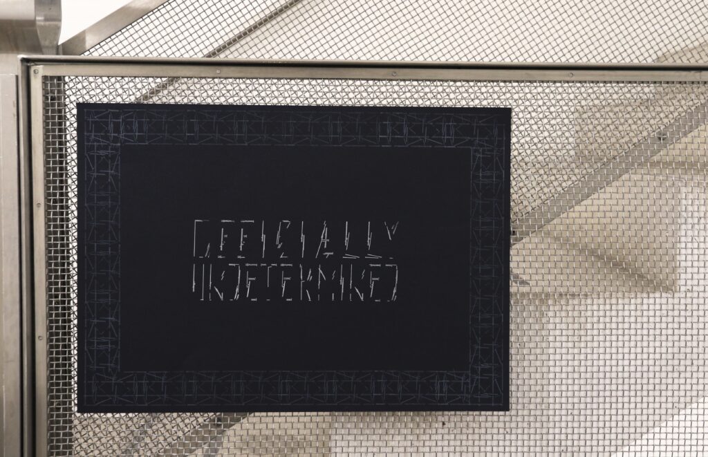
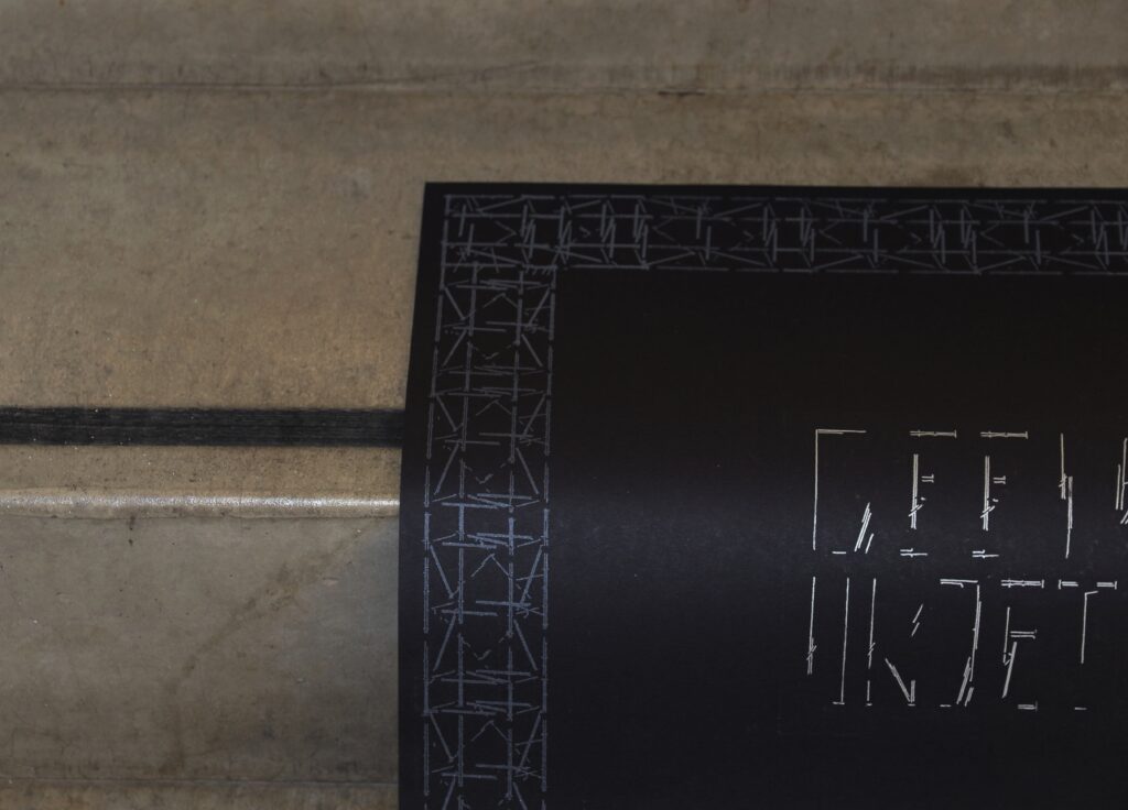
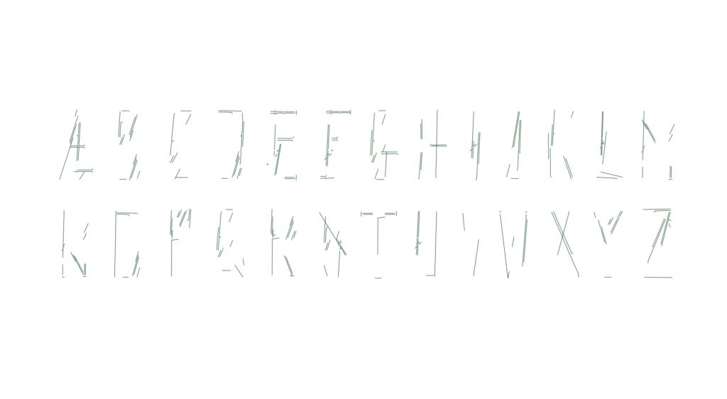
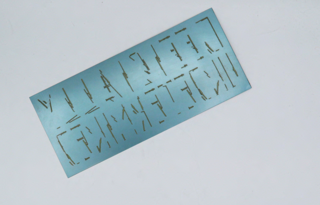
Framework began with an investigation of the warped woodblocks in the caseroom. Damaged by the 2018 fire, its cause was left ‘officially undetermined’, and the letters are unable to run through the press. In response, the project’s lettering mirrors the scaffolding that now envelops the building, framing it as an architectural form itself. By translating these letters into a printable photopolymer plate, the work returns to the letterpress, grounding the project where it began.
Corner
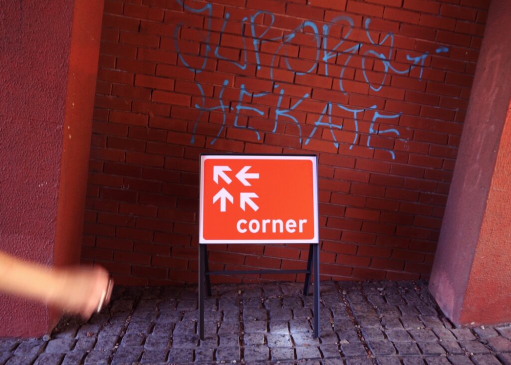
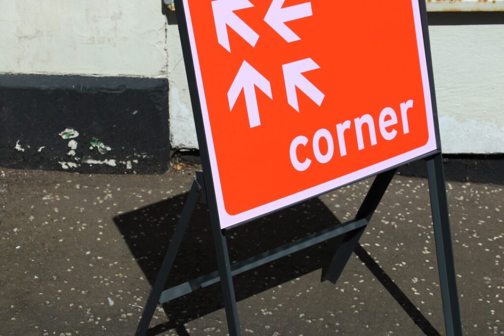
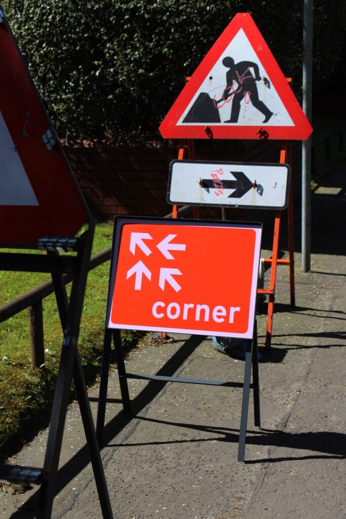
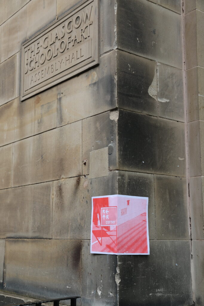
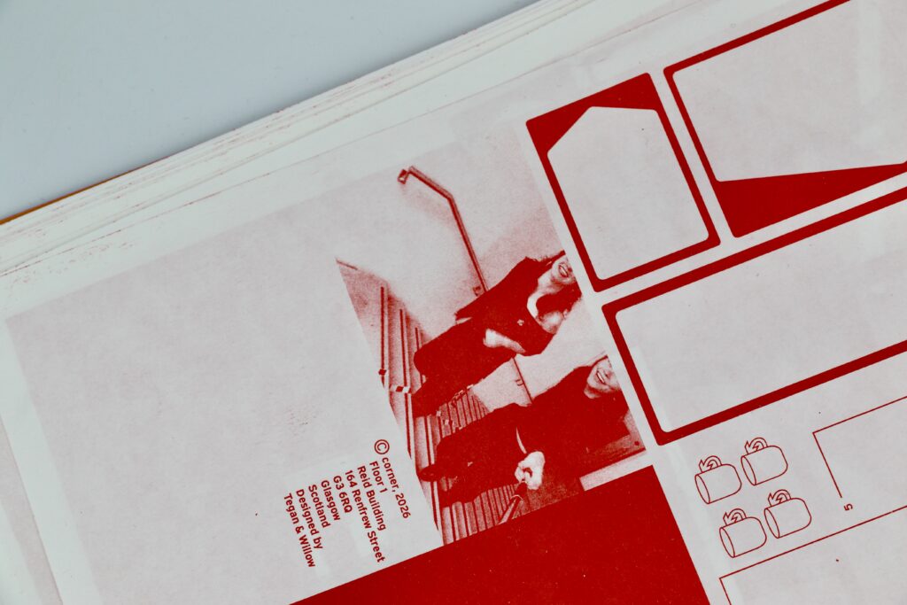
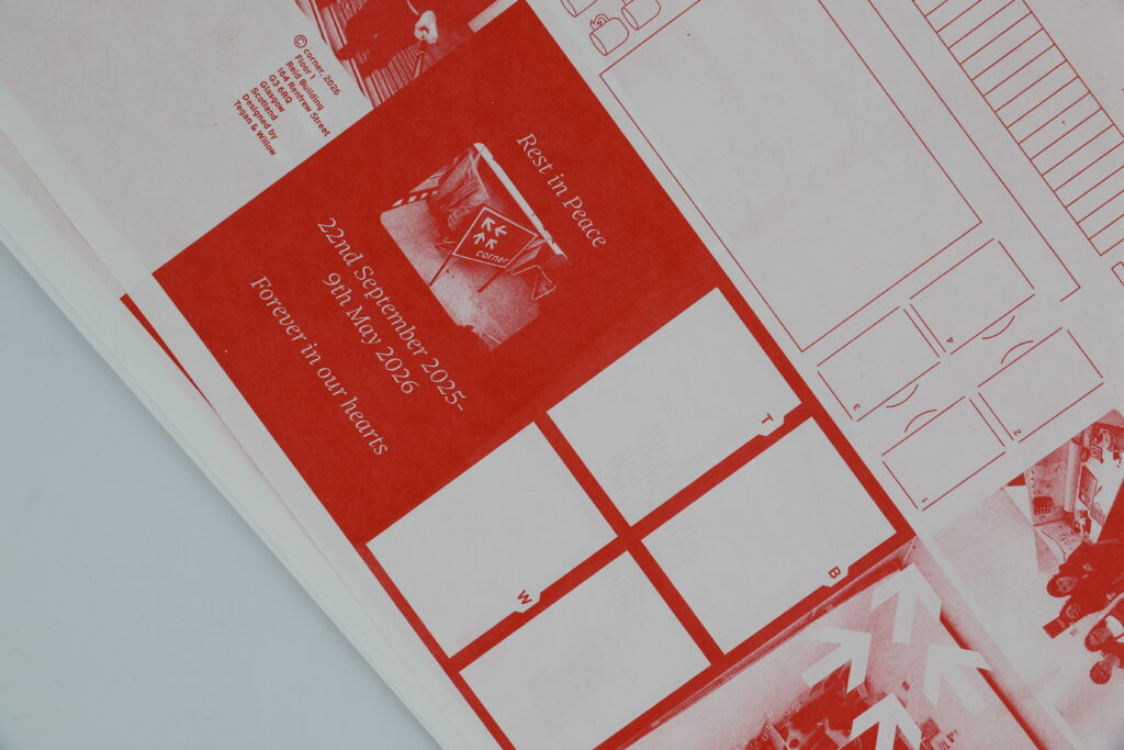
This collaborative project was developed as an ode to studio culture. A playful brief that combined both of our styles and lateral thinking, we developed an identity for our corner of the studio– a road sign and zine that provides context for not only the sign, but our experience in the studio in final year.
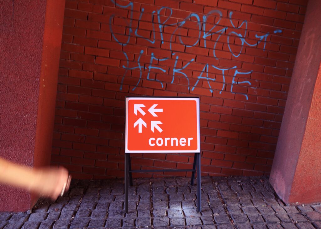
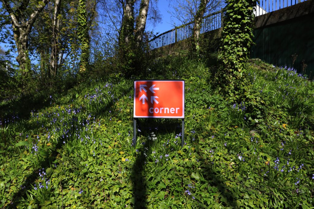
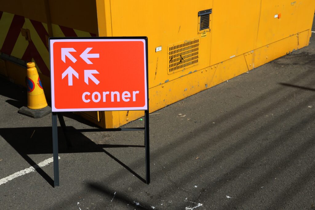
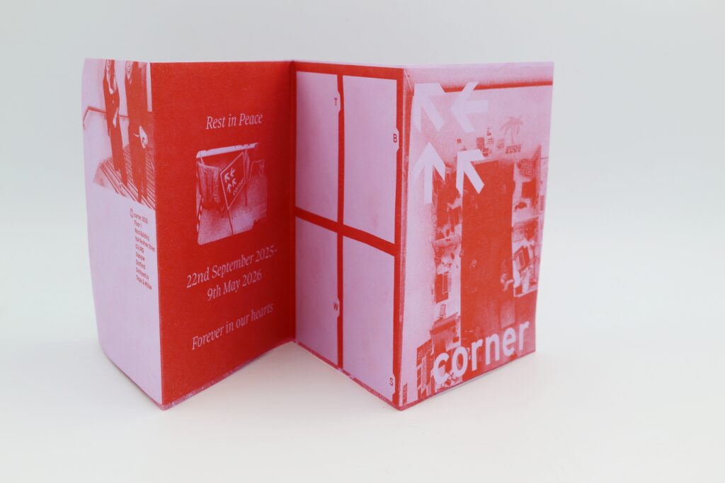
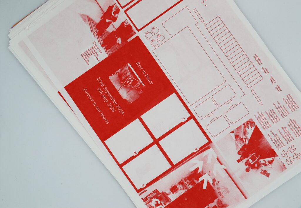
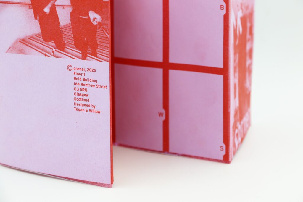
Corner
This collaborative project resulted in a road sign for the identity of our corner of the studio, along with an information leaflet that provides context for the sign. A playful brief that combined both of our styles and lateral thinking, an ode to the studio culture that will be greatly missed.