
Natalie Yong
My design practice lies in crafting brand identities, visual systems and narrative-driven design across physical and digital media. My multidisciplinary approach to design balances research and craft to create thoughtful, compelling work that challenges convention and engages people meaningfully.
My interest in type design has led me to explore letterforms as a vehicle for carrying culture, emotion and voice.
Sensical
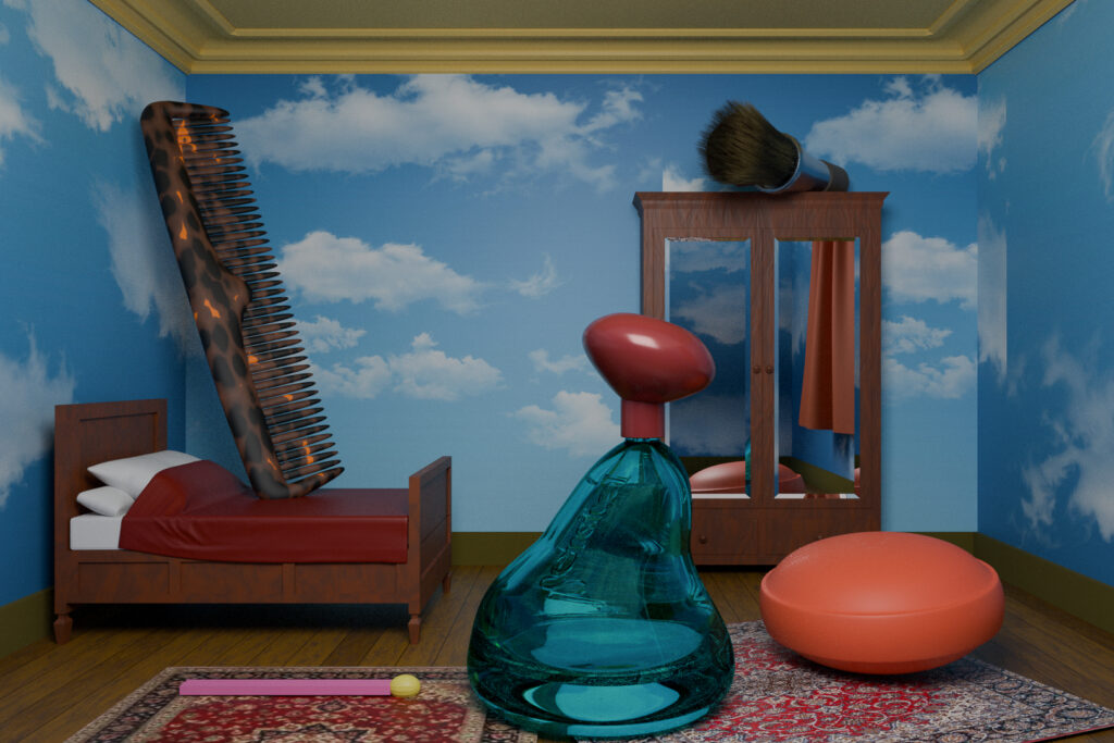
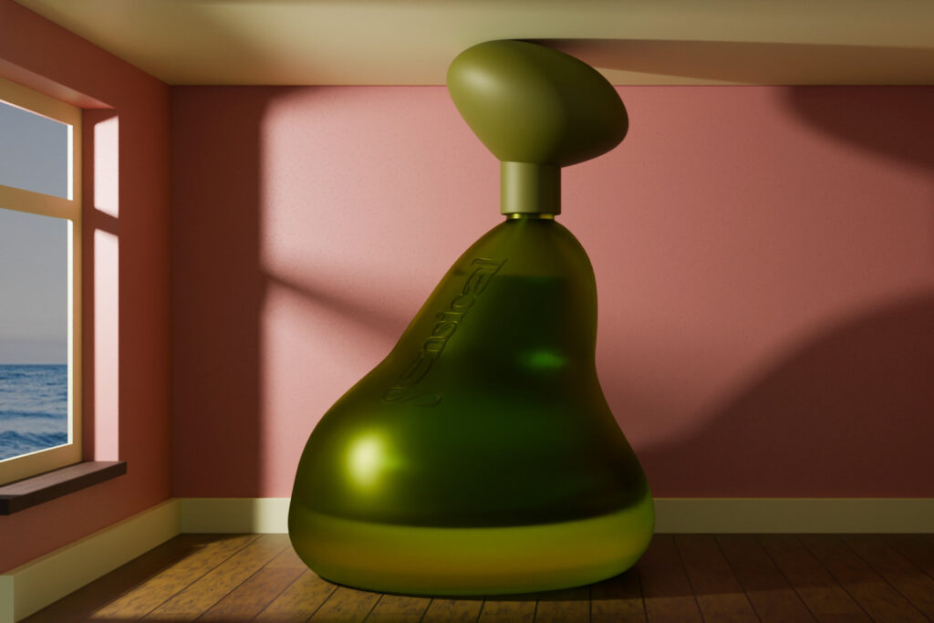
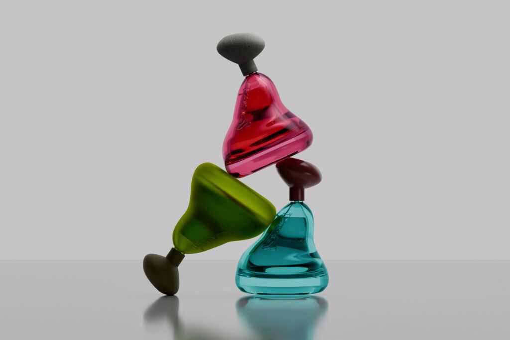
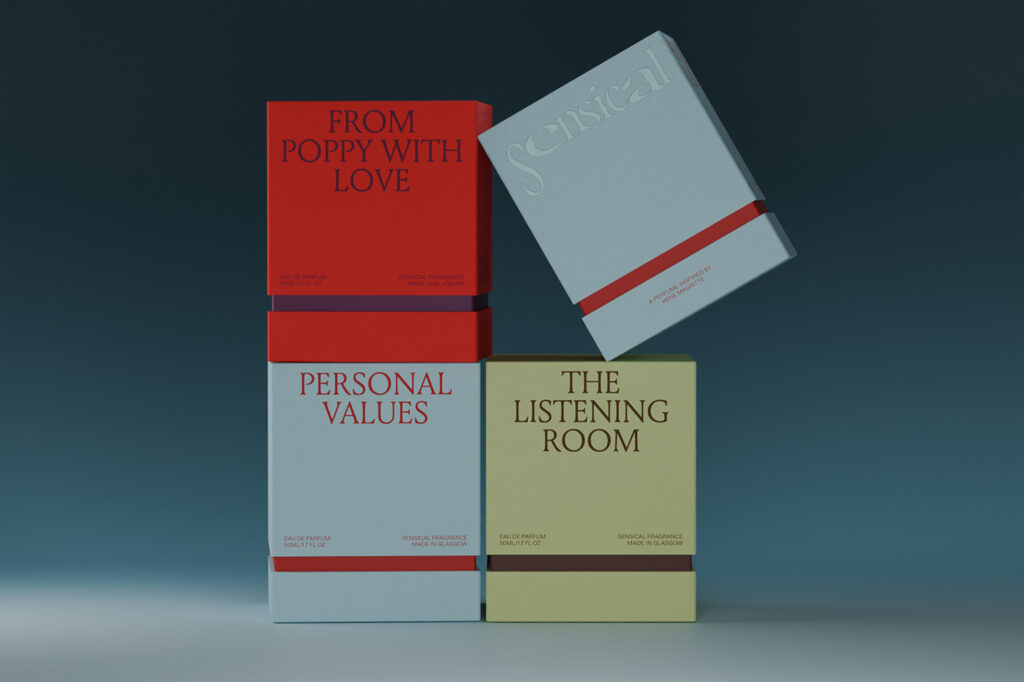
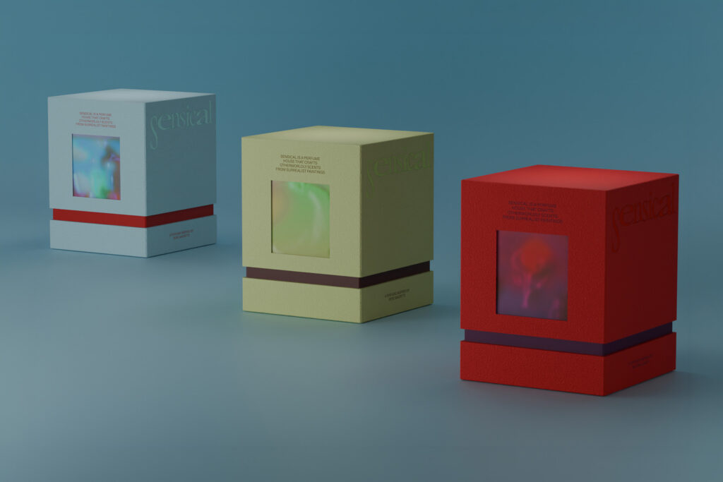
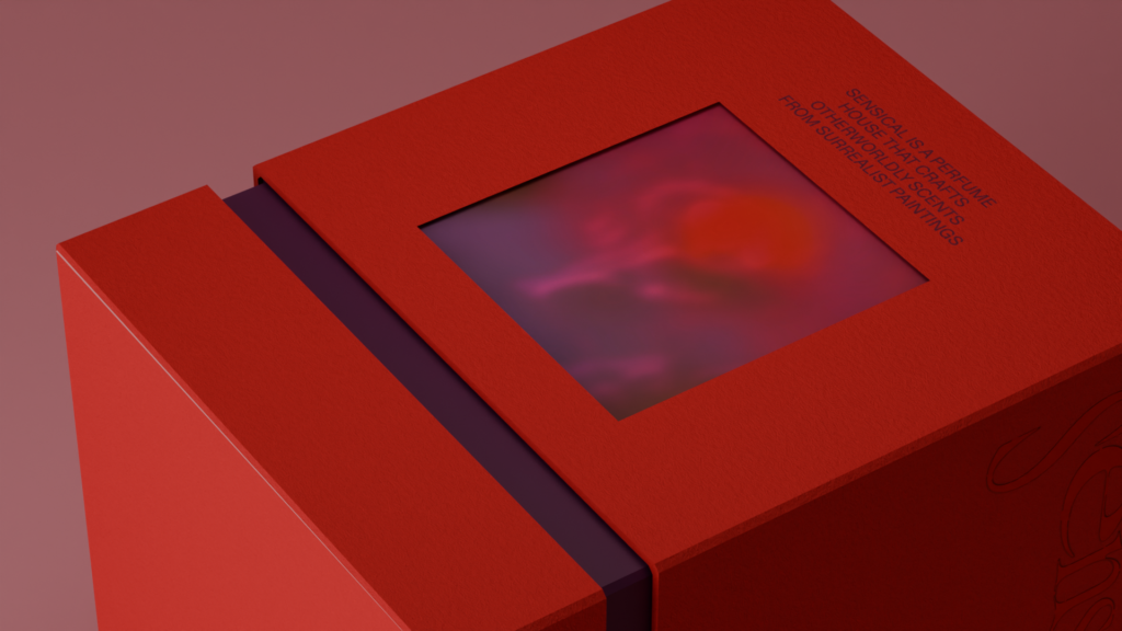
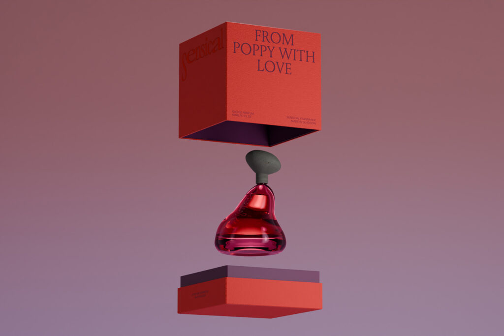
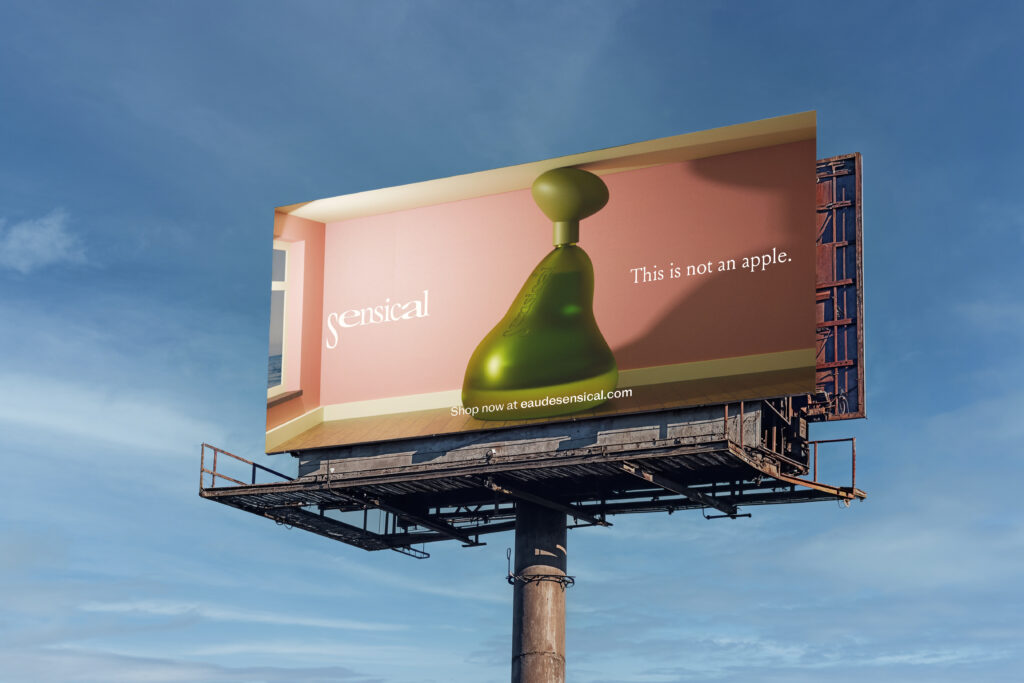
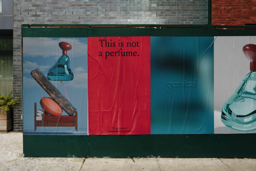
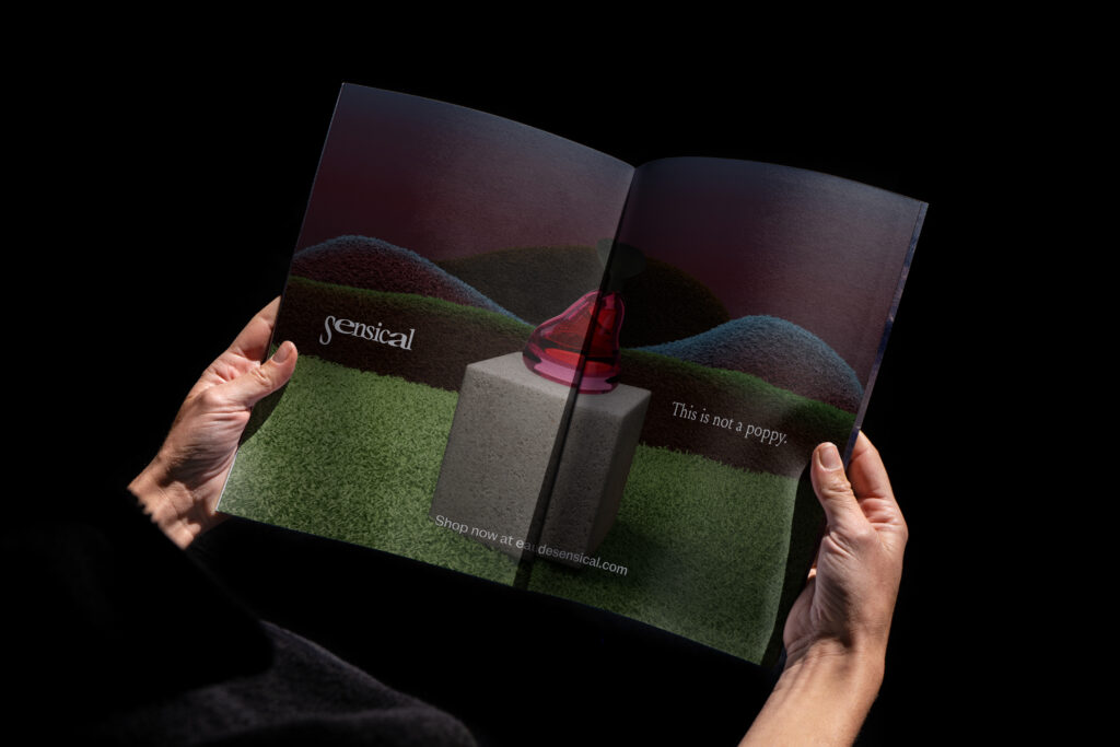
Sensical is a perfume house that crafts scents that should and shouldn’t work. Unexpected accords, contradictory notes, compositions that unsettle before they turn heads. Inspired by the weird and wonderful worlds within Surrealism, each perfume is based off the following paintings: The Listening Room, Personal Values and From Poppy with Love.

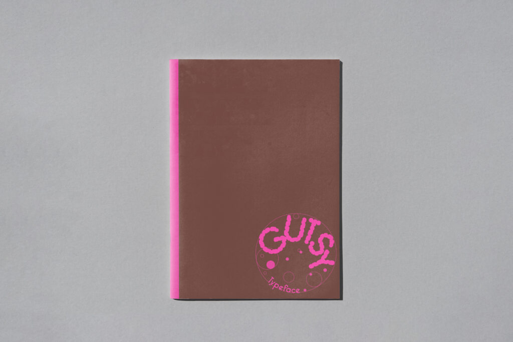
Gutsy
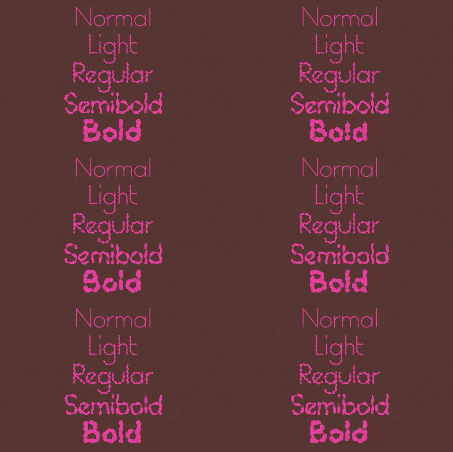
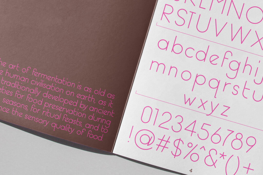
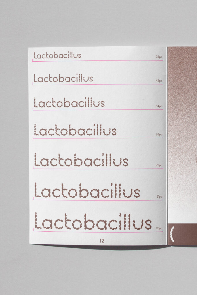
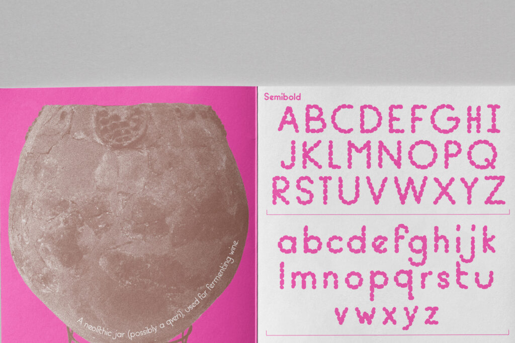
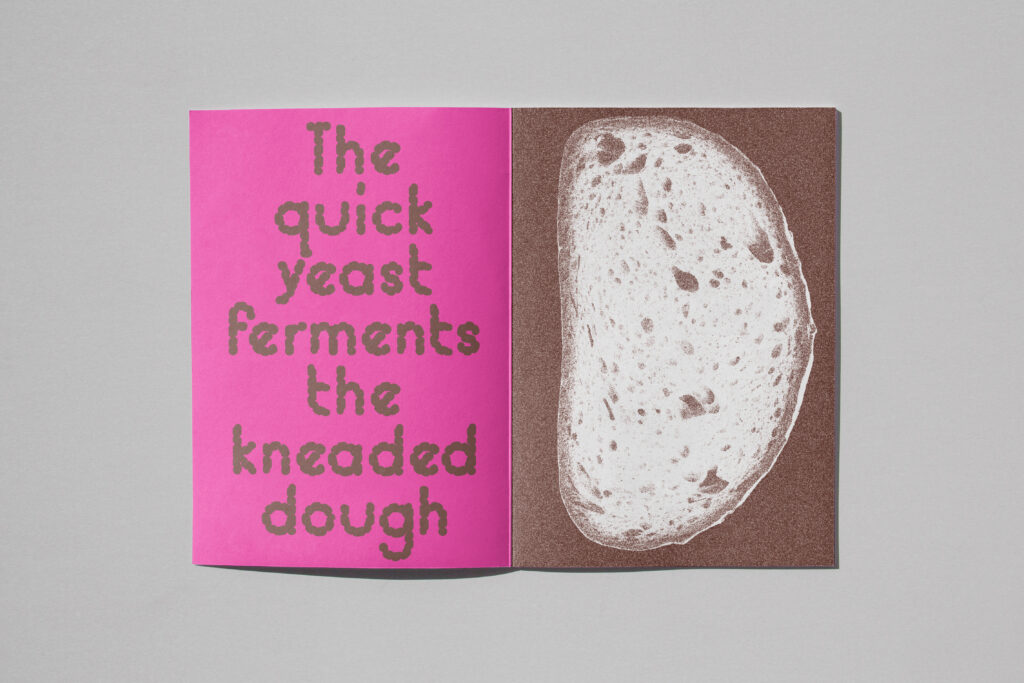
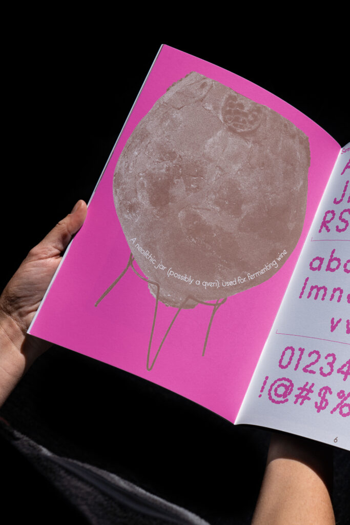
Gutsy is an organic, display typeface inspired by the wild and lively process of fermentation. The letterforms mimic the forms and movement of bacteria. The font comes in 5 different weights: Normal, Light, Regular, Semibold & Bold. Each weight getting progressively thicker, mirroring the stages of a fermentation culture as it matures.
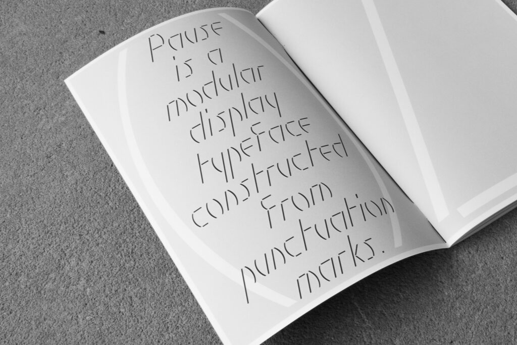
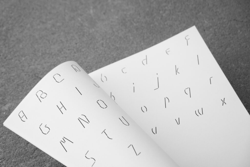
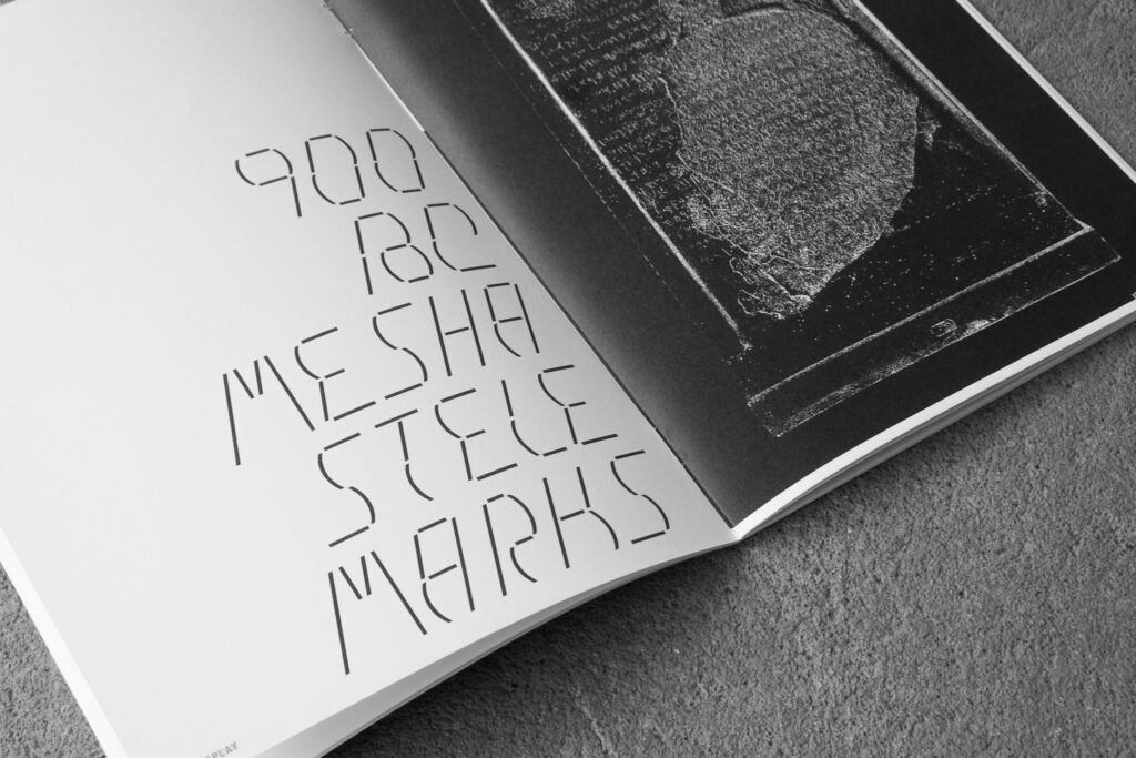
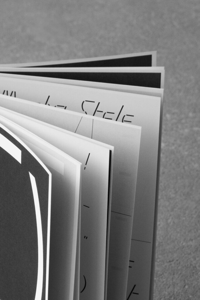
Pause
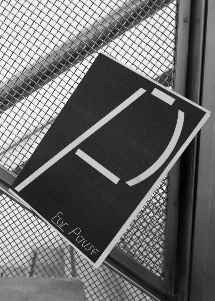
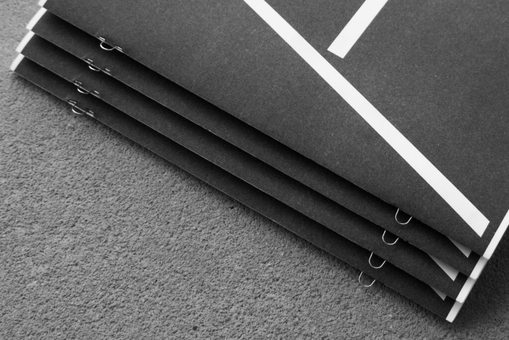
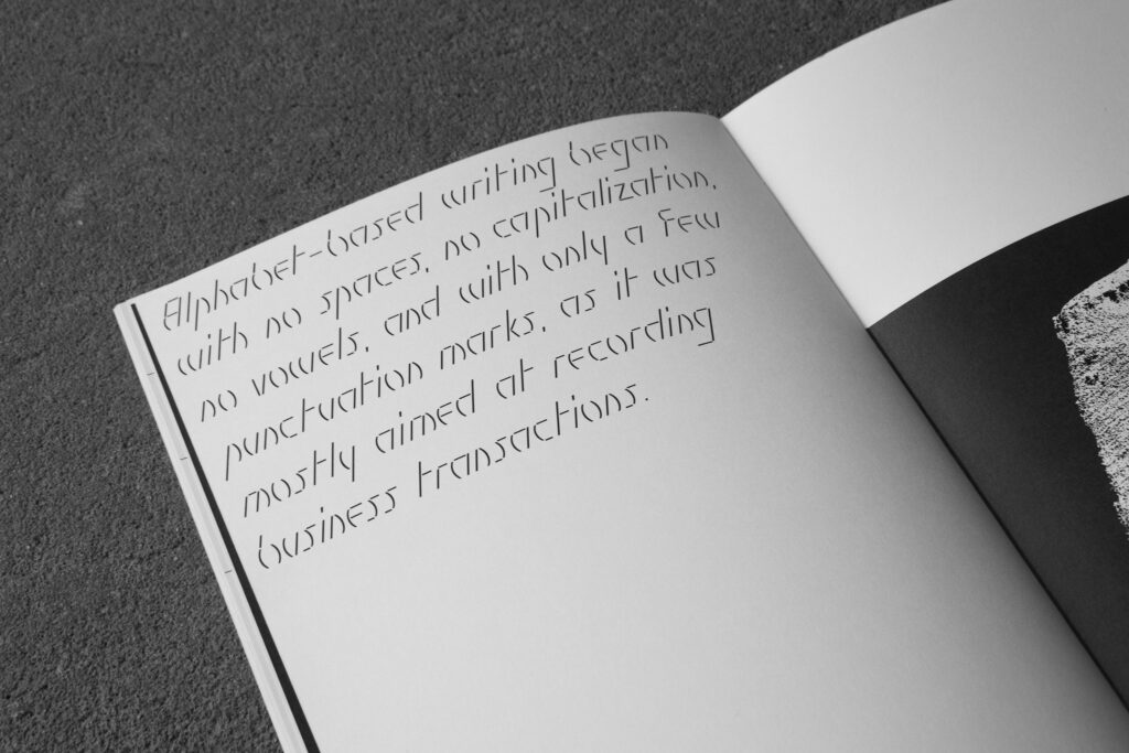
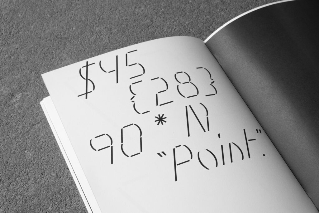
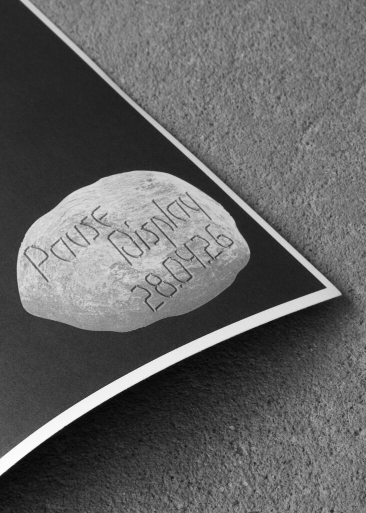
Pause is a modular, display typeface constructed from punctuation marks. This typeface was designed in response to the overlooked role of punctuation in the written language.
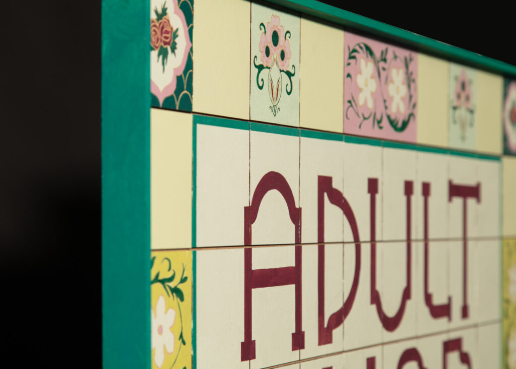
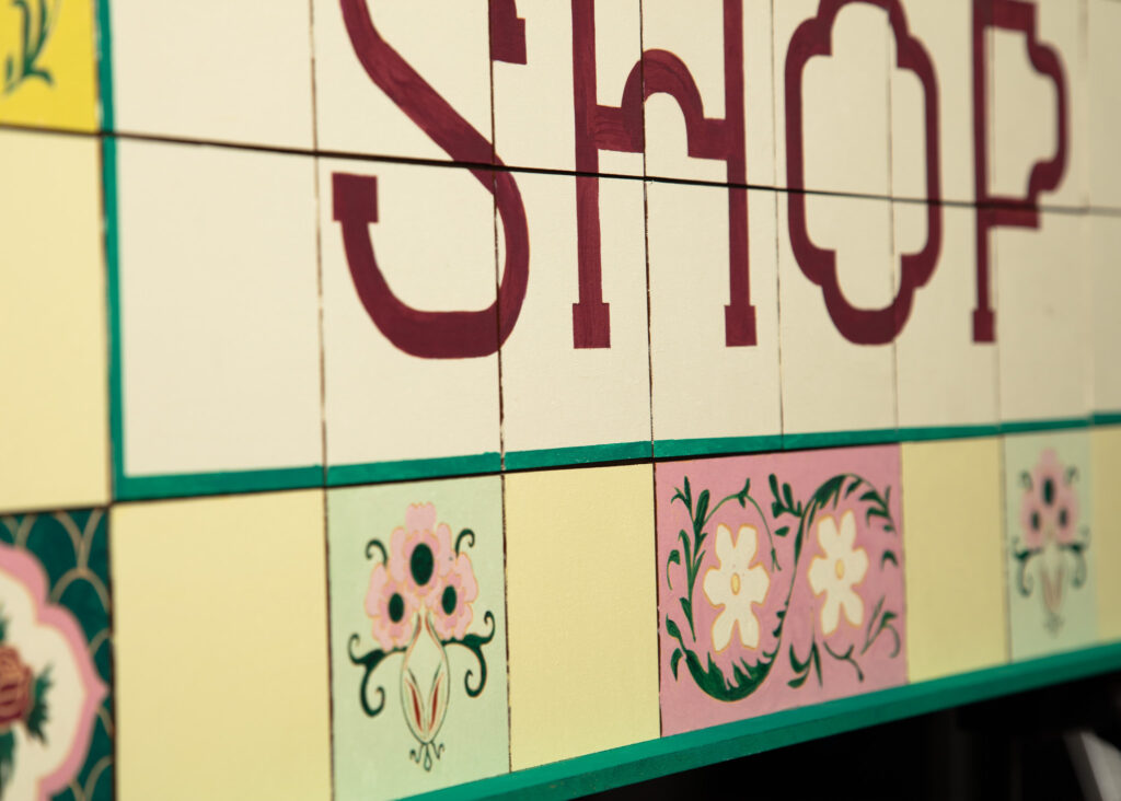
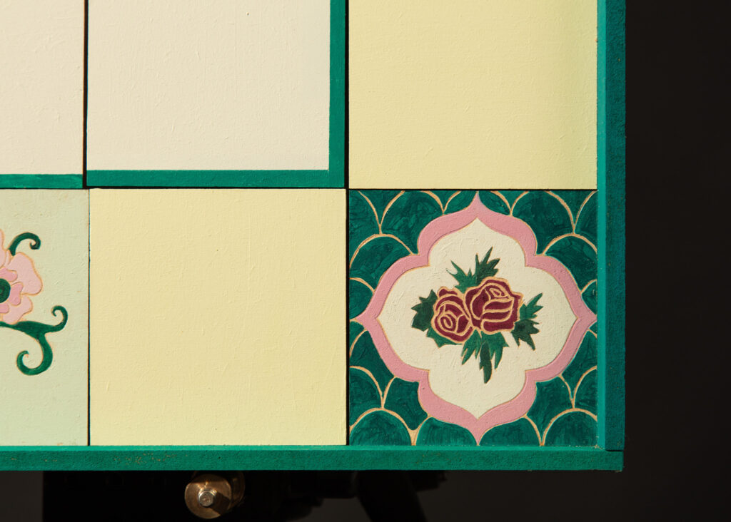
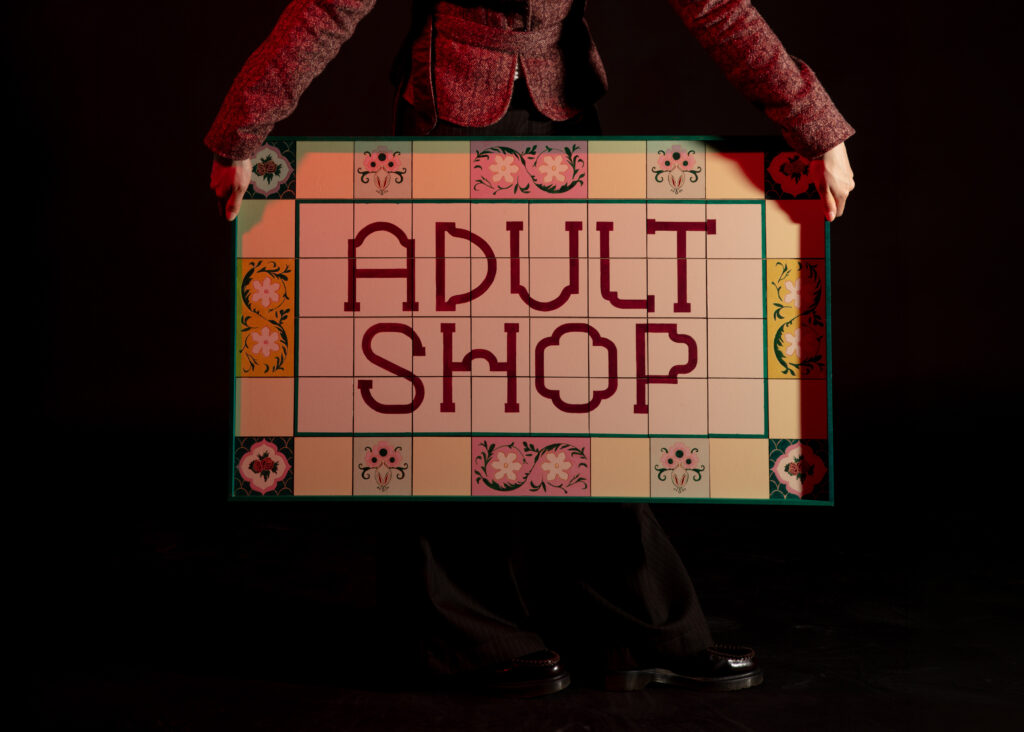
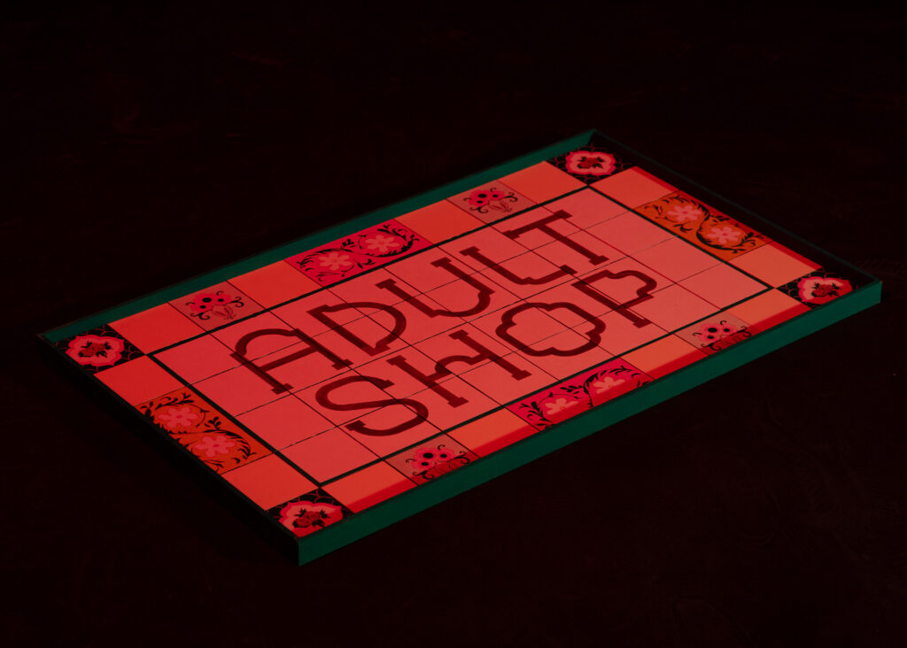
Adult Shop Signage
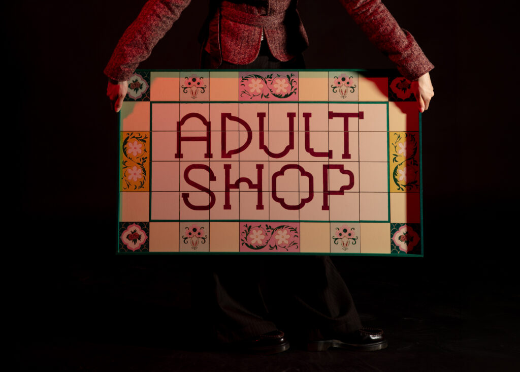
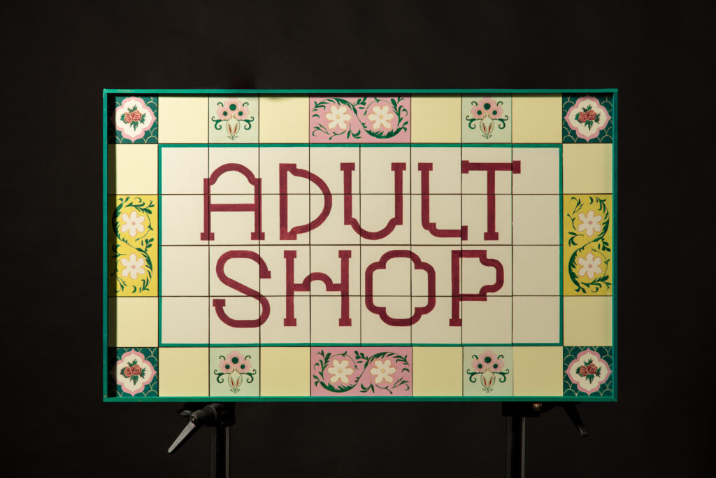
This signage was made in response to my extended essay, The Aesthetics of Geylang. The sign’s visual language is rooted in the Peranakan architecture and tilework of Singapore’s most infamous red-light district. By applying the culturally revered aesthetic to an adult shop, it legitimises sex work by embedding it within the visual language of heritage.
Photo credits: Ross Finnie
For Sale: £180