Hulot
Re-watching one of my favourite films, Playtime, I was inspired to design a typeface based on the themes of this film. Playtime is directed by and stars French comedian Jacques Tati. Playtime follows Monsieur Hulot a bumbling everyman who visits Paris for an appointment only to discover it transformed into a maze of Modernism.
Hulot is comprised of 2 styles, the first takes influence from Neo-Grotesque typefaces such as Univers the second, the popular French typeface, Mistral. Mistral designed by the prolific French type designer Roger Excoffon was an appropriate influence due to its friendly naïvety and unpretentiousness which related strongly to the character of Monsieur Hulot and French comedies as a whole.
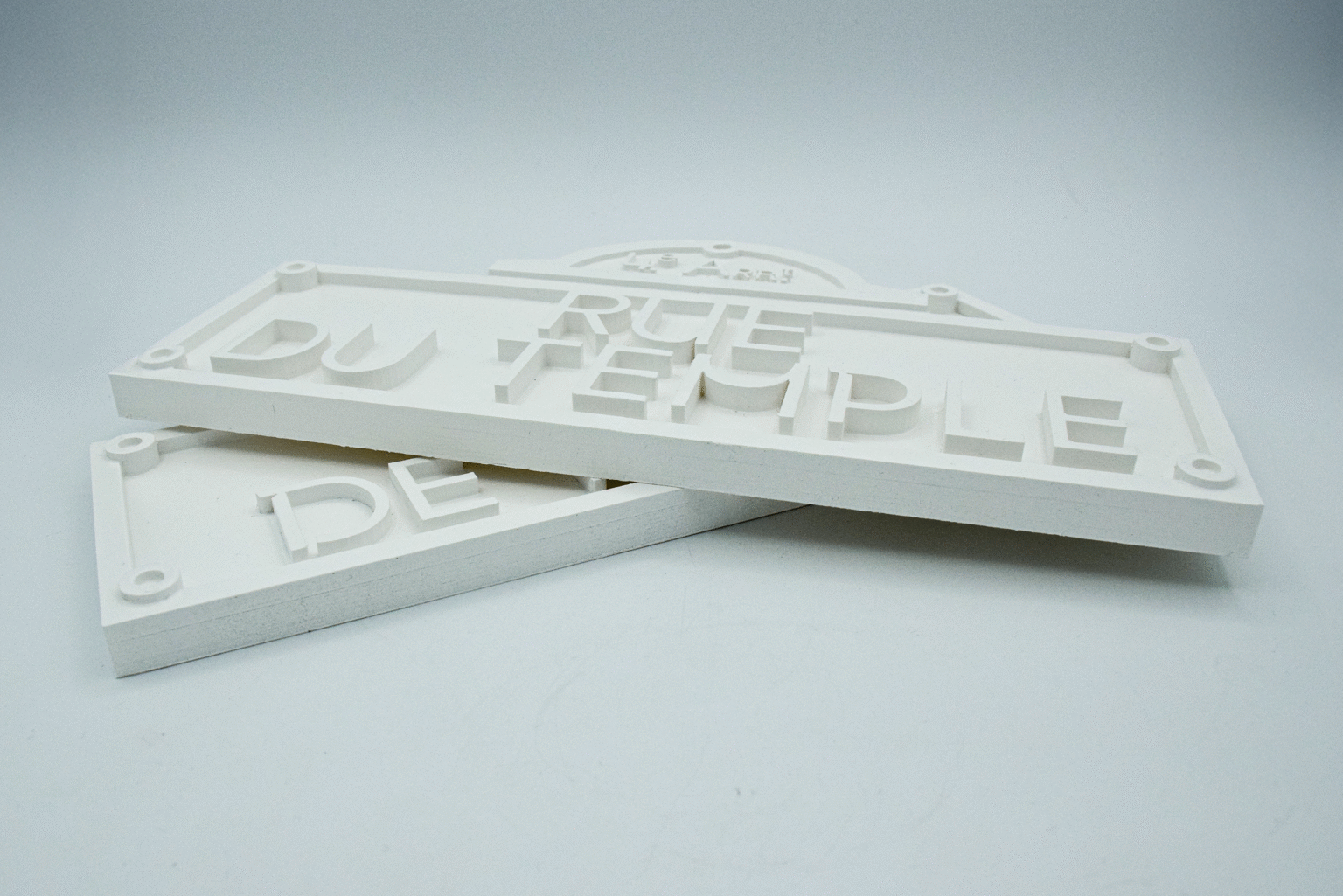
This project features 3 outcomes, the first is a traditional type specimen with a typographic map of central Paris screenprinted on top. The second is an exploration of the properties of glass and layering and how it relates to my type. And finally the third outcomes are 2 re-designed Parisian street signs in a Modernist style, acting as a kind of artefact from the film.