Benjamin Norman
(He/Him)
As a designer, my work often revolves around contradiction and contrast. In my final year I have enjoyed experimenting with process and found value in the materiality within my work. I have enjoyed exploring different processes with each of my projects focusing on a different aspect of design. These include type design, moving image, type setting and printing.
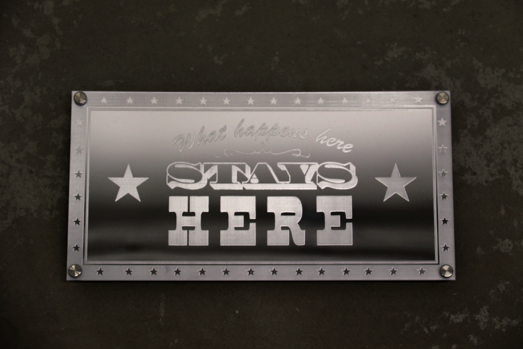
Vegas Variations
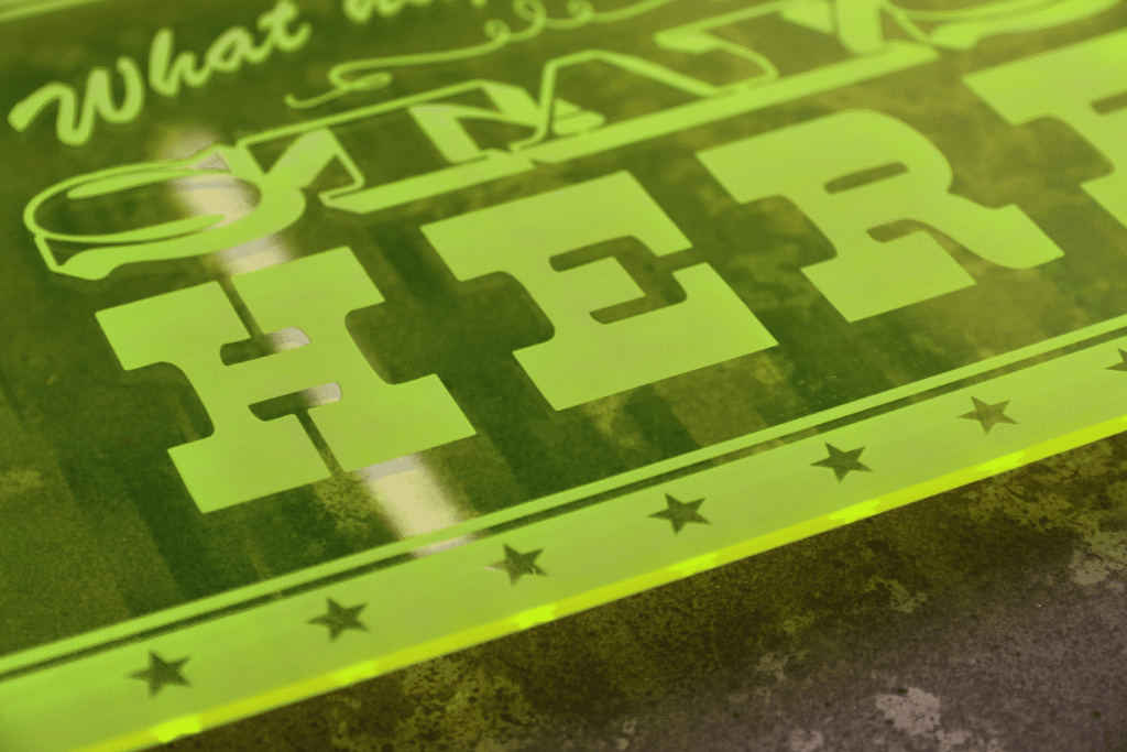
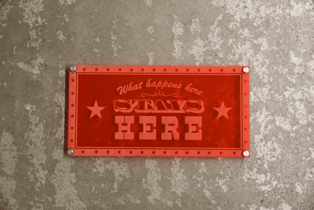
These signs were made in response to my extended essay which explored notions of Camp taste within Las Vegas and more broadly American politics. How appearance can contrast or attempt to mask the reality. These signs specifically play on ideas of accountability through the visual language of American aesthetics.
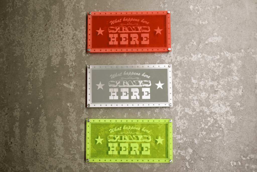
For Sale: upon request (as a set or individually)
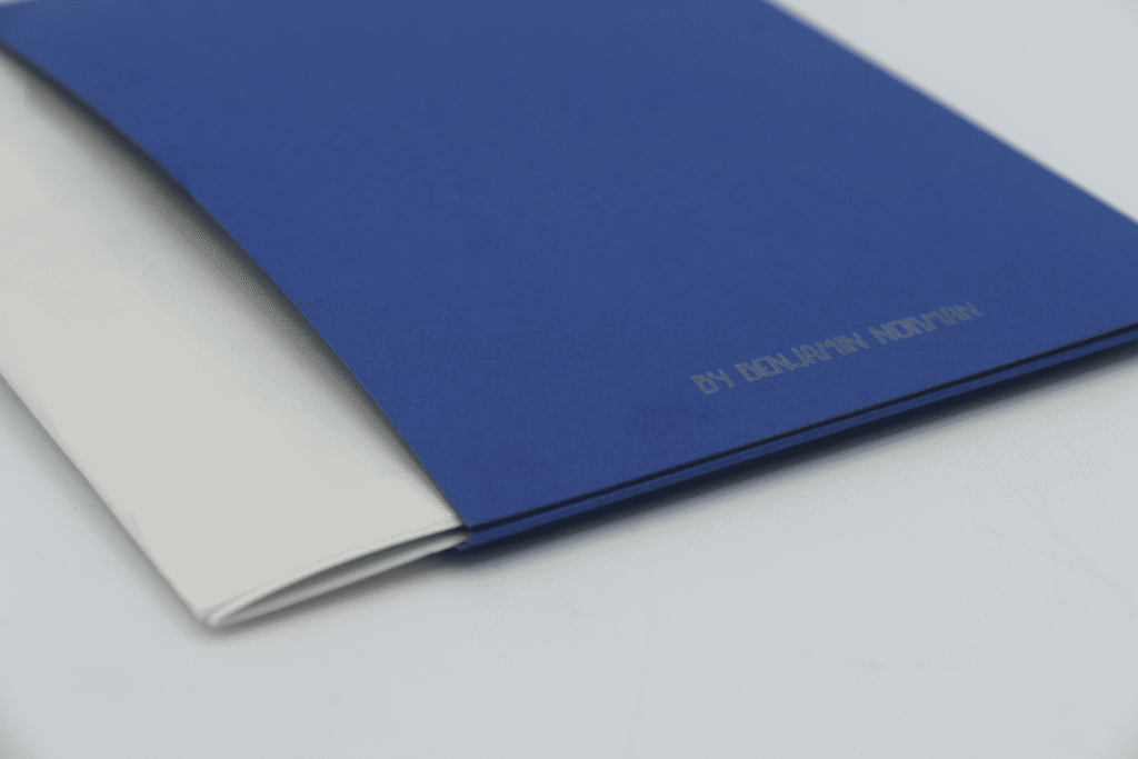
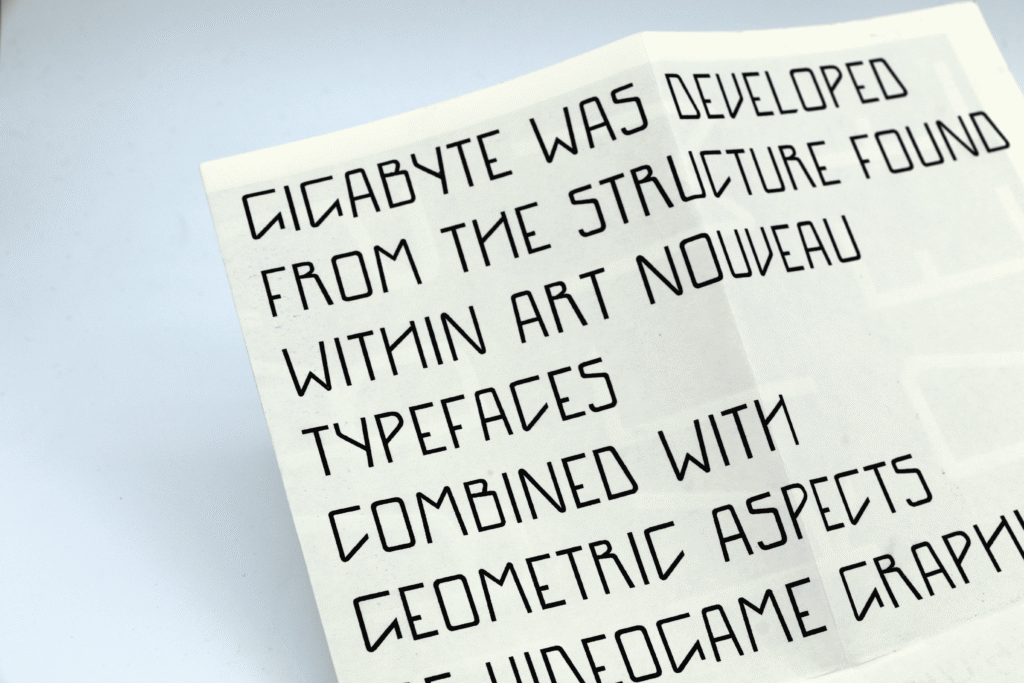
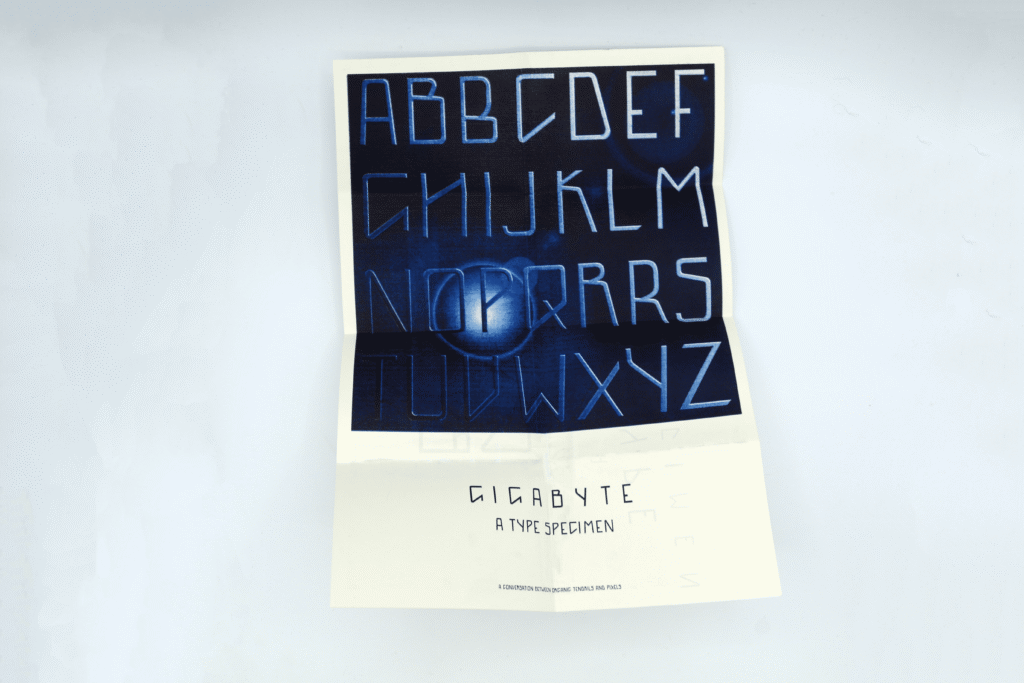
Gigabyte – Type Design
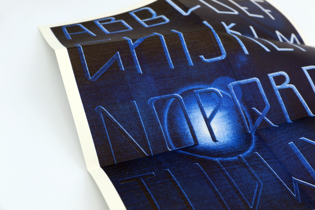
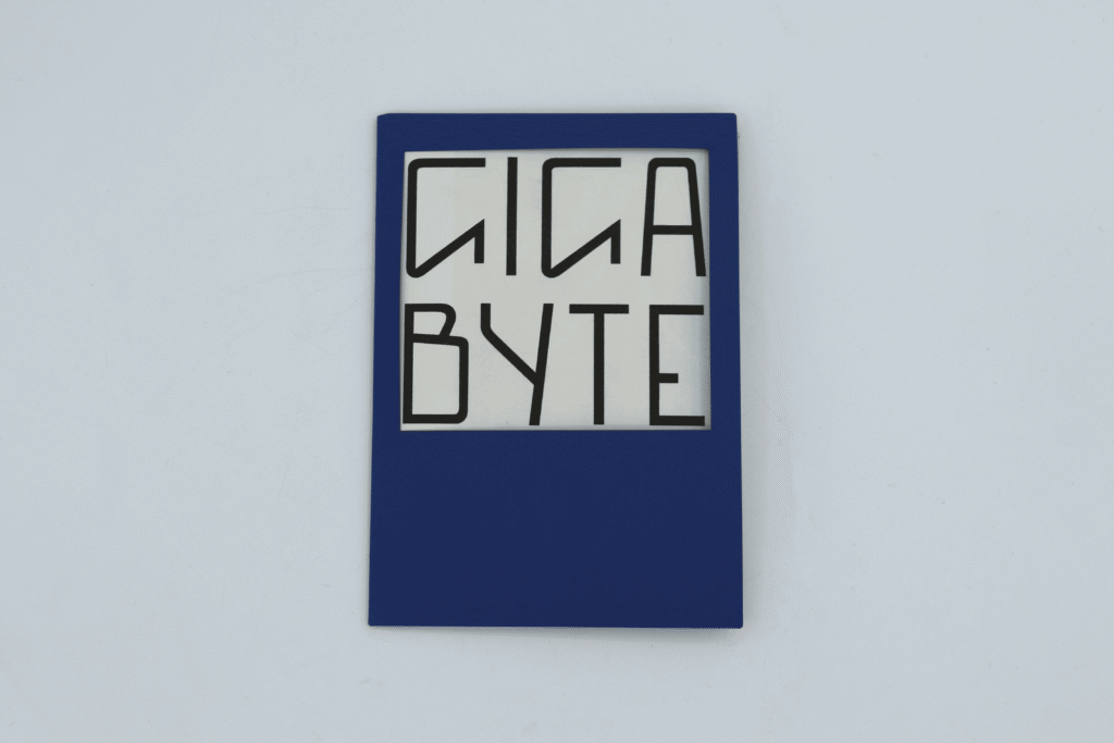
This typeface was inspired by structures seen within the art nouveau movement combined with the geometric graphics seen within video games.
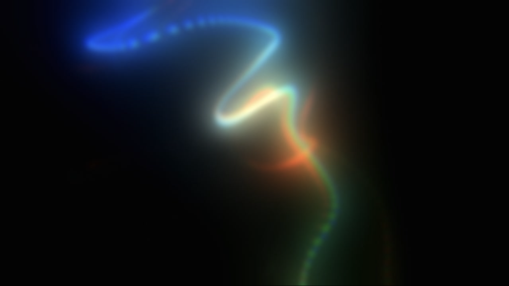
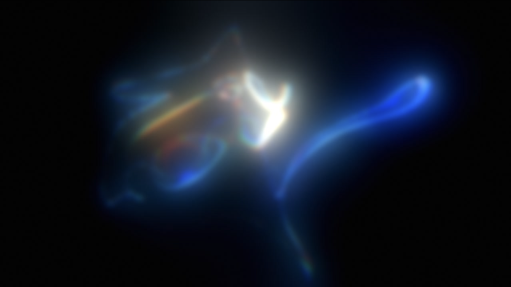
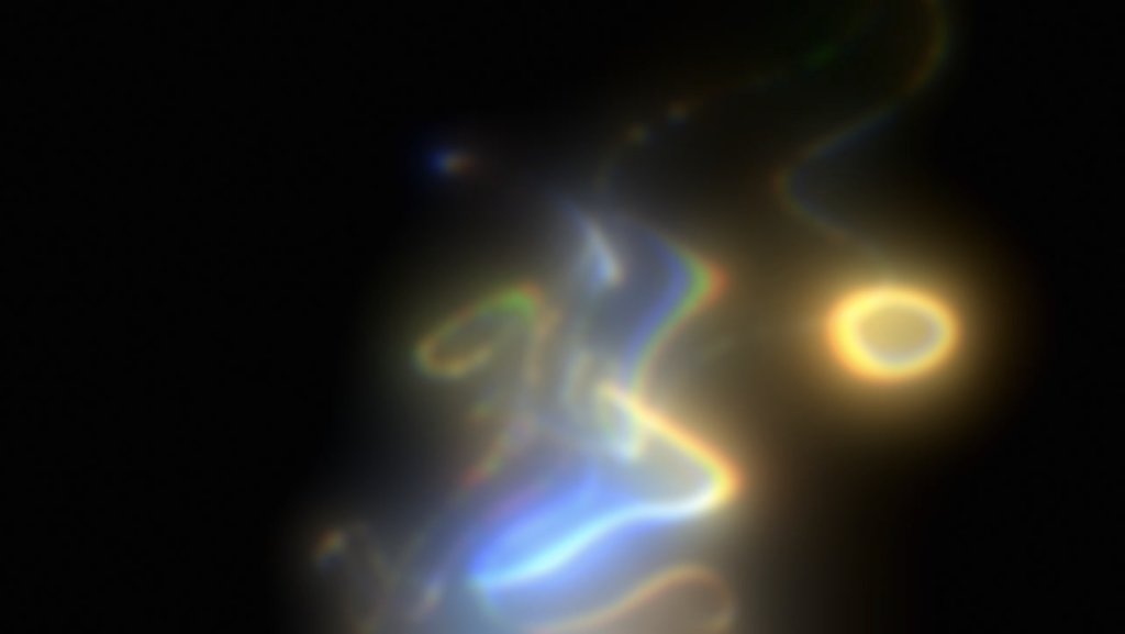
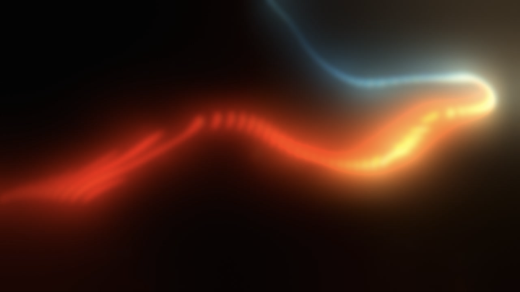
Audio Visualiser
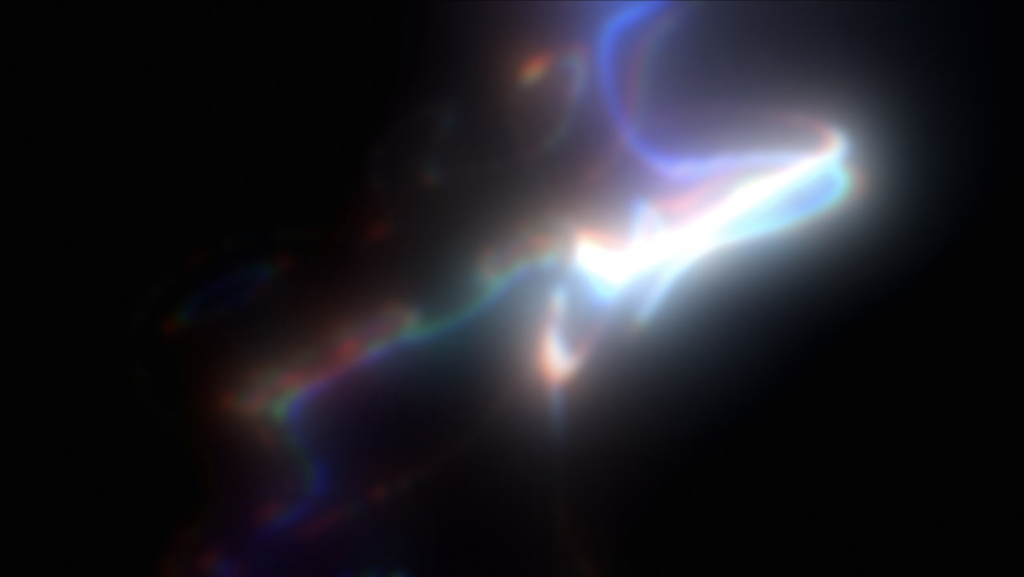
Audio Reactive Visualiser made using touchdesigner and inspired by nightlife and how light can create an atmosphere.
audio: 'Got This For You' by Noize
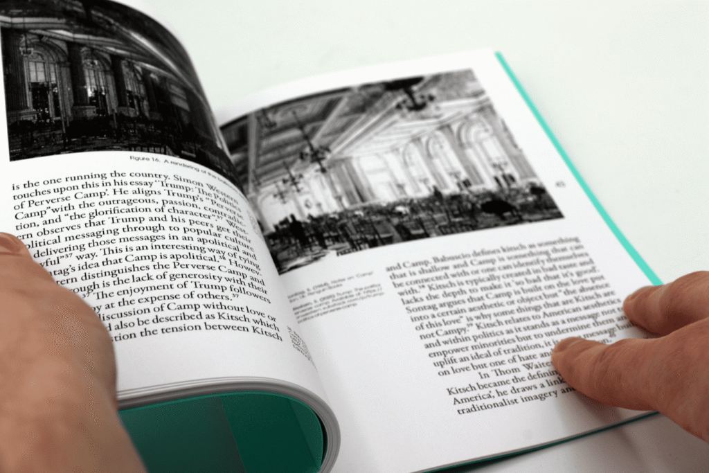
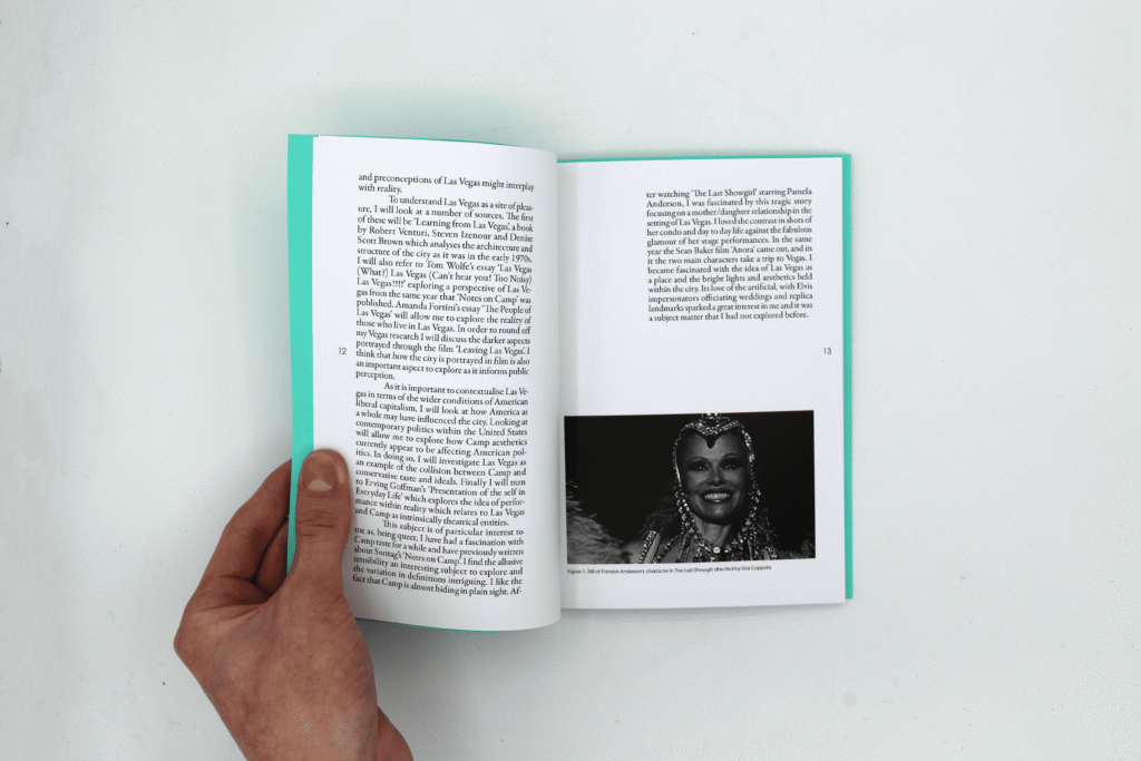
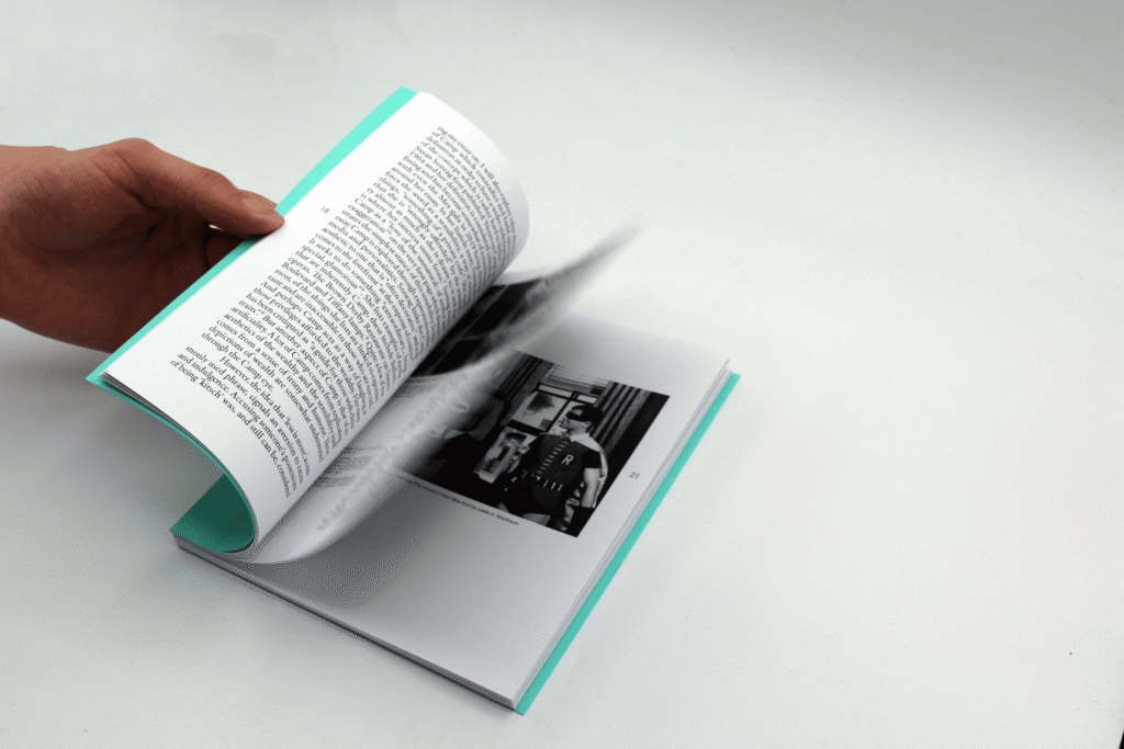
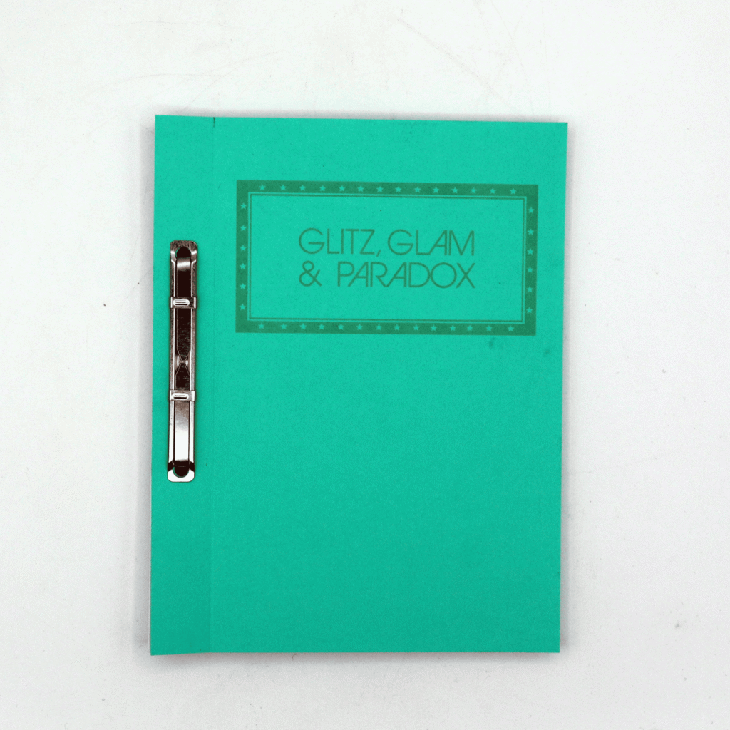
Glitz, Glam and Paradox
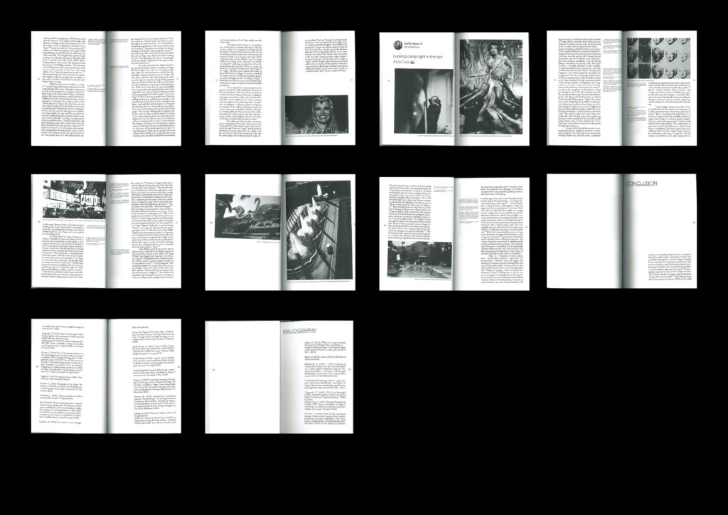
Publication design of my extended essay titled ‘Glitz Glam and Paradox: How Notes on Camp explains Las Vegas and Its Tension Between Spectacle, Ideals and Reality’.
Typographic Jazz
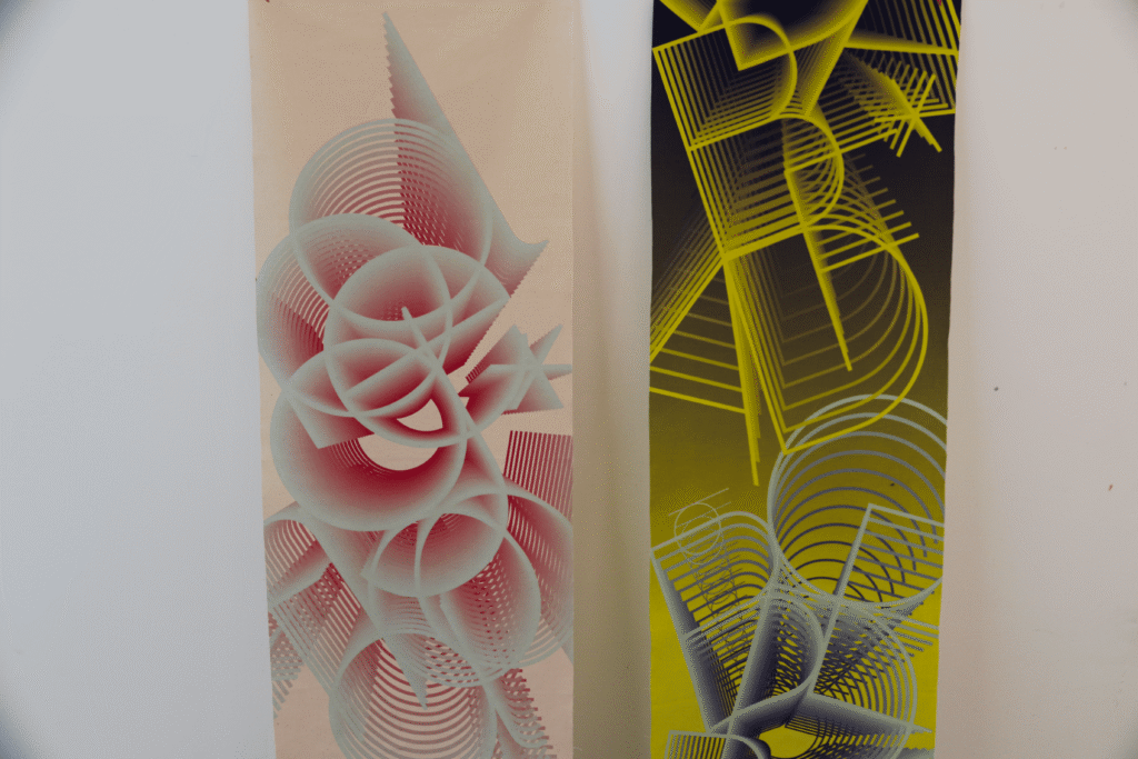
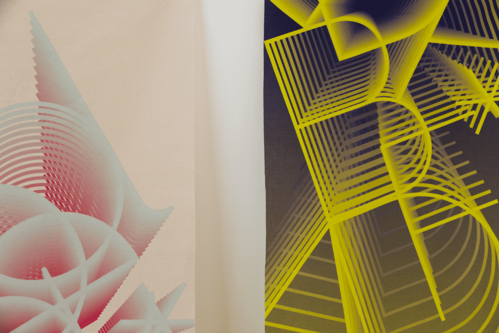
This Project centred around the idea of call and response within Jazz music. The letters used come from jazz chords and the layered three dimensional effect stems from the idea that sound takes up space and creates an atmosphere. I printed these on a cotton calico as a way to create texture and movement.