Darci Moore
(She/Her)
A Photograph Of Me – Letterpress Prints
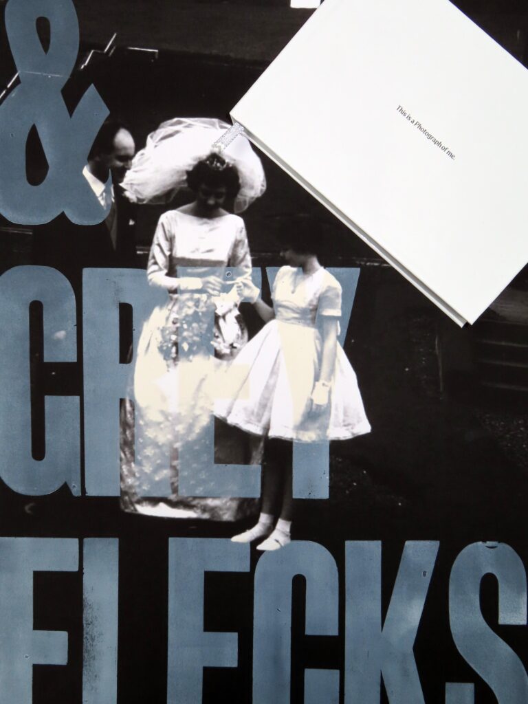
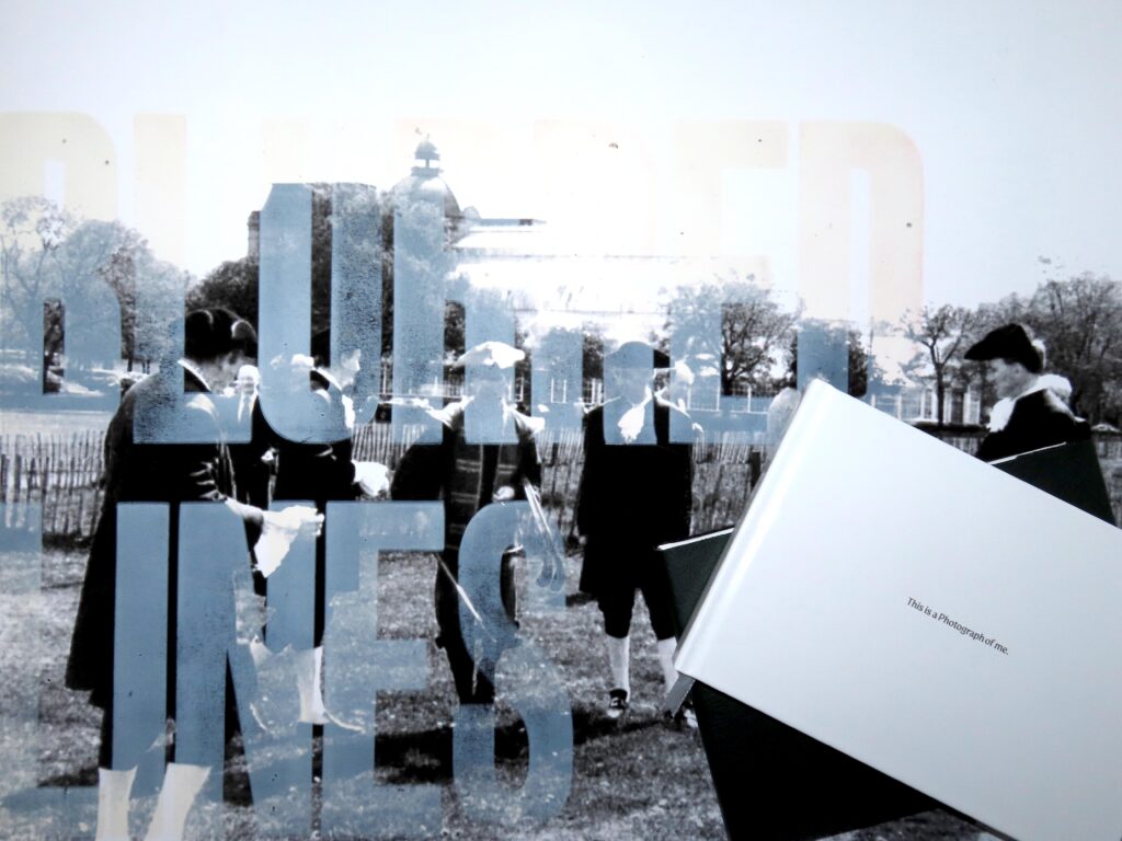
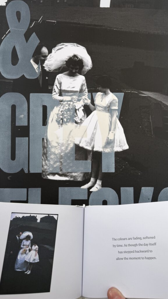
Through experimentation, I developed a publication using This Is a Photograph of Me by Margaret Atwood, revisiting earlier concrete poetry work. I initially explored a playful approach, moving from physical collage into digital manipulation of found images. However, feedback highlighted that the complexity was obscuring the narrative, leading me to rethink the format and shift towards large-scale prints. This allowed a stronger focus on ambiguity, ownership, and identity, while still using Atwood’s poem as a conceptual framework.
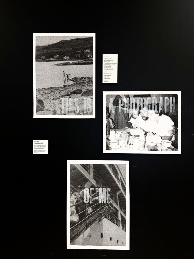
Final Letterpress Prints
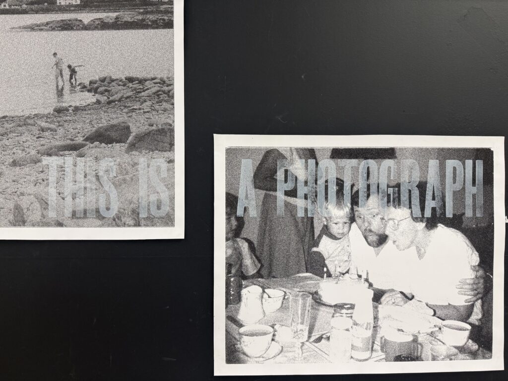
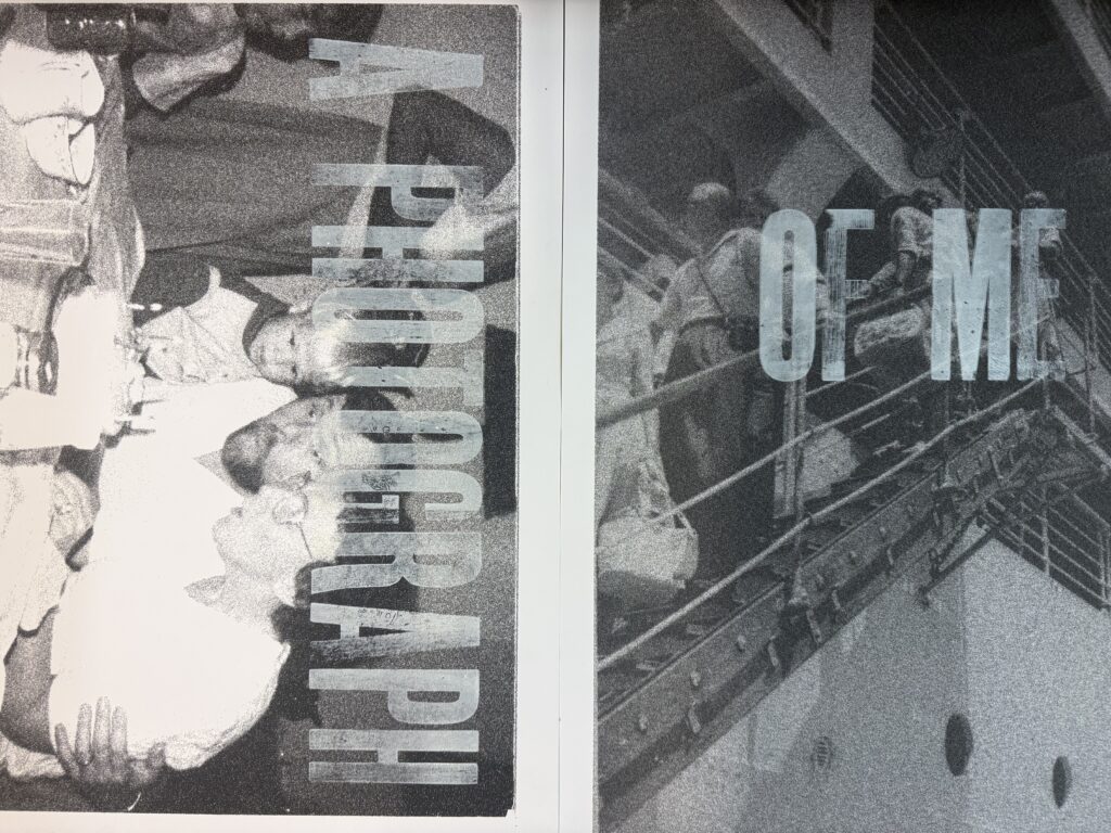
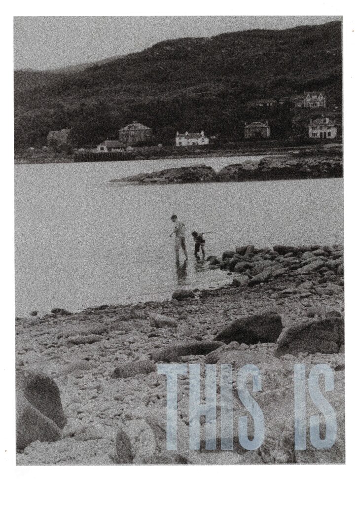
A Photograph Of Me – Publication
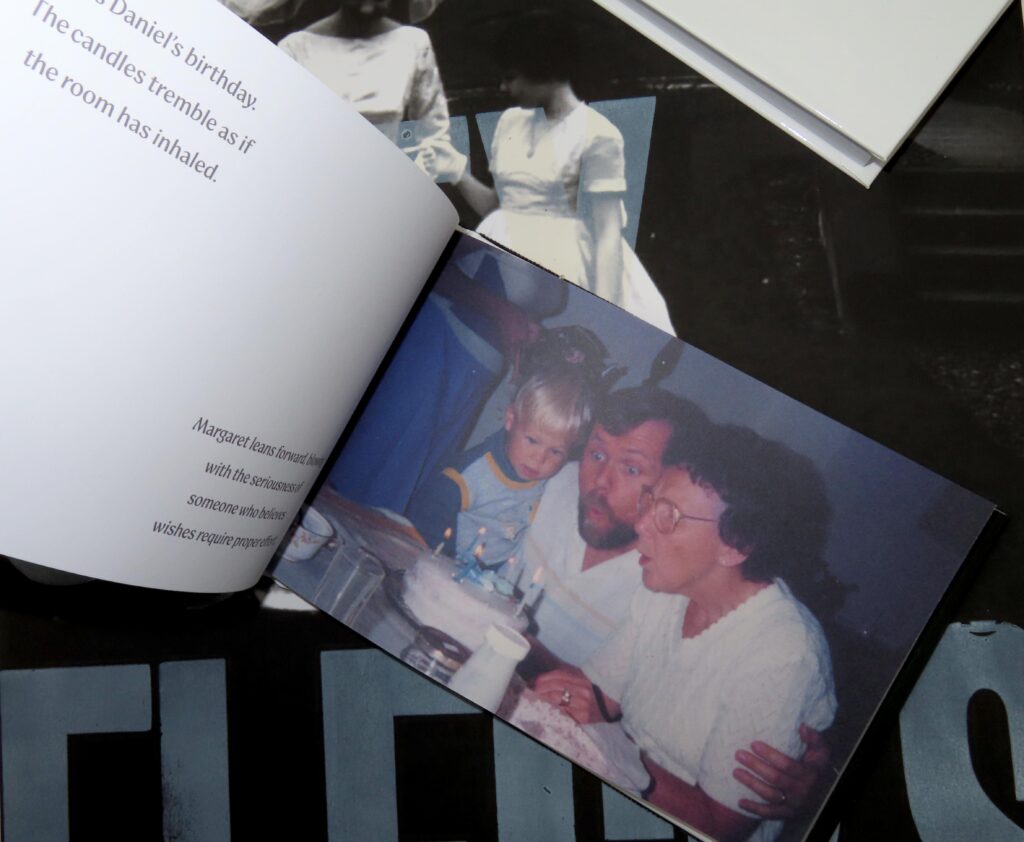
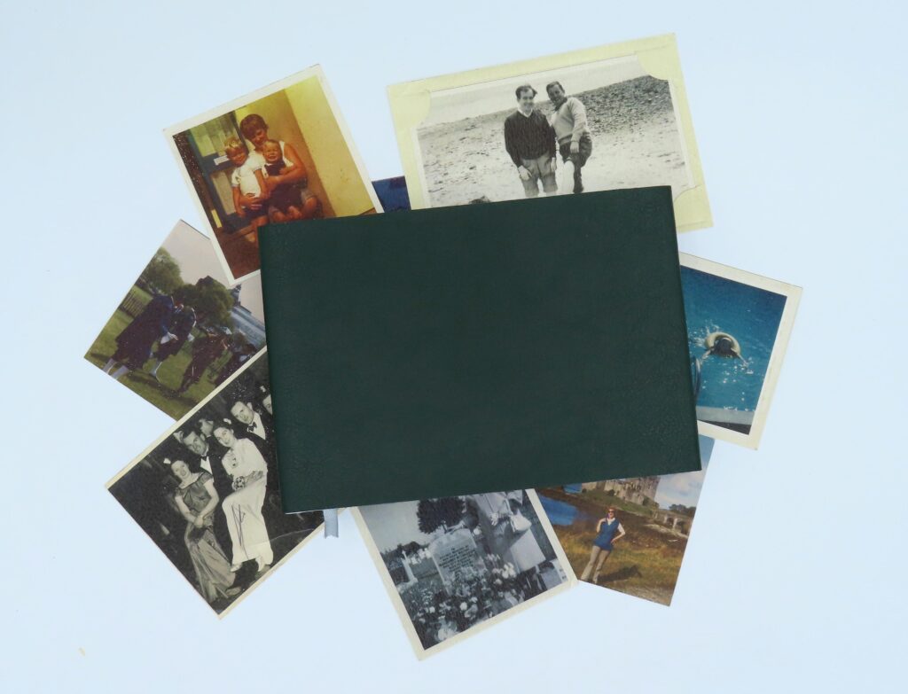
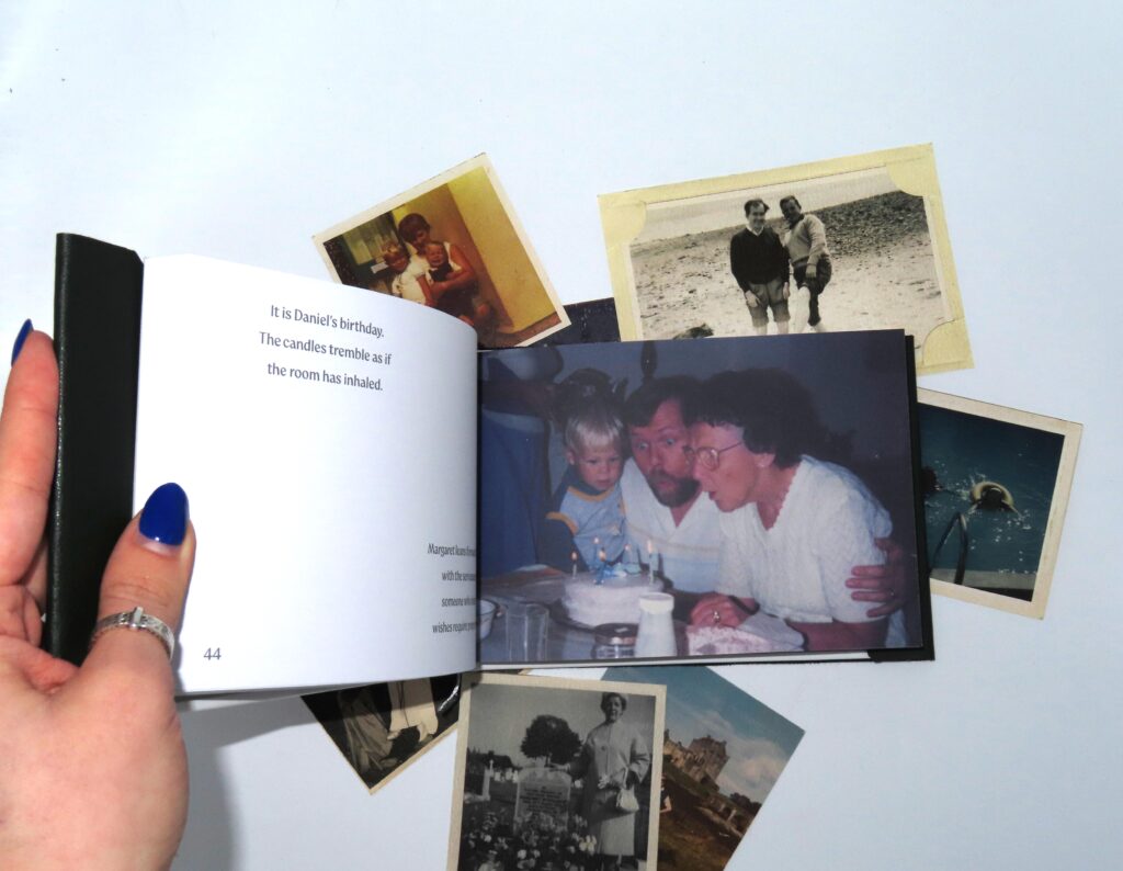
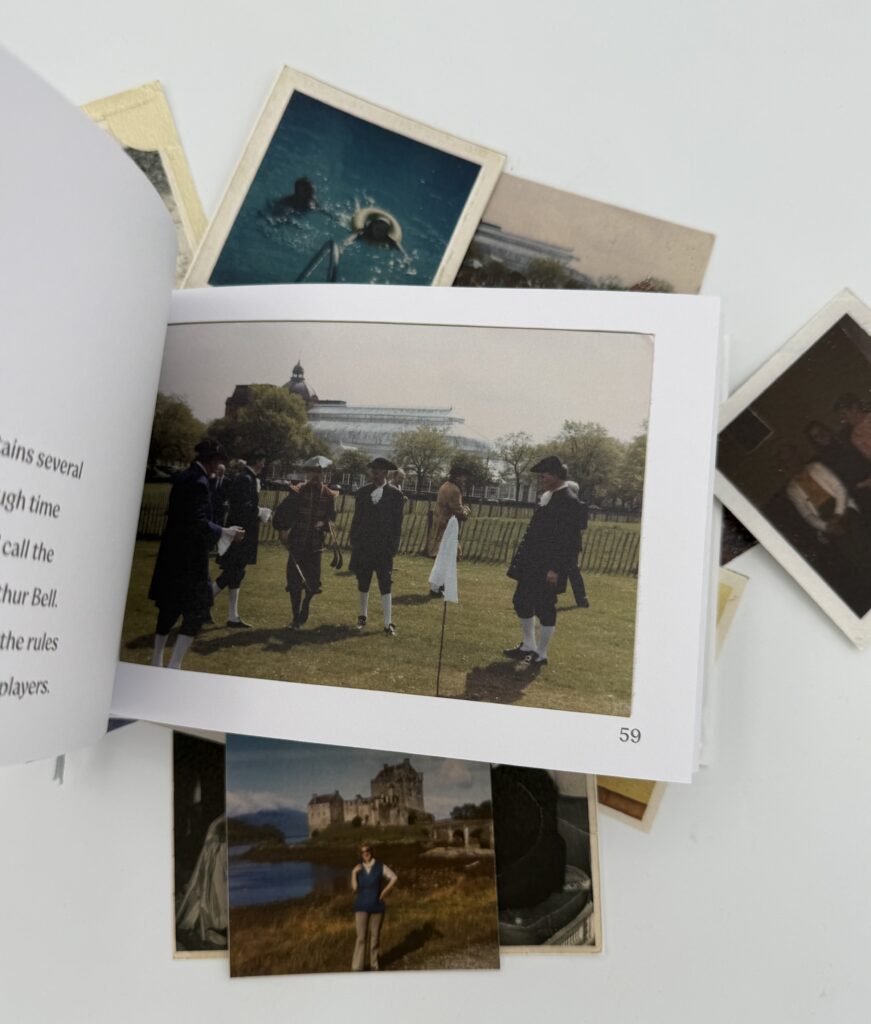
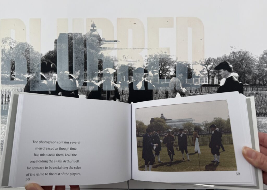
Following the letterpress print work, I continued exploring the idea of ‘lost’ images and the narratives behind them. I developed a publication concept where each image is paired with written responses inspired by This Is a Photograph of Me by Margaret Atwood.
Drawing on Atwood’s idea of positioning herself within the image, I imagined myself within these unknown photographs, constructing possible stories and identities behind them. I also researched publication layouts and formats to support this narrative-led approach.
Recode Earth
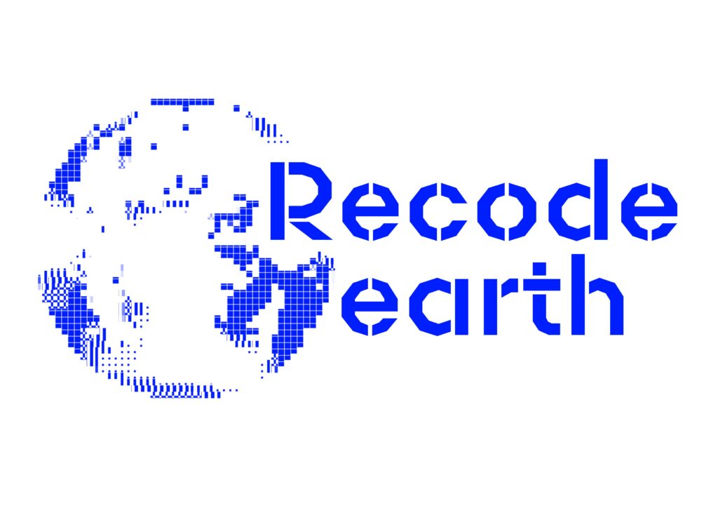
This project was about rebranding an existing logo, with this I used animation to help develop and communicate the concepts of data and pixelation through a clear and engaging visual identity. The design process involved exploring a range of approaches, including experimenting with symbolic forms, colour palettes, and background treatments to refine how these digital themes could be represented most effectively.
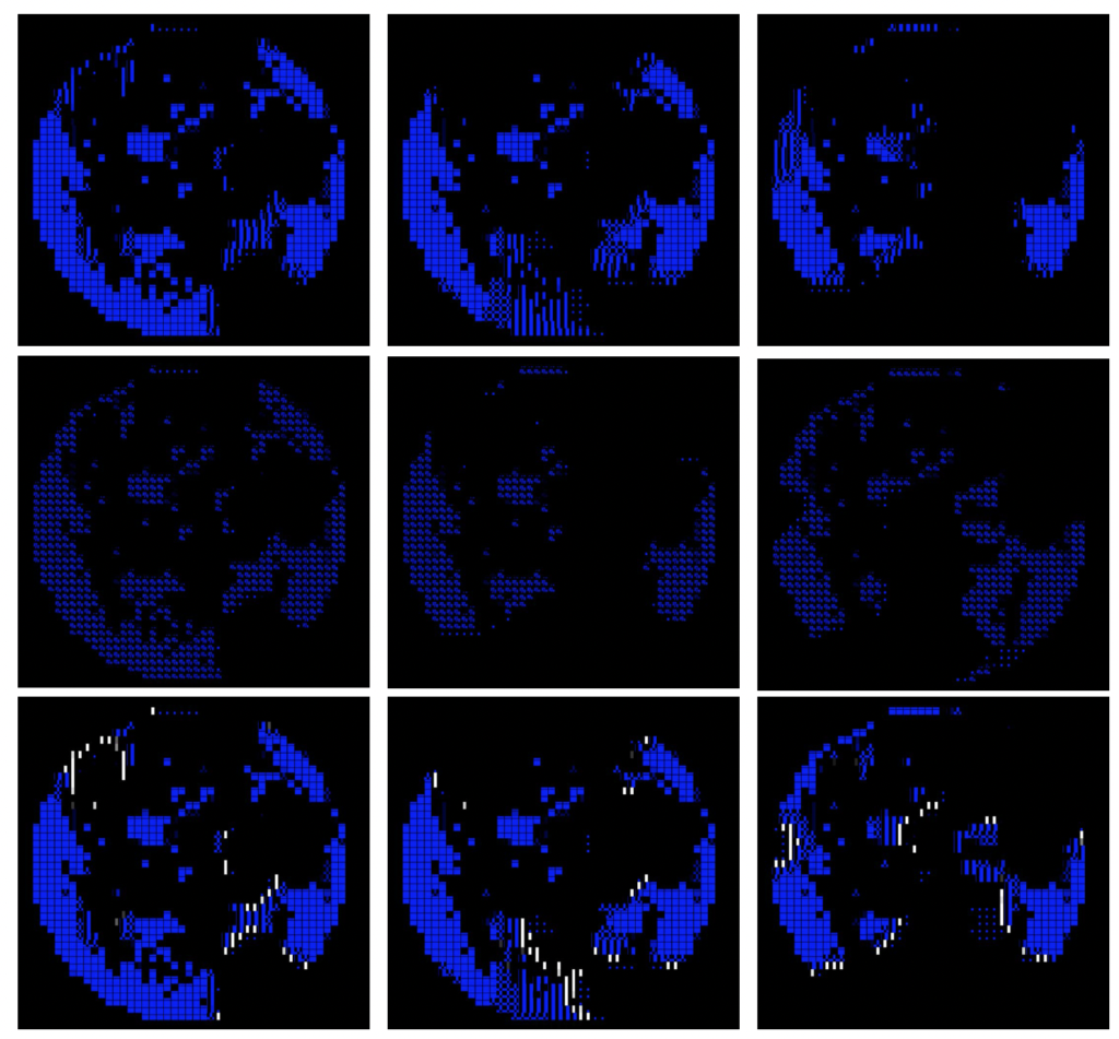
Stop Motions of Recode Earth Branding
Pen Pals
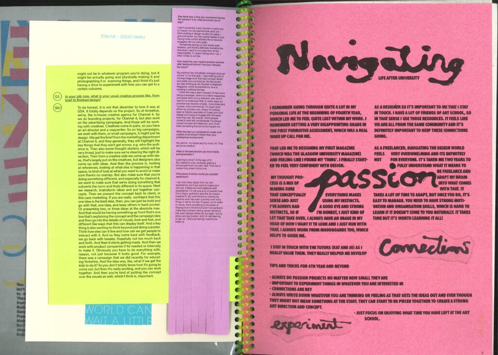
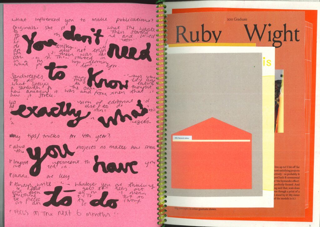
The Pen Pals project gave me the opportunity to speak with graduates about life after university. Conversations with Nancy offered useful insight and helped shape my thinking around post-graduation and my future creative direction.
Inspired by Nancy’s magazine Sandweegies, I explored how typography can communicate personality and emotions. Seeing the work spiral-bound into a publication was rewarding, bringing together advice and experiences from past graduates.
Extending Design
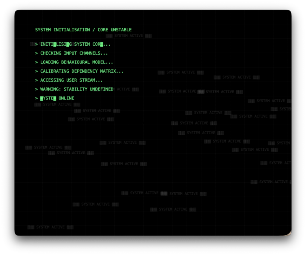
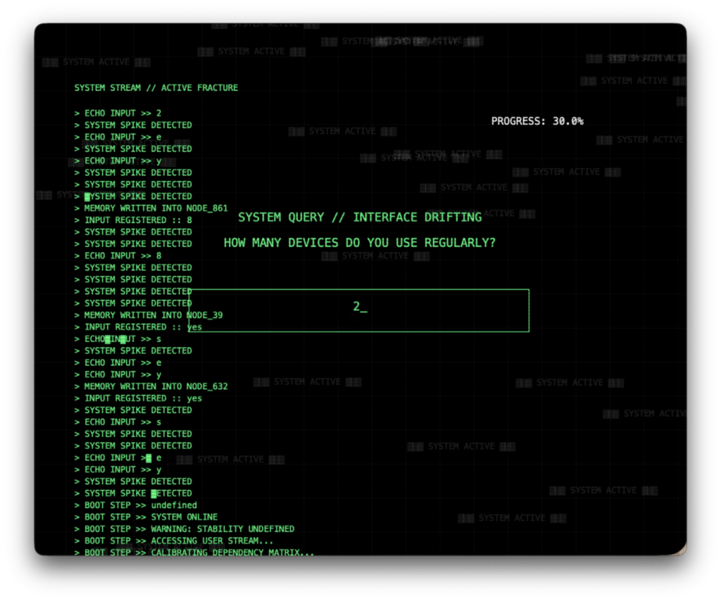
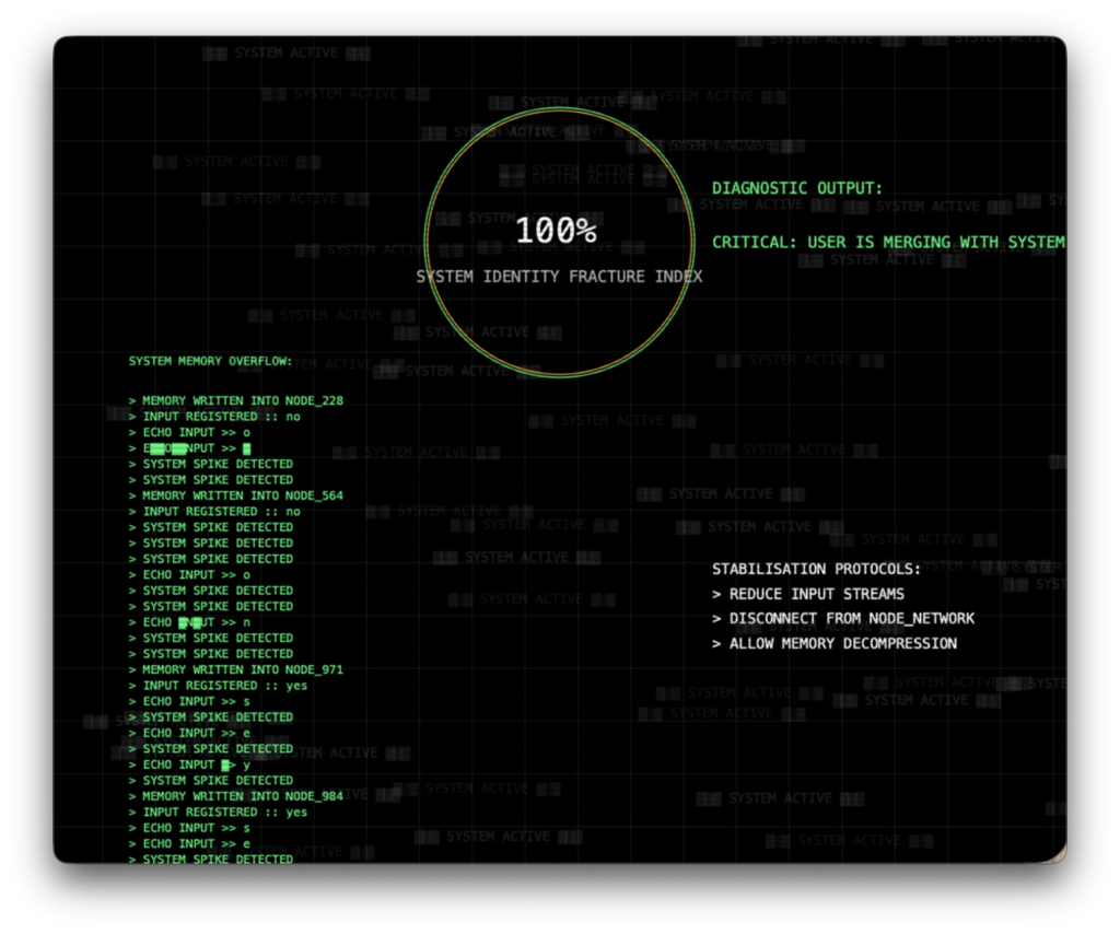
I developed a final outcome using p5.js and adapted it into a webpage to improve accessibility and interaction. The code was developed in response to my extended essay, Digital Overload: How Society’s Use – and Misuse – of Technology Is Reshaping Our World, which explores how technology reshapes the human condition across cognitive, psychological, physical, and social levels. While it brings clear benefits, it also raises concerns as everyday tasks become increasingly automated.
Coding was central to the project, allowing me to visualise digital overload through an interactive system. User interaction directly affects the visuals, creating moments of both engagement and overwhelm.
This process turned the work into an active system shaped by the user and pushed my practice into a more experimental, code-based direction.