Communication Design School of Design
David Symmons

Throughout 4th year and perhaps even beyond, I wished to have an underlying theme to my work. I firmly believe that type, lettering and language are one of the most important aspects of humanity. As such, my practice to focuses on the diverse traditions and history within type and written text.

Hulot
Re-watching one of my favourite films, Playtime, I was inspired to design a typeface based on the themes of this film. Playtime is directed by and stars French comedian Jacques Tati. Playtime follows Monsieur Hulot a bumbling everyman who visits Paris for an appointment only to discover it transformed into a maze of Modernism.
Hulot is comprised of 2 styles, the first takes influence from Neo-Grotesque typefaces such as Univers the second, the popular French typeface, Mistral. Mistral designed by the prolific French type designer Roger Excoffon was an appropriate influence due to its friendly naïvety and unpretentiousness which related strongly to the character of Monsieur Hulot and French comedies as a whole.
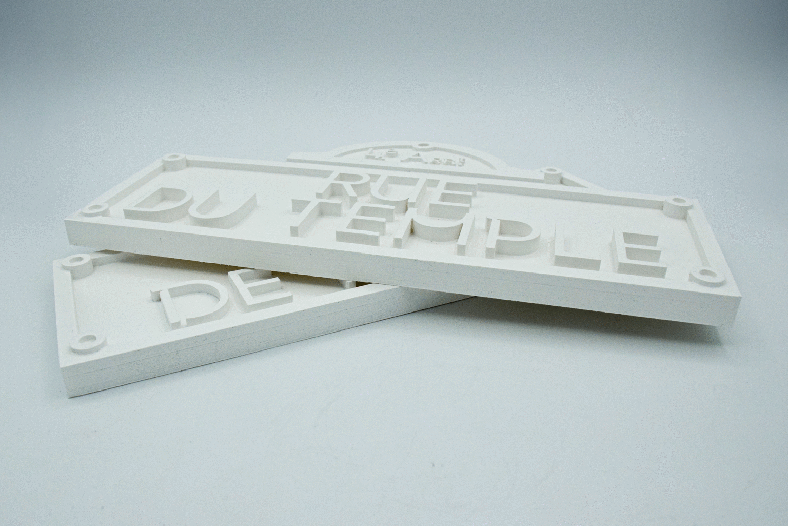
This project features 3 outcomes, the first is a traditional type specimen with a typographic map of central Paris screenprinted on top. The second is an exploration of the properties of glass and layering and how it relates to my type. And finally the third outcomes are 2 re-designed Parisian street signs in a Modernist style, acting as a kind of artefact from the film.
Hastings
In the spirit of the master Punch-Cutters of continental Europe, who took influence from Latin and Cyrillic inscriptions, Hastings is influenced by ancient lettering found in the British Isles. Hastings takes inspiration from runes and manuscripts written in the diverse array of languages found in the British Isles during the pre and early medieval period. The strokes of the letters are largely derived from the movement of the brush on velum.
The Weird, The Eerie and The Liminal
For the Extending Design project I decided to type set my essay into a publication. In this essay I explore the effect of weirdness and/or eeriness overlapping with the theme of liminality. I explore this effect through three filmic sources, these being – The Trial (1963) by Orson Welles, Pulse (2001) by Kiyoshi Kurosawa and Inland Empire (2006) by David Lynch. Throughout this essay I refer to the writing of Mark Fisher who redefined weirdness and eeriness in his essay, The Weird And The Eerie.
I created two versions of the publication, one is a normal book with more subtle representations of the themes and the second copy is a weird, eerie and liminal version, with overt references to the themes. Some examples of how I achieved this include, holes between pages, changing typefaces and missing words.


