Communication Design School of Design
Emelie Svensson

Creative Director with a passion for events planning and curating, always trying to harness my creativity in the pursuit of innovative and joyful solutions.
Contact
Camouflage Publication
‘The Paradigm of Camouflage’ explores attributes associated with essences of camouflage and its breadth of contemporary applications, seeking to challenge the often-prejudicial connotations attached to the phenomenon. The notion of camouflage has been channelled to communicate its military roots, with the project outcome emulating the elusive concealment of intelligence with a tactile appeal of confidential documentation. The body of work aims to harness interpretative perspectives of elemental disguise; rather than outwardly promoting an archetypical camouflage pattern, a monochromatic theme has been adopted to encourage the viewer to form an opinion detached from any nuanced preconceptions of camouflage.


Cherimoya Collection – The Inventory
The ‘Cherimoya Collection’ is a a luxury homeware and events brand, that sells and rents sought-after items from an eclectic inventory. From special occasions to dinner parties, merrymakers can curate the desired objects for their celebrations with collections of glassware, crockery, and ornaments. To compliment the following catalogue, three taxonomies of homeware stock serve as an inventory list to provide an all–encompassing view of the many decorative possibilities available to buy or rent.


Cherimoya Collection – The Catalogue
With such a range of delicate statement pieces to choose from, potential customers are able to test and envisage combinations from the collection in their own setting with itemised catalogue cards. Contained in a glass case for safekeeping, the catalogue cards within can be utilised to contextualise the items in unique displays. By positioning the glass case in the desired location of an item from the collection, then by holding a catalogue card so that its scale guides align with the top and bottom of the glass case, one can visualise the item as though it were already in their possession.


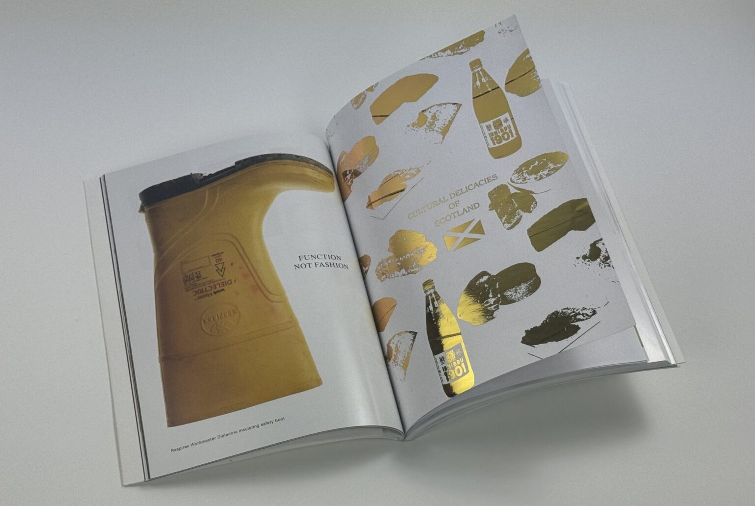
Paperboy, Scotland Issue – The Supplement
Paperboy curator David McKendrick set the task of creating a supplement for the publication’s latest Scottish issue. This outcome focusses on some iconic ‘Scottish delicacies’ – typically identified by deep-frying processes – that are recognisable by their distinct colour palette and unmistakeable textures.


Paperboy, Scotland Issue – The Added Feature
Alongside the supplement, an added feature that compliments the overall project outcome. A thematically patterned tea towel inspired by the colours of the Scottish saltire seeks to epitomise the culinary aspect of the project in a tangible, practical implement; one that can be utilised in one’s own food endeavours. These 100% cotton tea towels are available for purchase in the shop or upon request.


GSA Poster
The Glasgow School of Art proclaims to the objective that “they are inclusive and creative collaborators.” This poster seeks to emblematise this key ethos, embodying visual cues that speak of such an objective. The poster was printed using a risograph to accentuate the bold colour scheme of the institution, depicting the hands of multidisciplinary students exercising their unified spirit to augment string into the letters G, S, and A.
