Communication Design School of Design
Jack Craigie Henderson

I value humour as much as clarity in my work. Whether it’s chaotic structure or surrealist visuals, I tend to approach my work with a mix of pragmatism and daftness. Humour is often a way I’ve found helps unlock more meaning in a project. I don’t feel tied to any particular medium, although publication design became a natural format for many of my ideas this year. What I care about most is composition – the overall feel, tone and direction of a project. I usually draw from what’s closest to me, familiar references or experiences and I don’t often chase inspiration – it needs to come to me and it usually does when working on something close that I enjoy.

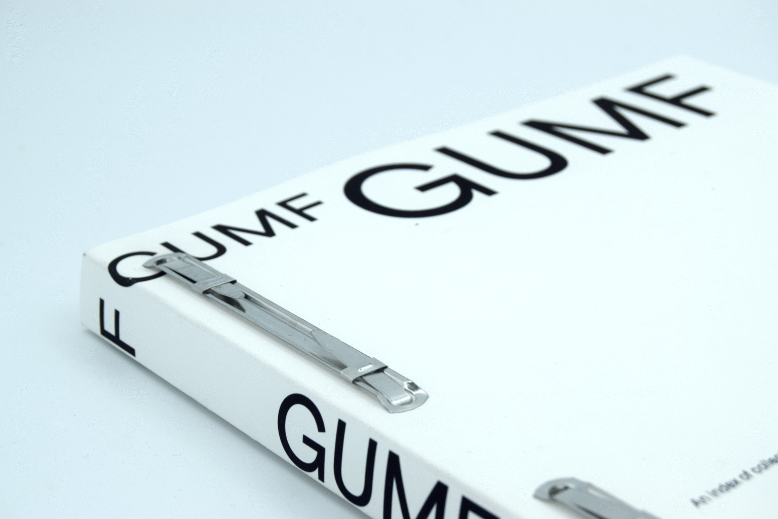
GUMF
“GUMF” is an index of overlooked objects “inherited” from my Dad and Papa. Collected over time—taken from sheds, lofts and spare-rooms—these items are presented not for their material value, but for the habits and stories they quietly hold. Each object is catalogued using formal indexing parameters, accompanied by an informal transcribed conversation between myself, my Dad and my Mum. The publication balance’s structure and sentiment, using design to reflect on memory, inheritance, and the desire to keep things that might otherwise be thrown away.
On Swiss Design
“On Swiss Design” is a publication based on my extended essay, that critiques the legacy and overuse of Swiss Design principles in the contemporary design world. Initially structured, clean, and grid-based, the book gradually breaks down, becoming chaotic and illegible as it progresses. This visual collapse mirrors the essay it contains, which argues that Swiss Design, once radical, has become a default aesthetic. By exaggerating its own structure, On Swiss Design enacts its own critique, turning clarity into noise. The result is both an appreciation and subversion of Swiss Design philosophy.
>exhibition_title_goes_here<
“>exhibition_title_goes_here<” is an identity system, created for the Communication Design Work in Progress show in semester one. It aims to capture and portray the studio culture we had built until that point, through playful graphic elements. Leaning into the WIP aesthetic provided a stable base to create these graphics, I opted for an experimental low-poly 3D rendering of each participant’s head. Creating such personable graphics was also important to remind us all who we were doing it all for, and that the WIP show could be a lighthearted celebration of us, not a stressful event.


