Communication Design School of Design
Kaci Smith

My design practice is rooted in typographical exploration, with a strong emphasis on analogue typesetting techniques. I am drawn to the tactile and experimental qualities of working by hand, using traditional tools and processes to uncover new visual possibilities. These analogue methods form the foundation of my creative approach, but I am equally interested in the dynamic intersection between analogue and digital. Rather than seeing them as opposing mediums, I view them as complementary tools that challenge and enhance one another, allowing me to question conventions of legibility, form, and process while pushing the boundaries of contemporary typographic design.
Process-led briefs are central to my practice, fostering experimentation and enabling ideas to emerge organically through making. This hands-on approach supports my deep engagement with analogue techniques, where materiality, discovery, and intuition shape the direction of a project. By prioritising process over outcome, I create work that is grounded in craftsmanship yet open to innovation, celebrating the expressive potential of typography in all its forms.
Brachen Typeface
Brachen is a lowercase modular typeface that draws inspiration from the rich heritage of early blackletter script. In creating a grid based modular system, I was able to explore form and tactility within type design, as well as density and compactness evident in blackletter scripts. By translating the ornate details of these historic styles into modular forms, Brachen balances the rich tradition of blackletter with a modern geometric approach. In working with a modular system, I was able to explore working within creative constraints which served as a generative force whilst designing, encouraging me to explore the tension between repetition and variation. Through pushing these boundaries and experimenting with legibility and visual impact, I aimed to celebrate the elegance of blackletter whilst reimagining its potential for contemporary design applications.


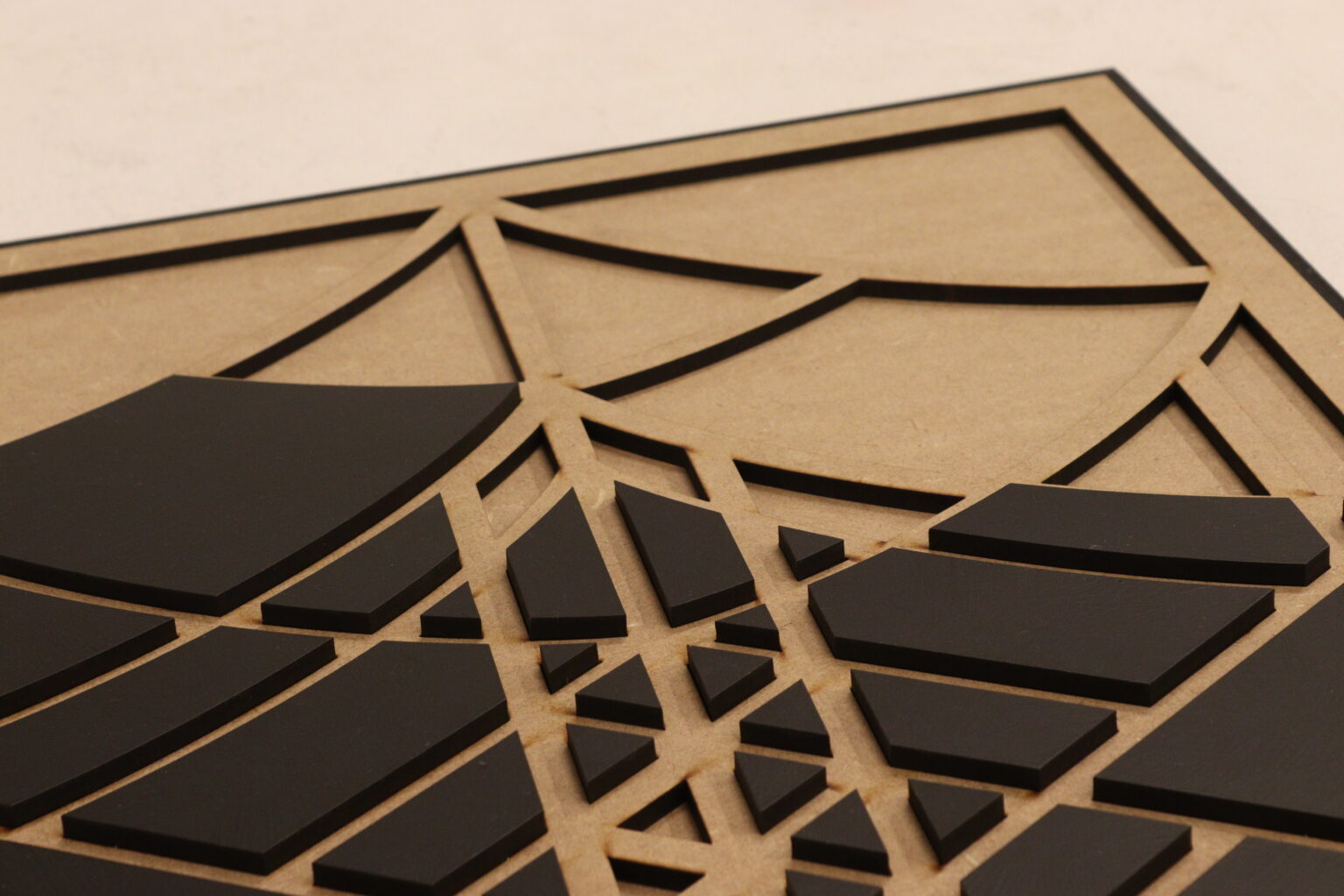
Brachen Grid
This grid sculpture serves as a tangible extension of the Brachen typeface, pushing the boundaries of typographic design by translating its modular system into a physical, interactive form. Measuring 48cm x 86cm, the laser-cut model is a direct representation of the structural grid that underpins Brachen, allowing viewers to engage with the typographic framework in a new and tactile way. By materialising the typeface’s underlying grid, the sculpture shifts typography from a purely visual medium to a spatial and experiential one.


Pandaemonium – The Devil
“Spanked along the road to Liverpool, it is quite a just remark that the Devil, if he travelled, would go by train.” – The Devil – 215
‘Pandaeonium’ by Humphrey Jennings is a collection of texts describing how the Industrial Revolution transformed British society and imagination, by compiling a variety of the publics accounts. In responding to a process lead brief contained within the Caseroom, I was able to explore these themes and accounts with techniques from this time period. This particular account sparked ideas to visually depict how although the Industrial Revolution brought an abundance of technological advancements, some were rushed or unrefined, leading to varied responses to the revolution. Creating a substantial amount of train tickets with individually layered letterpress arrangements, I was able to touch on the idea of a journey through a satirical lens.


Pandaemonium – Newton
Newton – 112 is a poem written by William Blake, mocking the discoveries of Newton, Voltaire and Rousseau. ‘Mock on, mock on: Tis all in vain!’ Blake touches on how with Newtons discoveries, the world can be explained away with maths and logic, and contributed to an overly rationalised world. This creates a tension between reason and imagination, as Newton is a symbol of supreme intellect but the Industrial Revolution came with emotional, social and spiritual costs. I created a collection of posters in response to this account, using typography, heavily inspired by works of Dafi Kuhne and Hansjorg Mayer, exploring how I could push the boundaries of traditional letterpress techniques.


Glitch & Grain
Glitch & Grain is the brand for an exhibition which I curated within my Design History & Theory coursework in fourth year – ‘Designing the Future, Honouring the Past: Exploring the Relationship Between Analogue and Digital Graphic Design’. My curatorial rational speaks about how the two mediums can evolve and harmonise, rather than being kept at a distance, and through exploring these themes in DH&T, I now often make a conscious effort to combine the two in my practice.
Glitch + Grain is an exhibition set in The Buchstabenmuseum in Berlin, that showcases how analogue design has set the fundamental principles in graphic design, that even now in the digital world, we still refer back to. It celebrates analogue design, whilst admiring how graphic design has changed to what we know it as today, sparking a conversation for how the two can evolve simultaneously, without the depreciation of traditional techniques.


The Shipping Forecast
The Shipping Forecast is a weather forecast specifically designed for shipping, providing crucial information about conditions in the sea areas around the British Isles. Despite its practical function, the forecast has taken on a cultural significance, often perceived as rhythmic, hypnotic, and even poetic by those who listen. It is something I have never fully grasped, perhaps never will, which is precisely why I chose this direction for my creative exploration.
Rather than attempting to decipher the forecast in a literal sense, I sought to interpret the sensation it evokes, particularly the idea of white noise, a phenomenon many listeners associate with the broadcast. This conceptual approach naturally lent itself to the medium of code, where repetition, layering, and algorithmic sequencing could visually mirror the continuous ebb and flow of the forecast’s delivery. The final piece is a grid of continuously looping codes, each representing and visualising selected lines from Seamus Heaney’s ‘The Shipping Forecast’. Through detailed analysis of the poem, I aimed to construct a set of visuals that embody its tone and rhythm: captivating yet calming, structured yet fluid. The result is an interplay between poetry, data, and movement, designed to immerse the viewer in the same quiet, meditative state that white noise inspires. By translating the auditory experience of the forecast into a dynamic visual form, this project explores the poetic and abstract dimensions of information, rethinking the way we engage with coded systems, weather reports, and the overlooked aesthetics of functional language.
