Communication Design School of Design
Robbie Lunn

I am passionate about football, and every project within my final year at The Glasgow School of Art is underpinned by that interest. I use football as a lens to explore broader themes of Scottish culture and heritage, including sectarianism, masculinity and identity
The scope of my work is diverse. In Extending Design, I examine how the visual language of modern football culture has influenced contemporary fashion. In Pal/Bastard, I repurpose the familiar aesthetics of sponsorship logos on football strips to address sectarianism in Glasgow’s football scene. For my final project, my degree show piece ‘We’re Aw Going Tae The Ground’, I draw inspiration from a local graveyard filled with the names of Scottish football greats. Through the creation of a fictitious team, I celebrate the spirit and nostalgia of 1970s Scottish football.
We’re Aw Going Tae The Ground
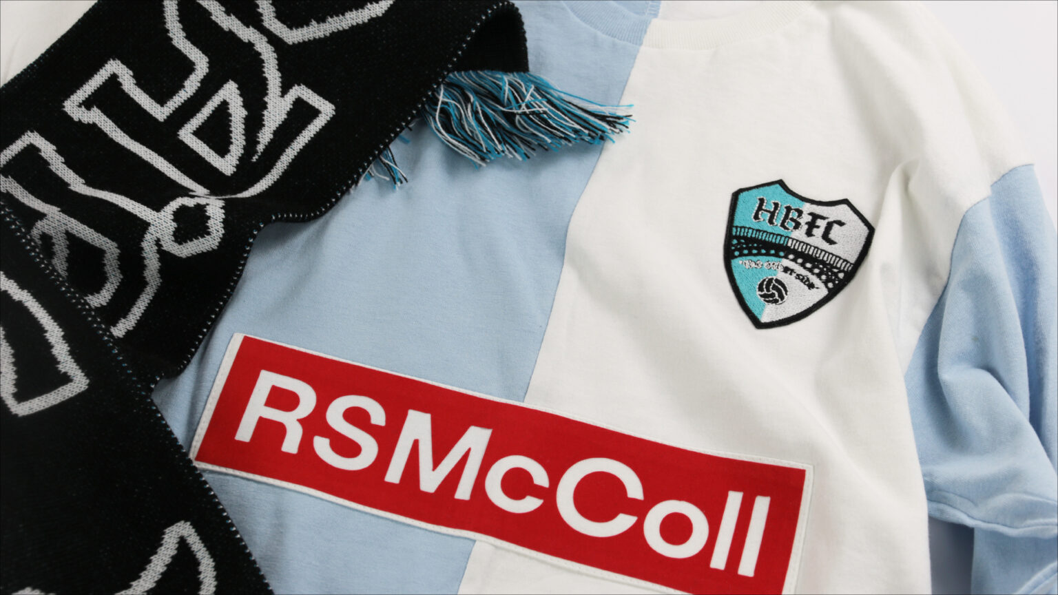
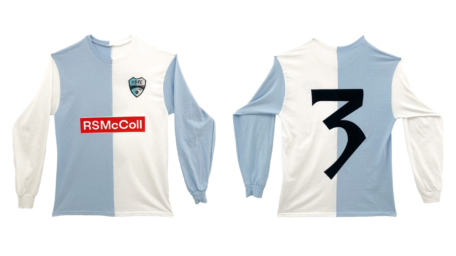
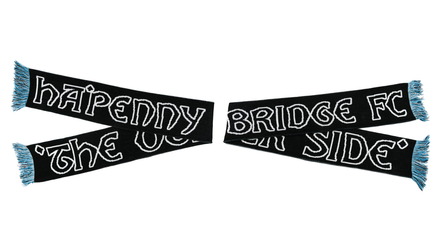
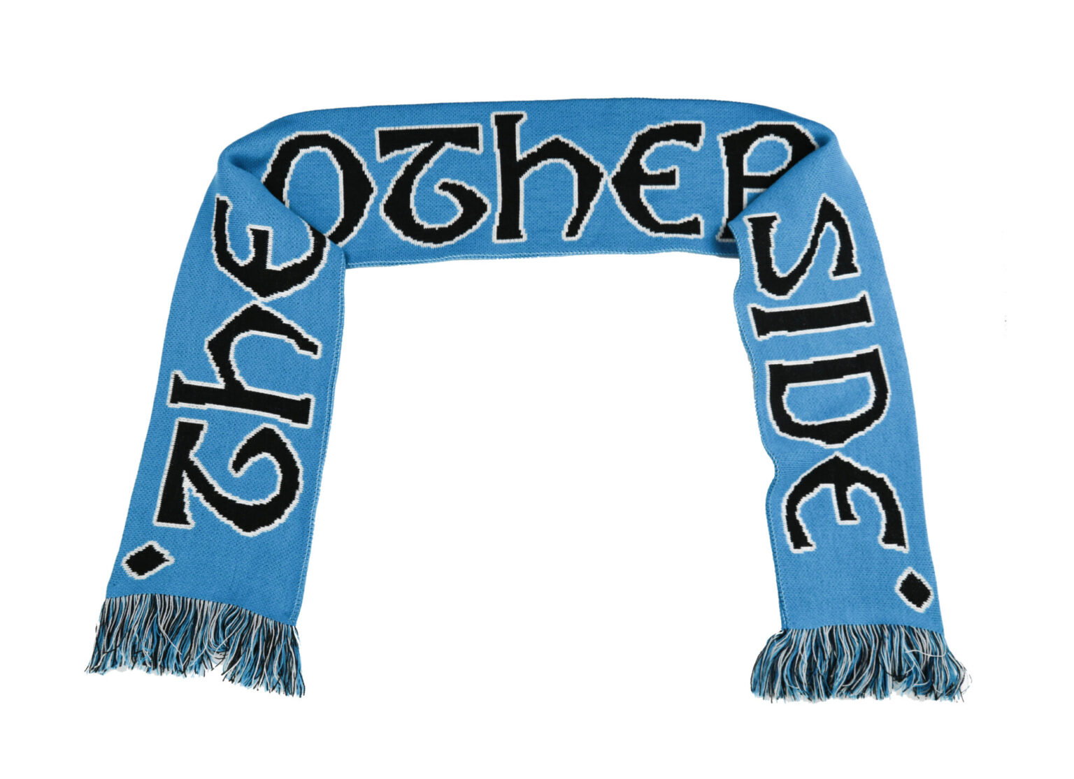
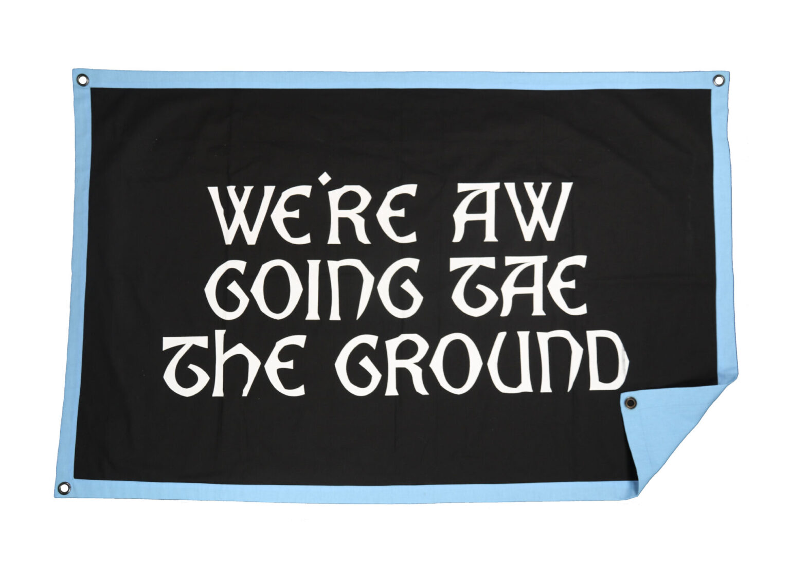
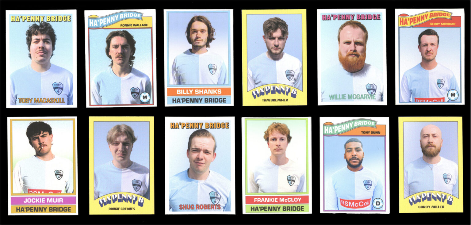
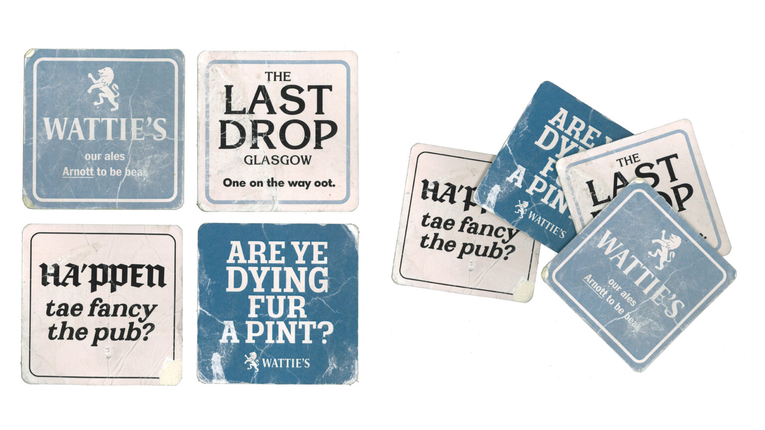
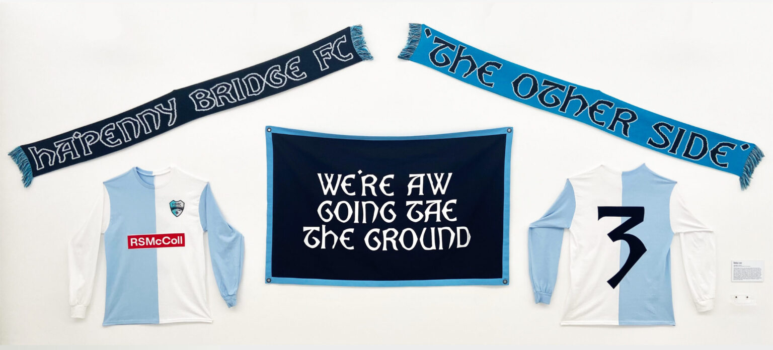
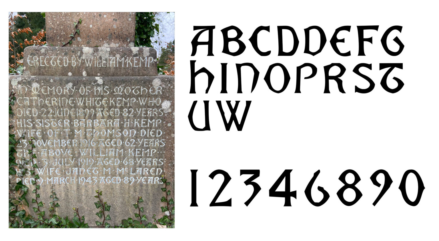
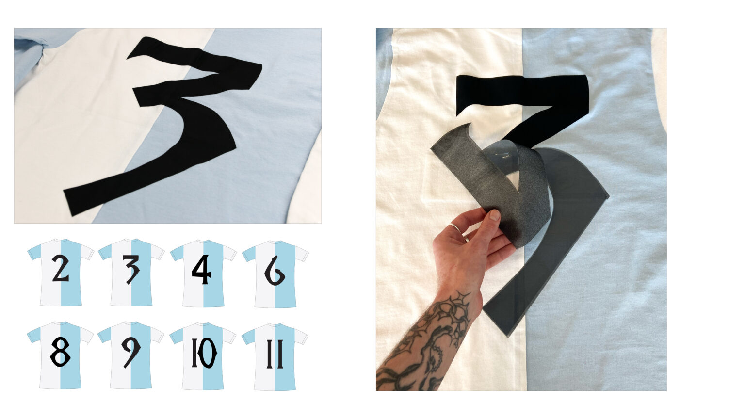
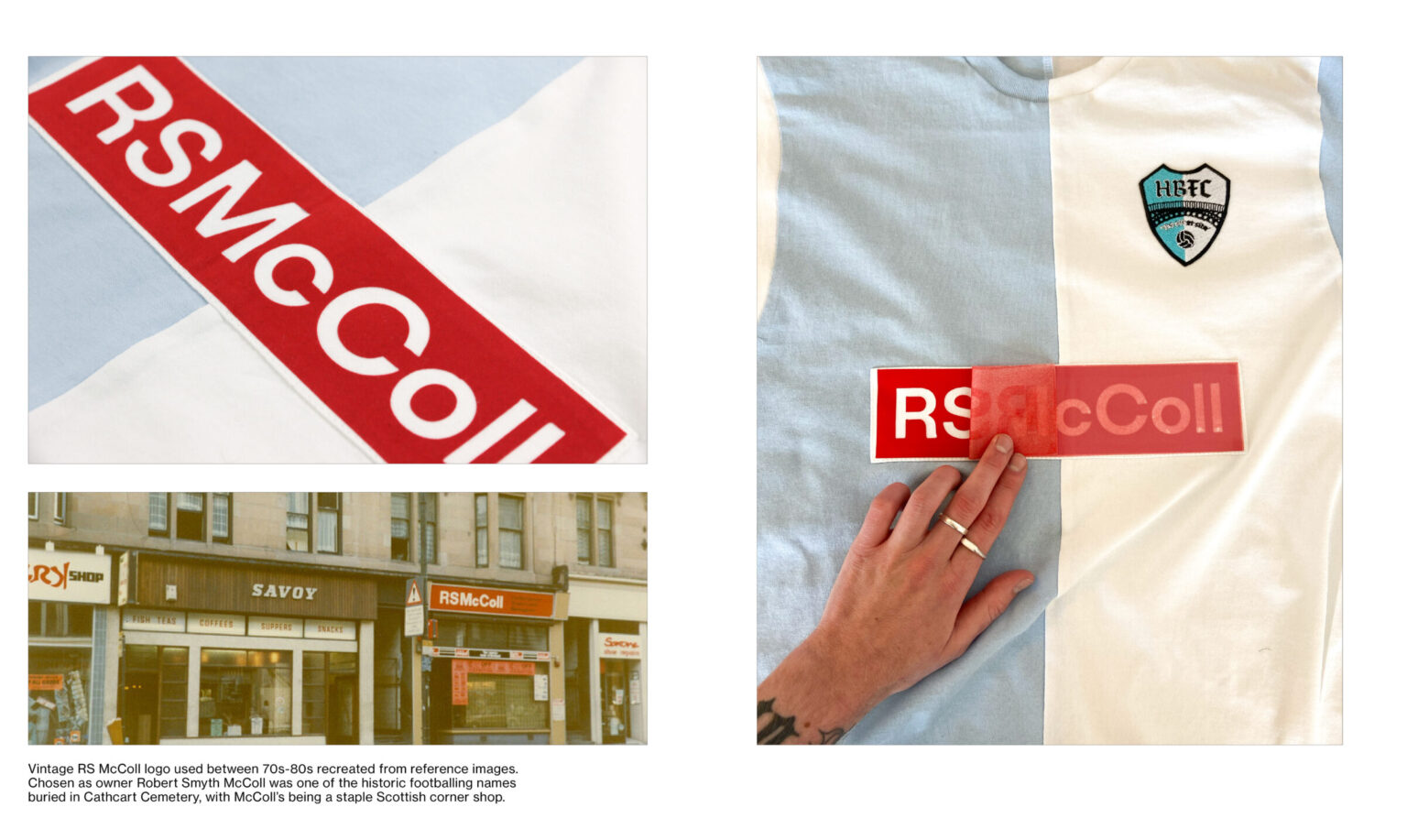
We’re Aw Going Tae The Ground is a conceptual project centered around the creation of 70s-era football team Ha’penny Bridge FC, based on celebrating the over-thirty significant names of Scottish football history that are all buried within Cathcart and Linn Cemeteries in Glasgow’s southside. With so many prominent names laid to rest in such a concentrated area, I wanted the team’s identity to be based on this location of the two cemeteries and the ground between them. This project seen me create a range of football ephemera such as jerseys, scarves, flags and player cards in a location-specific body of work that places focus on world-building.
Extending Design
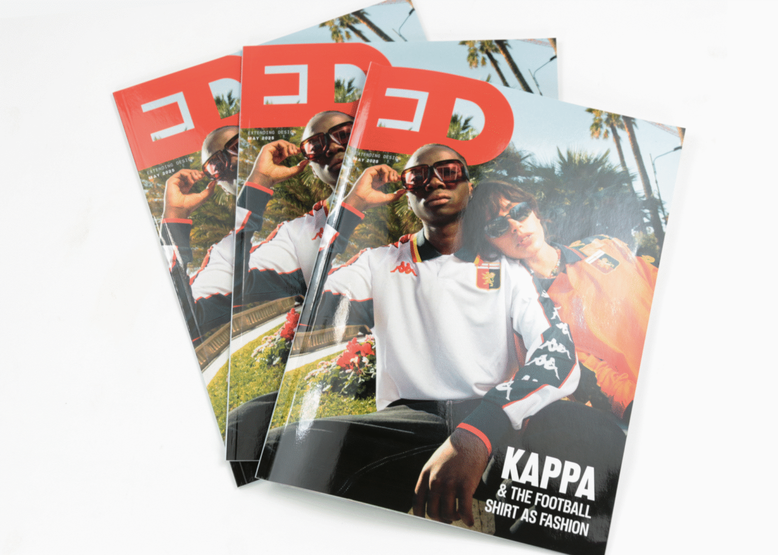
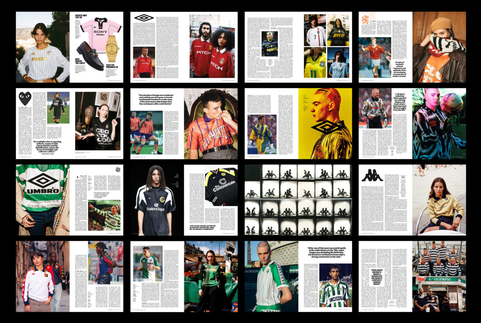
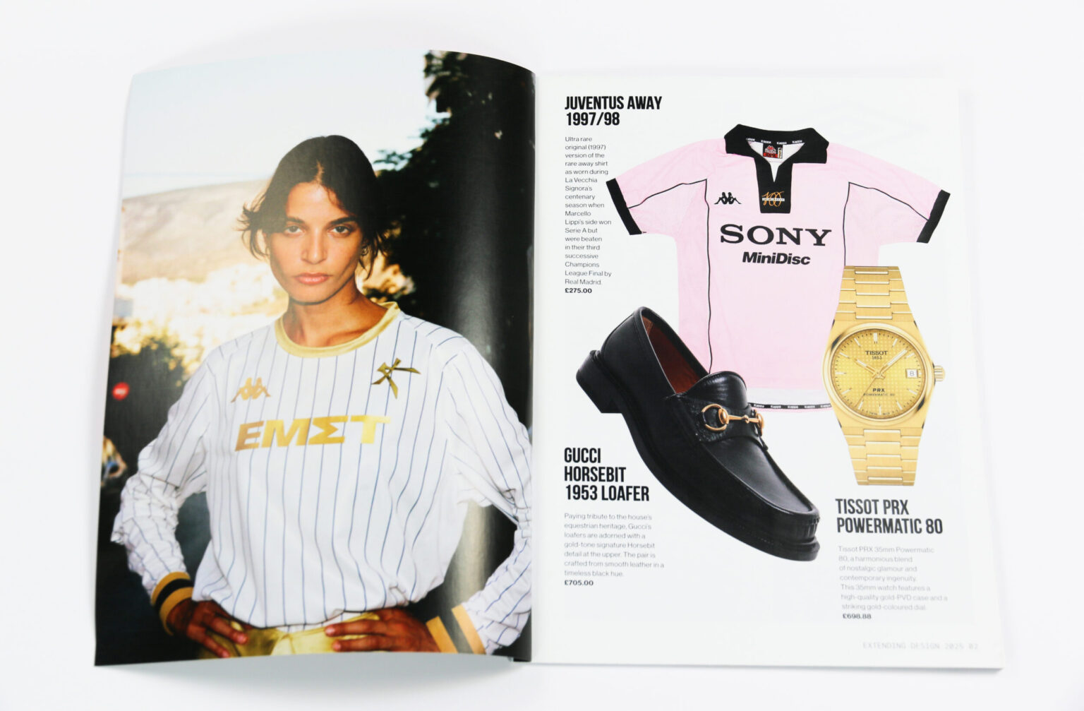
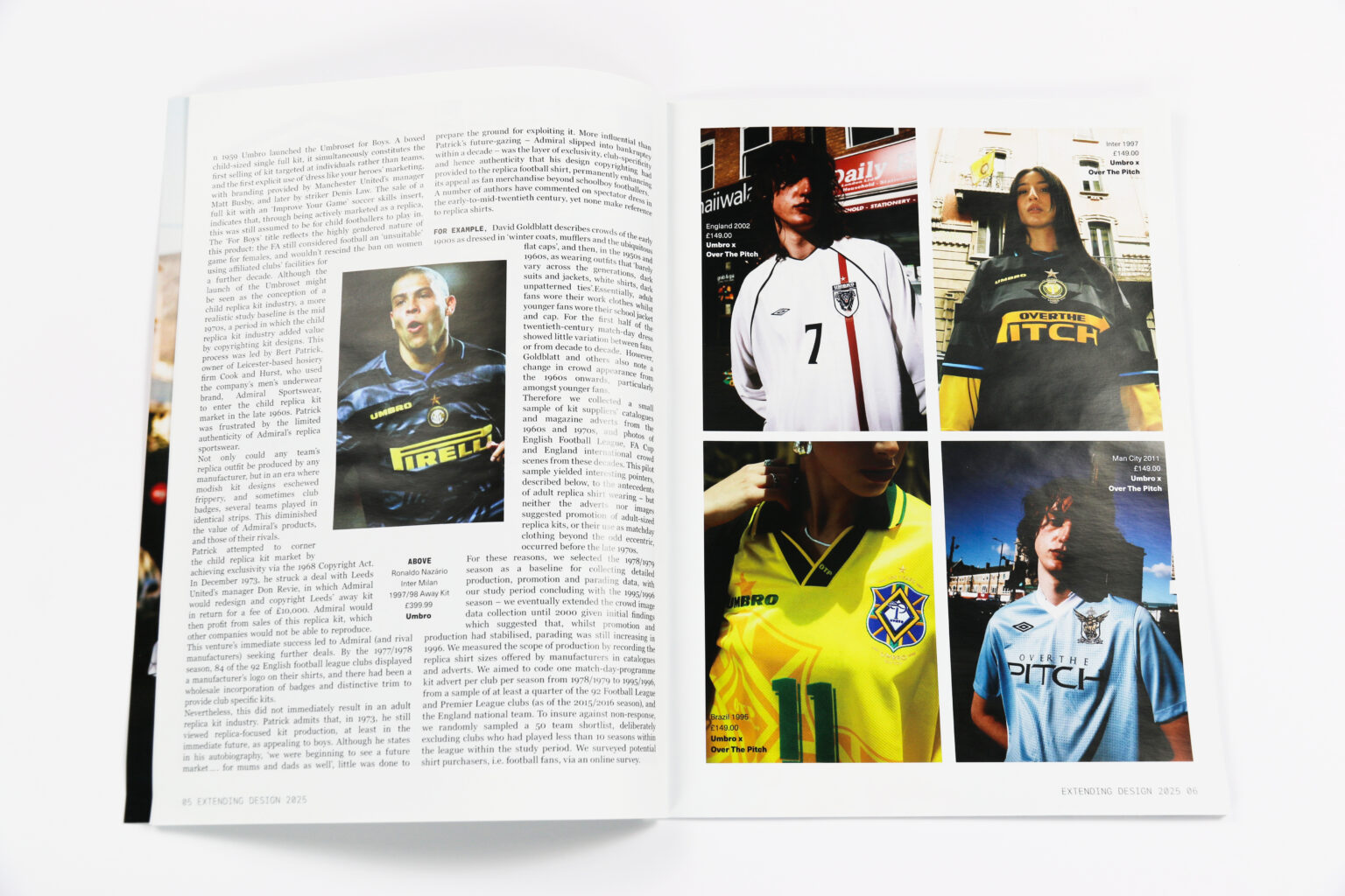
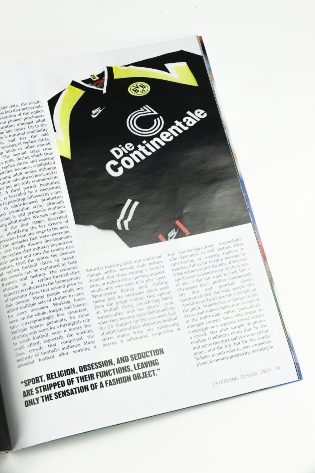
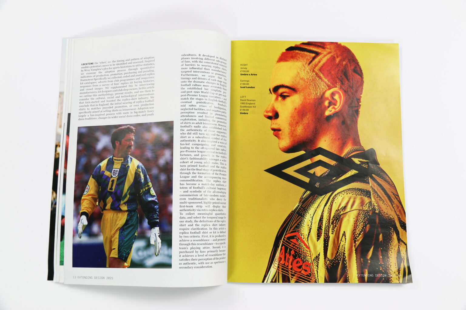
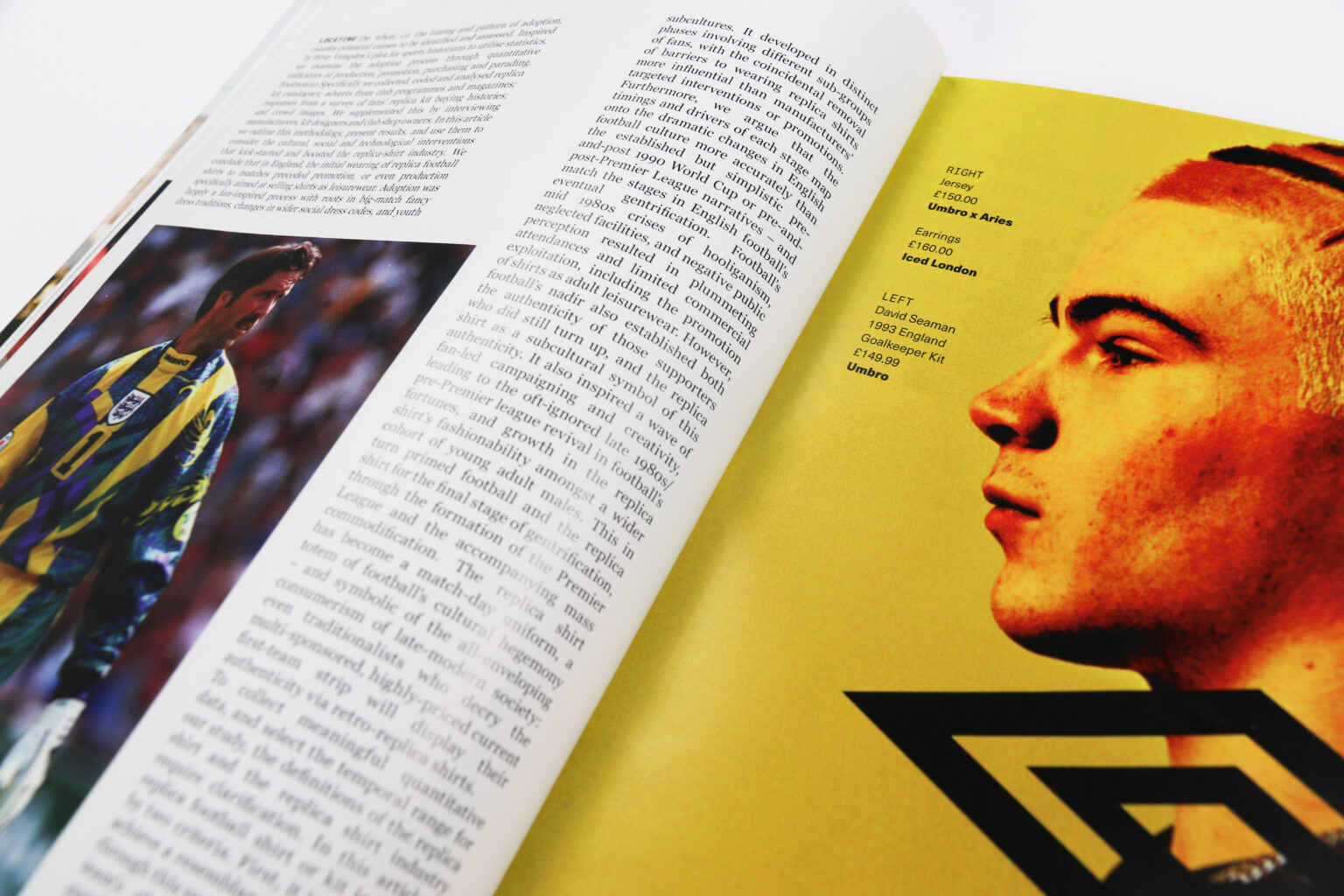
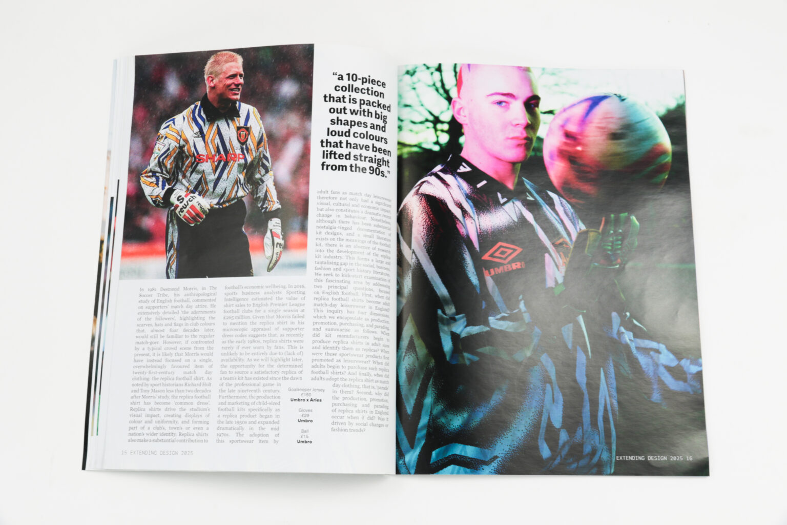
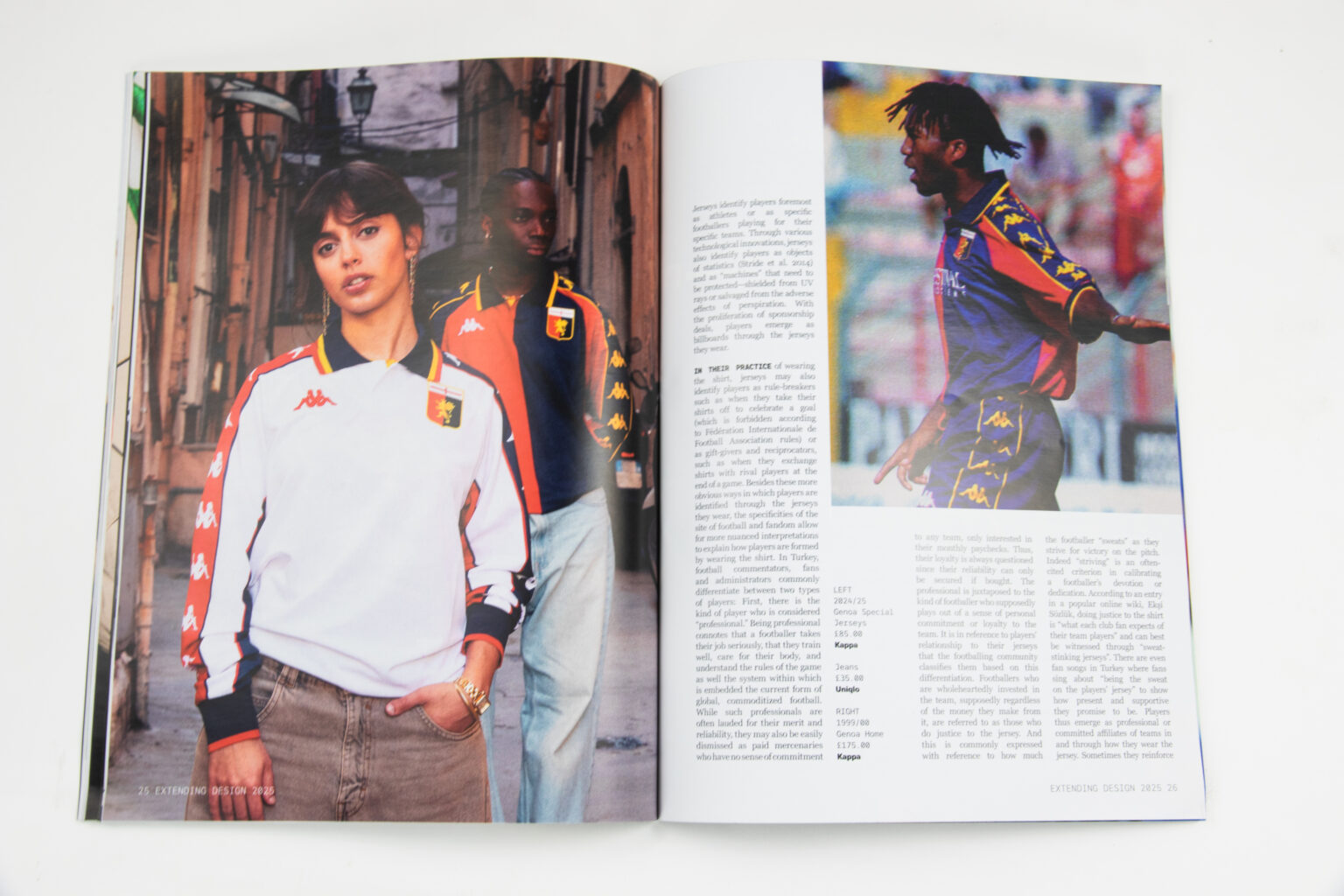
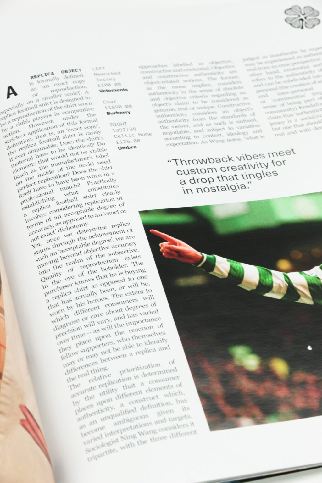
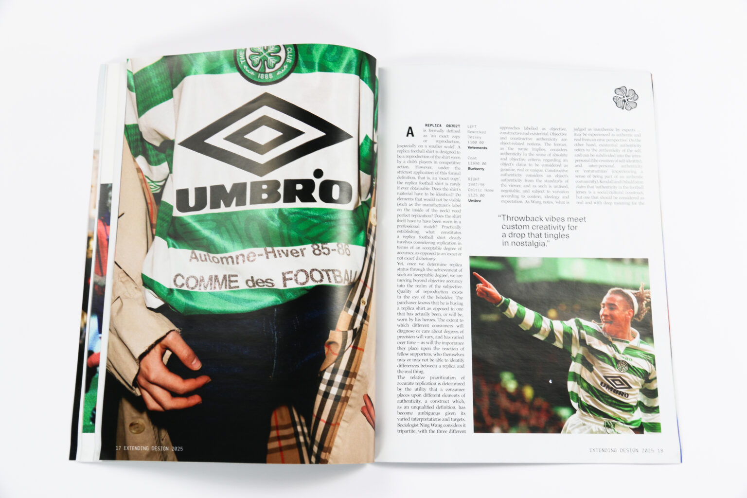
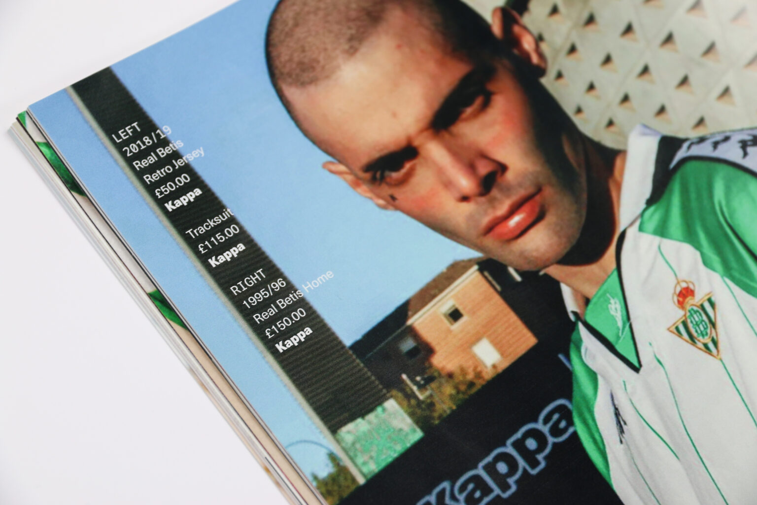
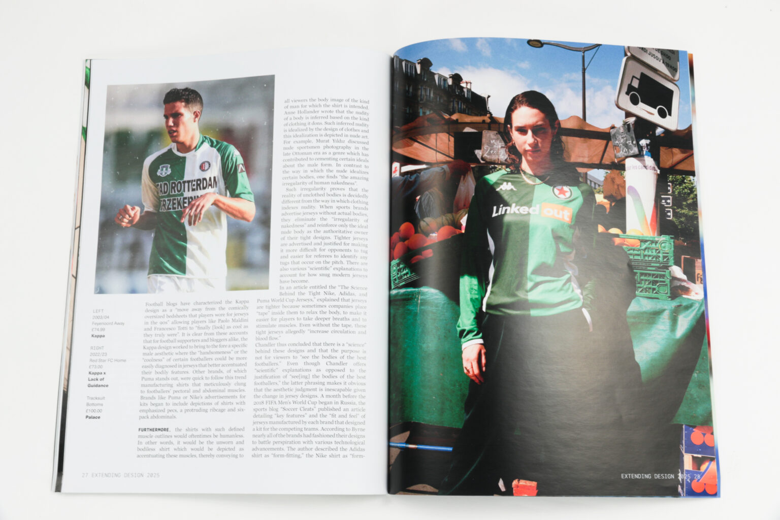
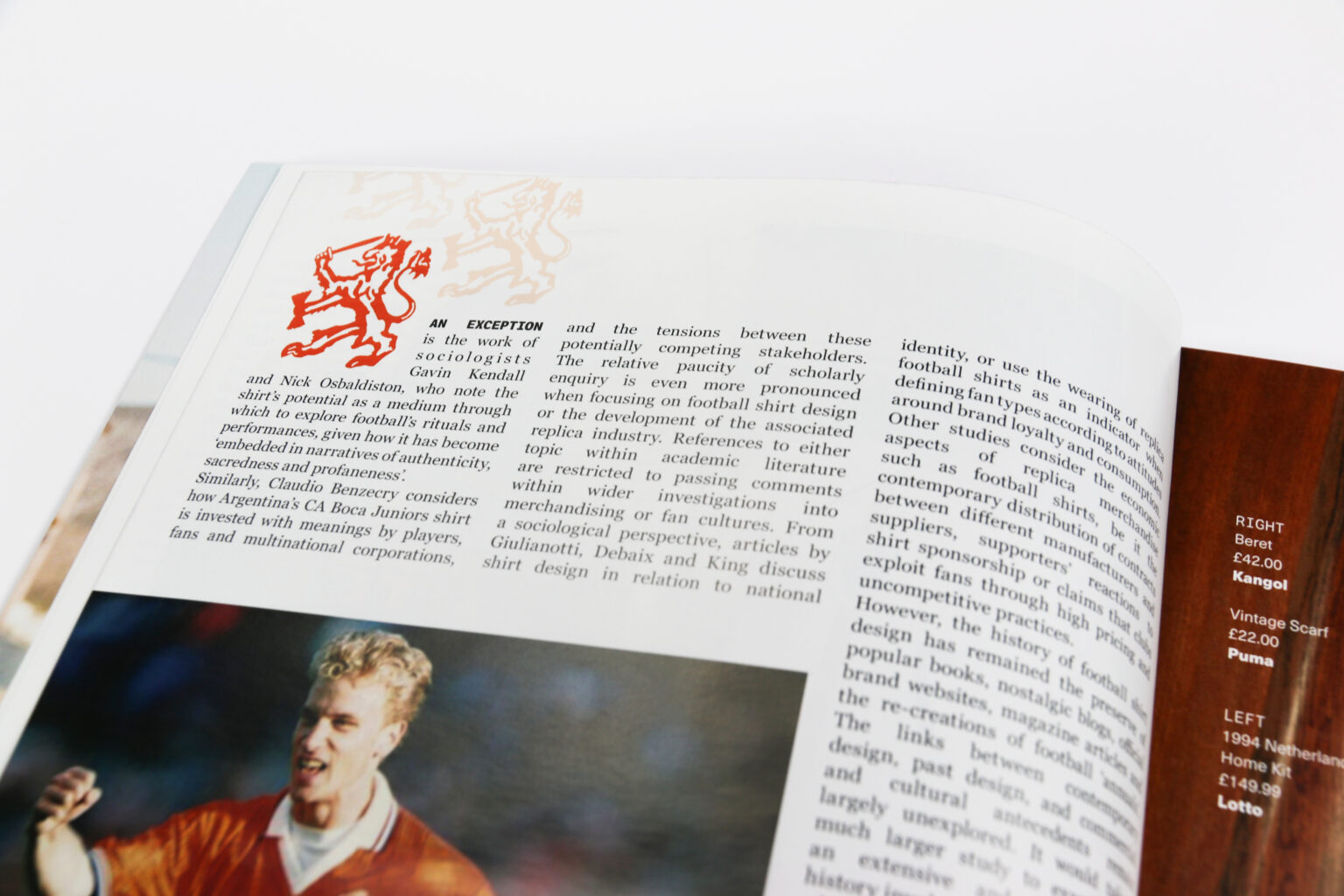
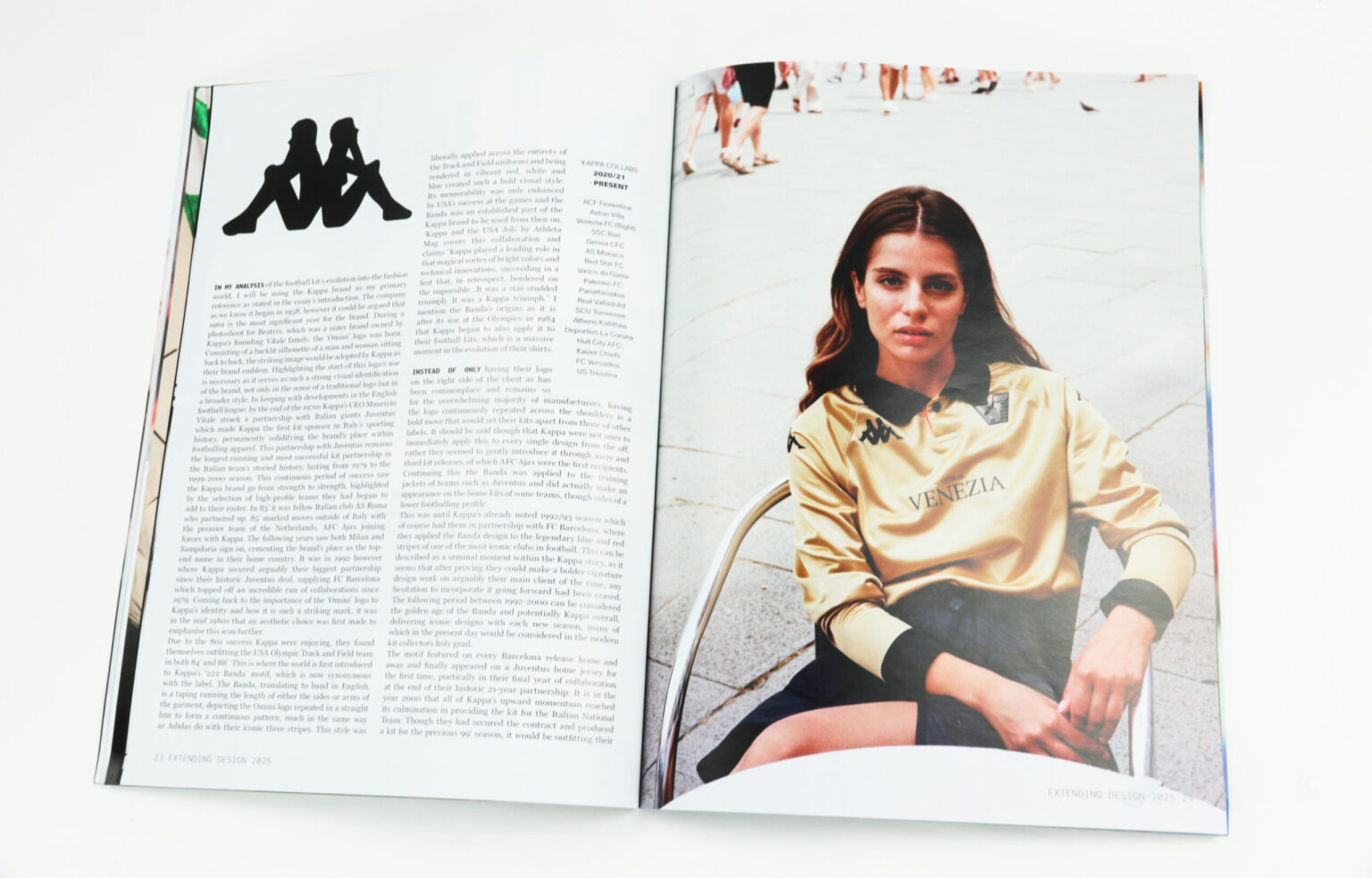
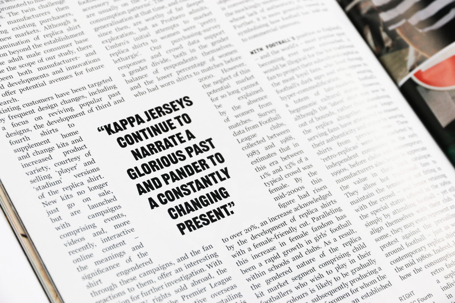
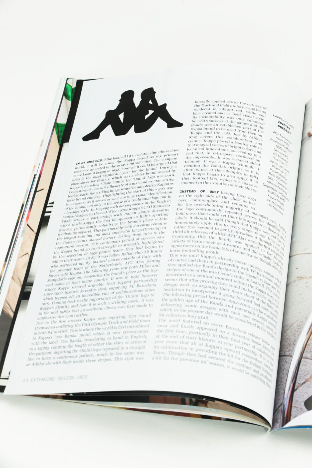
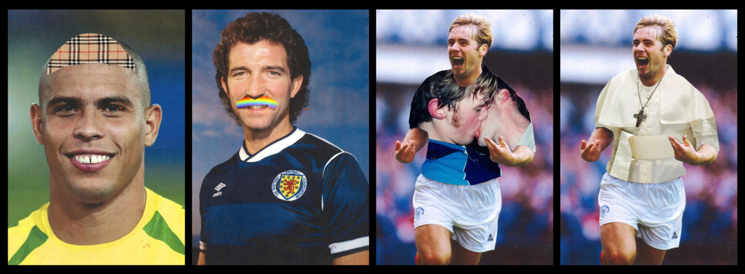
My Extending Design project is a visual response to the subject of my final year academic essay, the football jersey’s evolution from player-wear to a high-fashion piece in it’s own right. This publication is a direct play on the format of GQ magazine and replaces imagery of fashion shoots with the football top’s representation on the field, paired next to it’s adoption within contemporary fashion circles, with the text being that of my essay and the accompanying texts I have referenced. Within this, the Kappa brand became my main case study and point of reference. A main goal of this project was to play with how well I could mimic a GQ publication through first it’s layout, then how it is printed and works as a physical object that can be interacted with.
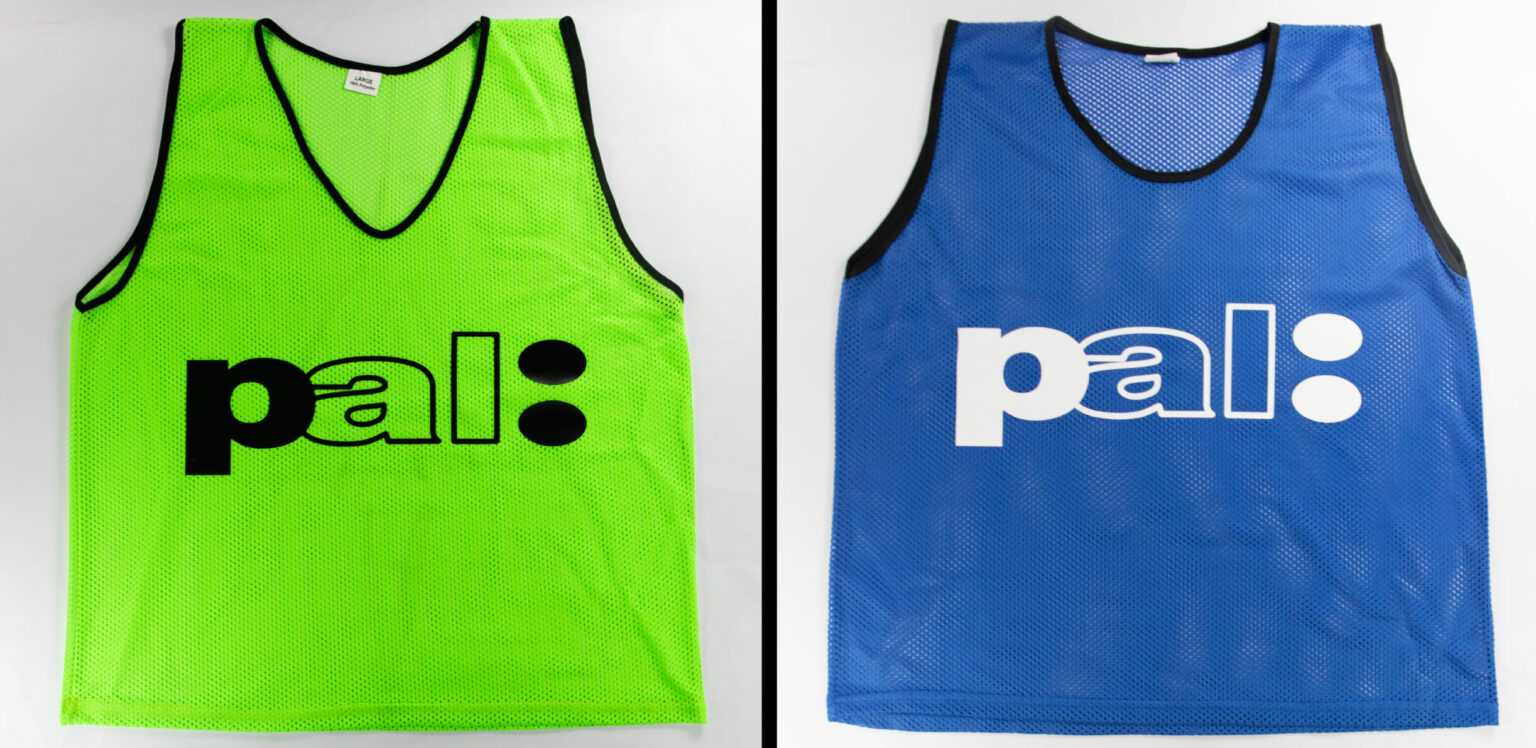
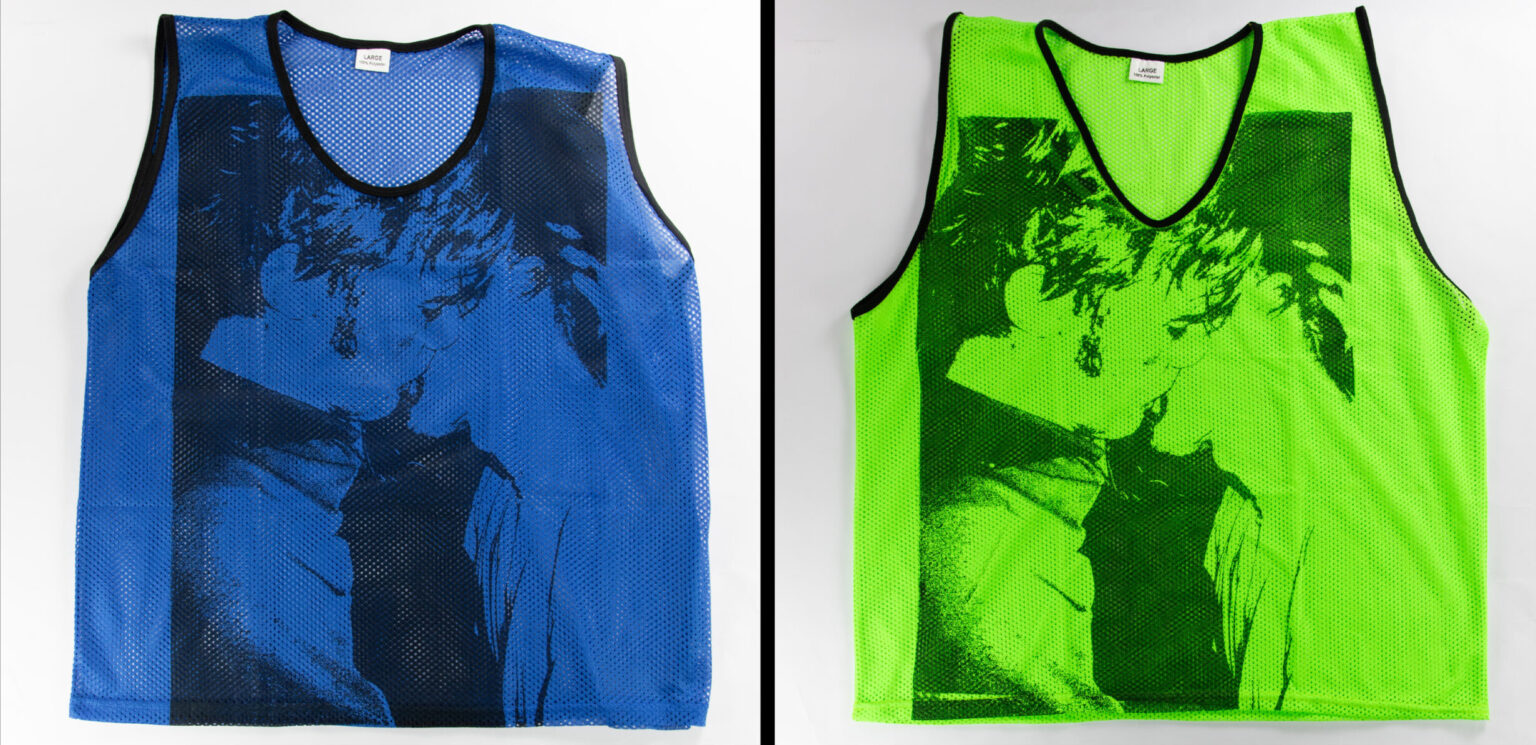
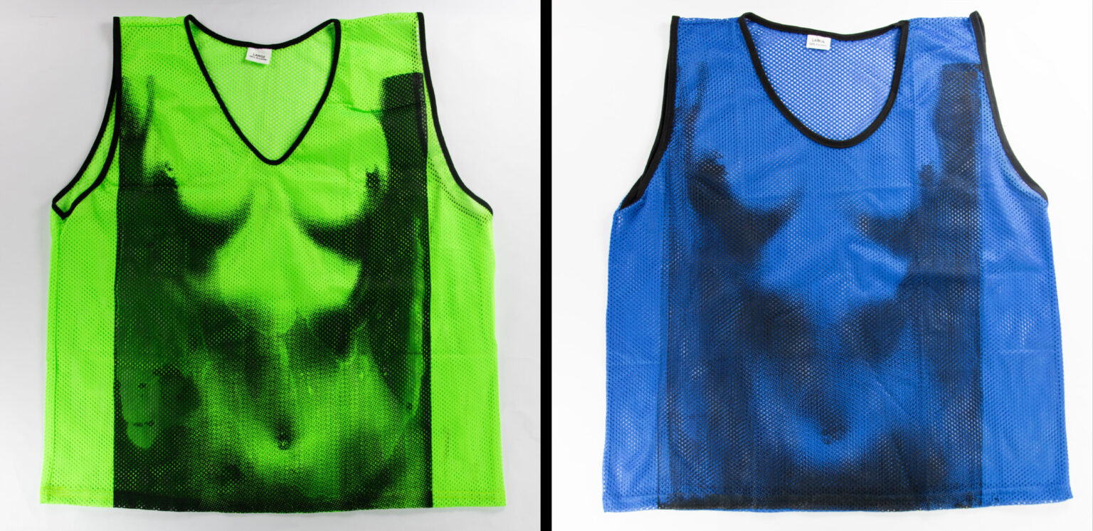
Pal/Bastard
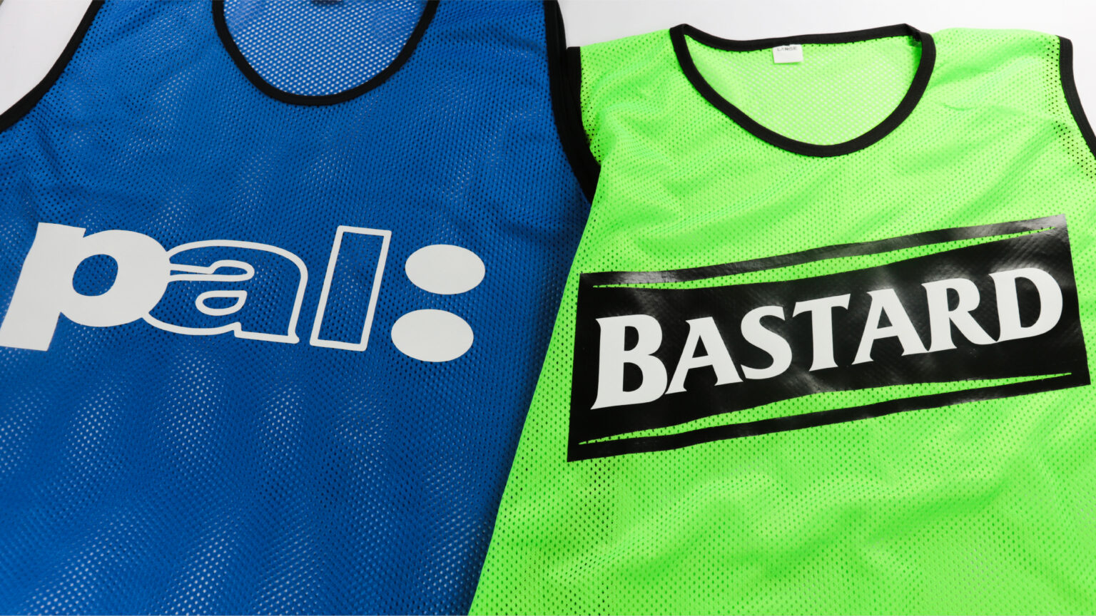
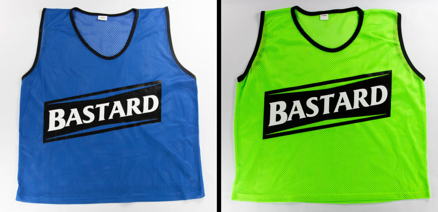
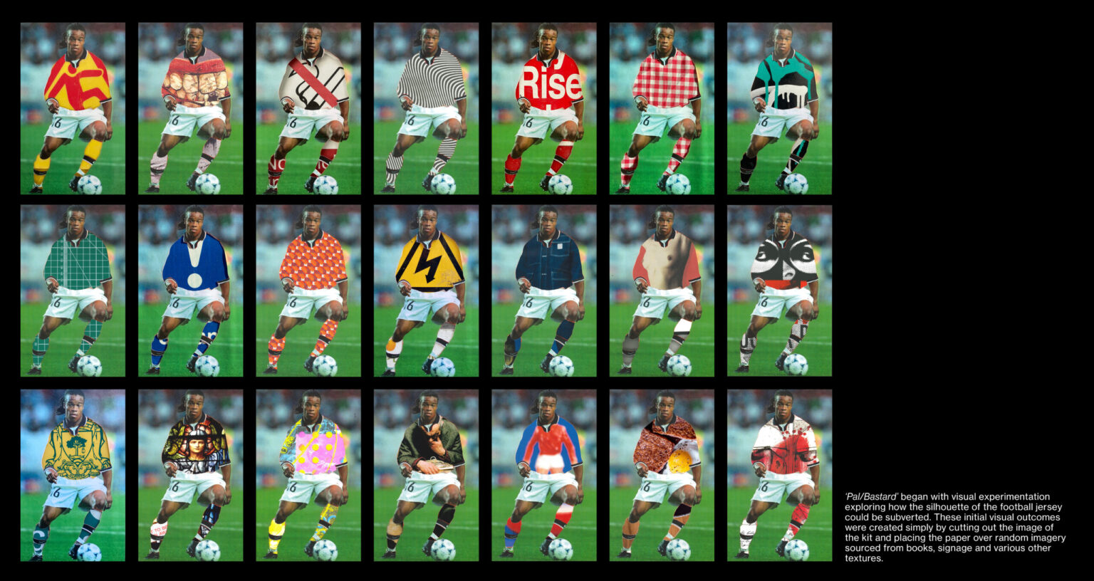
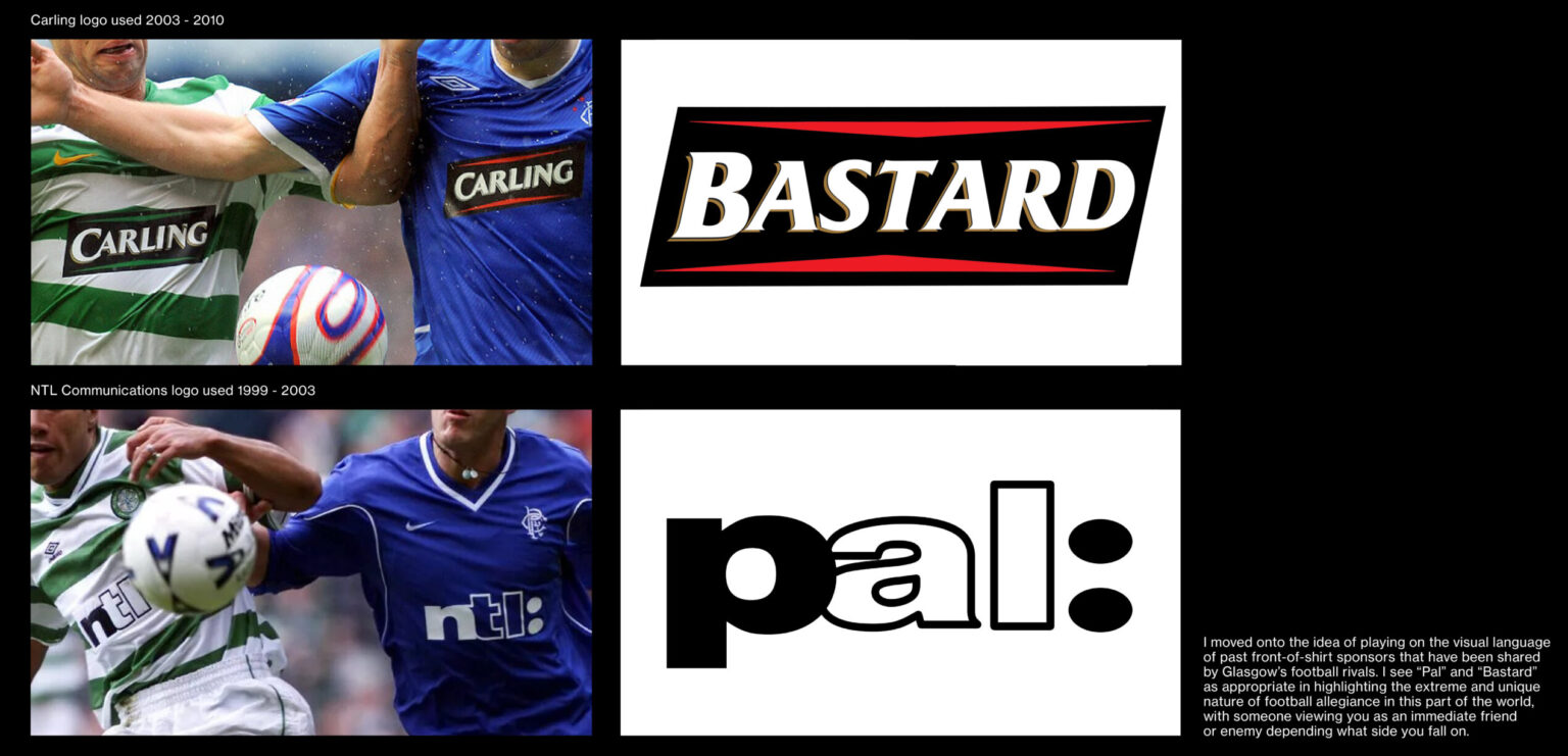
Pal/Bastard began with visual experimentation exploring how the silhouette of the football jersey could be subverted. These initial visual outcomes were created simply by cutting out the image of the kit and placing the paper over random imagery sourced from books, signage and various other textures. I moved onto the idea of playing on the visual language of past front-of-shirt sponsors that have been shared by Glasgow’s football rivals. I see “Pal” and “Bastard” as appropriate in highlighting the extreme and unique nature of football allegiance in this part of the world, with someone viewing you as an immediate friend or enemy depending what side you fall on.
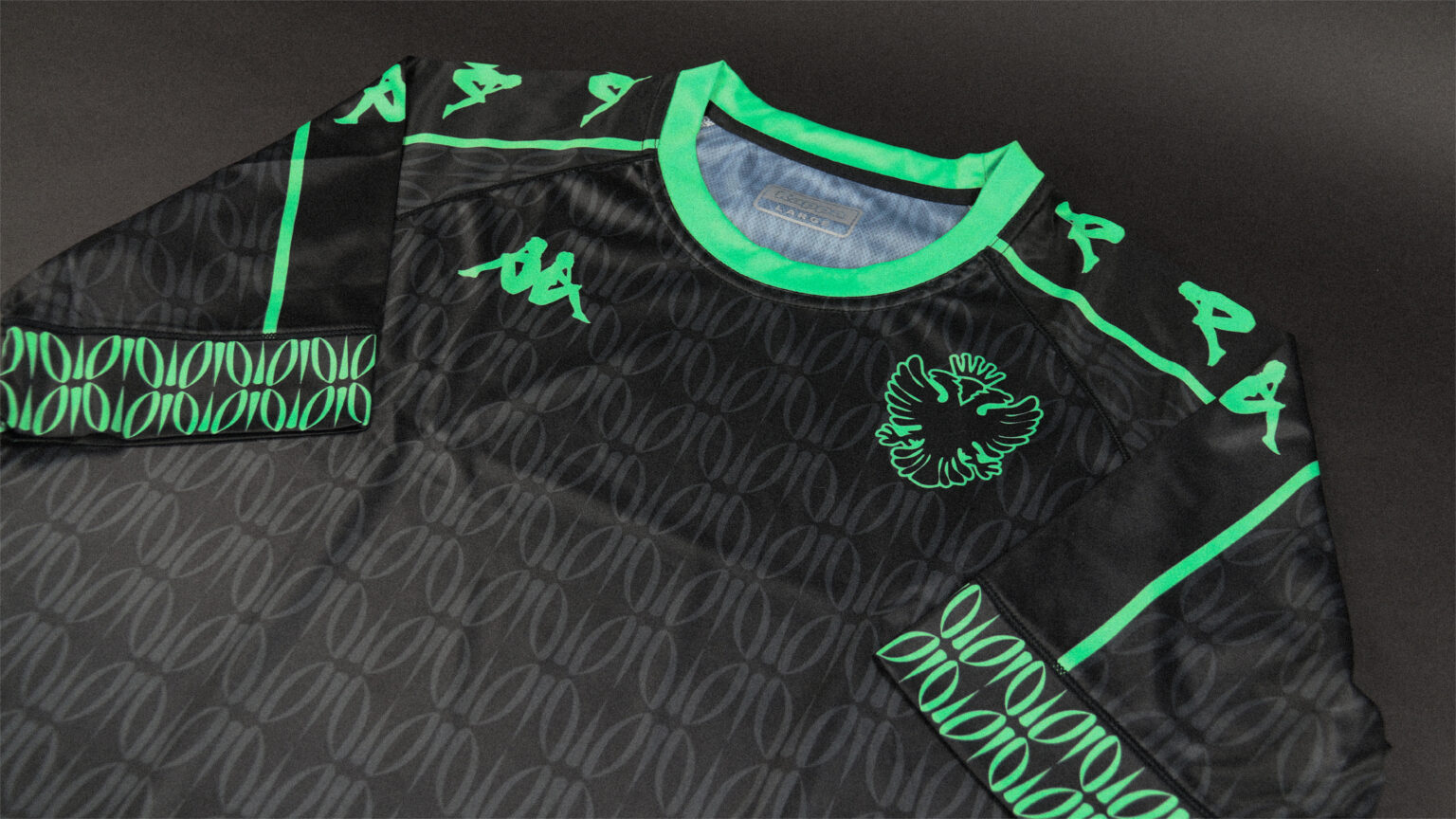
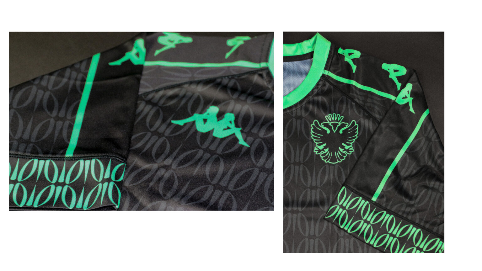
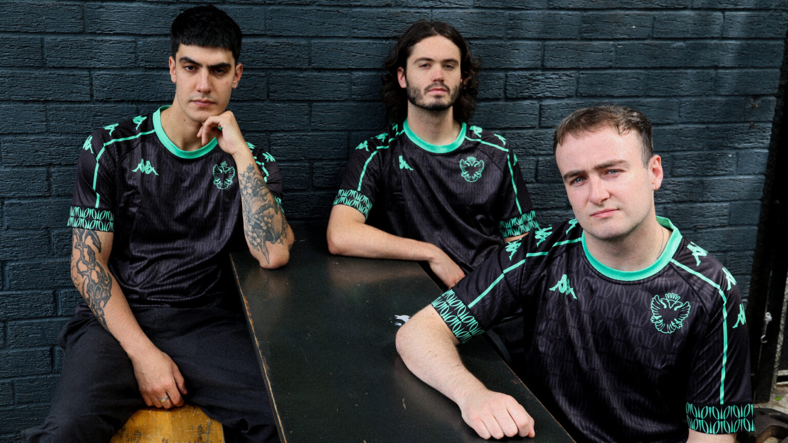
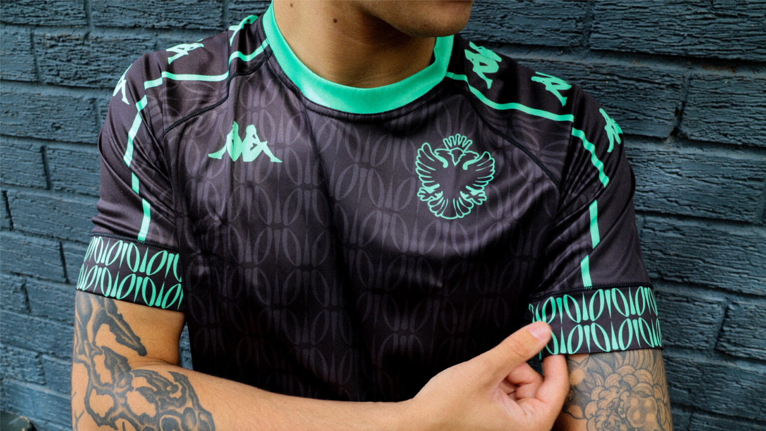
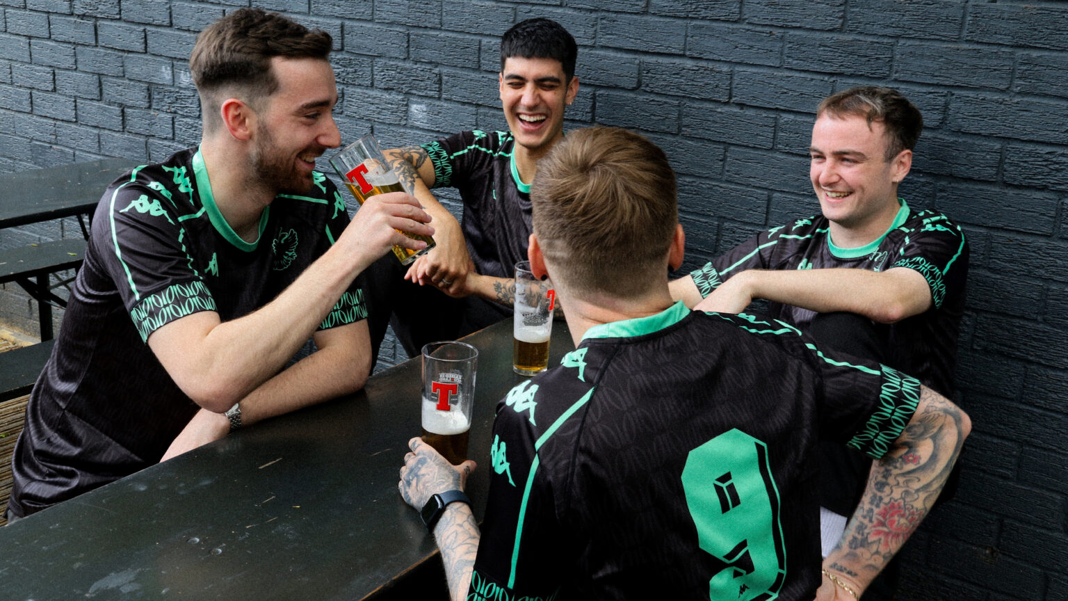
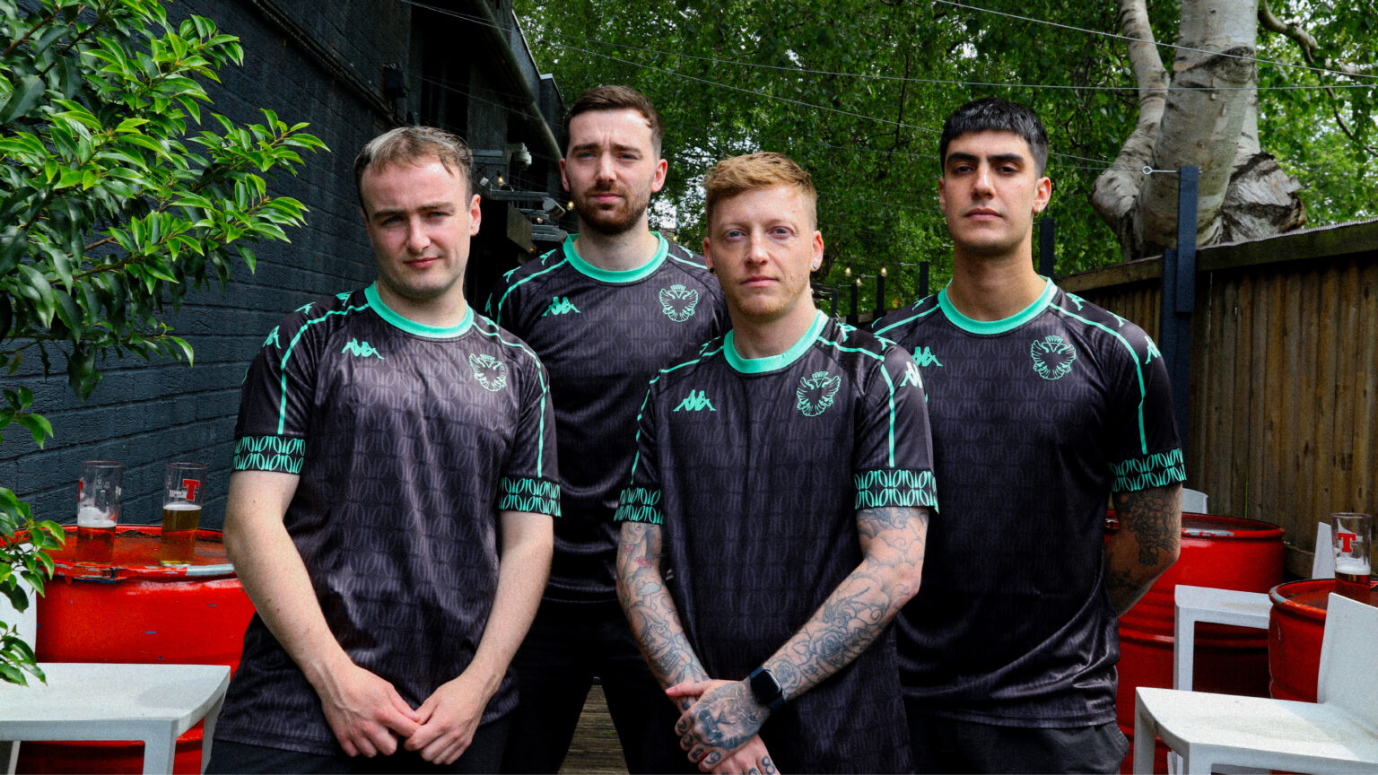
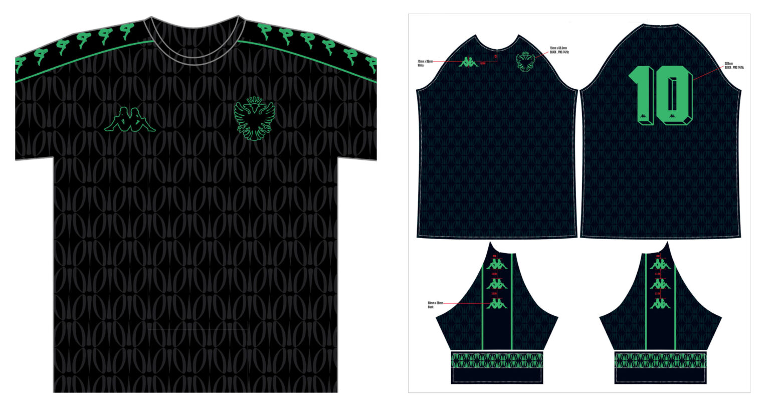
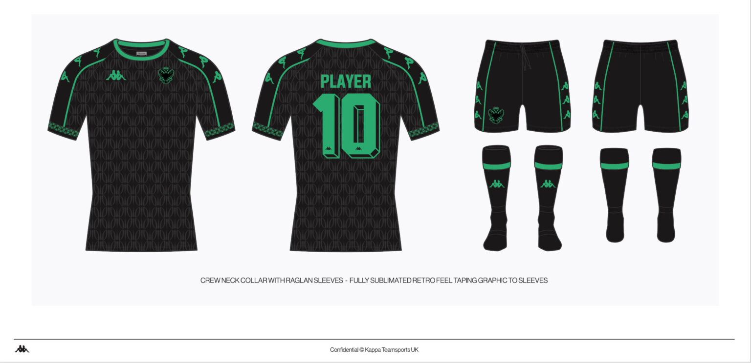
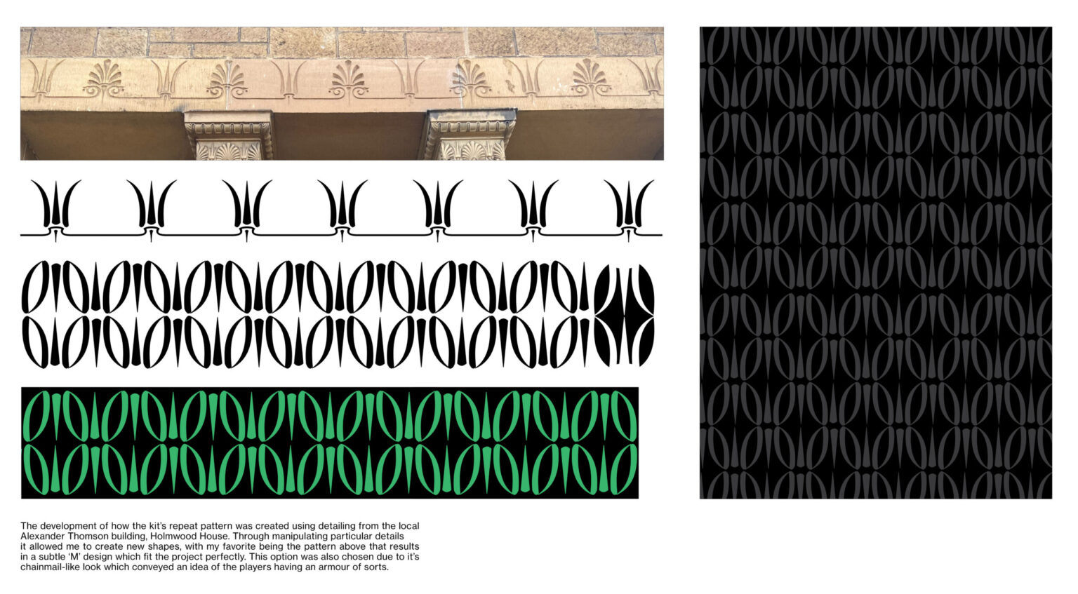
Muirend Athletic x Kappa
This project sees me collaborate with Muirend Athletic, a Sunday league football team based in the southside of Glasgow, to redesign their home jersey. Carrying on fittingly from the subject matter of Extending Design, I was able to get in contact with Kappa and have them on board to manufacture my design. The kit features a bespoke repeat pattern that appear’s subtly on the black of the kit and more prominently on the cuffs. This pattern is derived from details of the local Alexander “Greek” Thomson building Holmwood House.