Kazimir Typeface
Kazimir is an experimental display typeface developed from the Type Design workshop with Gudmunder Ulfarson. This font explores how letterforms can move beyond functional reading and become a system for generating visual compositions.
Inspired by Suprematism Movement and the works of Kazimir Malevich, Kazimir investigates the relationship between geometry, contrast, and negative space. The typeface merges upper and lowercase structures, creating hybrid letterforms. Each character carries a sense of movement through contrasting stroke weights, detached elements and fragmented forms, allowing the eye to complete what is not fully spelled out.
Rather than behaving as a neutral tool for communication, Kazimir is intentionally bold, expressive and image-led. Its letterforms can be arranged as patterns, structures and spatial compositions, turning typography into a visual language of its own.
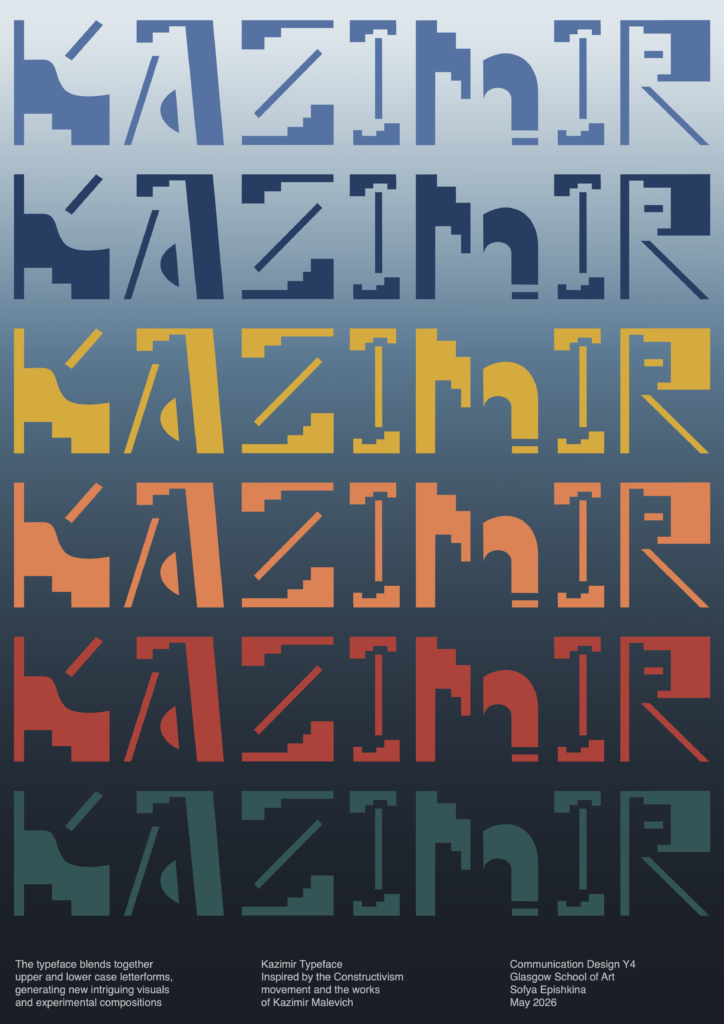
Kazimir type specimen poster exploring the relationship between constructed letterforms, colour, rhythm and negative space.
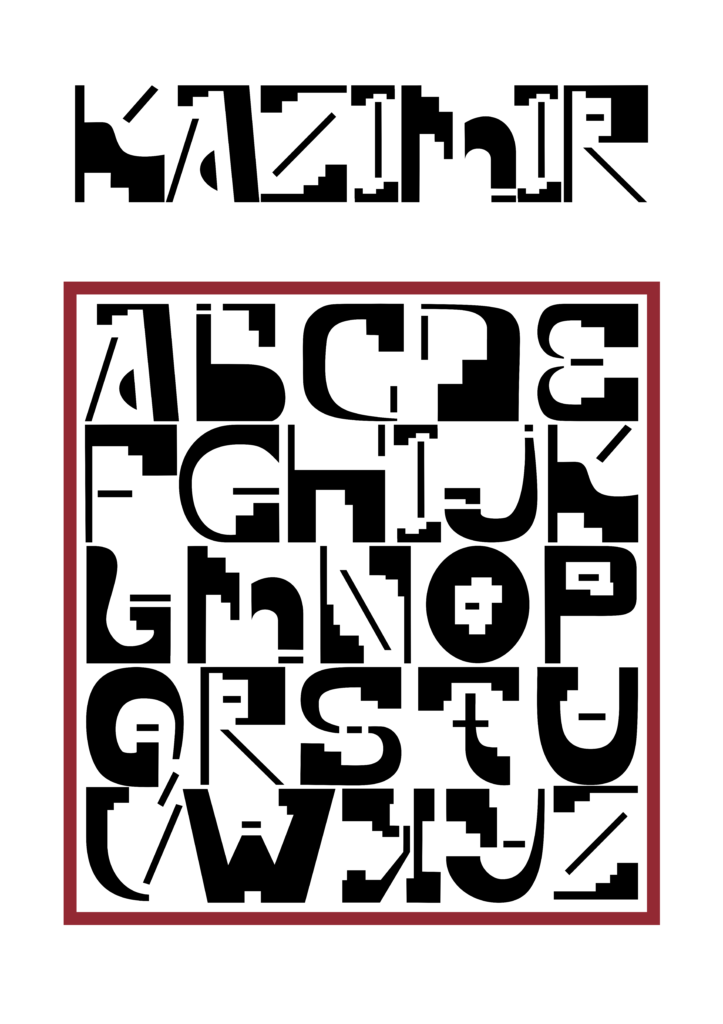
Kazimir alphabet specimen exploring modular letterforms, contrast and negative space.