Communication Design School of Design
Zara Robertson
As a graphic designer, my work centres on bold typography, motion and colour to create impactful visual languages. I enjoy producing work that blends digital and analogue qualities, giving my projects a richer sense of personality. Problem-solving and organisation are key strengths of my practice, skills I have developed through my experience working in a studio environment. I thrive in collaborative settings where idea generation drives the creative process, but I’m equally confident in the strength of the work I produce independently.
Looking ahead, I’m excited to join a team that encourages bold thinking and values creative making. I also look forward to applying the skills and knowledge I’ve gained from my time at The Glasgow School of Art to new and challenging environments.
Every Object Tells a Story
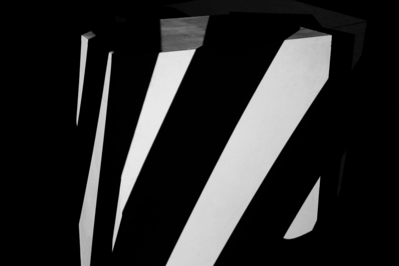
Every Object Tells a Story is an animation project created in collaboration with Elizabeth Law. This project explored the storytelling of WWI Dazzle ships through strikingly distorted typography, considered motion and spoken word. The brief was to create a short projection mapped animation that could be used as an immersive installation for a museum. The dynamic animation is used cleverly to disguise the form of the plinth nodding to the confusing quality of the Dazzle ships.
The warped imagery are lines from a poem by Victoria Hendry, a Scottish female poet. We decided to add the audio of the poem layered with ambient wave noises that evoke the movement of the sea. The audio component adds depth to the piece, inviting the viewers to not only see but feel the confusion that the Dazzle ships aimed to inflict.


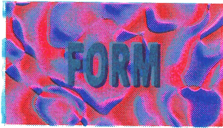
Moving Voice
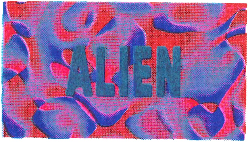
I created a Riso graph animation inspired by David Bowie’s prescient 1999 BBC Newsnight interview with Jeremy Paxman. Centered on Bowie’s bold declaration that the internet is an “alien life form,” the piece juxtaposes his insights with a montage of found internet and tech advertisements from the cusp of the millennium. The Riso technique lends a tactile, retro-futuristic aesthetic, echoing the analogue-digital duality of the era. As Bowie’s words resonate across pulsating frames, the animation hints at the tension between the Internet’s untamed potential and its commercial co-option. Alien Life Form invites viewers to reflect on the 1999 web frontier.
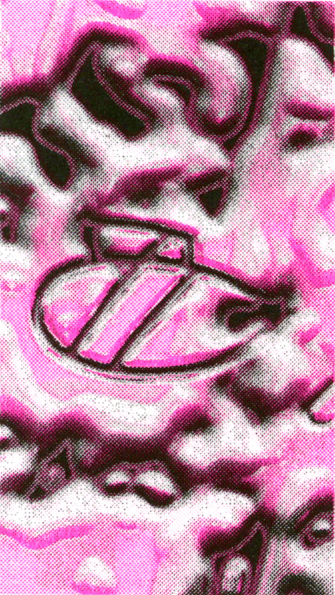
I also created a promotional animation for SubClub, using the same riso process to capture the “trippy” aesthetic of headliner ‘The Trip London’ for a club night. The punchy animation moves in time to one of ‘The Trip London’ s biggest hits and incorporates all of the promoters logos in a way that ties into the animation.


Shotokan Publication
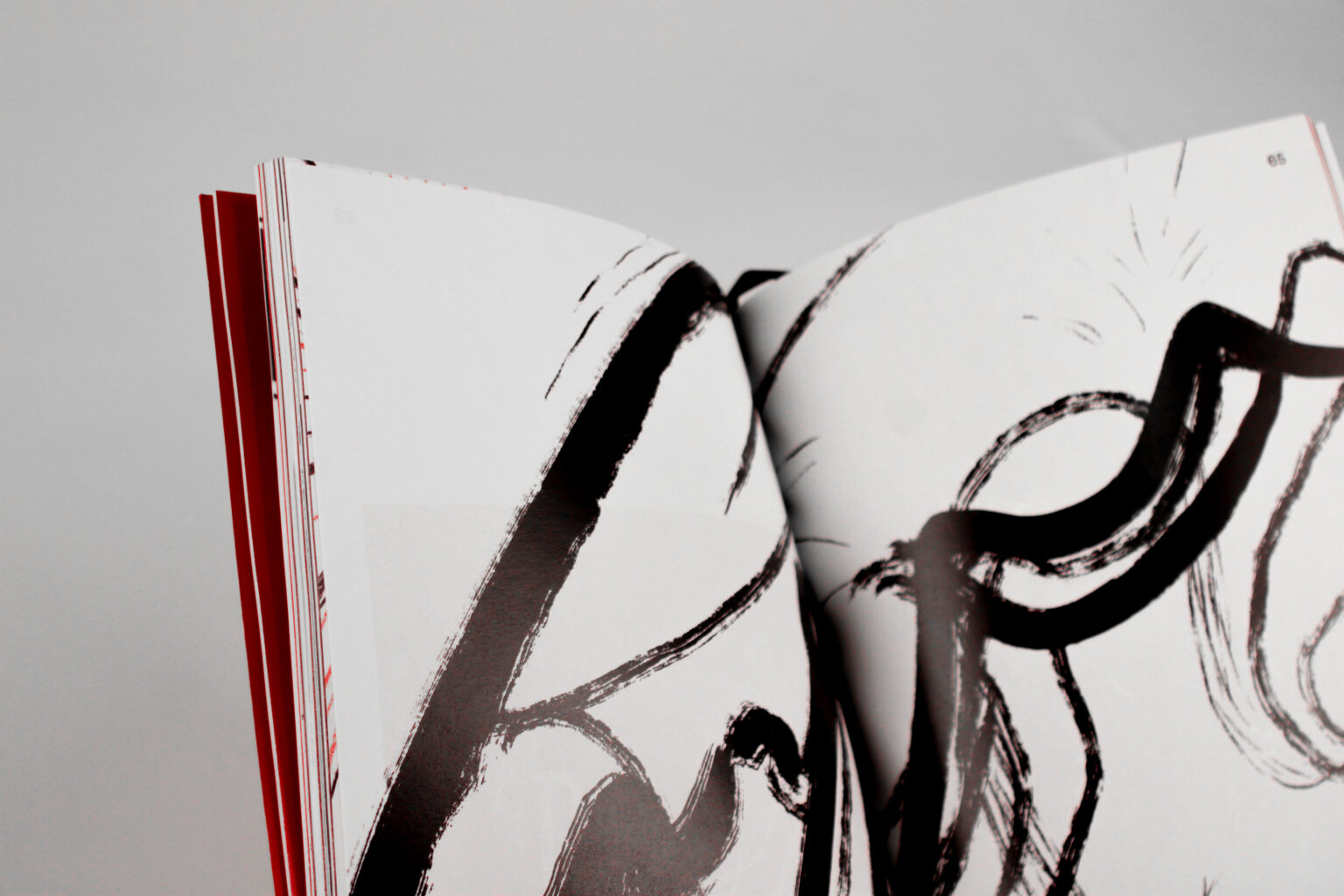
Shotokan publication is a collection of observational works that reflect on an experience with the art of karate. The content of the publication was illustrated by Ellis McQuillan, who observed a local karate studio for a series of months collecting drawings and notes. The publication is a result of a collaboration between myself and Ellis who asked me to curate her works in a way that takes inspiration from Japanese/Karate elements yet leaves the illustrations as the focus. The contrast in bold colour and type choice sits well alongside the white space that allows the illustrations to breathe. The structured layout is disrupted by spreads of bolder graphic images, moving page numbers and playful Q&A pages. The placement and sizing of images all work together to build a sense of how Ellis observed specific elements of the dojo (karate hall) and the people in it.


Kelvingrove Rebrand
Identity redesign for Kelvingrove Art Gallery/Museum Scotland. The design was inspired by the 1902 organ in the heart of the museum’s main hall. The overlapping organ pipes transform into a ‘K’ for Kelvingrove with the bold blue colour bringing a modern element to contrast with the rich history of the building. Applications showcase how the overlapping and staggered visual language can be used in textiles, advertisements and signage.


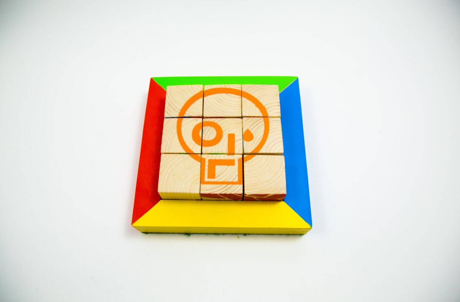
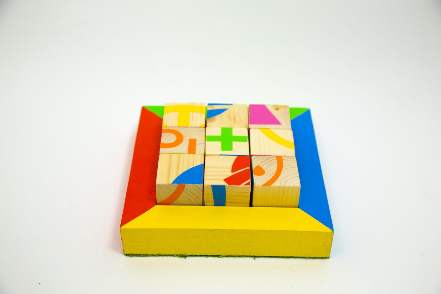
Little Political
In response to my extended essay that I wrote as part of my Design History and Theory class I created a children’s puzzle toy from prominent political graphic symbols. The essay discussed the ideas of commodification of politically and socially charged graphic design, discussing how these processes have evolved from being a vehicle for activism and influence on contemporary culture, to a highly commercialised medium. The discourse within the essay highlighted how graphic design, originally a tool for resistance and awareness, is now compromised by market forces that dilute its activist potential.
The toy plays on this idea of commodifying the symbols and breaking them down to abstract shapes that then hold no significance or meaning.