Extending Design

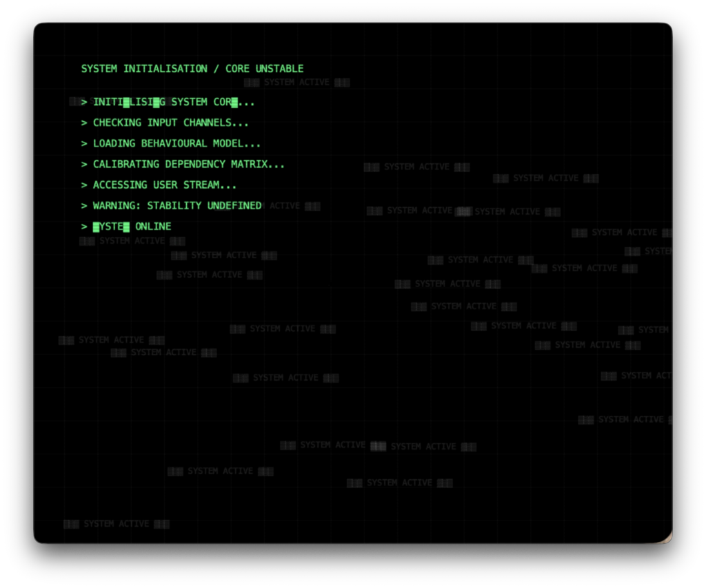
I developed a final outcome using p5.js and adapted it into a webpage to improve accessibility and interaction. The code was developed in response to my extended essay, Digital Overload: How Society’s Use – and Misuse – of Technology Is Reshaping Our World, which explores how technology reshapes the human condition across cognitive, psychological, physical, and social levels. While it brings clear benefits, it also raises concerns as everyday tasks become increasingly automated.

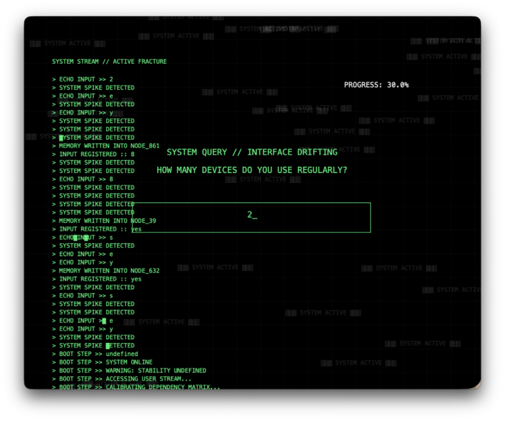
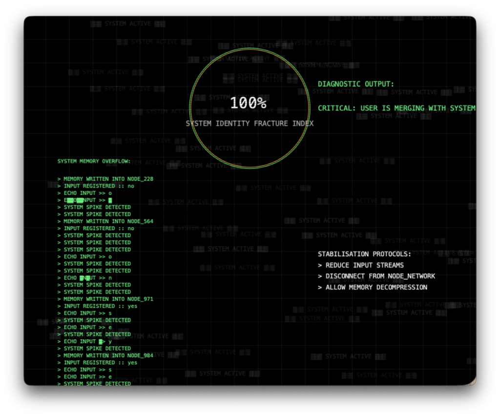
Coding was central to the project, allowing me to visualise digital overload through an interactive system. User interaction directly affects the visuals, creating moments of both engagement and overwhelm.

This process turned the work into an active system shaped by the user and pushed my practice into a more experimental, code-based direction.

Extending Design

The design proposal for my extended project is centred on a study of living coral.

Living reef environments explode with colour, movement, and energy. Where my main graduate collection reflected the pale, skeletal stillness of bleached coral, dwelling in silence and loss, I intend that my extended project will turn towards life and the vibrancy of coral in its living state.

It is the tension between the two states – life and death that will be displayed in my two bodies of work.

Central to my research is the phenomenon of coral fluorescence, produced by algae living within the animal’s tissues. I plan to extend my design to include rich, contrasting fabrics echoing the vivid coral animated by the current in the depths of the dark ocean.

I intend to develop my skills in the use of fabric manipulation, intertwining contrasting colours and adding stitching, to bring visual curiosity, and display the reflective dimension of living coral into my samples.

I plan to visualise this extended project through accessories — hats, handbags, and interior objects — a decision that allows the work to move fluidly across contexts while retaining its visual intensity.

My aim is that the life and vibrancy captured in these pieces is not simply decorative; it is a quiet argument for preservation, a reminder of what bleaching erases, rendered in colour, light, and form.


IMG_2587
IMG_2636

Extending Design

This replica of a library-owned photobook foregrounds the process of reading photographs through marginalia, specifically questioning how the layers of information hidden in each photograph can help to frame them.


William Eggleston + Lois Levi

Extending Design

For a person with a disability, wayfinding is essential for a person to navigate a space.

We need to consider what happens when you lose a sense, such as hearing, vision, or mobility.

How can we make wayfinding not only easy to navigate but also supportive to all?

There is a rendered image of a niche in the wall that will house tactile floorplans. Below this image are three images of the tactile floorplan prototype of the bar. This is made with a dark wood background and white acrylic floorplan details.
Tactile Signage

Speaking with Julie reinforced how essential a tactile map is for deaf blind users. I began by analysing the bar layout, testing how objects could be identified through touch and whether written labels were necessary. Julie’s guidance to keep the map flat and aligned with the rooms orientation led me to explore a wall integrated niche with wheelchair and/or guide dog space beneath.

There is a rendered image showing the tactile iconography on the wall next to the niche with tactile floorplans. Below, there are images of my prototypes of the tactile icons I created and designed.
Tactile Iconography

For the iconography, I analysed existing systems and tested how each symbol would read through touch, stripping forms back to their most tactically legible shapes. I then explored materials. Initially I considering wood before shifting to black acrylic for its clarity, hygiene, and contrast against light timber. As with the tactile map, I produced physical prototypes and renders to show how the final icons operate within the space and contribute to a coherent accessible language.